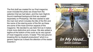
1. The first draft we created for our final magazine
cover included the photo we chose from the
selection that we had taken, and the main Sight &
Sound masthead background that we created
separately on Photoshop. We then started to add
the main text which includes the title of the film and
the name of the starring actor of the film as these
are some of the most common aspects of the
magazine. We decided to use Italic font as it makes
it look more distinctive and unique. We also added a
tagline at the bottom of the cover as its very typical
of most magazine covers. It reads "The new ground-
breaking film by bluebolt productions" which is a
generic tagline as it draws the attention of the reader
towards it.
2. After we had completed the first draft of our poster we
showed it the audience and got some feedback, which
mainly suggested that the poster looked very empty and
didn't include much information. So we then decided to
add some more text onto the cover such as what else is
featured in the magazine issue which is placed near the
bottom of the cover.
We also decided to include a ‘call-out’ which is
mainly used to bring the readers attention to an
important piece of information. We decided to
make this issue include BAFTA award
nominated/winner films and reviews as it is popular
and familiar to the majority of the readers.
We also included the actual retail price of the issue
in its usual location (which we researched).
3. After the first set of improvements, we compared it with
previous issues of Sight & Sound to see if there were any
aspects that we were missing. What we found is that we
were missing the issue/volume number and date from the
top of the cover so worked out which issue and volume the
magazine would be and added that to the right top corner
(which is the usual spot for it).
We also decided to change the anchorage
text from “Adam Cadman in…” to “Upcoming
actor Adam Cadman gives exclusive
interview on…” as it follows the theme of all
the other issues and it also gives another
level of detail to the cover. It also creates
more excitement and buzz as it shows the
magazine is supporting newer actors.
We finally decided to change the font to make it
appear as much like all the other issues as possible,
so we chose a basic and clear text, and put it all in
capitals. We also changed it so that “bluebolt
productions” was it capitals as it fit better
(“BLUEBOLT PRODUCTIONS”)