
Recommended
More Related Content
What's hot
Viewers also liked
Viewers also liked (20)
Similar to Final designs
Similar to Final designs (20)
Recently uploaded
Recently uploaded (20)
Final designs
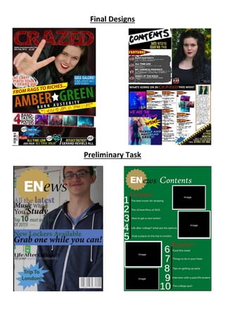
- 2. Over the course of this design process, I have learnt a lot about magazine conventions, and how to progressively improve my products. In the preliminary task, I didn’t use a selection of colours which would grab the attention of the target audience. I also believe that the space was not used as efficiently as it could have been. Therefore, in my final design, I used bold, bright colours, mostly consisting of the four most used colours for a magazine of my genre, Yellow, Black, Red and white. This created a house style that was bright, bold, and striking. I have learnt how to create a magazine that will attract the attention of a younger teenage audience through the use of typical conventions, and vibrant eye-catching colours of a magazine similar to the genre of mine. I also learnt how to use the space provided within my products in the best possible way. Doing this allowed me to include more information, and enabled the audience to see more of what was involved inside the magazine straight away, therefore drawing them in to pick my product up. One way I did this, was creating different sections for the cover lines on my front cover, allowing them to stand out and be easily read, and also providing space for things such as puffs, which add further information. On the front cover for my preliminary task, the cover lines aren’t very striking, and at some parts you can hardly read what they say as they blend in with the colours of the main cover photo in the background. There’s also a lot of unused space which means that I haven’t provided the information to the audience that I could have. In this project I also learnt how to create an image that would appeal to the target audience chosen. For the preliminary task, I didn’t think about lighting, or angles. And therefore the image that I produced for my product seems quite dark, and doesn’t have any aspects of originality. For my final designs I considered the type of audience that I was targeting my magazine for, and used a model that would attract them. I also considered angles, making the main front cover image shot from an above angle. I believe that this gave my front cover a more original approach to the images, and made it appear more striking and appealing to the target audience. During the designing of my final products, I learnt to use more striking fonts, for example; I used I font called ‘Hand Writing’ that I got off of a font website for the pull quote on my front cover, instead of using a standard sans serif font. Using the different fonts, I found, is something that I lot of magazines with the same genre of mine use. This is because it makes the magazine appear more original and eye-catching, as the magazines that use the normal given fonts. In my preliminary products, I only used the normal sans serif fonts and it creates a mature look, that would appeal more to an older audience and as my products where aimed at a young target audience the different fonts a used in my final designs make it stand out more. Another way in which I learned to improve on my designs, was by used the ‘Ruler’ tool that was given on the software ‘Adobe Photoshop’. This tool created lines on my work, where I could mark out the conventions that I wanted to create on my final products, and therefore it would make it so that by sticking to these lines I could ensure the text was always straight, and this made the magazine look neater. On my preliminary task designs, you can see that I have not used this method as the cover lines on my front cover are not straight, and the numbers, and page descriptions on my contents page are different lengths apart, creating an unprofessional look. When designing my final designs, I used many contentions taken from other music magazines. I made the style bold and bright, and added images and text to use up the space, and keep the target audience entertained, as many teenage audience orientated magazines do. I used striking fonts, making sure to not just stick to the normal sans serif font that magazines for a more mature audience would. In order to improve while compleating the design process for my final designs I asked for feedback from classmates, and the teacher, and I used the feedback in a productive way. I also speculated every detail of my three products so that it looked as proffessional as possible, as the aim was to make proffessional looking magazine pages.