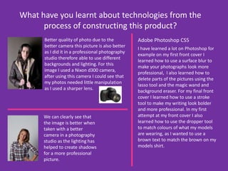
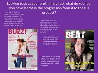
My Evaluation! By Hannah Dennis
In what ways does your media product use, develop or challenge forms and conventions of real media products? I have used the conventions of real media products by:I got the idea to use a yellow  and white colour scheme for my magazine from the NME magazine as it stands out from the Picture.I have used a large title to draw attention to my magazineI have used stories which are  appropriate for my target audience My initial idea and influence. I wanted to do a country issI have used many different fonts to move the audiences eyes around the page Making sure the readers can clearly see who the magazine is about by making the text bold and in capitals Using real bands and artists which match the genre of my magazineI have inserted a barcode to make it look like a real magazine.
In what ways does your media product use, develop or challenge forms and conventions of real media products? I have used the conventions of real media products by:I also liked the idea of having band names listed and it was one of my answers from my questionnaire so I decided to use it on my contents pageI have challenged the conventions of this media product by adding other pictures to my contents page unlike the real media product. When I typed in magazine contents  pages this was the one that caught my attention and would look good for my magazine so I used this for my inspiration and tried to make it different and more colourful.I have made up a website I chose to make the names of the people in my magazine larger than the rest of the text and also put them in capitals  and used a stroke tool so it draws the readers attention . I also liked the idea of using black and white like they did on the real contents page so I used this in my magazine.I also wrote and editors letter which I saw on other magazines that I did research on.  This was common in a lot of magazine so I thought this would be a good thing to put in my magazine.
In what ways does your media product use, develop or challenge forms and conventions of real media products? Again I have used a website. Which is displayed on every double page and my contents page.I have challenged forms of real media products by having large images where my model is not looking at the camera. The images used are also appropriate for my target audience. I have used forms of real media products by writing a short introduction telling the reader what is in the article and hopefully inspire them to read on. I have made the text bigger and in a different font to show that it is clearly not part of the interview.I have used forms of real media products as I have used the idea of making certain quotes  or answers bigger and in a different colour to attract the reader My media challenges real magazines by having a coloured background rather than white.
How does your media product represent particular social groups?My media product represents particular social  groups as you wouldn’t get a 7 year old child wanting to read my magazine as it not filled with colours and have a lot of freebies inside, the audience for my magazine is for a 16 – 21 year old audience as the bands listed are listened to by a teenage audience the clothes she is wearing also matches the 16 – 21 year old audience.My model isn't wearing a lot of make-up has no piercings and looks like a normal teenage girl and so could therefore be a role model for my audience.
What kind of media institution might distribute your media product and why?IPC Media may distribute my magazine as they publish magazines such as NME which do various  music genres. This magazine had the same genre as my music and from the picture is clearly aimed at the same target audience as I hoped my magazine would attract 16-21 year olds.  IPC / NME would publish my magazine because I have designed my magazine to give readers and consumers the most recent newsin the alternative indie industry and I have used this NME front cover as my inspiration.
Who would be the audience for your magazine product?I wanted to create a magazine that would mostly attract teenagers male and female. I did this by using an image that would appeal to my target audience for example I have used an older teenage girl for my model so that this could look like she is the same age and does the same things as regular teenage girls and boys.I took various different pictures when deciding on my magazine cover and for many different audiences.Other pictures I took.
How did you attract/address your audience? I attracted my audience by first using a large image on the front cover draws the attention to the magazine.I used many different fonts and made some in capitals so all the text didn’t look the sameBy having the model at eye level and looking straight into the camera also attracts the audience because the feel they are just as important as the model.I also attracted my audience by giving them a preview of other bands inside so I could attract many different audiences. The use of brightly coloured writing makes the magazine eye catching and appealing to young audiences
What have you learnt about technologies from the process of constructing this product?Better quality of photo due to the better camera this picture is also better as I did it in a professional photography studio therefore able to use different backgrounds and lighting. For this image I used a Nixon d300 camera, after using this camera I could see that my photos needed little manipulation as I used a sharper lens. Adobe Photoshop CS5I have learned a lot on Photoshop for example on my first front cover I learned how to use a surface blur to make your photographs look more professional,  I also learned how to delete parts of the pictures using the lasso tool and the magic wand and background eraser. For my final front cover I learned how to use a stroke tool to make my writing look bolder and more professional. In my first attempt at my front cover I also learned how to use the dropper tool to match colours of what my models are wearing, as I wanted to use a brown text to match the brown on my models shirt.We can clearly see that the image is better when taken with a better camera in a photography studio as the lighting has helped to create shadows for a more professional picture.
Looking back at your preliminary task what do you feel you have learnt in the progression from it to the full product?I have learnt that it is better not to put text over the image or a block of colour as my preliminary task would have looked better if we could see the models knees in the air. I have learnt that it is better to use an image where I am quite close to the model  and they are looking  straight at the camera I have also learned that the better the camera the better the picture quality.I have learnt to use more articles but display them smaller so you can have more in to attract more audiences

Evaluation

  • 1.
    My Evaluation! ByHannah Dennis
  • 2.
    In what waysdoes your media product use, develop or challenge forms and conventions of real media products? I have used the conventions of real media products by:I got the idea to use a yellow and white colour scheme for my magazine from the NME magazine as it stands out from the Picture.I have used a large title to draw attention to my magazineI have used stories which are appropriate for my target audience My initial idea and influence. I wanted to do a country issI have used many different fonts to move the audiences eyes around the page Making sure the readers can clearly see who the magazine is about by making the text bold and in capitals Using real bands and artists which match the genre of my magazineI have inserted a barcode to make it look like a real magazine.
  • 3.
    In what waysdoes your media product use, develop or challenge forms and conventions of real media products? I have used the conventions of real media products by:I also liked the idea of having band names listed and it was one of my answers from my questionnaire so I decided to use it on my contents pageI have challenged the conventions of this media product by adding other pictures to my contents page unlike the real media product. When I typed in magazine contents pages this was the one that caught my attention and would look good for my magazine so I used this for my inspiration and tried to make it different and more colourful.I have made up a website I chose to make the names of the people in my magazine larger than the rest of the text and also put them in capitals and used a stroke tool so it draws the readers attention . I also liked the idea of using black and white like they did on the real contents page so I used this in my magazine.I also wrote and editors letter which I saw on other magazines that I did research on. This was common in a lot of magazine so I thought this would be a good thing to put in my magazine.
  • 4.
    In what waysdoes your media product use, develop or challenge forms and conventions of real media products? Again I have used a website. Which is displayed on every double page and my contents page.I have challenged forms of real media products by having large images where my model is not looking at the camera. The images used are also appropriate for my target audience. I have used forms of real media products by writing a short introduction telling the reader what is in the article and hopefully inspire them to read on. I have made the text bigger and in a different font to show that it is clearly not part of the interview.I have used forms of real media products as I have used the idea of making certain quotes or answers bigger and in a different colour to attract the reader My media challenges real magazines by having a coloured background rather than white.
  • 5.
    How does yourmedia product represent particular social groups?My media product represents particular social groups as you wouldn’t get a 7 year old child wanting to read my magazine as it not filled with colours and have a lot of freebies inside, the audience for my magazine is for a 16 – 21 year old audience as the bands listed are listened to by a teenage audience the clothes she is wearing also matches the 16 – 21 year old audience.My model isn't wearing a lot of make-up has no piercings and looks like a normal teenage girl and so could therefore be a role model for my audience.
  • 6.
    What kind ofmedia institution might distribute your media product and why?IPC Media may distribute my magazine as they publish magazines such as NME which do various music genres. This magazine had the same genre as my music and from the picture is clearly aimed at the same target audience as I hoped my magazine would attract 16-21 year olds. IPC / NME would publish my magazine because I have designed my magazine to give readers and consumers the most recent newsin the alternative indie industry and I have used this NME front cover as my inspiration.
  • 7.
    Who would bethe audience for your magazine product?I wanted to create a magazine that would mostly attract teenagers male and female. I did this by using an image that would appeal to my target audience for example I have used an older teenage girl for my model so that this could look like she is the same age and does the same things as regular teenage girls and boys.I took various different pictures when deciding on my magazine cover and for many different audiences.Other pictures I took.
  • 8.
    How did youattract/address your audience? I attracted my audience by first using a large image on the front cover draws the attention to the magazine.I used many different fonts and made some in capitals so all the text didn’t look the sameBy having the model at eye level and looking straight into the camera also attracts the audience because the feel they are just as important as the model.I also attracted my audience by giving them a preview of other bands inside so I could attract many different audiences. The use of brightly coloured writing makes the magazine eye catching and appealing to young audiences
  • 9.
    What have youlearnt about technologies from the process of constructing this product?Better quality of photo due to the better camera this picture is also better as I did it in a professional photography studio therefore able to use different backgrounds and lighting. For this image I used a Nixon d300 camera, after using this camera I could see that my photos needed little manipulation as I used a sharper lens. Adobe Photoshop CS5I have learned a lot on Photoshop for example on my first front cover I learned how to use a surface blur to make your photographs look more professional, I also learned how to delete parts of the pictures using the lasso tool and the magic wand and background eraser. For my final front cover I learned how to use a stroke tool to make my writing look bolder and more professional. In my first attempt at my front cover I also learned how to use the dropper tool to match colours of what my models are wearing, as I wanted to use a brown text to match the brown on my models shirt.We can clearly see that the image is better when taken with a better camera in a photography studio as the lighting has helped to create shadows for a more professional picture.
  • 10.
    Looking back atyour preliminary task what do you feel you have learnt in the progression from it to the full product?I have learnt that it is better not to put text over the image or a block of colour as my preliminary task would have looked better if we could see the models knees in the air. I have learnt that it is better to use an image where I am quite close to the model and they are looking straight at the camera I have also learned that the better the camera the better the picture quality.I have learnt to use more articles but display them smaller so you can have more in to attract more audiences