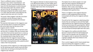
1. There is two dominant images on the front cover
the first one is a medium close up of Jurassic park
actor Chris Pratt and the second one is a close up
on he dinosaurs head. Both images cover part of
the masthead which shows they are more
important than the magazine name because
people already know the name of the magazine.
Chris Pratt is staring directly at the audience which
makes it feel more personal.
This magazine has a yellow and white theme
because it stand out from the dark background.
There is also fire speckles near the bottom of
the magazine cover to represent the island that
is going to explode which was hinted at in the
trailer for this film
There is no tagline on this magazine because
empire is a well established brand and they
know people will still buy the magazine without
a tagline.
The skyline tries to attract people in to read
about the latest superhero blockbusters if
they are not a fan of the Jurassic park
franchise. There is also a sub image of
deadpool to go with the skyline to attract fans
of deadpool and superhero fans.
The sell line for this magazine is advertising other
movies that are coming out soon and that might
make people buy the magazine because they want
to find out more about the upcoming films. Which
includes big Hollywood actors and franchises that
are continuing and being brought back after years
There is a different culture in Australia
because it says ‘winter movie blowout’ and
instead of summer movie blockbusters they
have all of the blockbusters in winter because
they have winter when the summer movies
are out in the UK. The writing is in a old
fashioned writing for the winter movies which
is in a 90’s style font which could reference the
original movie that came out in the 90’s.
This magazine attempts to attract people to buy
it by offering free posters so if the readers don’t
like what's on the cover the free posters that are
included might incise them into buying the
magazine
The essential information on this magazine cover
is the barcode which is located at the bottom
left corner which also has the price of the
magazine which is $10.95
The words ‘Fallen kingdom’ look like it has been
scratched on by the dinosaurs claws to
potentially show how powerful the dinosaur
could be
This is a print magazine which means people have
to go out and buy the magazine or order a
subscription online to be delivered to there houseThe purpose of this magazine is to make people excited
for the upcoming Jurassic world movie and other
movies that are coming out during the time this
magazine was released.
2. The left side of the double page
spread there is one dominant
image of henry cavil. And this is a
common trope for double page
magazine spreads
There is a splash advertising the
upcoming mission impossible film. To
make fans of the other films excited
about the upcoming film and he new
addition to the cast which is henry cavil
The writing is in a old fashioned
writing for the winter movies
which is in a 90’s style font which
could reference the original
mission impossible movie that
came out in the 90’s.
There is two sub images on the
right side of the double page
spread. They are both stills from
the film that show the main
characters including tom cruise
who has been with the franchise
since the 90’s
At the bottom of each page
there is the page number and
the publisher which is empire.
This is in a question and answer format we
can see this because the questing are in
bold and the answers are not. This is more
targeted at a younger demographic and
henry cavil already has a younger fan base
because of his work with DC where he plays
superman. The interview is very informal so
it appeals more to a younger audience.
There is a border around the double
page spreads which looks like a
celebration banner.
There is a light on henry cavil
face to show that he is the most
important person in this article
and it is just about him and his
career. He is not central and is
off to the side so we can only
see once side of his face. This
shot is a medium close up.
The images are overlapped and the image
of the two biggest stars is smaller than the
image of Simon Pegg but Simon top to show
they are more powerful and have a bigger
star power so they don’t need to be as big
because they already have a fan base.
The purpose of this double page spread is to inform
people about henry cavils experiences on set and
working with tom cruise and to make people excited for
the new mission impossible film
3. The tagline for this cover is ‘All killer! No
filler! Starring reborn horror’ which
represents Michael Myers who does not
care who he kills and he is cold hearted. And
reborn represents the franchise continuing
with the same leading lady Jamie lee Curtis
who played Laurie Strode is returning to the
franchise 40 years after the original which
came out 1978. this new sequel is ignoring
all of the other sequels and setting it 40
years after the original. Laurie has a light on
her face that makes her look angelic an
shows she is the savior of the franchise.
Proairetic code is used to create a tense
atmosphere because Michael is lurking in
the shadows. Laurie is staring at the
audience while Michael is staring at Laurie
The masthead is neon orange and represents the Halloween
seasons because it is linked with autumn and pumpkins
which are orange and related to the Halloween season and
was the original color of the Halloween logo in 1978
The dominant image is of Jamie lee Curtis who plays final girl
Laurie strode who is further forward than the shape because
she is out in the open and the shape is lurking in the
shadows behind her while she is ready to fight him and get
this nightmare over with.
The skyline is ‘Ultimate spring 2018 preview’ makes people
want to buy this too see what other films are coming out
soon and what movies are going to considered for an Oscar
with Oscar season approaching.
The color scheme is orange, green and
white which could refer to the 3
different masks in Halloween season of
the witch
The logo for Halloween looks like it has
been layered the new logo has been
placed over the original which has faded
away or decomposed just like Michael
Myers mask which looks worn out and
not in good condition because its been
40 years
The sub image is a picture of Bruce Willis from the movie
die hard which turns 30 this year ad this might incise
people to read this because they might like the original die
hard or the rest of the franchise. People may also want to
find out the real story of die hard like advertised
The sell line would be the list of movies that are coming out
soon to get them excited about the new blockbuster movies
an movies that could possibly be up for an Oscar
The use of Hermeneutic code with the exclamation
mark to create mystery about what is included in
‘many more!’
The target audience is fans of the Halloween franchise
and horror fans and is used to entertain the readers
This is a digital magazine which means people can buy
it online which can be more useful because people can
access it everywhere it can also be cheaper to read it
online.
The purpose of this magazine cover is to make
people excited to see a follow up sequel of
Halloween since it has been 40 years since the
original. Another purpose of this cover is to
show other upcoming films that come out in
October.
4. Michael face is blurred out to create
mystery and suspense the audience
does not know what is going to
happen next because Laurie is
behind him with a gun and the roles
are reversed now she is stalking him
but she still insignificant because
she is smaller than him so she is still
in danger. A Proairetic code is used
in this wide shot to create mystery
about Michael because his face is
blurred out and you are left
wondering what is going to happen
since the roles are reversed.
The title of the article is ‘Halloween’
which is the name of the film but it
is small so they are relaying on the
popularity of the franchise and the
fan base that they have gained over
the past 40 years. This is a wide shot
and we can see the house which
puts us back in a familiar place with
Michael stalking the small town of
Haddonfield.
Fans of the series and horror know
that Jamie Lee Curtis one of the
original scream queen and they will
want to know if Laurie can finally
defeat Michal once and for all in her
final appearance in the franchise.
The selective focus on Laurie while
Michael is not in focus
The picture of the ghost sitting in the
chair replicates the original movie where
Michael put a bed sheet over him after
he killed a teenager and his will impact
fans because they will recognize this
scene and John carpenter and Debra hill
are returning to help with this film so
fans will be happy to see references to
the original
The picture of Michael with his signature
weapon a butcher knife will make fans of
the series happy to see him back to his
roots and killing people with the same
weapon as he did in the original 1978
movie will make fans nostalgic to see one
of there favorite killers going back to his
roots. There is a backlight on Michael
showing his mask in the light to show
how much it has faded and shows the
importance of the mystery of the killer
and you never see him without a mask
The classic orange color is used on this double page spread which links with
the Halloween season and is the color of leaves in the fall. Orange is used
through Halloween one main example would be the colour of pumpkins. The
neon colour is used again on the double page spread again around the edge
of the page. It was used for the empire logo on the front cover
A drop cap is used which is a normal code and convention for a
double page spread. The format is a question and answer interview
with Jamie Lee Curtis who fans will be happy to see return to the
Halloween franchise after her last movie Halloween: resurrection
which was released in 2002 where she was killed off. The interview is
very relaxed throughout when Jamie Lee Curtis says thins like ”fuck
rock and roll”
The publisher of this magazine is
Empire this is essential information so
people know where it comes from.
The purpose of this double page spread is to inform people
about actresses Jamie lee Curtis experiences on set and to
tell fans about the movie and what it is like being back 40
years after being on set for the original. Another purpose is
to make fans excited because the original actress is
returning
5. Pros and cons of print and digital
Pros of print
One pro of print is the fact you re more likely to read the magazine because you have paid actual money for the product and you have
had to go out and get it yourself o you are more likely to read it. The film magazines I analyzed are used for diversion it entertains the
audience by telling them information about the topic they are interested in. if they own the magazine and physically bought it they are
more likely to read it because they can take it anywhere they want without using Wi-Fi which would be needed if it was digital. Another
pro of print is you can collect them if it is a certain magazine that has special issues you can buy them, display them and keep them
forever. You don’t need to wait for anything to download and you can read it right away. Print publications don’t have software that
crashes.
Con’s of print
One con of print is that there will be wear and tare after a while and after it has been used a lot. Over the years there has been a
readership decline, less people are going out to buy magazines most people would prefer to stay home. Printing magazines is more
expensive than putting them online for people to access. Print is not as accessible because you have to go out and buy the magazine and
spend more money on it. They aim for a particular target while online is able to reach all.
Pros of digital magazines
One positive thing about digital magazines is that they are easily accessible and you can get it anywhere from a touch of a button. They
are much cheaper than printing because they go onto a website so no physical copies need to be made. Digital magazines also have a
higher global potential so people can find the magazine worldwide. The digital magazines are more eco friendly because you don’t have
to dispose of them one you are done reading them. With digital magazines you can get all previous issues with a click of a button.
Con’s of digital magazines
Digital magazines can be hard to read because it requires zooming in and out. Another con of digital magazines is that it requires Wi-Fi to
access and not everyone has Wi-Fi to access so digital magazines may not be accessible to everyone. Digital magazines may add layers to
confuse the readers. Whatever you are reader the magazine on may run out of power or crash so you could have to stop reading.