
Recommended
More Related Content
What's hot
What's hot (20)
Similar to magazine analysis
Similar to magazine analysis (20)
More from 18001927
More from 18001927 (20)
Recently uploaded
Recently uploaded (20)
magazine analysis
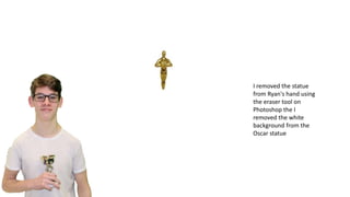
- 1. I removed the statue from Ryan's hand using the eraser tool on Photoshop the I removed the white background from the Oscar statue
- 2. This is my first draft at a front cover I will be changing some of the writing and the placement of it. The model in the picture has a photoshopped statue in his hands because the Oscar statue was not available on the day of shooting. There was a replacement statue that was in his hands but I removed it and added the statue of the Oscar. Colour scheme red because it stands out from the dark background and yellow/gold because it is the colour of the Oscar statue
- 3. I have moved the movie names over the the left because there was more space and moved the splash to the other side because there is less room on the right and it does not take up as much room. This lesson I want to edit the cover a bit more so it looks right.
- 4. I have added all of the text and started o the first side of the double page spread
- 5. Final version of my magazines double page spread
- 6. I added a gray background because of the original invisible man to pay homage to the original movie I used the gradient tool so I could have the page go from a light grey to dark Next I added the 5 secondary images which have been unedited because they are the posters for the movies and then added the reviews for the movies to give readers a little information on what the movie is like. After that I had the title which was this month movie reviews which shows my magazine will be published monthly. I choose the yellow writing because it’s the writing on the front cover. I also resized the images to make sure they would all fit on one side I added the title for the main article and added a sub section for exclusive behind the scenes images for the day of the photoshoot. I chose to put the invisible man in a different colour so it would standout as it is the name of the movie.
- 7. I added the primary photos which I took myself for the magazine these are behind the scene photos from the interview I put these to one side so I could put the actual interview down the other side in columns. I resized the images so they were all the same size and that they would all go down in a column. This is my final product of my doubled page spread it contains the article which is in the form of an interview, behind the scenes primary photos and secondary photos from google which are the posters of the movies that I have chose to review I think this is effective because there are a mixture of photos and text. Also the interview is in a very conversational tone which may attract younger audiences because there is no complicated words and is easy to read
- 8. First of all for my front cover I used a secondary image of a brick wall because it was dark and since the mode was wearing white they would stand out against the dark brick wall Secondly I added the main photo which is Ryan with the trophy which I had to edit I removed the trophy he had in his hand originally and added in the Oscar statue then I made the entire front cover darker so the wall was not as light and Ryan not as pale
- 9. Next I added the Magazine name which is Film reel I got the font from ‘dafont’ and I decided to go with red because it stands out on dark backgrounds. I then added the barcode and resized it and placed it in the bottom left corner. The next thing I did was add text about the interview exclusive is in bold and bigger than the rest so it stands out it is also the only word to be in a different colour the rest of the sentence is is a gold/yellow colour Next I added a splash which is a red circle to stick to the colour scheme I added black text so you could see it and since the text was about the Oscars I added the same Oscar trophy that was in Ryan's hand into the splash. I then removed the part of the trophy that you could see the words I used the eraser tool to do this.
- 10. This is the final version of my front cover I think the colour scheme goes well together the red stands out against the dark background and the gold is the same colour that is on the Oscar statue. The central image of Ryan grabs your attention because he is wearing white while the rest of the magazine cover is a darker colour. My magazine will probably appeal to movie fans that care about movie reviews and interviews with directors. The bold words such as exclusive stand out because they are in a different colour to the other text so they would stand out more. The purpose of this magazine is to entertain the reader. It will entertain them if they like reading interviews about exclusive interviews and seeing behind the scenes photos.