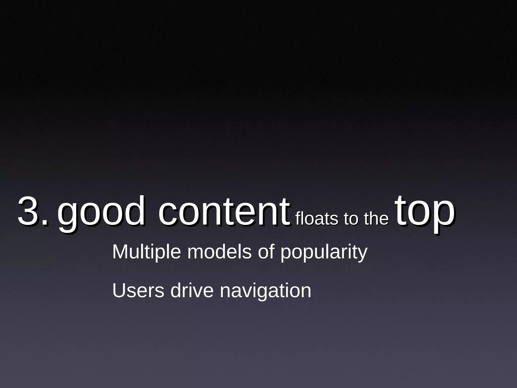
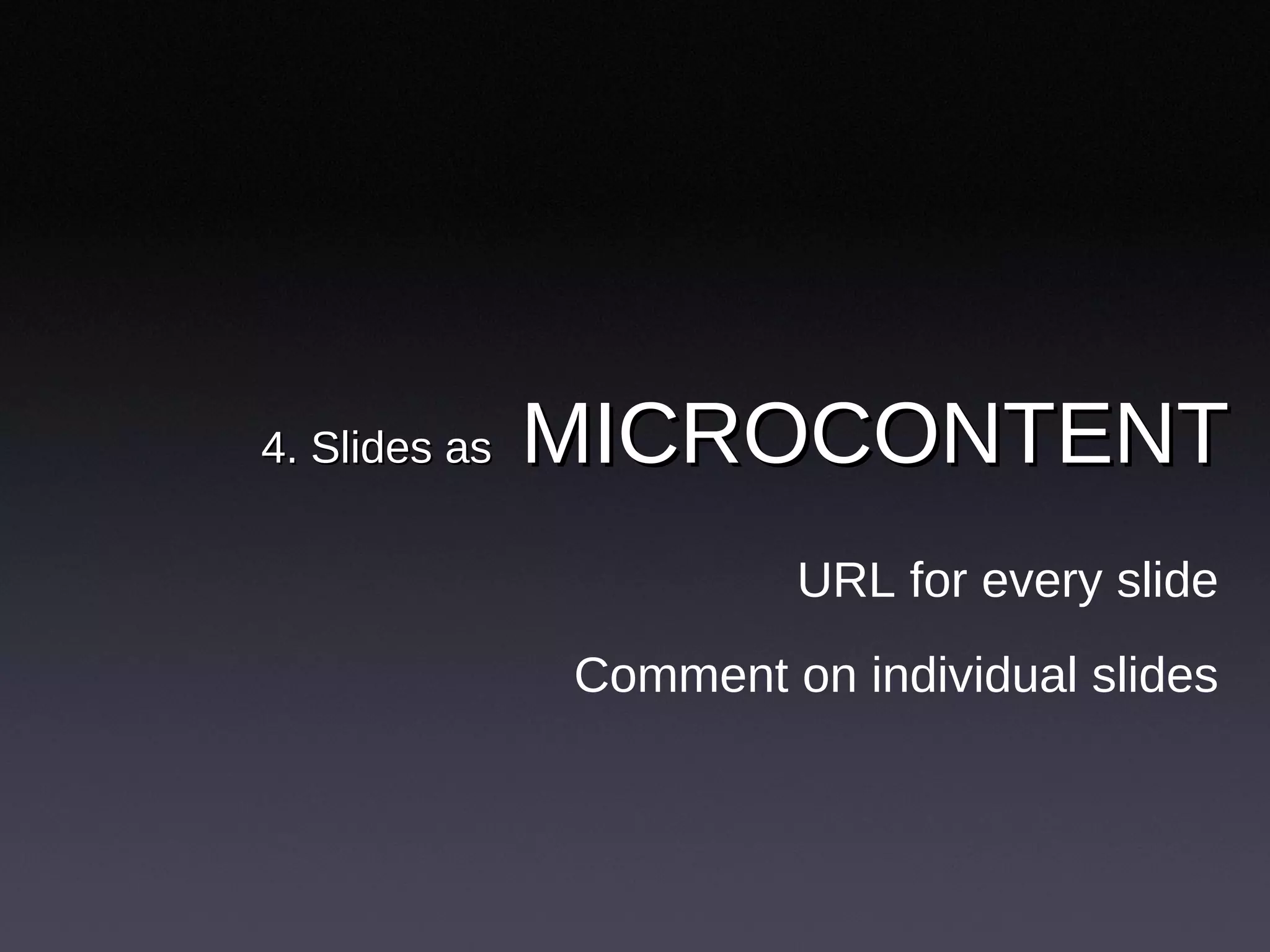
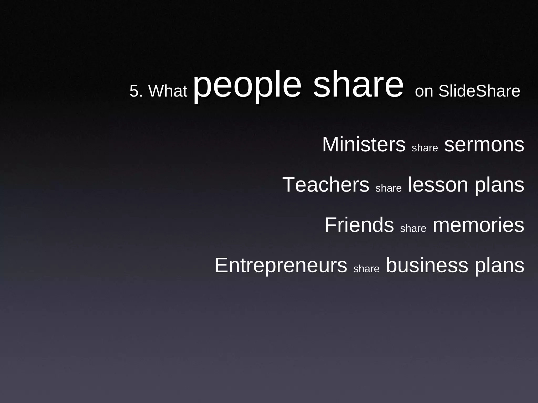
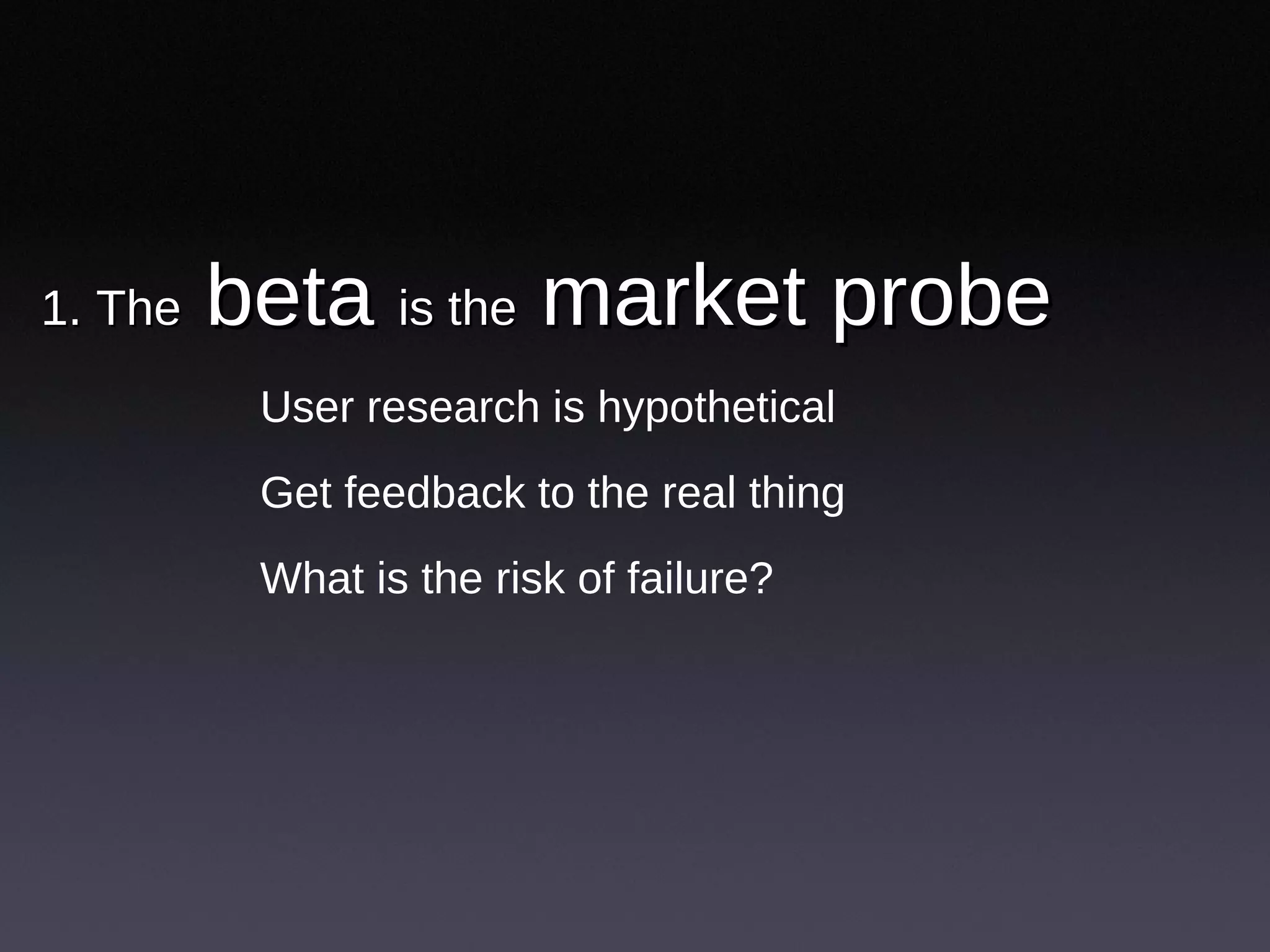
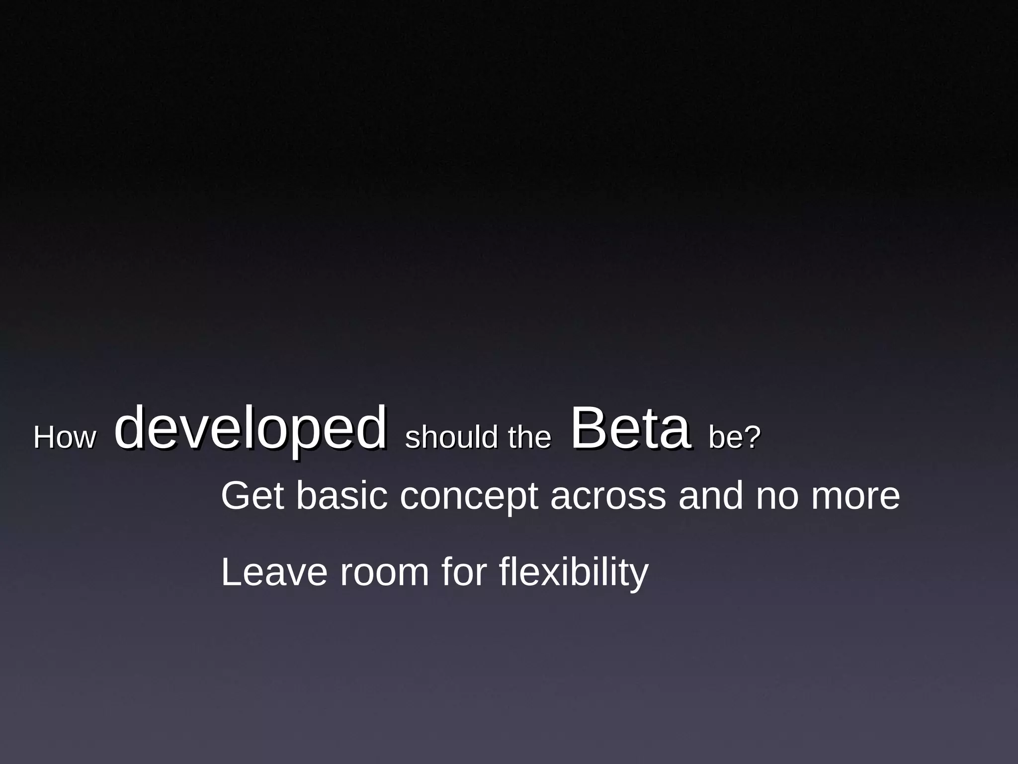
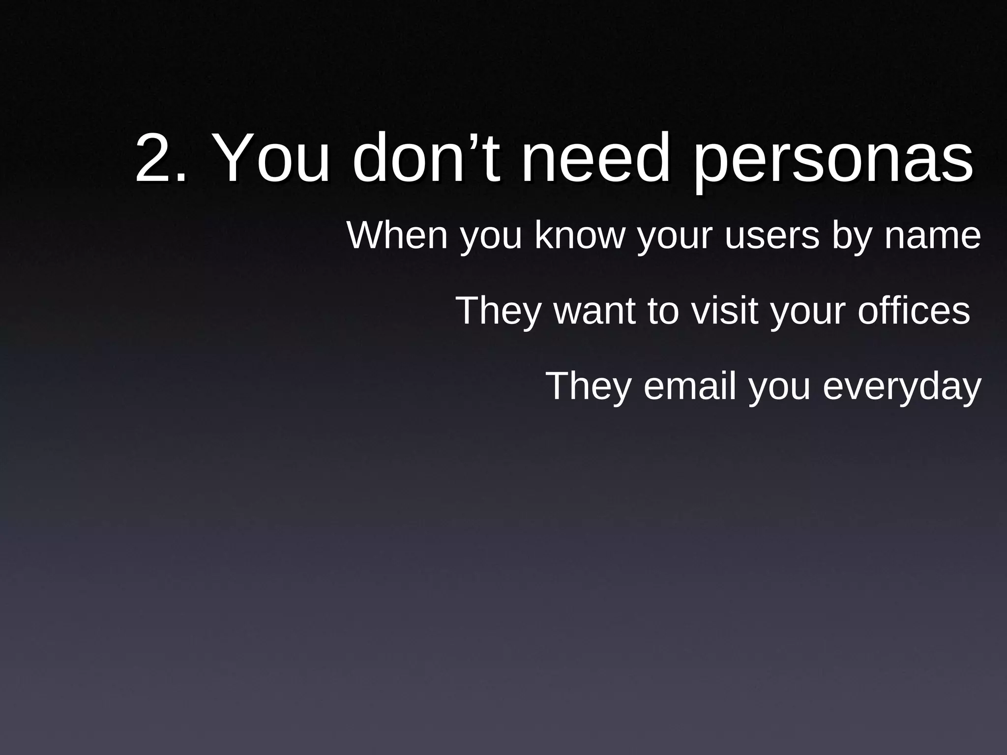
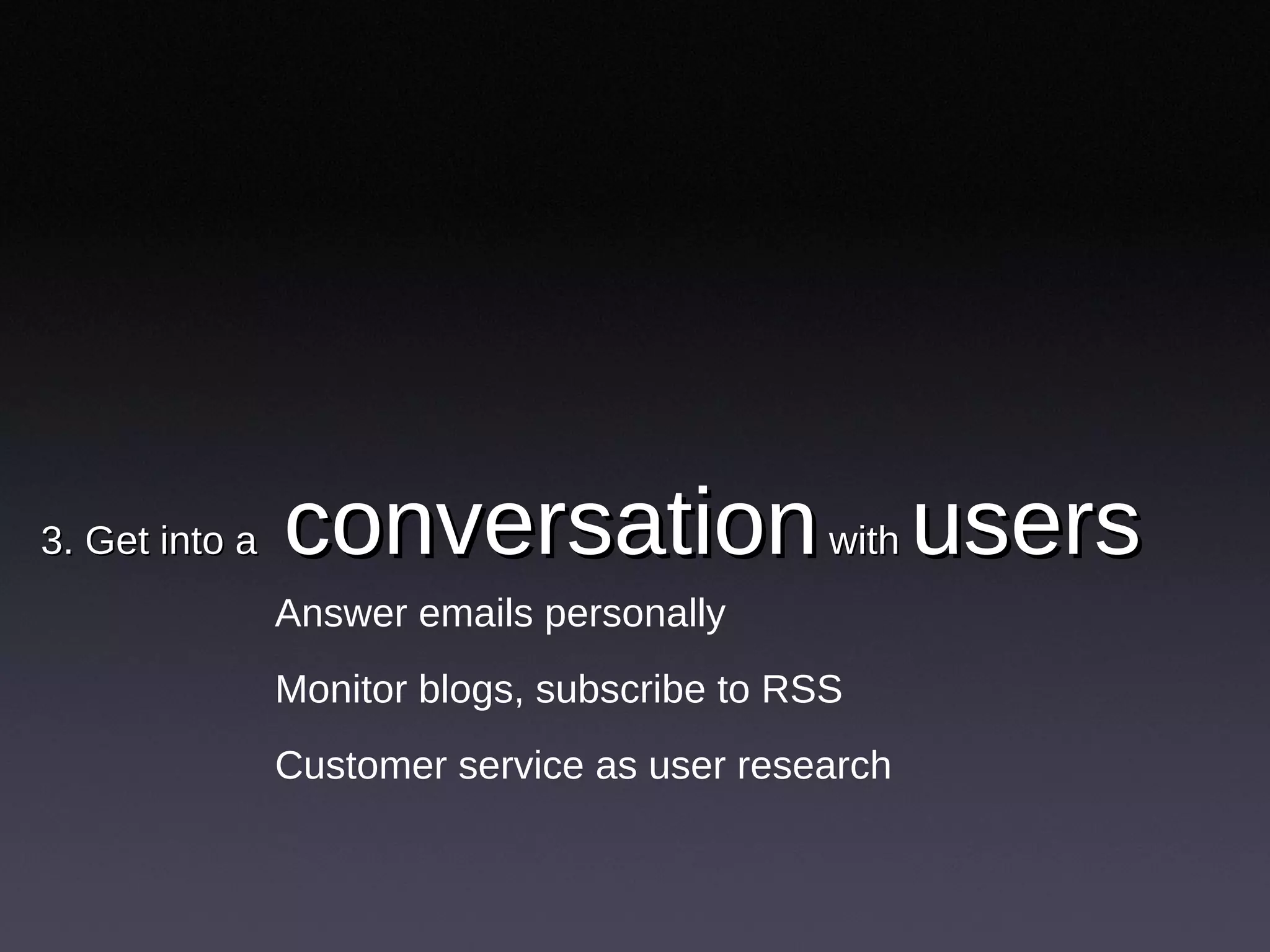
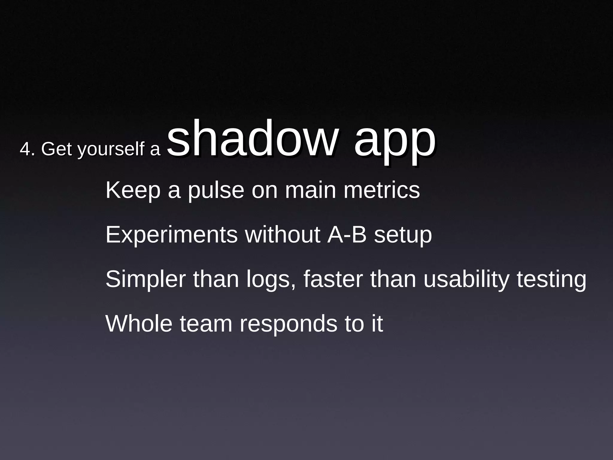
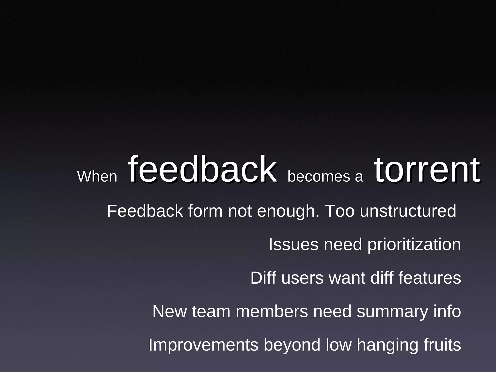
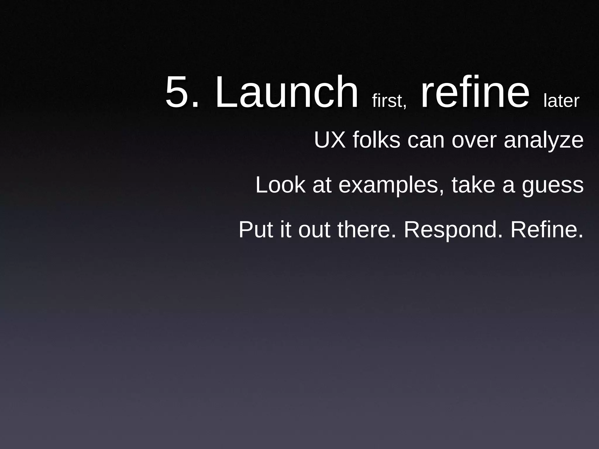
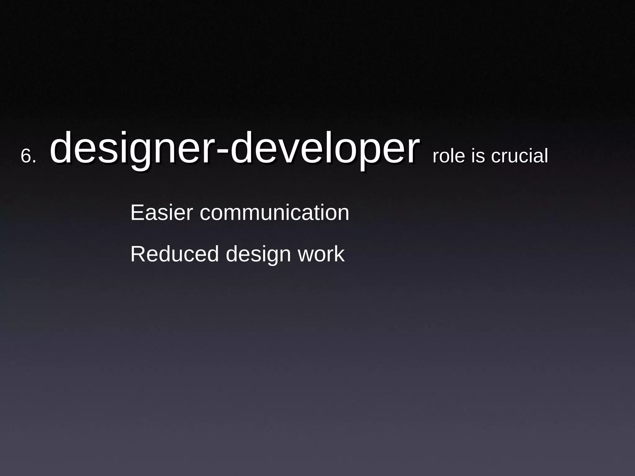
Fast cheap and somewhat in control: 10 lessons from the design of SlideShare - Presentation Transcript
Fast, cheap and somewhat in control 10 Lessons from the design of SlideShare
Rashmi Sinha
First
www.slideshare.net
www.themindcanvas.com
Designing SlideShare
1. Documents are hard to share
What would large-scaling sharing look like?
Is office 2.0 just editing & collaboration?
A social critique of PowerPoint
2. A simple sharing website
A space, not a utility
For sharing and connecting
Sharing and finding both user driven
First generation Social Networks (Friendster, LinkedIn…) 1) I am linked to -> -> to you --->You are linked to her -> ---> on…
How it works
People connect to each other
Six degrees of separation
“ Are you my friend” type of awkwardness
Second generation social network (networks with objects in between, e.g., Flickr, Yahoo answers) 1) I share my pics -> -> with you ---> -->You share your pics -> ---> with him
How it works
People share objects | watch others
Connections through objects
Social info streams: emergence of popular, interesting items
Viral sharing (passing on interesting stuff, e.g., YouTube videos)
How it works
Individual to individual to individual
Popularity based navigation track “viral” items
1) I send video I like -> -> to you. You pass on --> --> to her, who sends on to her, who passes on…
3. good content floats to the top
Multiple models of popularity
Users drive navigation
4. Slides as MICROCONTENT
URL for every slide
Comment on individual slides
5. What people share on SlideShare
Ministers share sermons
Teachers share lesson plans
Friends share memories
Entrepreneurs share business plans
10 Lessons
1. The beta is the market probe
User research is hypothetical
Get feedback to the real thing
What is the risk of failure?
How developed should the Beta be?
Get basic concept across and no more
Leave room for flexibility
2. You don’t need personas
When you know your users by name
They want to visit your offices
They email you everyday
3. Get into a conversation with users
Answer emails personally
Monitor blogs, subscribe to RSS
Customer service as user research
4. Get yourself a shadow app
Keep a pulse on main metrics
Experiments without A-B setup
Simpler than logs, faster than usability testing
Whole team responds to it
When feedback becomes a torrent
Feedback form not enough. Too unstructured
Issues need prioritization
Diff users want diff features
New team members need summary info
Improvements beyond low hanging fruits
5. Launch first, refine later
UX folks can over analyze
Look at examples, take a guess
Put it out there. Respond. Refine.
6. designer-developer role is crucial
Easier communication
Reduced design work
7. Under invest in visual design
Let users feel ownership of space
Unpolished look is fine
8. Pay attention to technical simplicity Balance user needs & technical simplicity Complexity > slower, riskier, harder to maintain
9. Help users kick ass Everything else is secondary No step by step ROI calculations Have sound business model, but don’t sacrifice user good
0 comments
Post a comment