
Recommended
More Related Content
What's hot
What's hot (20)
Similar to Front cover analysis kerrang!
Similar to Front cover analysis kerrang! (20)
More from owenhaynes30
Recently uploaded
Recently uploaded (20)
Front cover analysis kerrang!
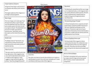
- 1. Owen Haynes Target Audience and genre The genre of Kerrang! Is rock and all of its variations like metal, punk-rock and so on. The target audience of this magazine is teenagers and young adults. Main Image The main image is of a lead singer from the band name that is superimposed over the basketball. She has a nose ring and a leather jacket, this links in to the music genre of punk. The basketball is on fire so as to create a pun with the festival name: ‘Slam Dunk’ and its description as the hottest festival of the year. Model credit The Model Credit of ‘Slam Dunk’ uses stylised font to reflect the American sport connection and create a sense of national identity. Main Cover Line The main cover line can be found in the top right corner of the magazine, and uses a well-known band name to draw in readers to the magazine. It also suggests a major article through the phrase: ‘How they changed the world’. Masthead The Masthead is placed behind the main image as it is a big brand name, so the magazine does not need to advertise itself so openly. The font itself is shattered and in capital letters to establish the genre of tough and violent sounding music. The Gutenberg Design Principle In the primary optical area, a popular and well-known band is placed to establish the tone of the cover (Slipknot) and the genre of the magazine. The bottom right corner has an article about Glastonbury festival referenced so as to draw in readers who are familiar with this highly popular music festival. Colours/Typefaces/House style The house style of the magazine is block capital letters for titles. This reflects the loud and tough nature of the music the magazine discusses. The colours are also very bright, again linking into the vibrant and loud genre of rock. Cover lines The cover lines share an overall style and font so it is easier to identify what is a cover line on the cover and what isn’t. It also contributes to the house style of the magazine. Banners/Flashes/badges The flash in the bottom left corner stands out by using a colourful logo and the buzz word: Win! To draw a viewer’s attention to the competition.