
Recommended
More Related Content
Similar to Q and mixmag contents page analysis
Similar to Q and mixmag contents page analysis (20)
More from owenhaynes30
Recently uploaded
Recently uploaded (20)
Q and mixmag contents page analysis
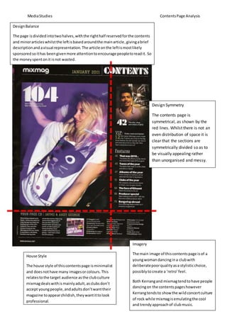
- 1. MediaStudies ContentsPage Analysis House Style The house style of thiscontentspage isminimalist and doesnothave many imagesor colours. This relatestothe target audience asthe clubculture mixmagdealswithismainlyadult,asclubsdon’t accept youngpeople,andadultsdon’twanttheir magazine toappearchildish,theywantittolook professional. Imagery The main image of thiscontentspage isof a youngwomandancingina clubwith deliberatepoorqualityasa stylisticchoice, possiblytocreate a ‘retro’feel. Both Kerrangand mixmagtendtohave people dancingon the contentspageshowever Kerrangtendsto show the wildconcertculture of rock while mixmagisemulatingthe cool and trendyapproachof clubmusic. DesignBalance The page isdividedintotwohalves,withthe righthalf reservedforthe contents and minorarticleswhilstthe leftisbasedaroundthe mainarticle,givingabrief descriptionandavisual representation. The article onthe leftismostlikely sponsoredsoithas beengivenmore attentiontoencourage peopletoreadit. So the moneyspentonit isnot wasted. Design Symmetry The contents page is symmetrical, as shown by the red lines. Whilst there is not an even distribution of space it is clear that the sections are symmetrically divided so as to be visually appealing rather than unorganised and messy.
- 2. MediaStudies ContentsPage Analysis DesignBalance The designbalance forQappearsto be more eventhanmixmag,asthere isnot a large central image withthe contentssurroundingit like inmixmagbutthere isa clearand fairlyevendivide betweenthe imagesontopandthe contentsonthe bottom. Thisshowsusthat unlike mixmag, Q has equal investmentinthe qualityof all theirarticlesandsowantsa potential buyertoread all the articlessothe moneyinvestedisnotwasted. Imagery There are more imagesinQ than there are inmixmag,andalmostall of the imagesin Q are of famousmusicartistslike Florence Welchand Alice Cooper.Thiscontrasts mixmag’scoverwhichhasjusttwo(clearly visible) people. Thissuggeststhatmixmag isa lesserknownmagazineandassuch it strugglestogetbig name artiststo feature init. Alsothe dance musicgenre focuses more heavilyonthe musicandlessabout the DJs and artiststhat make music.Q takesthe opposite approachasit is alreadya well-establishedmagazineso artistsare more willingtobe interviewed. The music genre Qfocusesonis notset in stone so ittendsto be the latestand most successful artistsintheirgenresrecently. DesignSymmetry There is design symmetrywiththe contentspage of Q,as seenby the green dottedline dividingthe tophalf of the page withthe bottomhalf. The top half isdominatedby imagesandtheirassociatedarticles inthe while the bottomhalf has articlesthatwere notsignificantenough to have images.Thishelpspeople whowanttoknow at a glance whetherthe magazine isforthembyseeingwhat artistsare beingdiscussedstraightawaywithoutsifting throughthe entire magazine. House Style Q magazinescontentsare splitupovertwopages, contrastingmixmag’sdesign.Thishasbeendone toshow more summariesof the articles,suggestingthatQ magazine hasmore contentthan mixmag. Thisrelatesto the nature of mixmag’sreaders,wantingshortsummaries of the latesttrendswhereasreadersof Qwantmore in depthbutlessfrequentcontentaboutmusic.