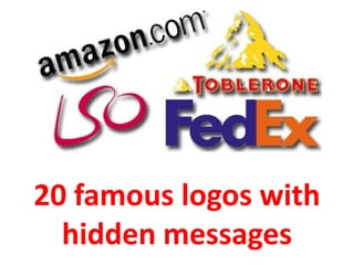
20 Famous Logos with Hidden Messages
•
28 likes•50,213 views

www.andrewchow.sg Logos are undoubtedly an important part of branding a business. Today, anyone who sees the golden arches would think of McDonald's, a bitten-into apple of the tech behemoth Apple, and a fairy tale castle of Walt Disney. Logos do not have to be complicated to be good, but they do have to symbolise the company and give it an image that nothing else can provide. And just like anything else, some logos are better than others in terms of design and its ability to give brand recall. We found some logos that actually have meanings cleverly hidden in the design. Take a look at them, and you will most not likely see them the same way again.

Recommended
More Related Content
What's hot
What's hot (20)
Viewers also liked
Viewers also liked (20)
Similar to 20 Famous Logos with Hidden Messages
Similar to 20 Famous Logos with Hidden Messages (17)
More from Andrew Chow ✯ Keynote Speaker ✯
More from Andrew Chow ✯ Keynote Speaker ✯ (20)
Recently uploaded
Recently uploaded (20)
20 Famous Logos with Hidden Messages
- 1. 20 famous logos with hidden messages
- 2. Logos are undoubtedly an important part of branding a business. Today, anyone who sees the golden arches would think of McDonald's, a bitten-into apple of the tech behemoth Apple, and a fairy tale castle of Walt Disney. Logos do not have to be complicated to be good, but they do have to symbolise the company and give it an image that nothing else can provide. And just like anything else, some logos are better than others in terms of design and its ability to give brand recall. We found some logos that actually have meanings cleverly hidden in the design. Take a look at them, and you will most not likely see them the same way again. Source : http://business.asiaone.com/Business/SME%2BCentral/Brand%2BMe%2521/Story/A1Story20111220-317293.html
- 3. Not only does the arrow form a smile, it also cleverly shows that Amazon sells everything from A to Z. Source : http://business.asiaone.com/Business/SME%2BCentral/Brand%2BMe%2521/Story/A1Story20111220-317293.html
- 4. Guess where they inserted their 31 original flavours? Can't see it? Check out the pink parts of the letters B and R. Source : http://business.asiaone.com/Business/SME%2BCentral/Brand%2BMe%2521/Story/A1Story20111220-317293.html
- 5. Carrefour means "crossroad" in French, which could explain the two arrows on each side of the arrow. The negative white space, meanwhile, actually forms a letter C. Source : http://business.asiaone.com/Business/SME%2BCentral/Brand%2BMe%2521/Story/A1Story20111220-317293.html
- 6. Egg 'n' Spoon is a national courier service for the UK whose slogan is "Speed with care". Their logo, which looks like a simple letter "e" at first glance, actually has an egg and spoon. See it? Check out the white space. Source : http://business.asiaone.com/Business/SME%2BCentral/Brand%2BMe%2521/Story/A1Story20111220-317293.html
- 7. You can plainly see that the Fedex logo spells out the company's name, but if you look between the letters E and x, you will see an arrow which represents the speed and accuracy of their deliveries. Source : http://business.asiaone.com/Business/SME%2BCentral/Brand%2BMe%2521/Story/A1Story20111220-317293.html
- 8. If you look closely at the logo of Galeries Lafayette, a lifestyle store in France, you will see that the logo represents Paris with its joined letters "t" to form France's most famous icon, the Eiffel Tower. Source : http://business.asiaone.com/Business/SME%2BCentral/Brand%2BMe%2521/Story/A1Story20111220-317293.html
- 9. Goodwill, a global social services enterprise, has a logo befitting what it does. If you take a look at the figure inside the blue box, you will either see a small letter "g" - or half of a happy face. Source : http://business.asiaone.com/Business/SME%2BCentral/Brand%2BMe%2521/Story/A1Story20111220-317293.html
- 10. Do you see the knight in armour with a spear in the middle of the K? You might also see the head of a horse in the same letter. Source : http://business.asiaone.com/Business/SME%2BCentral/Brand%2BMe%2521/Story/A1Story20111220-317293.html
- 11. Le Tour de France, is of course the globally famous cycling race. Can you see the cycling man in their logo? Hint: The yellow circle is the wheel! Source : http://business.asiaone.com/Business/SME%2BCentral/Brand%2BMe%2521/Story/A1Story20111220-317293.html
- 12. Some say the LG logo is actually Pacman in disguise. Source : http://business.asiaone.com/Business/SME%2BCentral/Brand%2BMe%2521/Story/A1Story20111220-317293.html
- 13. The London Symphony Orchestra's logo looks like a flowy interpretation of its acronym, LSO. But if you take another look, you might also see that it's a conductor waving his baton. Source : http://business.asiaone.com/Business/SME%2BCentral/Brand%2BMe%2521/Story/A1Story20111220-317293.html
- 14. NBC is also known as the "Peacock network" because of its stylised logo. It consists of the 3 primary and 3 secondary colours, which correspond to the network's six divisions when they redesigned the logo: News, Sports, Entertainment, Stations, Network and Productions. Source : http://business.asiaone.com/Business/SME%2BCentral/Brand%2BMe%2521/Story/A1Story20111220-317293.html
- 15. The N inside the circle of the Northwest logo can be plainly seen. But with the triangle, you can see the letter W too. Coincidentally, the W is pointing - where else? - northwest. Source : http://business.asiaone.com/Business/SME%2BCentral/Brand%2BMe%2521/Story/A1Story20111220-317293.html
- 16. Roxy is a female clothing brand owned by Quiksilver. Its logo is made up of two Quiksilver logos that form the shape of a heart. Source : http://business.asiaone.com/Business/SME%2BCentral/Brand%2BMe%2521/Story/A1Story20111220-317293.html
- 17. You might wonder why the logo for Sony's laptop line is stylised like that. It is actually a marriage of digital and analog. The VA actually forms an analog wave while the I0 represents the binary digits 1 and 0. Source : http://business.asiaone.com/Business/SME%2BCentral/Brand%2BMe%2521/Story/A1Story20111220-317293.html
- 18. Staples is an office supplies store, among other things, in the US. Notice the L? It's actually a stylised stapler. Source : http://business.asiaone.com/Business/SME%2BCentral/Brand%2BMe%2521/Story/A1Story20111220-317293.html
- 19. The Sun logo, designed by Professor Vaughan Pratt of the Stanford University, is one of the most famous ambigrams in the world - you can read the brand name in every direction; both horizontally and vertically. Source : http://business.asiaone.com/Business/SME%2BCentral/Brand%2BMe%2521/Story/A1Story20111220-317293.html
- 20. The T in the logo of TaylorMade, a golf equipment company, is the bottomside of a driver. Source : http://business.asiaone.com/Business/SME%2BCentral/Brand%2BMe%2521/Story/A1Story20111220-317293.html
- 21. Toblerone is originally from the town of Bern in Switzerland. The town Bern is also known as the "City of Bears". Can you see how the chocolate bar's logo paid tribute to this? Source : http://business.asiaone.com/Business/SME%2BCentral/Brand%2BMe%2521/Story/A1Story20111220-317293.html
- 22. Tostitos, a brand of tortilla chips, has two people enjoying the chips and dip in their logo. Clever, eh? Source : http://business.asiaone.com/Business/SME%2BCentral/Brand%2BMe%2521/Story/A1Story20111220-317293.html
- 23. Andrew Chow a.k.a Ideasandrew Social Networking Facebook - http://www.facebook.com/ideasandrew Plaxo http://ideasandrew.myplaxo.com/ Linkedin - http://sg.linkedin.com/in/ideasandrew Social Media Sharing Flickr Collection - http://www.flickr.com/photos/ideasandrew/ Youtube Channel - http://www.youtube.com/user/ideasandrew Slideshare - http://www.slideshare.net/ideasandrew Podomatic - http://ideasandrew.podomatic.com Social Blogging / Micro-blogging Twitter - http://twitter.com/Ideasandrew Blog – www.andrewchow.sg More than 200 interviews/features in 5 years from local and international media