Downloaded 13 times
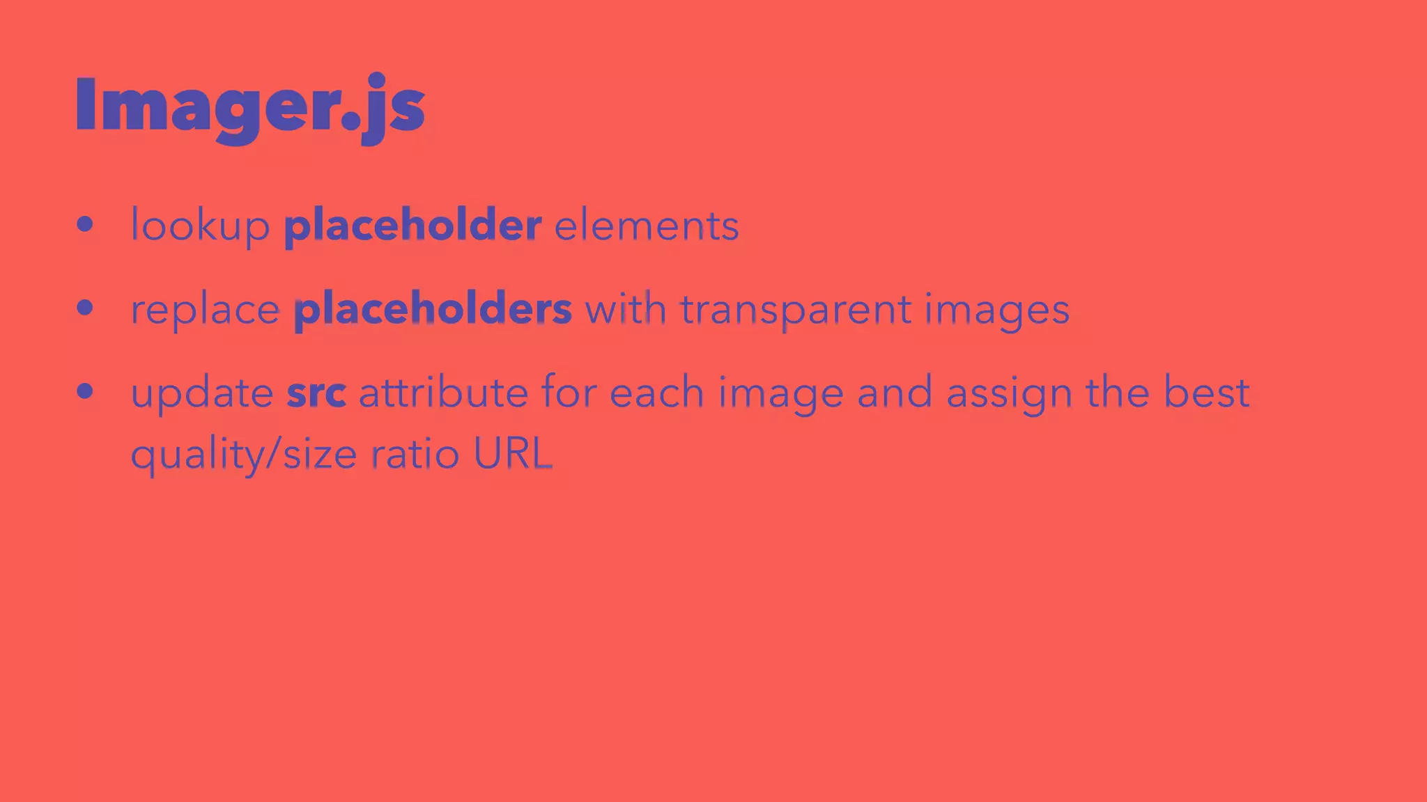
![Imager.js
<div style="width: 240px">
<div class="delayed-image-load"
data-src="/img/image.png"
data-alt="alternative text">
</div>
</div>
new Imager({ availableWidths: [200, 260, 320, 600] });](https://image.slidesharecdn.com/squishypixels-140919152235-phpapp01/75/Squishy-pixels-34-2048.jpg)

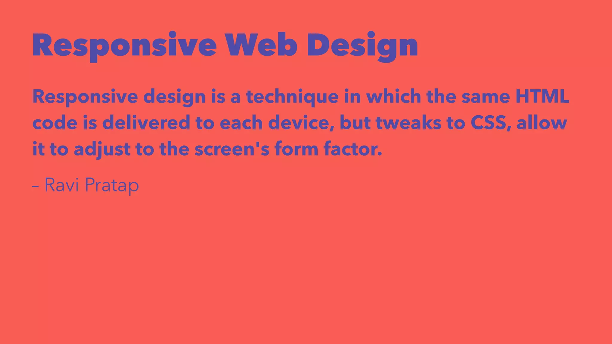
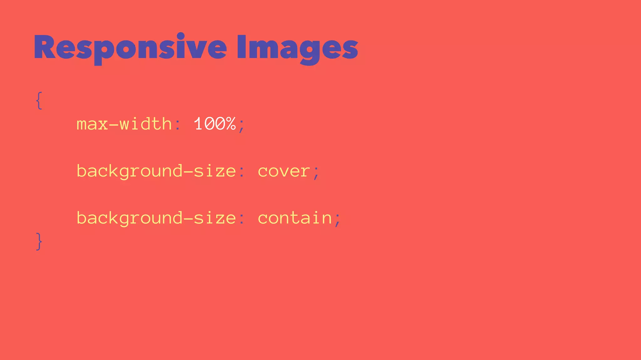
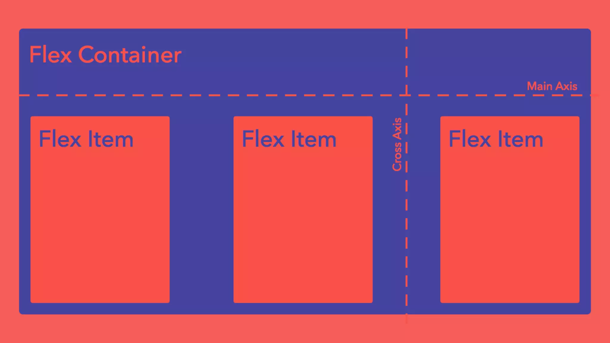
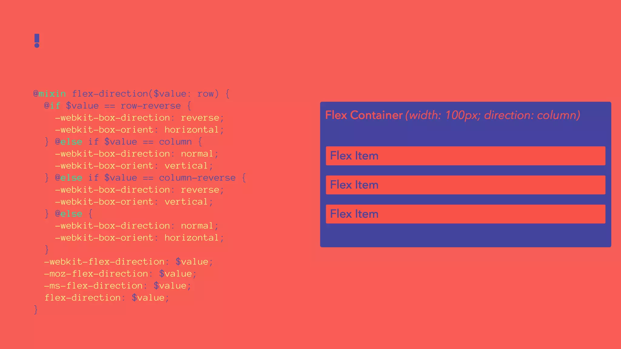
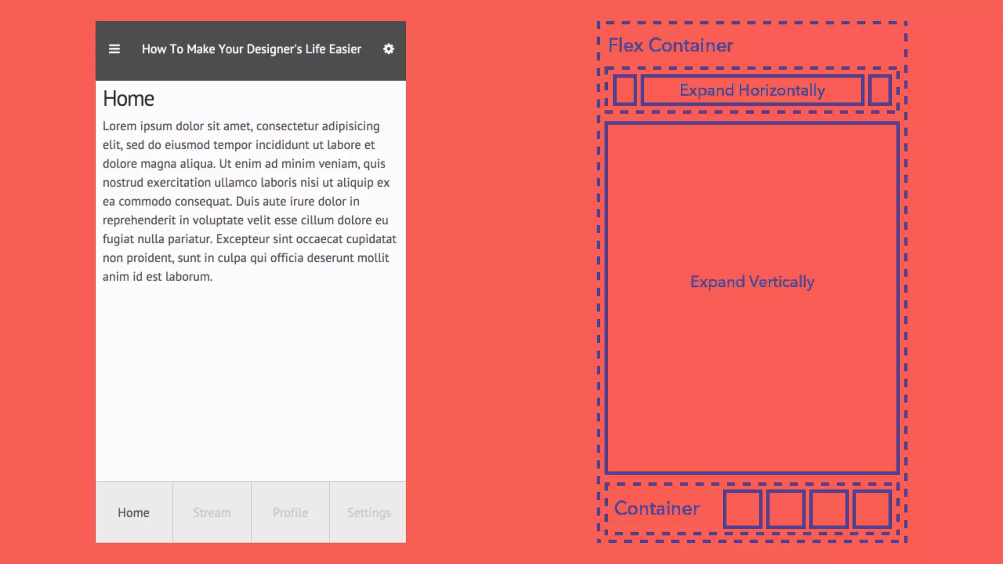
The document discusses various techniques for responsive and adaptive web design, emphasizing the delivery of a single web experience that adjusts to different devices and browsers. It highlights methods like fluid grids, flexible images, and responsive typography, as well as tools such as media queries and CSS frameworks. Additionally, it covers best practices for coding, including the use of SASS mixins for flexbox layouts and the importance of optimizing for performance.


![Number_Guessing_Game_Dsbsbssbzboc[1].pptx](https://cdn.slidesharecdn.com/ss_thumbnails/numberguessinggamedoc1-251206215042-a076fc05-thumbnail.jpg?width=640&height=640&fit=bounds)


