Download as PDF, PPTX

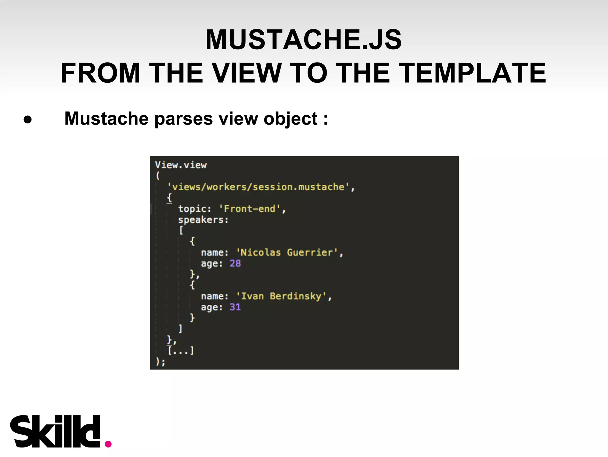
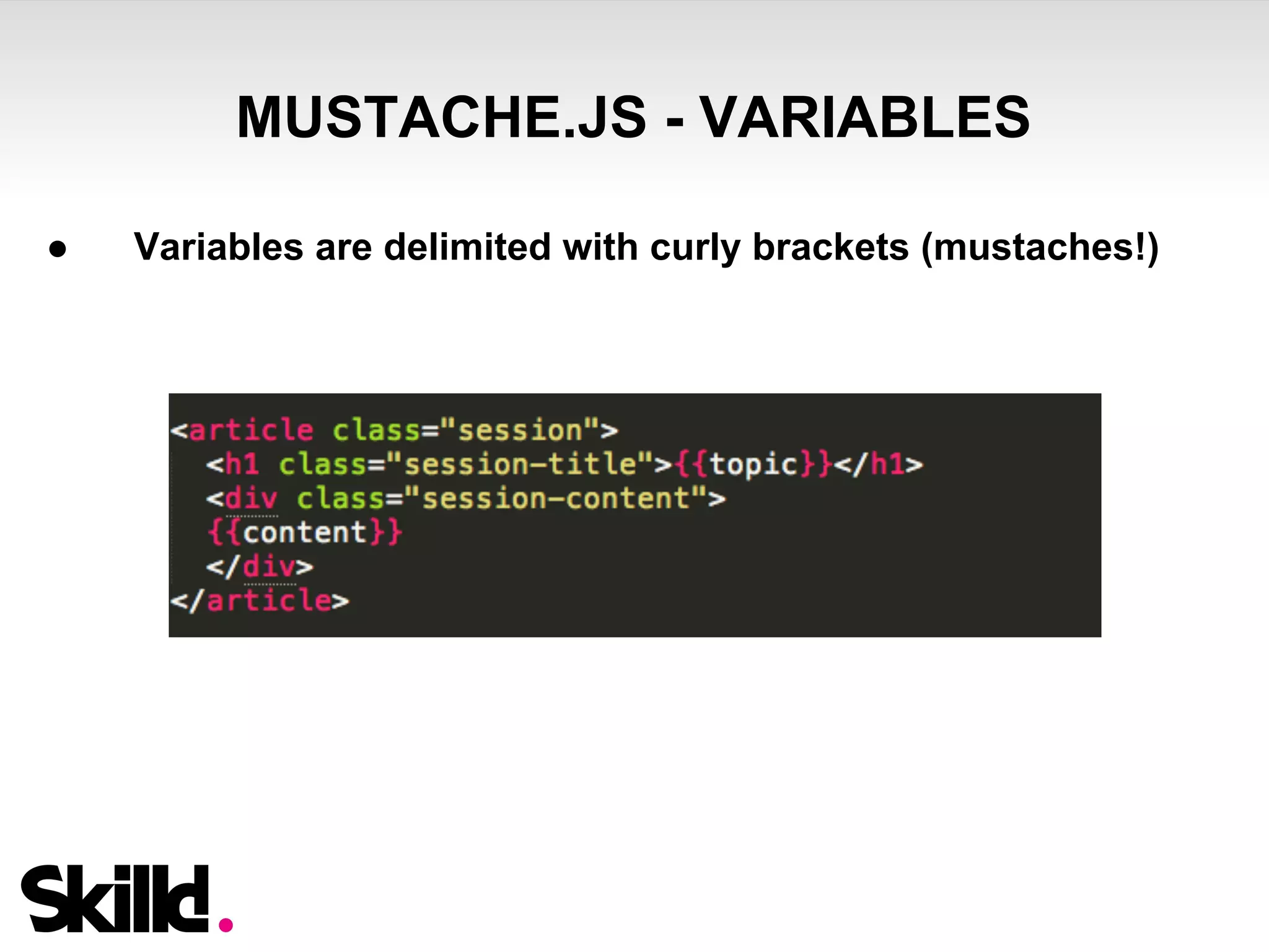
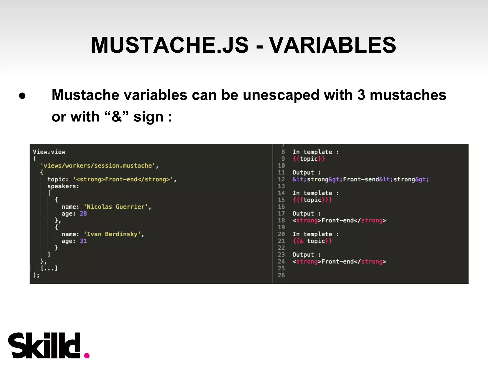
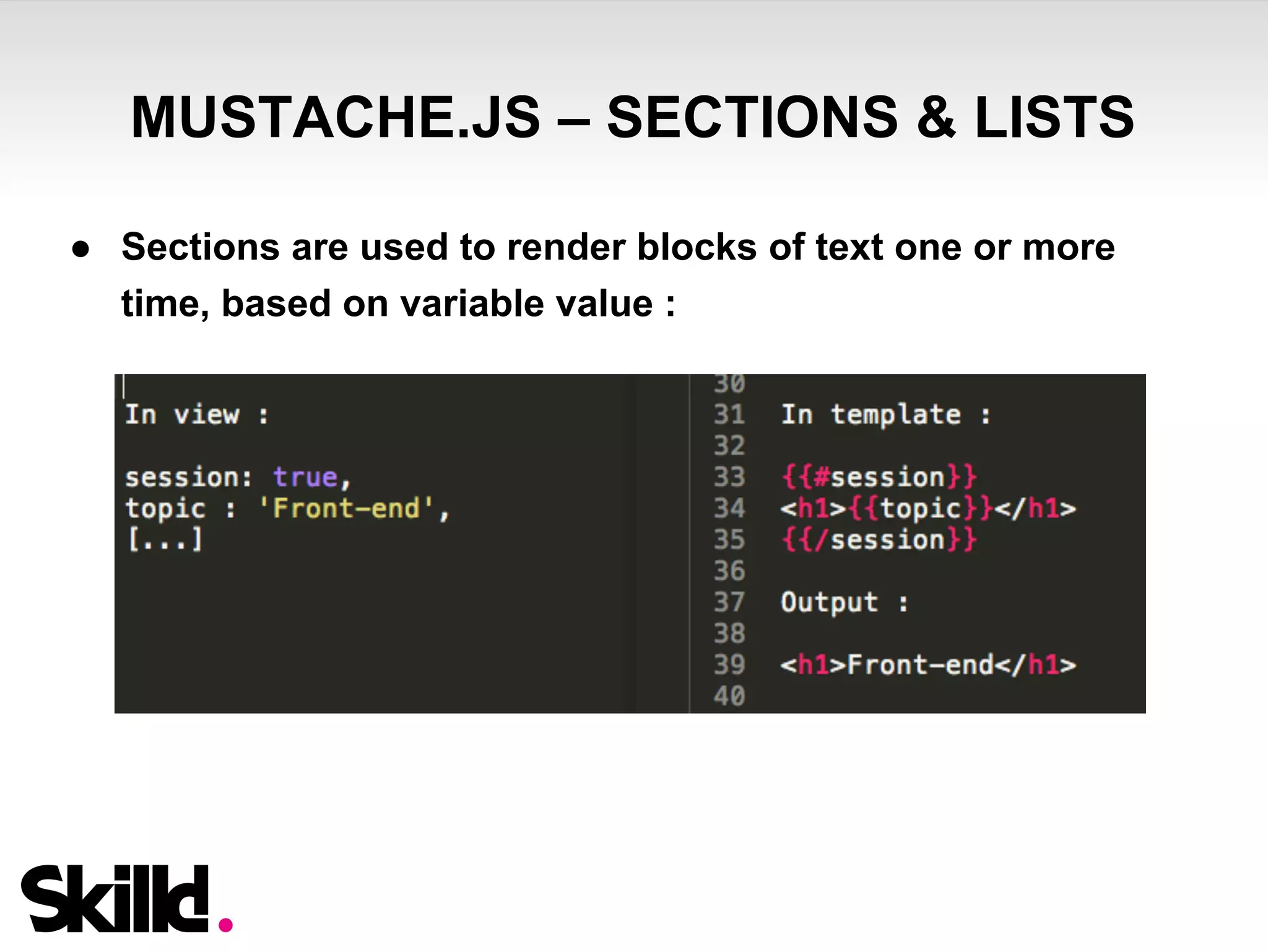
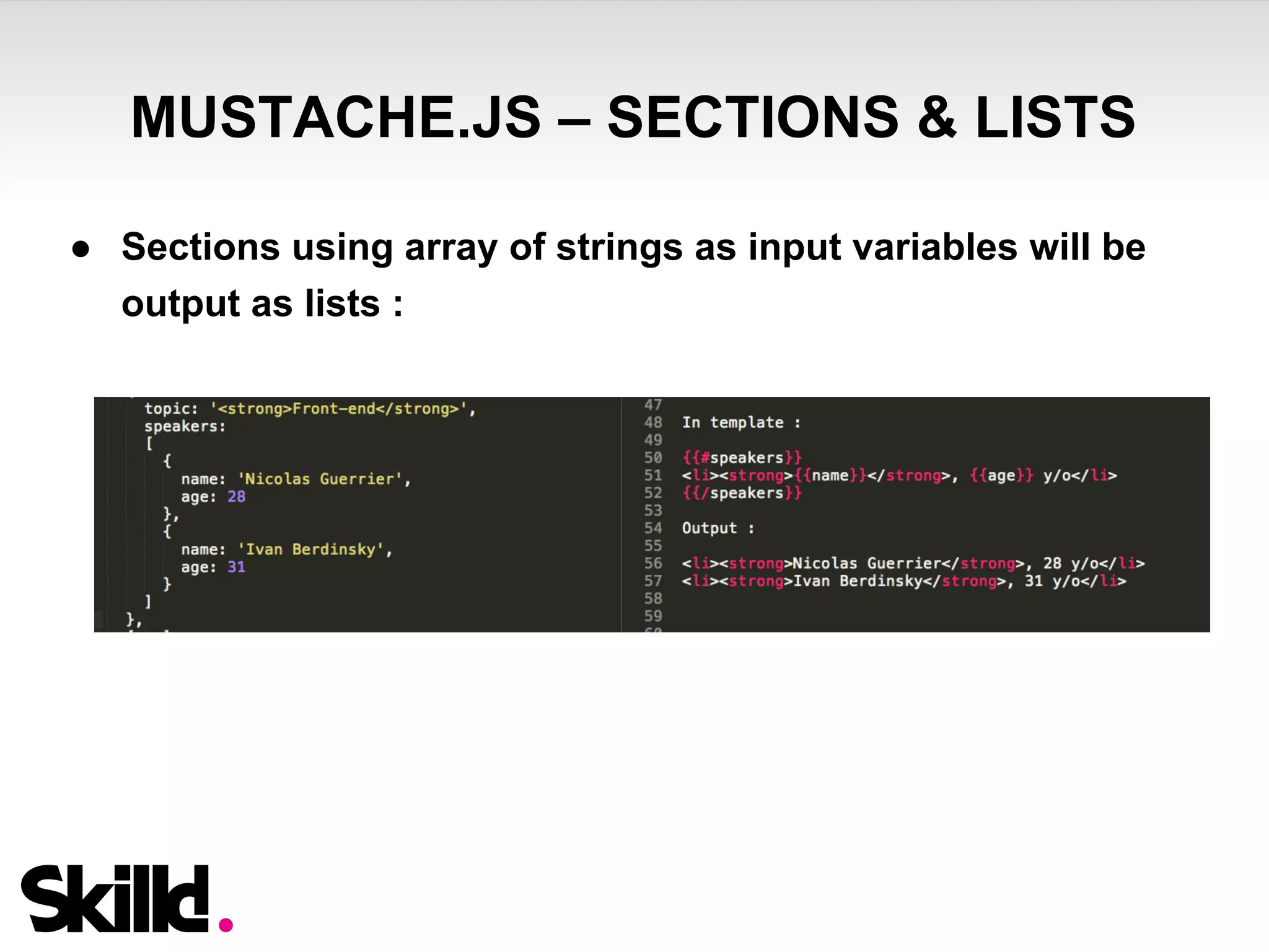
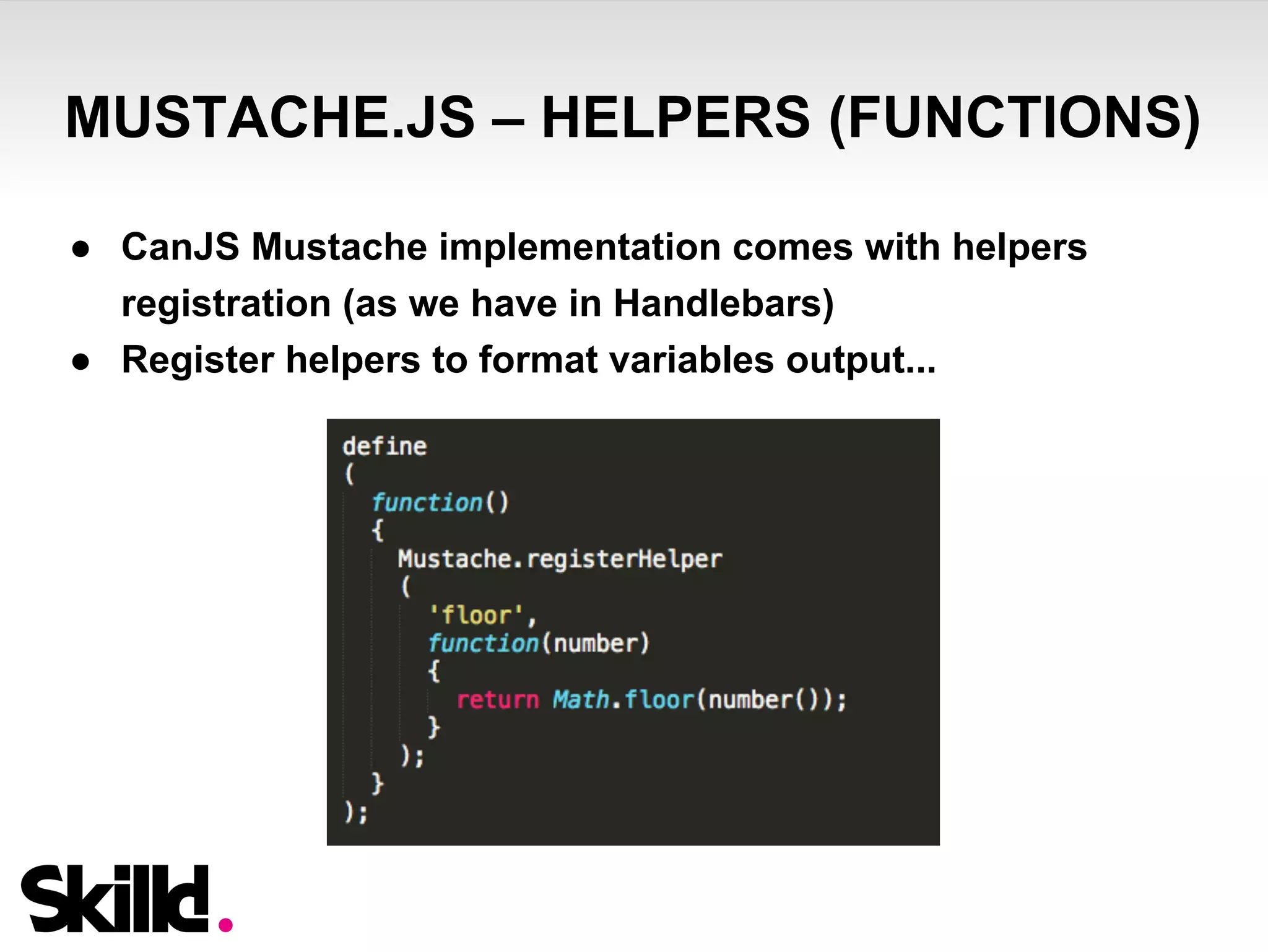
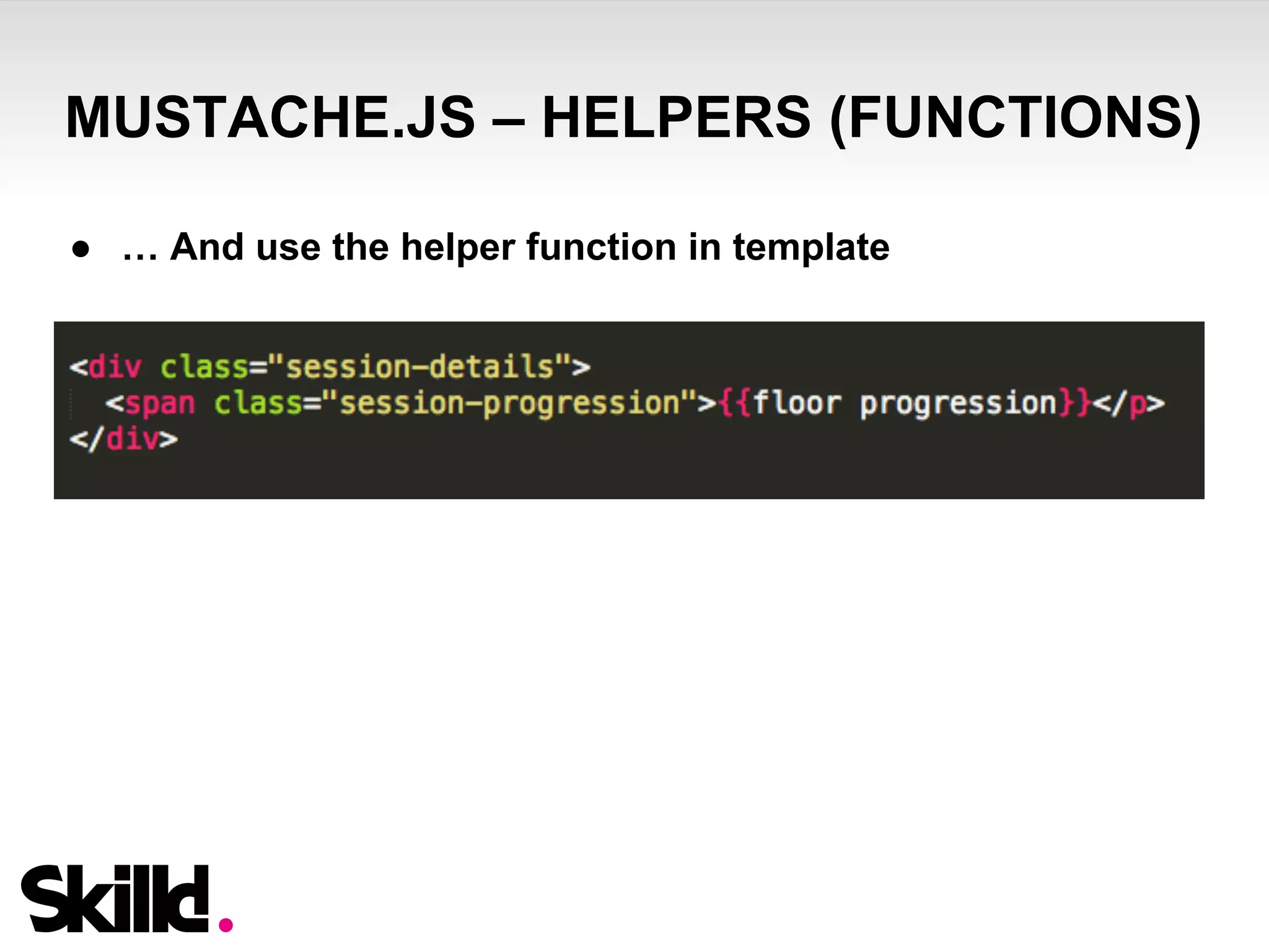
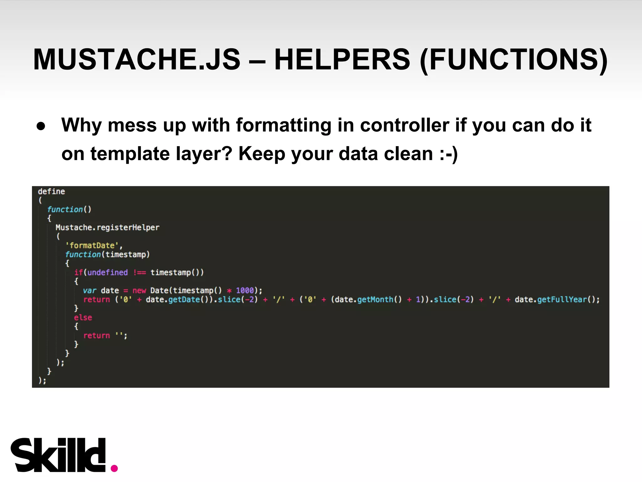
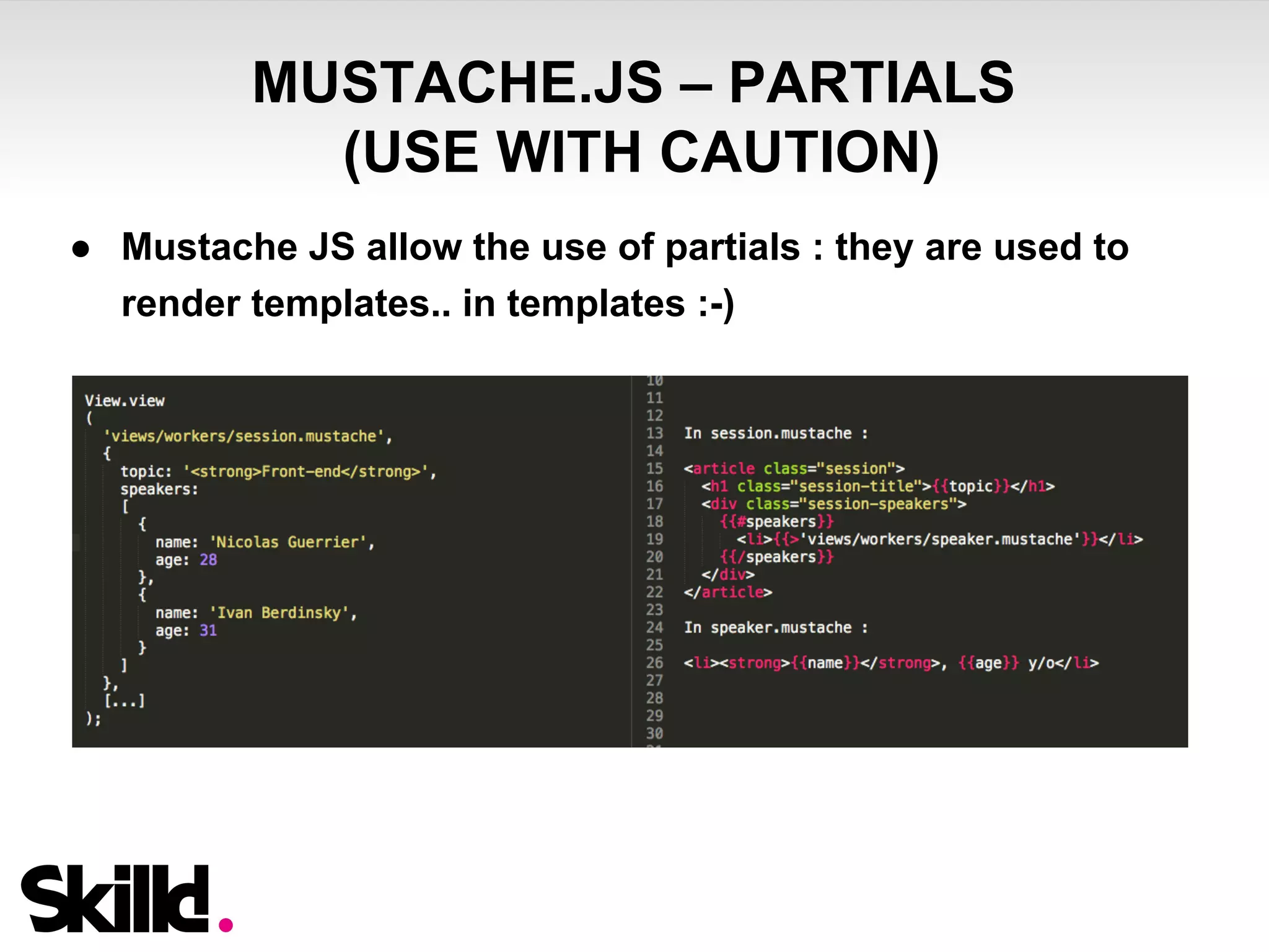


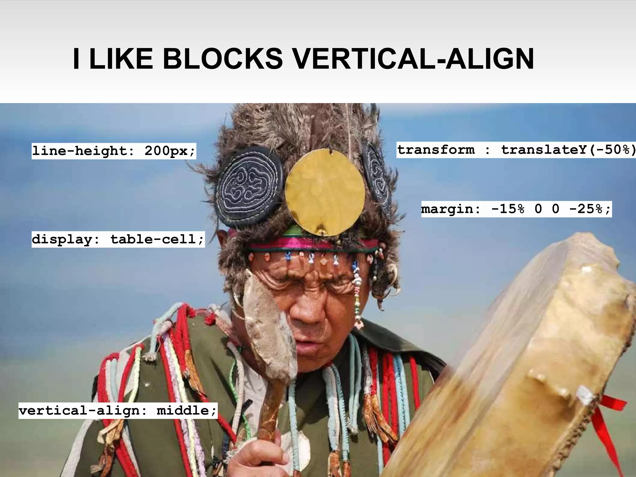
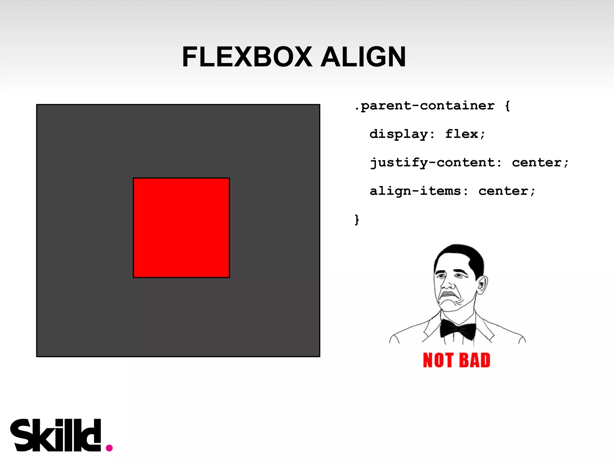
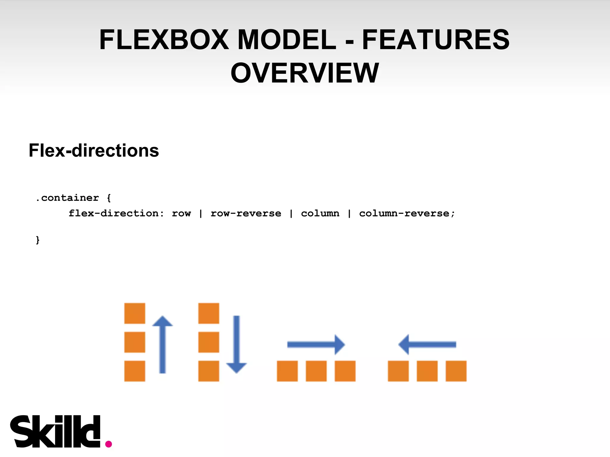
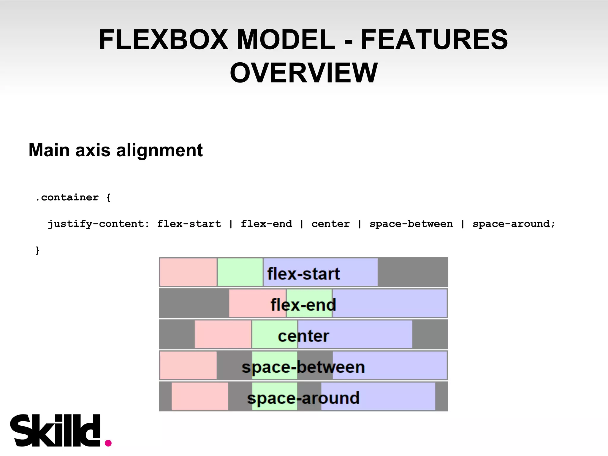
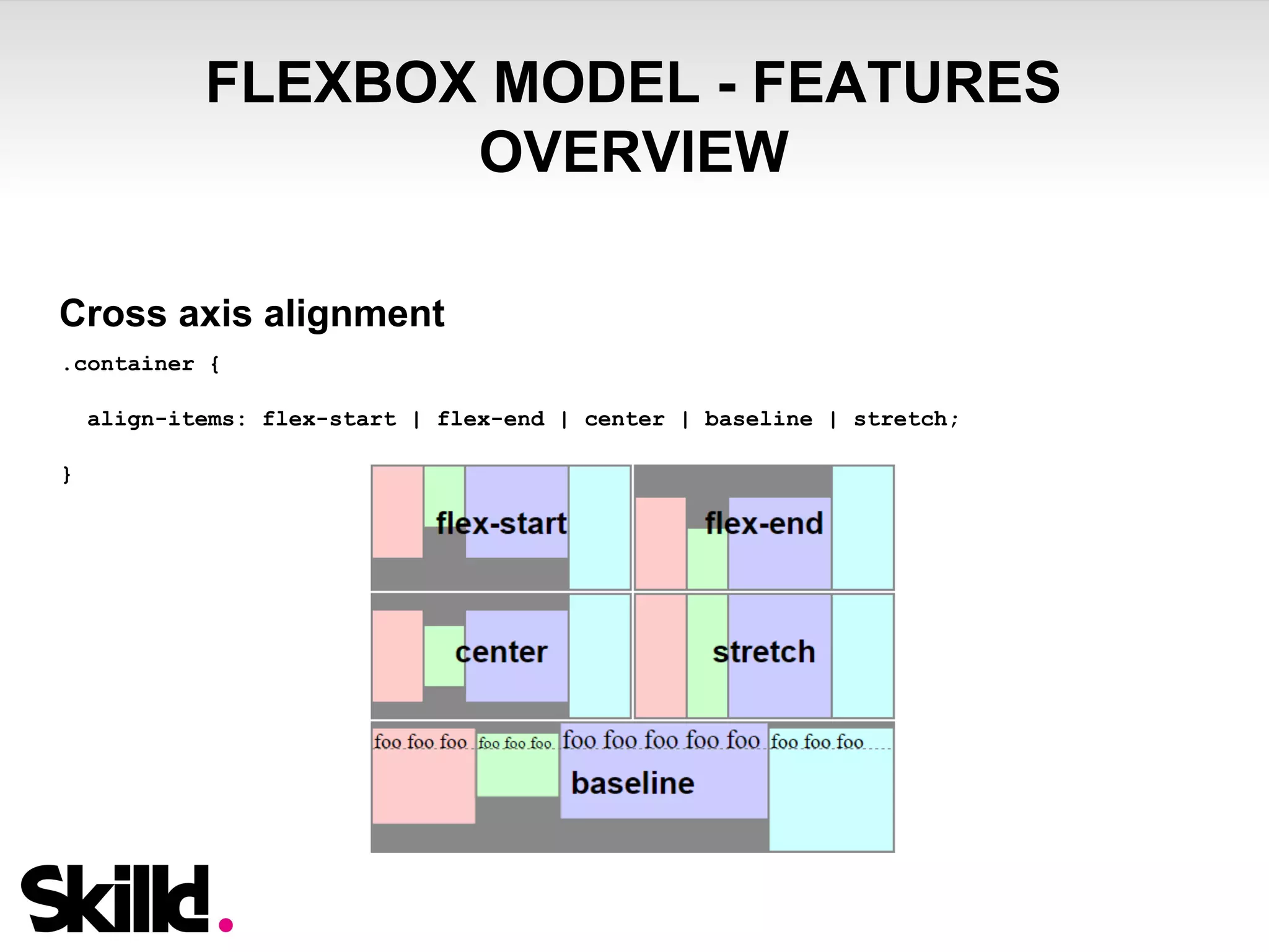

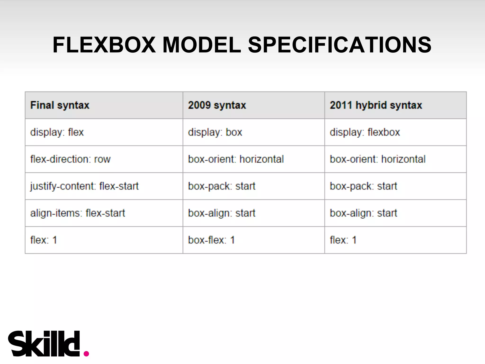
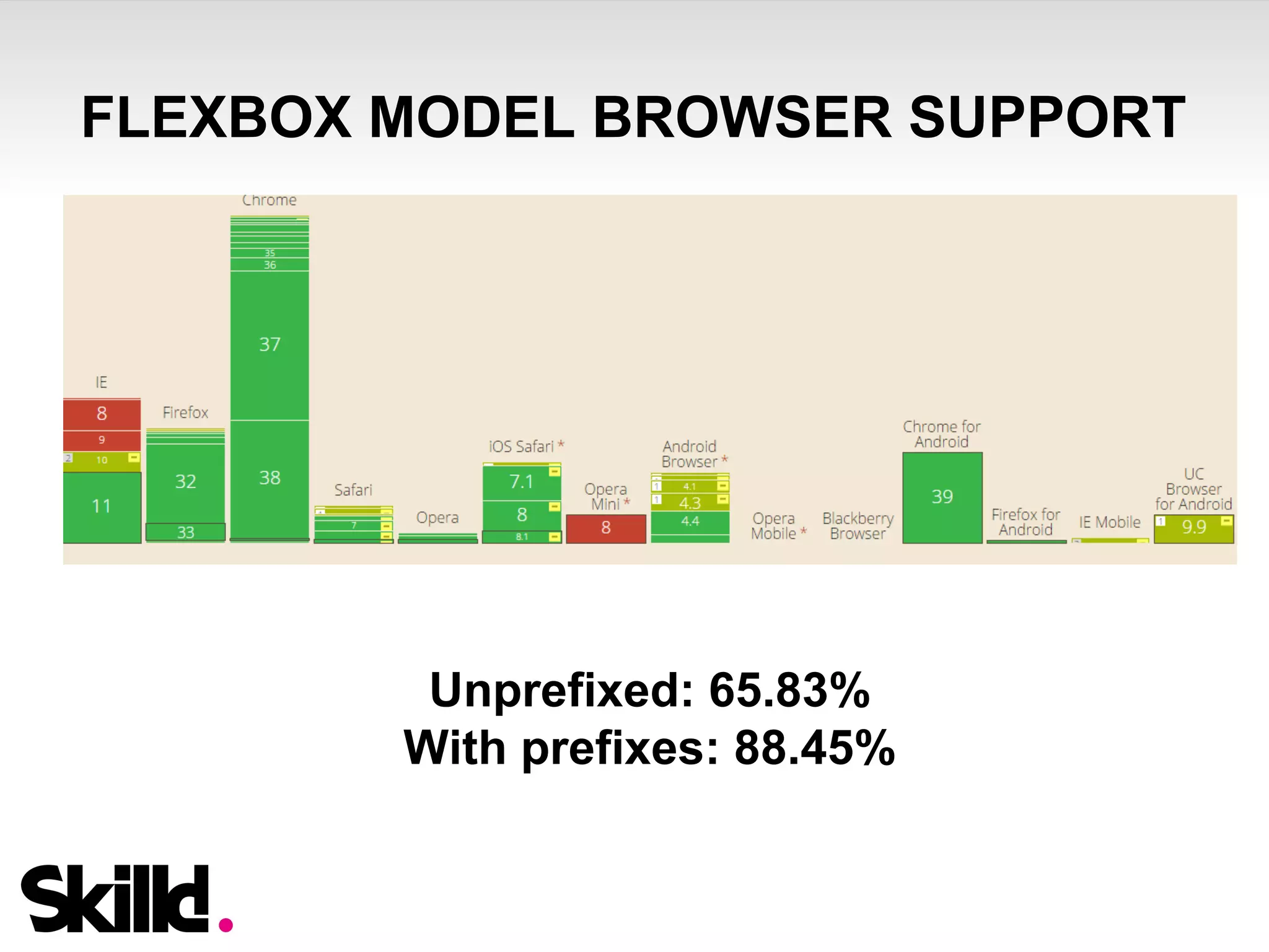

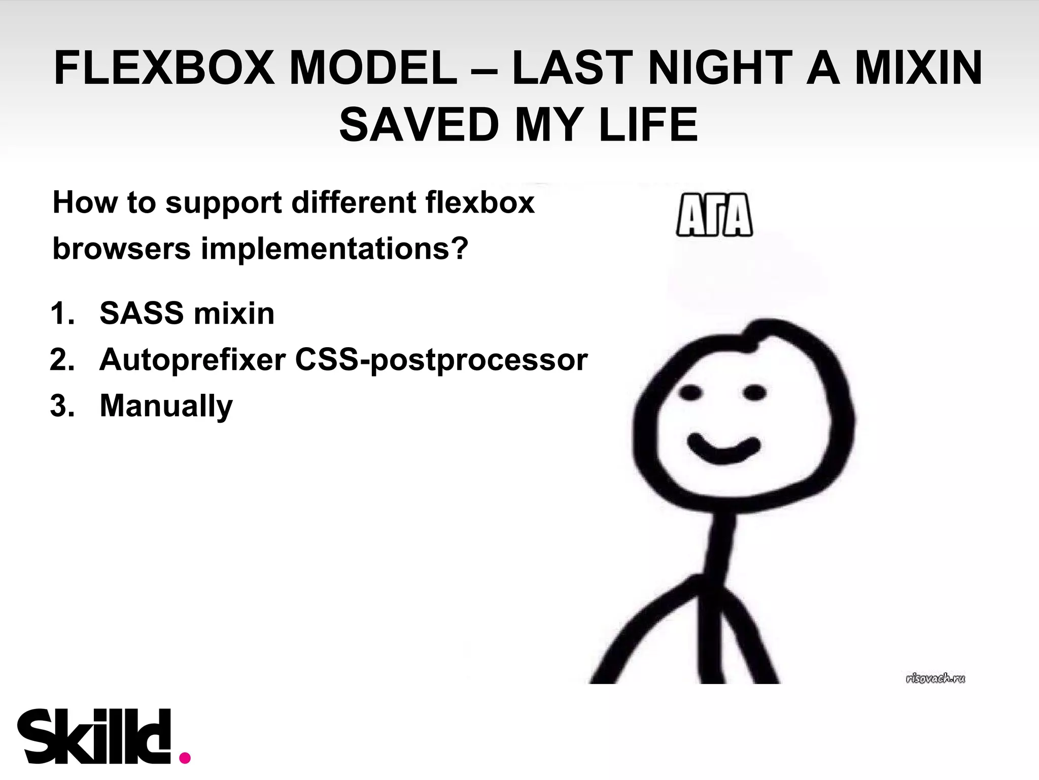
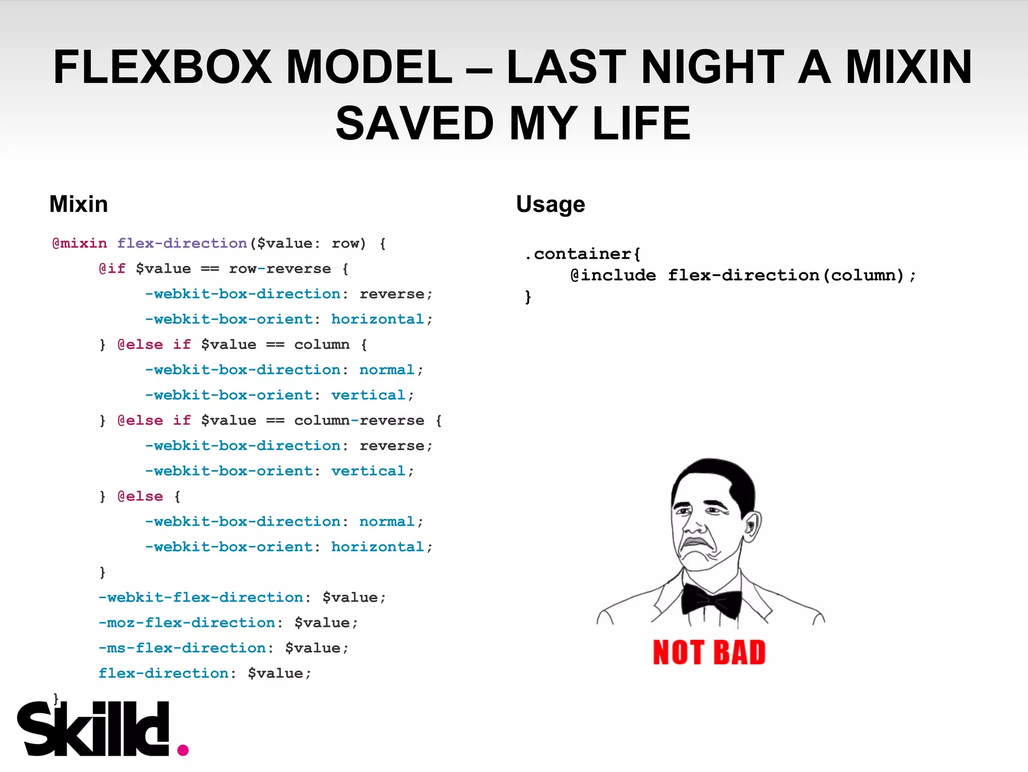


The document provides a comprehensive guide on building multi-device JavaScript applications, focusing on the use of Mustache.js for templating and CSS techniques like rem units and flexbox for responsive design. It emphasizes best practices for layout, sizing, and positioning, including the use of Sass mixins for compatibility. Additionally, it discusses the importance of preemptively considering design fluidity and the performance implications of using various techniques in web development.


![Computer Networks 01[1 using all terms].pptx](https://cdn.slidesharecdn.com/ss_thumbnails/computernetworks011-251214040533-327dd9f8-thumbnail.jpg?width=640&height=640&fit=bounds)


