WELCOME TO RESPONSIVE
DESIGN
Neil Perlin
Hyper/Word Services
2015
Welcome to
Responsive Design
Who Am I?
 Neil Perlin - Hyper/Word Services.
– Internationally recognized content consultant.
– Helps clients create effective, efficient, flexible
content in anything from hard-copy to mobile.
– Taught HTML and XML in the ‘90s and ‘00s,
CSS since the early ‘00s.
– MadCap-certified Flare trainer/consultant since
pre-alpha in ‘05.
– Using/training/consulting on RoboHelp since
‘91, vendor-certified since ‘97.
The Issues
 Responsive design overview
 How does it work?
 How to pull it out of your HAT
Responsive
Design
Overview
What Is Responsive Design?
 Creating one web site/help output that can detect
a display device’s properties and automatically
reformat itself accordingly.
– Vs creating one site/output for each device.
 Developed by Ethan Marcotte in 2010.
– See http://alistapart.com/article/responsive-
web-design/
 For example…
Pittsburgh Children’s Museum
Gatwick Airport
And Online Help? Flare…
RoboHelp…
Why It’s Important
 In general – Makes it easier for web pages to
address the growing universe of display devices.
 In tech comm – Lets us create content to run on
any display device (within reason) readers may
have.
– IMO, the biggest thing to hit tech comm since
HTML in ‘97.
Why It’s Important
 Why not just develop a separate site/output for
each device out there?
quartsoft.com
But…
 It complicates the conversion of legacy projects.
 And adds complex new issues to new projects.
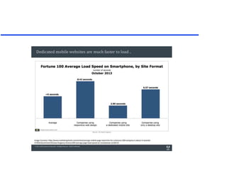
 And downloads more slowly, which raises some
new issues.
– From Vikram Verma’s Adobe presentation at STC
2014
How Does It
Work
Relative Size Units
 We’re used to point-based sizes – 72pt = 1” –
from our print experience – familiar and simple.
 But points are fixed, OK for print but have two
problems in online outputs:
– Can’t be resized by a browser user or a browser.
 Instead, use:
– % – Based on the default size of normal on a given
browser – 100%.
– Em – The height of the capital M in each browser
font set, now a computed font-size property for the
style it’s based on – aka it varies.
Why Relative Sizes?
 An image at an absolute
width in a too-narrow space.
– Note the horizontal scroll bar.
 And at a relative width in that
same space.
– No horizontal scroll bar; the
50% width makes a browser
show the image at 50% of
the available space – “relative”.
– In effect, each browser handles
that formatting for you.
Media Queries
 Formulas that test for certain parameters and run
different CSS settings at designated change
points – “breakpoints” – based on the result.
– Testable parameters include device screen size,
resolution, orientation, color vs. monochrome, etc.
Media Query Examples
 @media screen and (min-width: 320px) {
}
– Tests whether the device is a screen (a testable
property) and whether its width is 320x or more.
 @media screen and (min-width: 800px) {
}
– Tests to see if the screen’s width exceeds 800px.
– At each breakpoint, here width, different CSS
settings take effect that might reformat the screen or
show or hide different elements.
Fluid Grids
 Basically involves creating layouts that can go
from this to this
 Based on the CSS “float” property rather than
hidden tables.
 Good intro at:
http://www.1stwebdesigner.com/tutorials/fluid-
grids-in-responsive-design/
Fluid Grids Example
 For example:
Fluid Grids Example
Fluid Grids Example
Fluid Grids Example
 And here’s the code that makes it work.
HATs and Responsive Design
 Doing this calls for some knowledge of CSS,
HTML, and good coding practice.
 What if you’re not a coder?
 Flare, RoboHelp, Doc2Help, others(?) – let you
create responsive design now with no coding but
with some early limitations and oddities.
What’s RESS?
RESS
 Responsive Design + Server Side Components
– “…RESS combines adaptive layouts with server side
component (not full page) optimization. So a single
set of page templates define an entire Web site for all
devices but key components within that site have
device-class specific implementations… rendered
server side.”
– Luke Wroblewski, http://www.lukew.com/ff/entry.asp?1392
How To Pull It
Out of Your
HAT
The Tasks
 Use relative size units via the CSS.
 Create a fluid grid using “float” styles from the
CSS, depending on your content layout
complexity.
 Invoke your HAT’s responsive design feature.
 Specify the breakpoints.
 Design the layouts for each breakpoint.
 Generate, view, and test the output.
Flare
Use Relative Size Units
 All formatting via the Stylesheet Editor using
relative size units.
“Float” Your Graphics
 In the img tag via the Stylesheet Editor using the
float style in the Box functional group.
Invoke Responsive Design
 Set the breakpoints
on the Skin Editor’s
Setup tab.
– Note that there’s
just one tablet
breakpoint.
Set the Breakpoints
 Don’t try to set the
breakpoint values
for specific devices.
– You’ll go crazy trying to decide which devices
to base the decision on and only have two
options anyway.
 Instead, test your output to find sizes where the
design gets iffy and set your breakpoints there.
 To find generic breakpoints, simply resize the
browser window containing the output.
Define the Mediums (Layouts)
 Define the properties for each medium on the
Skin Editor Styles tab.
 Note the three output type mediums on the Skin
Editor toolbar.
– Use the UI Text tab to change the wording of
any UI element.
Define the Mediums (Layouts)
 Click the Highlight option on the Skin Editor
toolbar to highlight the setting for a selected
item on the preview or vice versa.
Watch Out For…
 Can only define one tablet breakpoint in v. 10.
– May be important if you need to distinguish
between 10” and 7” tablets.
– Hopefully multiple tablet breakpoints in v. 11.
 Some skin editor settings are hard-coded – e.g.
logo always left-justified for Web but centered
for Tablet and Mobile.
Watch Out For…
 Settings hierarchies – ex. Background priority
hierarchy is Image > Gradient > Color.
– Must set image field to None and Gradient to
Transparent for a Color setting to work.
RoboHelp
Use Relative Size Units
 All formatting
via the Styles
pod using
relative size
units.
 RH doesn’t
offer % and em
options but
supports them
if you type
them.
“Float” Your Graphics
 In the img tag via the Styles pod.
Set the Breakpoints
 Can’t change the default breakpoints through the
GUI.
 Must do so through a schema file and the CSS.
– Not difficult but you should be comfortable
working in code.
– If you are and want the instructions, email me.
– Hope to see this changed in RH12.
You Can Now Either…
 Design the layout, then invoke responsive
design and call the layout, or
 Invoke responsive design, then call the/a layout
(and modify it if necessary).
– I think option 1 is simpler but it’s up to you.
Design the Layout
 Add your new layout under Screen Layouts on
the Project
Set-Up pod.
 Then right-click
on your layout
and select
Edit – opens
the Layout
Editor.
Design the Layouts
 Select a layout component.
 Then modify
it using the
preview to
identify it on
the Properties
list.
Invoke Responsive Design
 Select Responsive HTML5 in the SSL folder,
click the Select button to pick a layout.
– Or the
Customize…
button to
open and
customize an
existing
layout in
the Layout
Editor.
Watch Out For…
 Need to edit a schema file and a CSS file to
change the breakpoints.
 Some skin editor settings are hard-coded, such
as placement of navigation options strip.
 Can’t modify TOC, index, glossary, or general
navigation differently for mobile and tablet –
settings are “mobile/tablet”.
What’s MultiScreen HTML5?
 Responsive design creates one output that adapts
itself automatically based on the device.
– With only one set of content, variables, etc.,
since there’s only one output.
 Multiscreen supports different output settings
and different content, etc. for each device.
– More device-granular content and design but
takes more work since you must define the
multiple devices individually.
Summary – Best Practices
 Design your content for “undesktop-first” via
fluid layout grids, relative sizes, etc.
 Eliminate local formatting, period.
 Images:
– Insert sequential images using the CSS “float”
style – no more table-based insertion.
– Size images dynamically using % or em units.
» But are images legible at smaller sizes. Can you
conditionalize them out? Effect on content?
Summary – Best Practices
 Use “autofit to window” option for tables.
 Define “device class” or “category” breakpoints
rather than device-specific ones.
 Consider effects of using
low-res pointers
on the interface
and interactivity.
Summary
 Lots of new technical, design, and output
challenges.
– Define your terms and platforms.
 It sounds daunting, but so did the move by tech
comm to online help and the web in the ‘90s and
still today.
 We met those challenges – time to do so again.
Hyper/Word Services Offers…
Training • Consulting • Development
Flare • Flare CSS • Flare Single Sourcing
RoboHelp • RoboHelp CSS • RoboHelp
HTML5
ViziApps
Single sourcing • Structured authoring
Thank you... Questions?
978-657-5464
nperlin@nperlin.cnc.net
www.hyperword.com
Twitter: NeilEric

Spectrum 2015 responsive design

  • 1.
    WELCOME TO RESPONSIVE DESIGN NeilPerlin Hyper/Word Services 2015
  • 2.
  • 3.
    Who Am I? Neil Perlin - Hyper/Word Services. – Internationally recognized content consultant. – Helps clients create effective, efficient, flexible content in anything from hard-copy to mobile. – Taught HTML and XML in the ‘90s and ‘00s, CSS since the early ‘00s. – MadCap-certified Flare trainer/consultant since pre-alpha in ‘05. – Using/training/consulting on RoboHelp since ‘91, vendor-certified since ‘97.
  • 4.
    The Issues  Responsivedesign overview  How does it work?  How to pull it out of your HAT
  • 5.
  • 6.
    What Is ResponsiveDesign?  Creating one web site/help output that can detect a display device’s properties and automatically reformat itself accordingly. – Vs creating one site/output for each device.  Developed by Ethan Marcotte in 2010. – See http://alistapart.com/article/responsive- web-design/  For example…
  • 7.
  • 8.
  • 9.
  • 10.
  • 11.
    Why It’s Important In general – Makes it easier for web pages to address the growing universe of display devices.  In tech comm – Lets us create content to run on any display device (within reason) readers may have. – IMO, the biggest thing to hit tech comm since HTML in ‘97.
  • 12.
    Why It’s Important Why not just develop a separate site/output for each device out there? quartsoft.com
  • 13.
    But…  It complicatesthe conversion of legacy projects.  And adds complex new issues to new projects.  And downloads more slowly, which raises some new issues. – From Vikram Verma’s Adobe presentation at STC 2014
  • 23.
  • 24.
    Relative Size Units We’re used to point-based sizes – 72pt = 1” – from our print experience – familiar and simple.  But points are fixed, OK for print but have two problems in online outputs: – Can’t be resized by a browser user or a browser.  Instead, use: – % – Based on the default size of normal on a given browser – 100%. – Em – The height of the capital M in each browser font set, now a computed font-size property for the style it’s based on – aka it varies.
  • 25.
    Why Relative Sizes? An image at an absolute width in a too-narrow space. – Note the horizontal scroll bar.  And at a relative width in that same space. – No horizontal scroll bar; the 50% width makes a browser show the image at 50% of the available space – “relative”. – In effect, each browser handles that formatting for you.
  • 26.
    Media Queries  Formulasthat test for certain parameters and run different CSS settings at designated change points – “breakpoints” – based on the result. – Testable parameters include device screen size, resolution, orientation, color vs. monochrome, etc.
  • 27.
    Media Query Examples @media screen and (min-width: 320px) { } – Tests whether the device is a screen (a testable property) and whether its width is 320x or more.  @media screen and (min-width: 800px) { } – Tests to see if the screen’s width exceeds 800px. – At each breakpoint, here width, different CSS settings take effect that might reformat the screen or show or hide different elements.
  • 28.
    Fluid Grids  Basicallyinvolves creating layouts that can go from this to this  Based on the CSS “float” property rather than hidden tables.  Good intro at: http://www.1stwebdesigner.com/tutorials/fluid- grids-in-responsive-design/
  • 29.
  • 30.
  • 31.
  • 32.
    Fluid Grids Example And here’s the code that makes it work.
  • 33.
    HATs and ResponsiveDesign  Doing this calls for some knowledge of CSS, HTML, and good coding practice.  What if you’re not a coder?  Flare, RoboHelp, Doc2Help, others(?) – let you create responsive design now with no coding but with some early limitations and oddities.
  • 34.
  • 35.
    RESS  Responsive Design+ Server Side Components – “…RESS combines adaptive layouts with server side component (not full page) optimization. So a single set of page templates define an entire Web site for all devices but key components within that site have device-class specific implementations… rendered server side.” – Luke Wroblewski, http://www.lukew.com/ff/entry.asp?1392
  • 36.
    How To PullIt Out of Your HAT
  • 37.
    The Tasks  Userelative size units via the CSS.  Create a fluid grid using “float” styles from the CSS, depending on your content layout complexity.  Invoke your HAT’s responsive design feature.  Specify the breakpoints.  Design the layouts for each breakpoint.  Generate, view, and test the output.
  • 38.
  • 39.
    Use Relative SizeUnits  All formatting via the Stylesheet Editor using relative size units.
  • 40.
    “Float” Your Graphics In the img tag via the Stylesheet Editor using the float style in the Box functional group.
  • 41.
    Invoke Responsive Design Set the breakpoints on the Skin Editor’s Setup tab. – Note that there’s just one tablet breakpoint.
  • 42.
    Set the Breakpoints Don’t try to set the breakpoint values for specific devices. – You’ll go crazy trying to decide which devices to base the decision on and only have two options anyway.  Instead, test your output to find sizes where the design gets iffy and set your breakpoints there.  To find generic breakpoints, simply resize the browser window containing the output.
  • 43.
    Define the Mediums(Layouts)  Define the properties for each medium on the Skin Editor Styles tab.  Note the three output type mediums on the Skin Editor toolbar. – Use the UI Text tab to change the wording of any UI element.
  • 44.
    Define the Mediums(Layouts)  Click the Highlight option on the Skin Editor toolbar to highlight the setting for a selected item on the preview or vice versa.
  • 45.
    Watch Out For… Can only define one tablet breakpoint in v. 10. – May be important if you need to distinguish between 10” and 7” tablets. – Hopefully multiple tablet breakpoints in v. 11.  Some skin editor settings are hard-coded – e.g. logo always left-justified for Web but centered for Tablet and Mobile.
  • 46.
    Watch Out For… Settings hierarchies – ex. Background priority hierarchy is Image > Gradient > Color. – Must set image field to None and Gradient to Transparent for a Color setting to work.
  • 47.
  • 48.
    Use Relative SizeUnits  All formatting via the Styles pod using relative size units.  RH doesn’t offer % and em options but supports them if you type them.
  • 49.
    “Float” Your Graphics In the img tag via the Styles pod.
  • 50.
    Set the Breakpoints Can’t change the default breakpoints through the GUI.  Must do so through a schema file and the CSS. – Not difficult but you should be comfortable working in code. – If you are and want the instructions, email me. – Hope to see this changed in RH12.
  • 51.
    You Can NowEither…  Design the layout, then invoke responsive design and call the layout, or  Invoke responsive design, then call the/a layout (and modify it if necessary). – I think option 1 is simpler but it’s up to you.
  • 52.
    Design the Layout Add your new layout under Screen Layouts on the Project Set-Up pod.  Then right-click on your layout and select Edit – opens the Layout Editor.
  • 53.
    Design the Layouts Select a layout component.  Then modify it using the preview to identify it on the Properties list.
  • 54.
    Invoke Responsive Design Select Responsive HTML5 in the SSL folder, click the Select button to pick a layout. – Or the Customize… button to open and customize an existing layout in the Layout Editor.
  • 55.
    Watch Out For… Need to edit a schema file and a CSS file to change the breakpoints.  Some skin editor settings are hard-coded, such as placement of navigation options strip.  Can’t modify TOC, index, glossary, or general navigation differently for mobile and tablet – settings are “mobile/tablet”.
  • 56.
    What’s MultiScreen HTML5? Responsive design creates one output that adapts itself automatically based on the device. – With only one set of content, variables, etc., since there’s only one output.  Multiscreen supports different output settings and different content, etc. for each device. – More device-granular content and design but takes more work since you must define the multiple devices individually.
  • 57.
    Summary – BestPractices  Design your content for “undesktop-first” via fluid layout grids, relative sizes, etc.  Eliminate local formatting, period.  Images: – Insert sequential images using the CSS “float” style – no more table-based insertion. – Size images dynamically using % or em units. » But are images legible at smaller sizes. Can you conditionalize them out? Effect on content?
  • 58.
    Summary – BestPractices  Use “autofit to window” option for tables.  Define “device class” or “category” breakpoints rather than device-specific ones.  Consider effects of using low-res pointers on the interface and interactivity.
  • 59.
    Summary  Lots ofnew technical, design, and output challenges. – Define your terms and platforms.  It sounds daunting, but so did the move by tech comm to online help and the web in the ‘90s and still today.  We met those challenges – time to do so again.
  • 60.
    Hyper/Word Services Offers… Training• Consulting • Development Flare • Flare CSS • Flare Single Sourcing RoboHelp • RoboHelp CSS • RoboHelp HTML5 ViziApps Single sourcing • Structured authoring
  • 61.