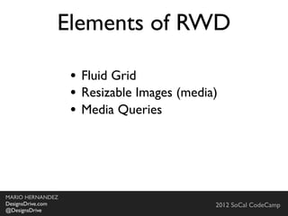
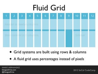
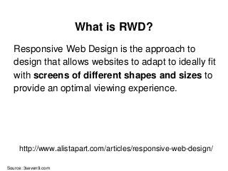
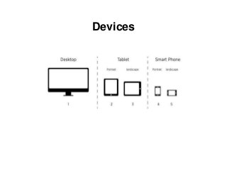
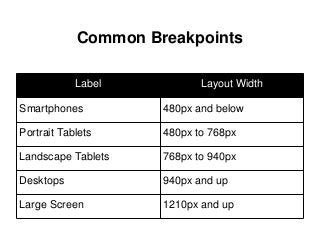
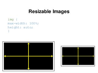
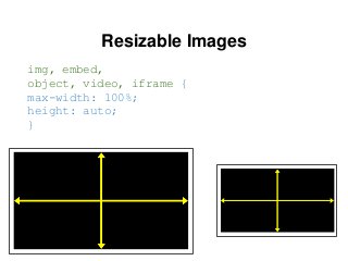
Responsive Web Design
(RWD)
by Mario Hernandez
Web: http://DesignsDrive.com
Email: designsdrive@gmail.com
Twitter: @DesignsDrive
Slides available at: http://slideshare.net/marequi
MARIO HERNANDEZ
Front-End Developer
Agenda
Session One:
SEO
Best practices, How does it relate to RWD
HTML
Introduction to HTML5 and CSS3
Progressive Enhancement and Graceful Degradation
CanIUse.com
Fonts
Pixels vs. EMs
Problems with EMs
Converting Pixels to EMs
Agenda
Session One:
Grid Systems
What are grids and how they apply to web design
Fixed vs Fluid vs. Responsive grids
Manipulating grids in web design (rows, columns, offsets,
source order, etc)
Media Queries
What are they?
What role do they play in responsive design?
Working with Breakpoints
Agenda
Session One:
Responsive Web Design or RWD
mariohernandez.github.io/responsive
Our Project
SEO
Search Engine Optimization
What search engines are looking for
Content
What search engines are looking for
Content
Performance
What search engines are looking for
Content
Performance
Authority
What search engines are looking for
Content
Performance
Authority
User Experience
Source: http://searchenginewatch.com/article/2259693/SEO-Basics-8-Essentials-When-Optimizing-Your-Site
What search engines are NOT looking for
Keyword Stuffing
What search engines are NOT looking for
Keyword Stuffing
Purchased Links
What search engines are NOT looking for
Keyword Stuffing
Purchased Links
Poor User Experience
Be consistent with Domain Names
HTML5
Document Object Model (DOM)
IT’S NOT ONE BIG THING
How can I start using HTML5 if browsers don’t support it?
IT’S NOT ONE BIG THING
How can I start using HTML5 if browsers don’t support it?
You can’t detect HTML5
support but you can detect
support for individual features
(video, canvas or geolocation)
You don’t need to throw anything away
If your web application worked
yesterday in HTML 4, it will still
work today in HTML5. Period.
HTML5 allows you to improve your
website
IT’S EASY TO GET STARTED
GRACEFUL DEGRADATION
Graceful Degradation is a widely used
term which ideology is basically using
the latest technologies first, and then fix
anything that needs fixing for older
browsers.
PROGRESSIVE ENHANCEMENT
Progressive Enhancement refers to
the habit of building first for the less
capable, outdated browser and then
enhance for the latest technologies.
DOM
The Document Object Model (DOM) is a cross-
platform and language-independent convention
for representing and interacting with objects in
HTML, XHTML and XML documents.
DOM
DOCTYPE
A Document Type Declaration, or doctype for
short, has traditionally been used to specify
which particular flavor of markup a document is
written in.
Source: Book: HTML5 For Web Designers by Jeremy Keith
DOCTYPE
The doctype for HTML 4.01 looks like this (line
wraps marked »):
<!DOCTYPE HTML PUBLIC »
"-//W3C//DTD HTML 4.01//EN" »
"http://www.w3.org/TR/html4/strict.dtd">
Source: Book: HTML5 For Web Designers by Jeremy Keith
DOCTYPE
Here’s the doctype for XHTML 1.0:
<!DOCTYPE html PUBLIC »
"-//W3C//DTD XHTML 1.0 Strict //EN" »
"http://www.w3.org/TR/xhtml1/DTD/xhtml1-
strict.dtd">
Source: Book: HTML5 For Web Designers by Jeremy Keith
DOCTYPE
HTML5:
<!DOCTYPE html>
Source: Book: HTML5 For Web Designers by Jeremy Keith
What is RWD?
Responsive Web Design is the approach to
design that allows websites to adapt to ideally fit
with screens of different shapes and sizes to
provide an optimal viewing experience.
Source: 3seven9.com
http://www.alistapart.com/articles/responsive-web-design/
http://www.abookapart.com/products/responsive-web-design
Elements of RWD
● Fluid Grid
Elements of RWD
● Fluid Grid
● Resizable Images (media)
Elements of RWD
● Fluid Grid
● Resizable Images (media)
● Media Queries
Elements of RWD
● Fluid Grid
● Resizable Images (media)
● Media Queries
+ a lot more stuff you
need to deal with
Fonts
Fonts - PXs
Fixed size
Fonts - PXs
Fixed size
Not resizable
Fonts - PXs
Fixed size
Not resizable
Not relative
Fonts - EMs
Fonts - EMs
Base font size is based on M
Fonts - EMs
Base font size is based on M
1em = Browser default body font size = 16px
1em = 100% the default body font size
Fonts - EMs
Base font size is based on M
1em = Browser default body font size = 16px
1em = 100% the default body font size
2em = 32px
Fonts - EMs
Base font size is based on M
1em = Browser default body font size = 16px
1em = 100% the default body font size
2em = 32px
EMs can be used for anything: width, height,
margin, padding, etc.
Fonts - EMs
Problems with EMs
Fonts - EMs
Problems with EMs
The cascade/compounding problem, em's are
relative to font size of parent
Fonts - EMs
Problems with EMs
The cascade/compounding problem, em's are
relative to font size of parent
li {font-size: 1.5em;} = 24px;
A list in a list is not 24px it's a 32px
Fonts - REMs
REMs like EMs, but based on root HTML
element size
Fonts - REMs
REMs like EMs, but based on root HTML
element size
Supported by all modern browsers
CodePen Demo
Fonts - REMs
REMs like EMs, but based on root HTML
element size
Supported by all modern browsers
Need to specify fallback for IE 8 and below
h1{font-size: 16px;font-size: 1rem;}
http://caniuse.com/#search=rem
Grid Systems
Skeleton Neat
csswizardry-grids
Foundatio
Singularity
GS
Sussy
Profound Grid
Responsive Grid System
Why Grids?
How do Grids work?
● Grid systems are built using rows & columns
● A fluid grid uses percentages instead of pixels
Media Queries
Media Queries
Media Queries is a CSS3 module allowing to
adapt the rendering of web pages based on
conditions such as screen resolution. It was first
drafted in 2001 by the W3C and became a
recommended standard in June 2012. It is a
cornerstone technology to RWD.
Devices
Common Breakpoints
Label Layout Width
Smartphones 480px and below
Portrait Tablets 480px to 768px
Landscape Tablets 768px to 940px
Desktops 940px and up
Large Screen 1210px and up
Resizable Images
img {
max-width: 100%;
height: auto;
}
Resizable Images
img, embed,
object, video, iframe {
max-width: 100%;
height: auto;
}
Viewport meta tag
<meta name="viewport" content="width=device-width" />
What do you do when you
lose 80% of your canvas?
http://www.abookapart.com/products/mobile-first
Building a Responsive Website
Planning
● Reset or normalize?
● Viewport meta tag
● Browser and device support
● Navigation
● Resizable Images/Media
● CSS3
Layout
● Sketching and/or Wireframing
● Content decisions
● Source Ordering
Navigation
● The concept
● Options
● Issues to consider
● Fixes and Hacks
Testing
● Browser test
● Simulator test
● Device test
Addressing Issues
● Internet Explorer and HTML5 elements
● Internet Explorer and Media Queries
● Proactively implementing fallbacks
What’s next?
● Versioning control
● Putting your site up on github
● Accessing your website on the web
● Additional resources (review relevant
resources and information)
Front-End Frameworks
Comparing Frameworks
● Bootstrap
● Foundation
Helpful Resources
● Font Size with REMs: http://snook.ca/archives/html_and_css/font-
size-with-rem
● Media Query Bookmarklet: http://goo.gl/RToKTC
● What's my browser size: http://whatsmybrowsersize.com
● Responsive Navigation: http://responsivenavigation.net/
● Media Queries for iOS devices: http://stephen.io/mediaqueries
● 10 Basic Tips for RWD: http://www.splio.com/responsive
The Ultimate RWD Beginners Resource List:
http://www.targetlocal.co.uk/responsive-web-design-resources/
Web: http://DesignsDrive.com
Email: designsdrive@gmail.com
Twitter: @DesignsDrive
Slides available at: http://slideshare.net/marequi
MARIO HERNANDEZ
Front-End Developer

Responsive Web Design

Editor's Notes

  • #9 Search engines want to do their jobs as best as possible by referring users to websites and content that is the most relevant to what the user is looking for. So how is relevancy determined?
  • #10 Is determined by the theme that is being given, the text on the page, and the titles and descriptions that are given.
  • #11 How fast is your site and does it work properly?
  • #12 First introduced in 2009 by Ethan Marcotte who has also written a book with the same title and which I also recommend.\n\nI&amp;#x2019;ve spent the last two years learning about and really digging into responsive Web design and I&amp;#x2019;ve gotta say, It is the beginning of a new era in the Web.\n\n\n
  • #13 First introduced in 2009 by Ethan Marcotte who has also written a book with the same title and which I also recommend.\n\nI&amp;#x2019;ve spent the last two years learning about and really digging into responsive Web design and I&amp;#x2019;ve gotta say, It is the beginning of a new era in the Web.\n\n\n
  • #14 First introduced in 2009 by Ethan Marcotte who has also written a book with the same title and which I also recommend.\n\nI&amp;#x2019;ve spent the last two years learning about and really digging into responsive Web design and I&amp;#x2019;ve gotta say, It is the beginning of a new era in the Web.\n\n\n
  • #15 First introduced in 2009 by Ethan Marcotte who has also written a book with the same title and which I also recommend.\n\nI&amp;#x2019;ve spent the last two years learning about and really digging into responsive Web design and I&amp;#x2019;ve gotta say, It is the beginning of a new era in the Web.\n\n\n
  • #16 First introduced in 2009 by Ethan Marcotte who has also written a book with the same title and which I also recommend.\n\nI&amp;#x2019;ve spent the last two years learning about and really digging into responsive Web design and I&amp;#x2019;ve gotta say, It is the beginning of a new era in the Web.\n\n\n
  • #17 \n
  • #18 \n
  • #19 First introduced in 2009 by Ethan Marcotte who has also written a book with the same title and which I also recommend.\n\nI&amp;#x2019;ve spent the last two years learning about and really digging into responsive Web design and I&amp;#x2019;ve gotta say, It is the beginning of a new era in the Web.\n\n\n
  • #20 \n
  • #21 First introduced in 2009 by Ethan Marcotte who has also written a book with the same title and which I also recommend.\n\nI&amp;#x2019;ve spent the last two years learning about and really digging into responsive Web design and I&amp;#x2019;ve gotta say, It is the beginning of a new era in the Web.\n\n\n
  • #22 Regardless of what approach you take, you should always consider &amp;#x201C;Mobile First&amp;#x201D;.\n\nCoined by Luke Wroblewski. He wrote a book with this title and highly recommend it.\n\n\nStarting with mobile first forces you to prioritize what&amp;#x2019;s important.\n\nThis is our approach. Every time a new application or even single functionality is introduce to our team. We always ask ourselves, How is this going to work on a mobile device?\n
  • #23 This is the challenge. Never before has the work of Web Designers been so hard and complicated.\n\nHow do you design for for all these devices?\nDo you have the staff and resources to develop for all of these devices? Do you have the budget?\n\nDo you do native apps or web apps? There isn&amp;#x2019;t a one approach solution.\n
  • #24 You evaluate. You no longer have the luxury of all the real-estate you want. YOu are forced to prioritized and think of content in a more practical manner.\n\nIf you properly think about serving your content the best way possible on a smart phone, graduating to a tablet, notebook or desktop will be that much easier because you are already addressing what&amp;#x2019;s important up-front.\n\nAt first this seems backwards but if you really think about it. The less space you have to work with the better use you&amp;#x2019;ll attempt to make of every pixel available. This is not the case if you start with the desktop because you have all the space in the world.\n
  • #25 \n
  • #26 Introduce Neil and tell the audience how he was able to incorporate what we have done on Drupal into .Net\n
  • #27 Introduce Neil and tell the audience how he was able to incorporate what we have done on Drupal into .Net\n