1. Front cover analysis
The masthead is kept in the same place, and has the same font and The main image has filled the “frame”; this is a very common
style in every issue keeping its brand identity and therefore the convention among magazines. This will increase the importance of the
audience can familiarise their selves with the magazine layout. image and the artist who the image is of. The artist may be popular so
by making him or her as the main image will draw fans/readers into
The Vibe masthead is placed behind the artist almost all of their issues, this says buying this issue.
a lot about the reputation of the magazine it’s self. The magazine is well known
enough to have part of the masthead blocked out. Dedicated fans and even The names of popular artists within the magazine will again draw
people who did not read the magazine regularly will be able to recognise the readers into buying it if they support or enjoy those artists music. With
magazine without fully knowing the name. The artist alone also may be enough the addition of more well known artists in the magazine, the readers
to attract the Target audience. The name “Vibe” reflects well on the genre of will feel like they are getting more “value for their money”.
music the magazine covers as most people refer to R “n” B music to have a
“vibe” and therefore associate that word with this genre of music. The target
audience will be attracted by the masthead alone as to helps them immediately The main sell line is kept to the left. As it is the most important issue
recognise the genre of music the magazine and therefore will be incited to read inside the magazine it should be kept on the left hand side as this is
about their favourite genre of music. where the reader’s eye will go first.
The mise – en – scene within the magazine’s front cover also follows
The barcode and price are hidden away and kept at the bottom of
conventions, and reflects the target audience well. T.I’s pose and facial
the page as it is the least important piece of information. The target
expression represent the masculine target audience. T.I’s facial expression
audience will also have to search for the price meaning they will see
is very aggressive which also shows the target audience to be aggressive.
most of what’s on the cover, and therefore more likely to see
However his pose shows him to be very relaxed as well as aggressive
content they like in the magazine.
which reflects the target audience to be aggressive but also have a very
relaxed and calm nature. The costume that T.I is wearing represents the
genre of music well, the snapback cap that he wears is known to be
associated with rap/ hip-hop/ and R “n” B music which is what Vibe’s
The sell line featuring Keri Hilson as a “Very bad girl” may entice readers
target audience like. By T.I wearing this costume, it makes it easier for the
to buy the magazine and look inside. This will also give an idea of the
target audience to recognise the genre of music it is promoting, and
Target audience of the magazine.
therefore will attract consumers better.
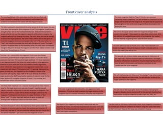
The Font of the masthead is in a massive red display font which makes it
easy for the target audience to see even though it is partly covered, The main image shows the artist with a very aggressive facial
regular customers will be able to read and recognise the magazine. The The Sell line of “We’ve got gifts” draws the readers into buying the
expression. This can be used to express the target audience of the
font of the sell-lines is used well to attract the target audience to the magazine. Readers love to receive stuff for free and will therefore feel
magazine and is a common convention of Rap/hip-hop magazines.
magazine. The important sell-lines are in a larger font such as “Keri more incline to buy the magazine in order to get the “free” gift.
Hilson” and “T.I” other important texts are in white to stand out
amongst dark background colours on the front covers.
The layout of the magazine is the same in every issue with the The shot used for this issue of Vibe breaks classic music magazine conventions,
The word “Exclusive” adds to the importance of the article inside the
masthead at the top and the most important sell-lines kept in the left as normally you would see a medium or medium- long shot used of the artist
magazine. It can also make the reader feel exclusive and important if
hand first. This follows traditional magazine conventions as well as on the front cover. However this issue uses a medium- close up.
they buy it and read it. The term exclusive indicates that you cannot find
vibe’s own layout conventions.
this article elsewhere – you have to buy this magazine to read it.
2. The background colour of the magazine has been “painted” in a Some Conventions within magazines has not been kept by this edition
The mise – en – scene within the magazine’s front cover also follows dark blue colour which is normally associated with being a of “The source”; the artist within the main central image does not fill
conventions, and reflects the target audience well. Jay-Z’s pose and actions masculine. There are three main colours on the front cover: Black, the “frame” as most, if not all, normally would, this may suggest that
represent the masculine target audience. Jay-Z’s facial expression is unclear White and Blue all three of these colours are seen as masculine the artist that features as the main image does not need to fill the
as he is faced away from the audience this alone shows his masculinity, and colours and can be reflective of the target audience as mainly or all whole “frame” as he is very well known. However even though he
the confidence to “break the rules” this can be reflected on the target male. does not fill the “frame” it doesn’t mean that his importance is
audience as well as being confident. His pose shows him to be very relaxed lowered. In fact his importance will be heightened a little bit as
as well as masculine which reflects the target audience to be masculine but readers will still buy the magazine based on the fact that Jay-Z is the
also have a very relaxed and calm nature. The costume that Jay-Z is wearing artist.
represents the genre of music well, the slightly baggy jeans and the cigar
that he is smoking known to be associated with the rap/ hip-hop genre
which is what Vibe’s target audience like. By jay-z wearing this “costume”, it
makes it easier for the target audience to recognise the genre of music it is
promoting, and therefore will attract consumers better. The layout of this edition of “The Source” is somewhat different
to the regular editions. It breaks the traditional layout
conventions and its own brand layout conventions which this
The masthead is in uppercase and in a bold solid display font. This suggests a magazine usually follows in every way, expect for the masthead,
male target audience. The image covering the letter “O” of a fist holding a the strap line and the barcode. It’s clear as it is a “Special
microphone also represents what type of magazine it is and also shows collector’s issue” the magazine’s layout and conventional image
masculinity which enhances the thought of it being targeted at a male shot has changed to suit the issues purpose, even though, it can
audience. be said that the sudden layout change could suggest confidence
from the magazine within its own reputation and this
The name of the magazine, “The Source”, reflects the magazine to be the confidence can also be reflected on the target audience.
number one place to receive information about the hip-hop/rap genre, as
this is the genre of music that this magazine reports on.
The main sell line is kept to the left. As it is the most important issue inside Direct address is also another important and very common
the magazine it should be kept on the left hand side as this is where the convention amongst magazines however yet again this edition of
reader’s eye will go first. The sell line is bold and placed in a bigger font size “The Source” has chosen to ignore that. This can reflect heavily on
than the other sell lines, highlighting its importance. The main sell line helps the target audience. This can suggest that like the artist on the cover
to give a sense of meaning towards the main image and why it may be an of the magazine that the target audience are also laid back and “Don’t
unconventional. By stating within the sell line that the “album turns 10” this care much” for “conventions” and that they do what they like.
suggests that it’s a special occasion for jay-Z and that he is the (for that issue
of course), the “centre of attention” this would easier explain the need to
fully show jay-z within the long shot and not the conventional medium or The barcode and price are hidden away and kept at the bottom of the
medium long shot. page as it is the least important piece of information. The target
audience will also have to search for the price meaning they will see
The main sell line has also been given a large font to make it stand out
most of what’s on the cover, and therefore more likely to see content
amongst the other sell lines, with Jay-Z’s name in a larger font than the rest
they like in the magazine.
of the main sell line. Through doing this they will attract more customers to
the magazine as Jay-z is very popular and well known.
The strap – line of “The bible of Hip-Hop Music, Culture and Politics” will The sell line on the left stating which artists will be The names of popular artists within the The masthead is kept in
further entice readers into buying the magazine as they will believe that they appearing within the magazine is layout unconventionally magazine will again draw readers into the same place in ever
will know everything there is to know about those three particular subjects within a vertical list-style format. This will appeal to a male buying it if they support or enjoy those issue keeping its brand
from reading this magazine alone, which is what this strap – line suggests. TA, as males prefer a simple presentation. The artists listed artists’ music. With the addition of more identity and therefore the
The reference to the magazine as a bible suggests that this magazine reflect the genre of music being promoted as well as the well known artists in the magazine, the audience can familiarise
deserves reverence and that it can be a guide to all those interested in hip- sell line stating that they are “starring” within “Rap’s readers will feel like they are getting their selves with the
hop music, culture and politics. biggest 4th quarter ever” more “value for their money” magazine layout.