
Recommended
More Related Content
What's hot
What's hot (20)
Similar to My magazine
Similar to My magazine (20)
More from RebeccaIH
Recently uploaded
Recently uploaded (20)
My magazine
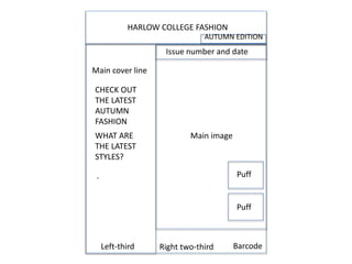
- 1. Left-third Right two-third HARLOW COLLEGE FASHION WHAT ARE THE LATEST STYLES? CHECK OUT THE LATEST AUTUMN FASHION . Main cover line Main image Barcode Issue number and date Puff Puff AUTUMN EDITION
- 2. Masthead Puff Cover lines Barcode Main image Issue number and date Catch line Left third Right two-third Complimentary colours Firstly, I included complimentary colours to make the magazine appeal to the target audience. The issue number and date is also included to let the audience know which latest magazine it is. I have also included cover lines to give an overview of what the magazine is about. To improve, I will make the cover lines more narrow to not overlap the main image, which is the main purpose of the magazine. Furthermore, I have followed the left-third rule for when the magazines are placed in a shop, you will still be able to see the cover lines and it makes it easier for the magazine to be purchased. A puff is included to attract the audiences attention and persuade them to do what is in the puff. To improve, I will include a few more puffs to advertise different events. The main image is the main purpose of the magazine. However, it is a bit blurry, therefore to improve I will retake the image and relate it to a theme. There is a masthead at the top of the magazine cover in bold, as it is the main title of the magazine and needs to be seen. A catch line is also included to relate to the title and the magazine overall. To improve, I will include a theme to make the magazine more interesting and appealing to the audience.
- 3. • To improve overall on my magazine, I will retake the main image and relate it to a theme for the magazine. For this, I may use props to link everything together. • I will also include more cover lines and puffs to attract the audiences attention. These are really important due to them being the overview of the magazine. • I will use more contrasting colours to make the magazine look professional and neat for the target audience. Therefore, I need a main audience, which will be the college students. • The barcode will need to be minimized to make more room on the magazine. • I will retake my photo based on the theme of fashion for autumn and talk about the latest trends. • I will also use someone else as the main image for my magazine cover. The person will have to wear the same clothes whenever I take photos.
- 5. masthead Tag line Cover lines Main image puff barcode
- 6. To design my magazine, I used ideas of a front cover and first design of my magazine layout. I chose to do an autumn themed magazine about the college, which is why I used the orange in the background as the main colour. I have used complimentary colours such as the white and blue to not clash the colours and make the magazine look more professional and neat. The techniques which I have used are including: a masthead which is the main title and stands out the most other than the main image on the magazine; cover lines to give a brief view of what the magazine is about; a barcode so the magazine can be purchased; a puff which is a type of advertisement and attracts the audiences attention with the bold colours and text; a tag line which is a slogan for the magazine; the one-third rule to make the magazine stand out on the shelf in a shop; and finally the issue number and date to make the audience whom purchase this magazine knows if it's the latest issue or not. To improve, I should have included a main cover line and include more puffs on the magazine to make it look professional and easier to purchase. The final piece is on the bottom right. This time, I did an autumn fashion theme, which is why I used the yellow and burgundy (to signify falling leaves). My text and layout is very effective to the audience as the magazine is aesthetically pleasing to the target market and the use of complimentary colours make the magazine look neat as nothing clashes. These colours are burgundy (which matches the trousers on the model) and yellow background and nothing clashes and it looks like a professional fashion magazine, which is also shown in the text. The techniques used in this magazine are: the one-third rule to make the magazine stand out on the shelf in a shop; the masthead (main title which stands out the most); cover lines and included the bigger fonts to attract the audiences attention; a puff which is another strategy to persuade the target market to purchase the magazine; a barcode to help purchase the magazine; and tag line to relate to the magazine and give it a professional and neat outlook. Furthermore, the background has a gradient to make the main image stand out the most and make the cover lines bolder and stand out more. To improve this, I must have included an issue number and date to make sure that my target market know if they’re up to date on the latest magazine and news or not. Whilst designing my magazines, I used photoshop to make the magazine front cover look professional with accurate measurements of the main image and text. Also, it makes the overall image stand out more as it is in high definition. Overall, I've learned that in terms of desktop publishing and use of software that I can be independent in designing my own magazine and that to be a successful publisher, that I must include all conventions of a magazine. Furthermore, my final front cover follows the conventions of a magazine as I have included most of them such as the masthead and main image etc. Also, my magazine follows the representation (stereotypically) of mainly women whom are into fashion, although I have a male model as the main image, which can also signify that my magazine has a target market of both genders.