Incoming and Outgoing Shipments in 1 STEP Using Odoo 17
Nirvana album advert
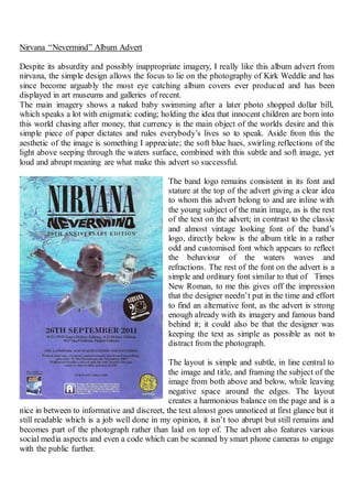
1. Nirvana “Nevermind” Album Advert
Despite its absurdity and possibly inappropriate imagery, I really like this album advert from
nirvana, the simple design allows the focus to lie on the photography of Kirk Weddle and has
since become arguably the most eye catching album covers ever produced and has been
displayed in art museums and galleries of recent.
The main imagery shows a naked baby swimming after a later photo shopped dollar bill,
which speaks a lot with enigmatic coding; holding the idea that innocent children are born into
this world chasing after money, that currency is the main object of the worlds desire and this
simple piece of paper dictates and rules everybody’s lives so to speak. Aside from this the
aesthetic of the image is something I appreciate; the soft blue hues, swirling reflections of the
light above seeping through the waters surface, combined with this subtle and soft image, yet
loud and abrupt meaning are what make this advert so successful.
The band logo remains consistent in its font and
stature at the top of the advert giving a clear idea
to whom this advert belong to and are inline with
the young subject of the main image, as is the rest
of the text on the advert; in contrast to the classic
and almost vintage looking font of the band’s
logo, directly below is the album title in a rather
odd and customised font which appears to reflect
the behaviour of the waters waves and
refractions. The rest of the font on the advert is a
simple and ordinary font similar to that of Times
New Roman, to me this gives off the impression
that the designer needn’t put in the time and effort
to find an alternative font, as the advert is strong
enough already with its imagery and famous band
behind it; it could also be that the designer was
keeping the text as simple as possible as not to
distract from the photograph.
The layout is simple and subtle, in line central to
the image and title, and framing the subject of the
image from both above and below, while leaving
negative space around the edges. The layout
creates a harmonious balance on the page and is a
nice in between to informative and discreet, the text almost goes unnoticed at first glance but it
still readable which is a job well done in my opinion, it isn’t too abrupt but still remains and
becomes part of the photograph rather than laid on top of. The advert also features various
social media aspects and even a code which can be scanned by smart phone cameras to engage
with the public further.