
Recommended
More Related Content
What's hot
What's hot (20)
Similar to Magazine 5th draft & reflection
Similar to Magazine 5th draft & reflection (20)
Recently uploaded
Recently uploaded (20)
Magazine 5th draft & reflection
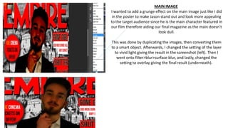
- 1. MAIN IMAGE I wanted to add a grunge effect on the main image just like I did in the poster to make Jason stand out and look more appealing to the target audience since he is the main character featured in our film therefore aiding our final magazine as the main doesn't look dull. This was done by duplicating the images, then converting them to a smart object. Afterwards, I changed the setting of the layer to vivid light giving the result in the screenshot (left). Then I went onto filter>blur>surface blur, and lastly, changed the setting to overlay giving the final result (underneath).
- 2. SKYLINE I decided to make a few changes to the skyline in particular, colour schemes to make our final magazine colour schemes more consistent otherwise they wouldn't match. I matched the 'leak' with the film title in red, and the made the film title 'My friend Dahmer' in white to stand out the most in the skyline because it's what Empire magazines like to do when featuring other films. It is their way of promoting a film effectively as possible to their audience so it can catch their eye.
- 3. COVER LINES Cover lines needed improvement the most as we were featuring very old movies in our magazine that were released over 5 years ago such as Inception and Shutter Island. To amend this, I had to change them to recent 2017/2018 thriller films and thought it would be good for our final magazine because the audience we are targeting are a younger audience and will be discouraged by old movies they probably aren't interested in seeing, whereas new movies will entice them a bit more impacting the final piece.
- 4. I changed the wording of the banner from 'Revealed scenes from the Lucifer Effect' to 'Revealed – behind the scenes with director Alex Evdokimov. My intention of doing this was to get my audience to get closer by getting to know more about the upcoming directors. This also aids the outcome of my magazine because it will encourage the audience to go and watch the film because they can see scenes which may reveal parts of the plot to the audience
- 5. One more change I made to my magazine was the colour of the urban background. I made it much more brighter by working with hue and saturation so it wouldn't interfere with the spotlight of the main image because at first both colour schemes were similar as I placed a grey background on top of the original background making the main image look useless. But now I would say it looks much better in my final magazine because there is a clear difference in colour between the main image and the background. Before Now