
Recommended
More Related Content
What's hot
What's hot (20)
Similar to Steps that have been used to create the advert.
Similar to Steps that have been used to create the advert. (20)
Recently uploaded
Recently uploaded (20)
Steps that have been used to create the advert.
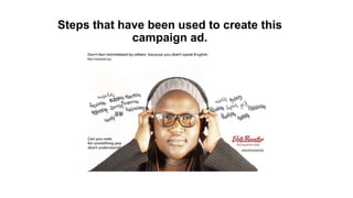
- 1. Steps that have been used to create this campaign ad.
- 2. One of the first step that I have doe was to make a layout and a template of how would the writing and the font look like in our advert. • I have used a ruler on a Photoshop to create the each of the four corners that will be used to be put on billboard. The reason for it is that if we to print the advert the words wont be cut of from the edges. Therefore by making space frame corners were useful. • Then we thought of the word that will be written in multiple languages and put it in a sort of a cloud from the both sides of the ad. The word that we have used was ‘election’.
- 3. The second step was to do the same thing on the illustrator in order to get our font in more high defined pixels which will make the HD font which will make our advert to look HD and more professional. We were meant to do each word separately which would be later be saved as a PNG file which at the end will be placed into the Photoshop. It was the first time when I have used Illustrated therefore I Had needed more time to practice in order to take out the most of the editing programme which would benefit the overall quality of the advert.
- 4. the next and most important step to create the advert was to take the photographs of our models. Each team member had to take their own photo which will make everything fair and show that all member are putting the same effort into the work. I have instructed my model to place her hands on headphones and look into the camera with the least facial expression possible which will make her look slightly thoughtless and confused. This was perfect as the main aim of the campaign is to show that because not all citizens of the United Kingdom know English , the 51% of the population would be confused as they do not know anything about the voting system and neither do they understand the reason why the are voting for the chosen party. the reason why I have decided that background should be white is for the wording that will be placed later on the photoshop to be clear and bold. And for the audience to see it clearly.
- 5. After getting all the needed files into HD , the ending step was to put everything together and save it as a JPEG file . which makes the advert ready to be print for the billboard. The Vote Booster logo was chosen to be in red because it will match the headphones wires , and makes the overall image more put together, finally it will just stand out for the audience as it is the source for the additional information.