Post - production
Canon journey campaign
The process I came/went through
The process started with me sorting images which ones would work
and which ones didn’t work. Then I since I didn’t have adapter I
uploaded all my files into google drive folder titled - Robins work in
this fine contained the pictures I was going to use then I edited these
files in photoshop adding certain colours or changing the saturation
doing 3 or 4 of these formats one with a slogan and some with a logo
of canon.
How did I select suitable images and discarding
others?
Well for starters I selected which images I thought
would work well with each other and went off that
some of the images are similar or the exact same so I
wanted images that would be clear and HD with
different setting and locations to fit into the journey
bubble having 9 or so very different images work
wonders in a print advert so finding suitable images
was easy I picked out some of the best and turned those
into select print adverts.
EXAMPLE 1 ^ EXAMPLE 2 ^
What did you do with the software to get them into
suitable design?
Well for started I obviously dragged them into
photoshop but it didn’t work in the normal sense then I
clicked the contact sheet button to create the storyboard
plan I talked about earlier in the pre production
element. After I import each image into a square within
in the same resolution and I had to change the colour
and add a logo to get them into the suitable design for a
print advert.
My process in creating a
print advert
What I did/why/how
SCREEN CAPTURES OF MY PROCESS
THE PROCESS I WENT THROUGH
EXPEREMENITNG/ CHANGES/ OUTCOMES
Firstly I started with after formatting the contact sheet dimensions ( W=4961mm H=3508mm) after that I
looked at what I could do and I decided to mess with some of the tools on the left hand side I went with one tool
for my print advert the rectangular marquee tool (M) which lets you select any rectangular shape and change the
properties in that selected square then after doing that I wanted to change the colours to make it look better
instead of just beige or grey colours so I went to edit: adjustments and there was Hugh/saturation and that
allowed me to change the colours and brightness to make the selected images look much better and brighter one
by one I repeated the process changing the colours until I got to the final images making sure I was happy with
the colours and tones in each dimension then I added the canon logo at the end to establish the campaign
finishing with a slogan of my choice which fitted into a positive manner.
Different versions and
outcomes
What I did/why/how
Experimenting
Canon example 1#
This is just one of many of my
canon posters in this one I think this
one is successful because of its
colours and its simplicity of just
vibrant colours but still appealing to
the canon brief.
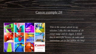
Canon example 2#
This is the second advert in my
selection I like this one because of its
colour range and its slogan. I think
this is successful because its codes and
conventions art in line within the brief
Canon example 3#
This is my 3rd advert I
created as you can see its
black and white that’s why
its so appealing I think its
successful because of its no
colour and the logo in a
bold red I think its fits into
a print advert nicely
Canon example 4#
This is 4th advert I created I
personally like this one
because of its monotone look
but I don’t think its quite
successful because of its bland
look it doesn’t quite catch the
eye enough but I think it all
fits together.
Canon example 5#
This is the 5th example of my
adverts I like this one of its
different to the other its
landscape offers a change in
advert I also think this is
successful because of its colours,
message and simplicity.
Canon example 6#
This is my 6th advert and
final advert in my opinonthis
is like the other one but with
a slogan I still like this one
and also think this is
successful because its meeting
the codes and conventions of
a brief but different enough
to attract attention.
Feedback
This is the feedback for the 6 adverts I did to find out
certain opinions and thoughts.
This was the feedback I gathered
to find out people opinions on
which adverts were successful or
which ones weren’t and why?
IN CONCLUSION
The varied work I presented with the 6 different adverts I have gathered feedback and what was successful
and which ones weren’t and why?. From this specific feedback people have said that the black and white
versions weren’t successful because of they're bland and they don’t grab your attention. Also people said that
any poster with colour was successful specifically 5, 2 and 6 I also agree with these choices because they are
good adverts and bring ur attention. In my final opinion I think Canon poster (1) is the most successful its
simple grabs your attention and appealing whilst sticking to the codes and conventions.
CANON POSTER (1)
Canon poster (1) will
be my final product.

Post - production (canon)

  • 1.
    Post - production Canonjourney campaign
  • 2.
    The process Icame/went through The process started with me sorting images which ones would work and which ones didn’t work. Then I since I didn’t have adapter I uploaded all my files into google drive folder titled - Robins work in this fine contained the pictures I was going to use then I edited these files in photoshop adding certain colours or changing the saturation doing 3 or 4 of these formats one with a slogan and some with a logo of canon.
  • 3.
    How did Iselect suitable images and discarding others? Well for starters I selected which images I thought would work well with each other and went off that some of the images are similar or the exact same so I wanted images that would be clear and HD with different setting and locations to fit into the journey bubble having 9 or so very different images work wonders in a print advert so finding suitable images was easy I picked out some of the best and turned those into select print adverts. EXAMPLE 1 ^ EXAMPLE 2 ^
  • 4.
    What did youdo with the software to get them into suitable design? Well for started I obviously dragged them into photoshop but it didn’t work in the normal sense then I clicked the contact sheet button to create the storyboard plan I talked about earlier in the pre production element. After I import each image into a square within in the same resolution and I had to change the colour and add a logo to get them into the suitable design for a print advert.
  • 5.
    My process increating a print advert What I did/why/how
  • 6.
  • 7.
    THE PROCESS IWENT THROUGH EXPEREMENITNG/ CHANGES/ OUTCOMES Firstly I started with after formatting the contact sheet dimensions ( W=4961mm H=3508mm) after that I looked at what I could do and I decided to mess with some of the tools on the left hand side I went with one tool for my print advert the rectangular marquee tool (M) which lets you select any rectangular shape and change the properties in that selected square then after doing that I wanted to change the colours to make it look better instead of just beige or grey colours so I went to edit: adjustments and there was Hugh/saturation and that allowed me to change the colours and brightness to make the selected images look much better and brighter one by one I repeated the process changing the colours until I got to the final images making sure I was happy with the colours and tones in each dimension then I added the canon logo at the end to establish the campaign finishing with a slogan of my choice which fitted into a positive manner.
  • 8.
    Different versions and outcomes WhatI did/why/how Experimenting
  • 9.
    Canon example 1# Thisis just one of many of my canon posters in this one I think this one is successful because of its colours and its simplicity of just vibrant colours but still appealing to the canon brief.
  • 10.
    Canon example 2# Thisis the second advert in my selection I like this one because of its colour range and its slogan. I think this is successful because its codes and conventions art in line within the brief
  • 11.
    Canon example 3# Thisis my 3rd advert I created as you can see its black and white that’s why its so appealing I think its successful because of its no colour and the logo in a bold red I think its fits into a print advert nicely
  • 12.
    Canon example 4# Thisis 4th advert I created I personally like this one because of its monotone look but I don’t think its quite successful because of its bland look it doesn’t quite catch the eye enough but I think it all fits together.
  • 13.
    Canon example 5# Thisis the 5th example of my adverts I like this one of its different to the other its landscape offers a change in advert I also think this is successful because of its colours, message and simplicity.
  • 14.
    Canon example 6# Thisis my 6th advert and final advert in my opinonthis is like the other one but with a slogan I still like this one and also think this is successful because its meeting the codes and conventions of a brief but different enough to attract attention.
  • 15.
    Feedback This is thefeedback for the 6 adverts I did to find out certain opinions and thoughts. This was the feedback I gathered to find out people opinions on which adverts were successful or which ones weren’t and why?
  • 16.
    IN CONCLUSION The variedwork I presented with the 6 different adverts I have gathered feedback and what was successful and which ones weren’t and why?. From this specific feedback people have said that the black and white versions weren’t successful because of they're bland and they don’t grab your attention. Also people said that any poster with colour was successful specifically 5, 2 and 6 I also agree with these choices because they are good adverts and bring ur attention. In my final opinion I think Canon poster (1) is the most successful its simple grabs your attention and appealing whilst sticking to the codes and conventions. CANON POSTER (1) Canon poster (1) will be my final product.