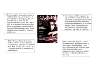
1. • The font used for the masthead is quite a
• The front cover of this magazine has
bold font which can connote the type of
kept to the three colour schemes, the
genre which is in the magazine, I’m not
reason why good magazine designer do
sure what type of genre is in the
this to make sure that the magazine is
magazine but I would guess that it pop or
eye catching and appealing to the target
rock. At the bottom of the magazine there
audience. When magazine use more
are list of typefaces in a different font to
than 3 colours it makes them look
the rest of the fonts which is quite simple
unattractive and make the page look
mistake I think you should be consistent
very busy.
with the font.
• Half of the mans face is blurred into I have noticed that there isn’t a lot of
black background which is symbolic text which draws the target audience to
for a mysterious figure you can see half the image in the background. This I
of his body. The guy looks like he’s in very important because the image is the
a recording studio so he must be a solo main focal point of any good
artist I assume. magazine, you obviously need text but
text can be off putting when there is
too much.