
Recommended
More Related Content
What's hot
What's hot (19)
Viewers also liked
Viewers also liked (20)
Similar to Front Cover Design Changes for Indie Music Magazine
Similar to Front Cover Design Changes for Indie Music Magazine (20)
More from jennyriceasmedia
More from jennyriceasmedia (7)
Recently uploaded
Recently uploaded (20)
Front Cover Design Changes for Indie Music Magazine
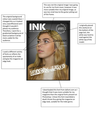
- 1. This was not the original image I was going to use for my front cover; however it was more suitable then my original image, as was too small due to the guitar jutting out of the frame. I originally placed this starburst at the bottom of the page but, the white was hard to read against the white top of the model. The orignial background colour was a pastel blue. I changed this as it looked very unproffesional and I thought it wouldn’t please my audience. Therefore, I went for a gradiented background of black as belive it wil be more uiable for the audience. I downloaded this font from dafont.com as I thought that it was more suitable for my magazine than the original fonts present on Photoshop. I chose this font resembled a death threat thus giving the magazine an edgy look, suitable for the Indie genre. I used a different variety of fonts as reflects the spontaneity of an Indie and give the magazine an edgy look.