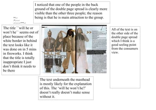
1. I noticed that one of the people in the back
ground of the double page spread is clearly more
visible than the other three people; the reason
**-+ being is that he is main attraction to the group.
/*/-+-+
-++-+-+***-+
**
The title ``will he or All of the text is on
won’t he`` seems out of the other side of the
place because of the double page spread
white border in behind which I think is a
the text looks like it good seeling point
was done on in 5 mins from the consumers
in fireworks. I think view.
that the title is totally
inappropriate I just
don’t think it needs to
be there
The text underneath the masthead
is mostly likely for the explanation
of this. The ‘will he won’t he?’
doesn’t really doesn’t make sense
without it.