
Recommended
More Related Content
What's hot
What's hot (18)
Viewers also liked
Viewers also liked (20)
More from RobertBarwood
Recently uploaded
Recently uploaded (20)
College Mag Inspiration
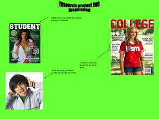
- 1. I chose to use a similar font to this due to its boldness I chose to take this layout for my cover lines research project two inspiration I will be using a medium Close up shot for my cover
- 2. I have chosen to lay out my contents page In a similar way to this one because the cover lines are very simple. However I will add more detail to my cover lines. I looked at this contents page but decided later that the left hand side was to busy and dull for my type of magazine. However I enjoyed this type of font and may use a similar font to this.