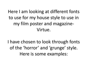
1. Here I am looking at different fonts
to use for my house style to use in
my film poster and magazine-
Virtue.
I have chosen to look through fonts
of the ‘horror’ and ‘grunge’ style.
Here is some examples:
2.
3.
4.
5.
6. This one is very simple to read. It looks like a strong font to use but I don’t like
the ‘drippy’ bits. I think it will be too distracting if the photo is detailed.
7. I like this font as it looks like it’s been scratched in. But I feel like that may be going
too much into the horror style which I want to get away from.
8. I took a liking to this font as the pattern on the text is tree bark which
incorporates with my film as the first few scenes will be shot in a forest.
9. Here is an example of my chosen font at this
moment in time I might change it in the future
but I think that it is the most effective that I
have seen: