1. When I was reading
this double page
spread it occurred to
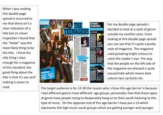
me that there isn’t a For my double page spreads I
clear indication of a decided to look at a style of genre
title but on closer outside my comfort zone. From
inspection I found that looking at this double page spread
the ‘’Radar’’ was the you can see that it’s quite a punky
most likely thing to be style of magazine. The magazine
the title. I think the used pulsating bright colours to
title thing I clear catch the reader’s eye. The way
enough for a magazine that the people on the left side of
of this standard, the the magazine are dressed is quite
good thing about the casual/indie which means dark
title is that it’s san serif colours lace up boots etc.
making it easier to
read. The target audience is for 13-30 the reason why I chose this age barrier is because
I feel different genres have different age groups, personally I feel that these types
of genre have people trying to desperately hang on to their youth listening to this
type of music. On the opposite end of this age barrier I have put a 13 which
represents the high music social groups which are getting younger and younger.