
Recommended
More Related Content
What's hot
What's hot (17)
Viewers also liked
Similar to Font & layout choices give magazine identity
Similar to Font & layout choices give magazine identity (20)
Font & layout choices give magazine identity
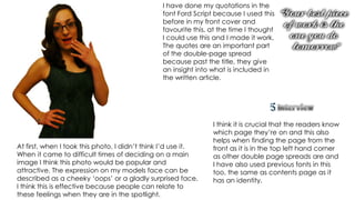
- 1. I have done my quotations in the font Ford Script because I used this before in my front cover and favourite this, at the time I thought I could use this and I made it work. The quotes are an important part of the double-page spread because past the title, they give an insight into what is included in the written article. I think it is crucial that the readers know which page they’re on and this also helps when finding the page from the At first, when I took this photo, I didn’t think I’d use it. front as it is in the top left hand corner When it came to difficult times of deciding on a main as other double page spreads are and image I think this photo would be popular and I have also used previous fonts in this attractive. The expression on my models face can be too, the same as contents page as it described as a cheeky ‘oops’ or a gladly surprised face. has an identity. I think this is effective because people can relate to these feelings when they are in the spotlight.
- 2. I used a regular Microsoft Office font for this as it is recognisable and much simpler to make this text chunk. I left it black even though the main article I have favoured this font style throughout is black I am relying on the font to detach it. the making of my magazine as it looks like a possible signature it gives the text a personal touch. This was aiming to go in the top The main article of text is also a centre of the pages as it identifies the regular Microsoft Office make; article and where that name is seen the Verdana. I have used this font popularity should follow. because I didn’t feel the need for there to be some fancy font as This was my fourth and final image. reader would want something The expression on her face is a understandable with that amount daring, cheeky and perhaps curious of text. I didn’t make a specific look because we usually see in background for the article as cartoons, for example, if a character other magazine have done is thinking then they have their finger because the page is a pale blue to the side of their mouths. I felt I anyway so I didn’t think I would needed this photo because as we need it. have seen a few other photos this one shows another side of my