KAHULUGAN AT KAHALAGAHAN NG GAWAING PANSIBIKO.pptx
Front 2
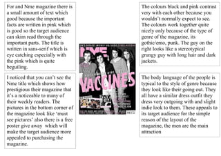
1. For and Nme magazine there is The colours black and pink contrast
a small amount of text which very with each other because you
good because the important wouldn’t normally expect to see.
facts are written in pink which The colours work together quite
is good so the target audience nicely only because of the type of
can skim read through the genre of the magazine, its
important parts. The title is gothic/emo, punk. The guy on the
written in sans-serif which is right looks like a stereotypical
eye catching especially with grungy guy with long hair and dark
the pink which is quite jackets.
beguiling.
I noticed that you can’t see the The body language of the people is
Nme title which shows how typical to the style of genre because
prestigious their magazine that they look like their going out. They
it’s a noticeable to many of all have a similar dress outfit they
their weekly readers. The dress very outgoing with and slight
pictures in the bottom corner of indie look to them. These appeals to
the magazine look like ‘must its target audience for the simple
see pictures’ also there is a free reason of the layout of the
poster give away which will magazine, the men are the main
make the target audience more attraction
appealed to purchasing the
magazine.