
Recommended
More Related Content
Similar to Magazine Analysis
Similar to Magazine Analysis (20)
More from tamarambrown
More from tamarambrown (16)
Recently uploaded
Recently uploaded (20)
Magazine Analysis
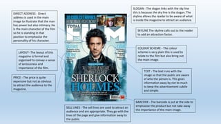
- 1. SELL LINES - The sell lines are used to attract an audience and are appropriate. They go with the lines of the page and give information away to the public. TEXT - The text runs with the image so that the public are aware of who the person is. This gives information away by not to much to keep the advertisement subtle and simple. COLOUR SCHEME - The colour scheme is very plain this is used to relate to the film but also bring out the main image. LAYOUT- The layout of this magazine is formal and organised to convey a sense of seriousness and importance of the film. DIRECT ADDRESS - Direct address is used in the main image to illustrate that the man has power but also intimacy. He is the main character of the film so he is standing in that position to emphasise the personality of his character. BARCODE - The barcode is put at the side to emphasise the product but not take away the importance of the main image. PRICE - The price is quite expensive but not as obvious to attract the audience to the magazine. SLOGAN - The slogan links with the sky line this is because the sky line is the slogan. The skyline allows the reader to be aware of what is inside the magazine to attract an audience. SKYLINE The skyline calls out to the reader to add an attraction factor.