DEV meet-up UiPath Document Understanding May 7 2024 Amsterdam
Mag analysis
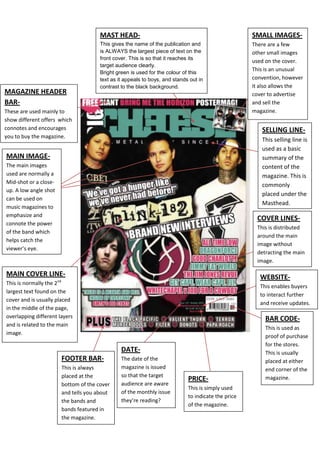
1. SMALL IMAGES-There are a few other small images used on the cover. This is an unusual convention, however it also allows the cover to advertise and sell the magazine.MAST HEAD-This gives the name of the publication and is ALWAYS the largest piece of text on the front cover. This is so that it reaches its target audience clearly. Bright green is used for the colour of this text as it appeals to boys, and stands out in contrast to the black background.<br />990600763270<br />MAGAZINE HEADER BAR-These are used mainly to show different offers which connotes and encourages you to buy the magazine.<br />MAIN IMAGE-The main images used are normally a Mid-shot or a close-up. A low angle shot can be used on music magazines to emphasize and connote the power of the band which helps catch the viewer’s eye.FOOTER BAR-This is always placed at the bottom of the cover and tells you about the bands and bands featured in the magazine.WEBSITE-This enables buyers to interact further and receive updates.COVER LINES-This is distributed around the main image without detracting the main image.SELLING LINE-This selling line is used as a basic summary of the content of the magazine. This is commonly placed under the Masthead.MAIN COVER LINE-This is normally the 2nd largest text found on the cover and is usually placed in the middle of the page, overlapping different layers and is related to the main image.BAR CODE-This is used as proof of purchase for the stores. This is usually placed at either end corner of the magazine.DATE-The date of the magazine is issued so that the target audience are aware of the monthly issue they’re reading?PRICE-This is simply used to indicate the price of the magazine.<br />-285752238375<br />Most of the writing used in this contents page is bold as it helps connote a tough look.No main image is used for this contents page, however normally there would be. By not doing so this connotes a masculine and rebellious look to the article.The traditional palette of 3 is used as the colours connote a masculine theme, suiting its target audience.The use of page numbers is extremely helpful as it organises the magazine, making it easier for the readers to read.The contents always include an image of the main band which also appears on the front cover, to connote repetition, making it stand out.The pictures are spread out randomly to emphasize the rebellious look, as it is aimed at boys.This contents page is used as a double spread page, and connotes a more formative and descriptive.30956251905635<br />2762250362585-247650362585<br />