
Recommended
More Related Content
What's hot
What's hot (20)
Similar to Cover analysis
Similar to Cover analysis (20)
Recently uploaded
Recently uploaded (20)
Cover analysis
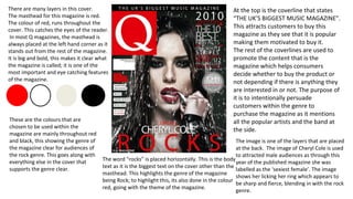
- 1. There are many layers in this cover. The masthead for this magazine is red. The colour of red, runs throughout the cover. This catches the eyes of the reader. In most Q magazines, the masthead is always placed at the left hand corner as it stands out from the rest of the magazine. It is big and bold, this makes it clear what the magazine is called; it is one of the most important and eye catching features of the magazine. At the top is the coverline that states “THE UK’S BIGGEST MUSIC MAGAZINE”. This attracts customers to buy this magazine as they see that it is popular making them motivated to buy it. The rest of the coverlines are used to promote the content that is the magazine which helps consumers decide whether to buy the product or not depending if there is anything they are interested in or not. The purpose of it is to intentionally persuade customers within the genre to purchase the magazine as it mentions all the popular artists and the band at the side. The word “rocks” is placed horizontally. This is the body text as it is the biggest text on the cover other than the masthead. This highlights the genre of the magazine being Rock; to highlight this, its also done in the colour red, going with the theme of the magazine. These are the colours that are chosen to be used within the magazine are mainly throughout red and black, this showing the genre of the magazine clear for audiences of the rock genre. This goes along with everything else in the cover that supports the genre clear. The image is one of the layers that are placed at the back. The image of Cheryl Cole is used to attracted male audiences as through this year of the published magazine she was labelled as the ‘sexiest female’. The image shows her licking her ring which appears to be sharp and fierce, blending in with the rock genre.
- 2. The masthead is placed vertically down the side of the cover. There are very few layers in this magazine compared to a Q magazine cover. The colour of the masthead is to match with the shade of Taylor Swift’s hair colour. This makes it effective and eye catching for consumers. Below the masthead is a small print of text, stating the month the magazine was issued and the magazine website. This information is at a small print as it is not the importance of the magazine and as it tries to draw attention to the only coverline on the cover, which states “2014 Taylor Swift Woman of the year”. The coverline, being the only coverline on the magazine is effective Taylor Swift having to be really successful in the year of 2014. For audiences, it attracts those within the pop genre and intrigues the consumers to purchase and find out why she is woman of the year as this is exaggerated as the biggest news in magazine. The main image is Taylor Swift. She is the face of the cover as the majority of the magazine cover is about her and mostly her image. This sets the pop genre to the magazine. The cover as a whole is set in a tone of colour. The background colour and the colour of the model’s eye match. For audiences this is extremely eye catching as it draw the audiences into the magazine. These colours are the colours that are used throughout the cover. These are used as they are eye catching to the reader as they look at the masthead and it goes with the model’s hair and the background colour goes with their eyes. The magazine coming across fairly simple is attracting.
- 3. The masthead is placed at the left hand side of the cover. This is so that consumers clearly know that it is an ID magazine straight away. The magazine is a neutral colour; the yellow box with the masthead helps to the masthead stand out more than it would if it was not there due to the neutral colours occurring in the cover. Within the masthead, it mentions what type of stuff that would be included in the magazine. This is different to other magazines as most magazines would normally place one or more coverlines to do with what will be included within the magazine. However this is kept very brief and not specific. There is one coverline placed at the bottom saying “play loud”. This makes readers very intrigued to know what “play loud” means in the context of the magazine therefore this will attract consumers to purchase the magazine. Though “play loud” also informs the consumers that the magazine consumes of music. It also attracts young audience as the term “play loud” would associate with them, in anyway and with them having fun as young people. The main image is Rihanna, a very popular pop star. It is placed central within the magazine. The image automatically sets the genre to pop and a young audience from 16-25. The magazine follows the Z format. As it starts off with the masthead at the corner then goes down to the model’s face then across to the coverline of “play loud”. These colours are used throughout the cover. The background colour is fairly light and neutral, making all the dark colours that are part of the model’s costume stand out. They are contrasting colours as the yellow comes out really bright compared to the rest of the colours. This is used as a technique to attract consumers to purchase the magazine as they are eye catching through the colours used and how simple the cover itself is. This gets straight to the point of what the magazine is about and what's in it without many layers of coverlines.