
Recommended
More Related Content
What's hot
What's hot (19)
Similar to Textual analysis contents
Similar to Textual analysis contents (20)
Recently uploaded
Recently uploaded (20)
Textual analysis contents
- 1. By SaskiaTidey Textual Analysis Contents
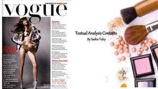
- 2. The san serif font on the contents page is very big and bold. This means it is outlined to the audience very well meaning they are aware of what magazine title they are reading, increasing brand identity, especially if it is repeated through out the whole magazine, so there is a repeated motif. Above the masthead is the date it Is issued making it really clear to the reader when it was addressed and can mean they can easily see it as it is placed at the top of the contents so isn’t hard to find if they want to find this exact issue or put it in the right order. The date is also In a red colour so it easily stands out next to the bold black colour. As the masthead is in the typically top left corner leading out to the right, it is easily spotted and could appeal to higher class people. However in my production I will try to not follow this house style and place my masthead in a different place to make it more unique and not as convectional. I also want it to be bright colours so it catches the eyes of more curious readers and will stand out on the shelves against other magazines.
- 3. This contents page has took the role of only using one main image which is convectional for contents pages, however it is quite plain and smaller other images should be used to draw attention to younger audiences around 16-25 which I my target audience. This could benefit the magazine as it means more affluent people might buy it as there is other events to look at. She is very dominant on the page against the pale grey background. There is a low angle long shot used which makes her look superior as she is kind of looking over and under everyone else, meaning younger people might idolise this model as they aspire to look like her. There is also a lack of clothing which could attract females too, however the magazine could get a bad reputation as she isn’t correctly dressed. This promotes fashion very well as she looks very trendy as she is coordinated with the gold colours and her airbrushed skin coordinates well, making her look very slender and slim which is what Vogue is trying to achieve. The gold colour could connote royalty in a way as it is seen as an expensive colour which could attract higher class people. Also her shoes make a big statement on the page and it fits in with the silver coat she is wearing too adding to how Vogue is trying to approach people with higher budgets.
- 4. The Layout is placed in a convectional way as they are placed in columns of 3 or 4 which you can see here. The same red colour which was used for the date is used for the subtitles which is a reoccurring theme and gives the magazine a simplicity and makes it easy to follow, however I feel like it makes it more classy and not as jumbled around. The layout is good as the main image isn’t covered much meaning it is on show more and is the main feature on the contents page and then reveals the text on the left hand side which means the audience will naturally read from left to right which fits this magazine well as it follows that convection. Also as this issue was released in December the red and grey fit very well as it makes it have a winter theme and would probably sell well, however her outfit doesn’t convey winter season which could put some people off.
- 5. The typography used is serif which adds a formal look to it and makes sure it doesn’t take the attention away from the masthead which would be the first thing audiences see. The colours the font use are very convectional and stand out bright and bold in front of the grey background. There are numbers used which give the magazine a layout and a theme and means the readers can be informed on where to find their other interests without having to flick through lots of other pages. There is also the number of the photo on the bottom right of the page so it is clear where to find it. There is also a whole section on fashion where some san serif text is used to fit in with the fashion sector and adding a more feminine touch to the font. At the bottom left of the contents page, there is a subscribe section which tries to promote their business to try and sell more of their copies which is good and convectional of some magazines. The subscriptions are used here with conventionally an editors letter or other types of information related to the magazine.