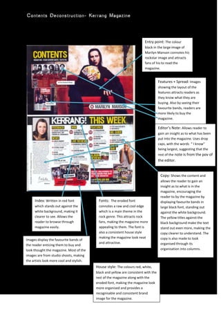
1. Features + Spread: Images showing the layout of the features attracts readers as they know what they are buying. Also by seeing their favourite bands, readers are more likely to buy the magazine.House style: The colours red, white, black and yellow are consistent with the rest of the magazine along with the eroded font, making the magazine look more organised and provides a recognisable and consistent brand image for the magazine.Editor’s Note: Allows reader to gain an insight as to what has been put into the magazine. Uses drop caps, with the words “ I know” being largest, suggesting that the rest of the note is from the pov of the editor.Copy: Shows the content and allows the reader to gain an insight as to what is in the magazine, encouraging the reader to by the magazine by displaying favourite bands in large black font, standing out against the white background. The yellow titles against the black background make the text stand out even more, making the copy clearer to understand. The copy is also made to look organised through its organisation into columns.Images display the favourite bands of the reader enticing them to buy and look thought the magazine. Most of the images are from studio shoots, making the artists look more cool and stylish.Index: Written in red font which stands out against the white background, making it clearer to see. Allows the reader to browse through magazine easily.Fonts: The eroded font connotes a raw and cool edge which is a main theme in the rock genre. This attracts rock fans, making the magazine more appealing to them. The font is also a consistent house style making the magazine look neat and attractive.Entry point: The colour black in the large image of Marilyn Manson connotes his rockstar image and attracts fans of his to read the magazine.0628650<br />