Digipaks and Posters
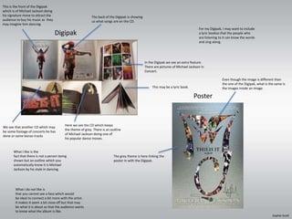
This is the front of the Digipak 
which is of Michael Jackson doing 
his signature move to attract the 
audience to buy his music as they 
may imagine him dancing. 
Digipak 
For my Digipak, I may want to include 
a lyric bookso that the people who 
are listening to it can know the words 
and sing along. 
Poster 
The back of the Digipak is showing 
us what songs are on the CD. 
In the Digipak we see an extra feature. 
There are pictures of Michael Jackson in 
Concert. 
Here we see the CD which keeps 
the theme of grey. There is an outline 
of Michael Jackson doing one of 
his popular dance moves. 
We see that another CD which may 
be some footage of concerts he has 
done or some bonas tracks 
This may be a lyric book. 
The grey theme is here linking the 
poster in with the Digipak. 
Even though the image is different than 
the one of the Digipak, what is the same is 
the images inside an image. 
What I like is the 
fact that there is not a person being 
shown but an outline which you 
automatically know it is Michael 
Jackson by his style in dancing. 
What I do not like is 
that you cannot see a face which would 
be ideal to connect a bit more with the artist. 
It makes it seem a bit close off but that may 
be what it is about so that the audience wants 
to know what the album is like. 
Sophie Scott
For my Digipak I might want to have a l 
ogo as well to label the artist so that if 
the symbol is seem elsewhere the audience 
will know that the artist is involved. 
Poster 
Digipak 
This could be a lyric book for the audience 
to look at and perhaps sing along to when 
they listen to the album. 
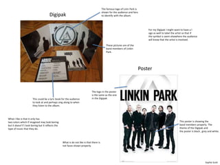
The famous logo of Linin Park is 
shown for the audience and fans 
to identify with the album. 
These pictures are of the 
band members of Linkin 
Park. 
The logo in the poster 
is the same as the one 
in the Digipak 
This poster is showing the 
band members properly. The 
theme of the Digipak and 
the poster is black , grey and white. 
What I like is that it only has 
two colors which if imagined may look boring 
but it doesn't’t look boring but it reflects the 
type of music that they do. 
What is do not like is that there is 
not faces shown properly. 
Sophie Scott
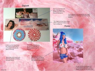
A close up of her face shows 
the audience exactly who is 
on the album and who the 
album is starring. 
There is a track list at the 
back of the Digipak so 
people know what song 
they are listening to. 
For my Digipak I may incorporate the scratch 
and smell CD as I think that would attract the 
audience. 
You can tell that the background 
is off candy floss the same as the 
Digipak, so they link into each other. 
The outfit worn here is 
different than the Digipak. 
She has on different outfits 
with different colored hair. 
Digipak 
Poster 
What I like is the scratch and 
smell CD and that candy floss 
as clouds theme. 
Sophie Scott
Digipak 
Poster 
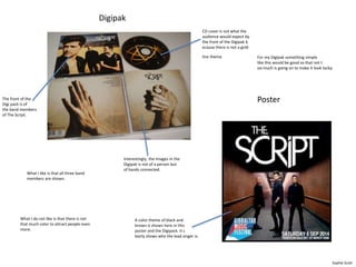
CD cover is not what the 
audience would expect by 
the front of the Digipak b 
ecause there is not a gold 
line theme. 
Interestingly, the images in the 
Digipak is not of a person but 
of hands connected. 
The front of the 
Digi pack is of 
the band members 
of The Script. 
A color theme of black and 
brown is shown here in this 
poster and the Digipack. It c 
learly shows who the lead singer is. 
For my Digipak something simple 
like this would be good so that not t 
oo much is going on to make it look tacky. 
What I like is that all three band 
members are shown. 
What I do not like is that there is not 
that much color to attract people even 
more. 
Sophie Scott

Digipak Powerpoint-Sophie Scott

  • 1.
  • 2.
    This is thefront of the Digipak which is of Michael Jackson doing his signature move to attract the audience to buy his music as they may imagine him dancing. Digipak For my Digipak, I may want to include a lyric bookso that the people who are listening to it can know the words and sing along. Poster The back of the Digipak is showing us what songs are on the CD. In the Digipak we see an extra feature. There are pictures of Michael Jackson in Concert. Here we see the CD which keeps the theme of grey. There is an outline of Michael Jackson doing one of his popular dance moves. We see that another CD which may be some footage of concerts he has done or some bonas tracks This may be a lyric book. The grey theme is here linking the poster in with the Digipak. Even though the image is different than the one of the Digipak, what is the same is the images inside an image. What I like is the fact that there is not a person being shown but an outline which you automatically know it is Michael Jackson by his style in dancing. What I do not like is that you cannot see a face which would be ideal to connect a bit more with the artist. It makes it seem a bit close off but that may be what it is about so that the audience wants to know what the album is like. Sophie Scott
  • 3.
    For my DigipakI might want to have a l ogo as well to label the artist so that if the symbol is seem elsewhere the audience will know that the artist is involved. Poster Digipak This could be a lyric book for the audience to look at and perhaps sing along to when they listen to the album. The famous logo of Linin Park is shown for the audience and fans to identify with the album. These pictures are of the band members of Linkin Park. The logo in the poster is the same as the one in the Digipak This poster is showing the band members properly. The theme of the Digipak and the poster is black , grey and white. What I like is that it only has two colors which if imagined may look boring but it doesn't’t look boring but it reflects the type of music that they do. What is do not like is that there is not faces shown properly. Sophie Scott
  • 4.
    A close upof her face shows the audience exactly who is on the album and who the album is starring. There is a track list at the back of the Digipak so people know what song they are listening to. For my Digipak I may incorporate the scratch and smell CD as I think that would attract the audience. You can tell that the background is off candy floss the same as the Digipak, so they link into each other. The outfit worn here is different than the Digipak. She has on different outfits with different colored hair. Digipak Poster What I like is the scratch and smell CD and that candy floss as clouds theme. Sophie Scott
  • 5.
    Digipak Poster CDcover is not what the audience would expect by the front of the Digipak b ecause there is not a gold line theme. Interestingly, the images in the Digipak is not of a person but of hands connected. The front of the Digi pack is of the band members of The Script. A color theme of black and brown is shown here in this poster and the Digipack. It c learly shows who the lead singer is. For my Digipak something simple like this would be good so that not t oo much is going on to make it look tacky. What I like is that all three band members are shown. What I do not like is that there is not that much color to attract people even more. Sophie Scott