
Recommended
More Related Content
What's hot
What's hot (17)
Similar to Editing my double page spread image
Similar to Editing my double page spread image (20)
Recently uploaded
Recently uploaded (17)
Editing my double page spread image
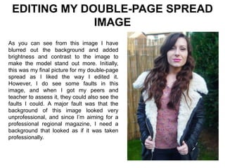
- 1. EDITING MY DOUBLE-PAGE SPREAD IMAGE As you can see from this image I have blurred out the background and added brightness and contrast to the image to make the model stand out more. Initially, this was my final picture for my double-page spread as I liked the way I edited it. However, I do see some faults in this image, and when I got my peers and teacher to assess it, they could also see the faults I could. A major fault was that the background of this image looked very unprofessional, and since I’m aiming for a professional regional magazine, I need a background that looked as if it was taken professionally.
- 2. EDITING MY DOUBLE-PAGE SPREAD IMAGE I transformed my image background into this background to make it look more professional. To do this, I used the ‘Clone Stamp Tool’ to bring the tree’s on the right hand side over to the left-hand side to look like the green tree’s were intentional for the image to be successful. I again asked my peers to assess the image with the changes added to it and they thought it was so much better and looked way more professional. I personally like it better as the background also makes my model stand out much more and focuses purely on her clothes and face.