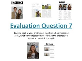
1. Evaluation Question 7
Looking back at your preliminary task (the school magazine
task), what do you feel you have learnt in the progression
from it to your full product?
2. The first, most prominent thing I feel that I have learnt in the progression of my school product to my final
product is the importance of the images. This is especially true for the mise en scene of the photos. Just having a
plain background in all the photos in the magazine can make it look extremely dull and boring. Looking back on
my preliminary task it is evidently clear that it should have had some sort of interesting feature to the photos to
massively improve the look of them, and I feel I definitely made the right choice varying the mise en scene for
my final product. I also noticed that I did not actually adapt the photos before finalising my preliminary magazine
(e.g cropping and resizing.) This left them having a lot of background instead of cropping them down so that the
people were larger in the frame. As well as this, one of the photos is not centred. I learnt that the photo should
always be centred unless done on purpose otherwise the framing looks wrong and unprofessional.
There has also been a large improvement in my images because I have learnt how to style my artists; this
includes hair, clothes and make up. With my preliminary magazine I did not instruct my models on what to wear
or how to do their hair which left them looking quite plain and not really how professional models would look. It
also meant I was not reaching the target audience it was aimed at (school kids) as they did not look as though
they were school ready. This would result in a decrease in buyers of my magazine. However, with my final
magazine I chose the outfits, showed my main female model how I wanted her make up, and instructed them
both on how I wanted their hair all so that they matched with the indie/alternative genre of the magazine. This
way the magazine did not confuse my audience on what genre it was and my artists look the part.
My directing skills also improved in the progression from my preliminary product to my final one. When taking
the photos for my preliminary magazine I didn’t give enough input when trying to direct my model on what to
do. This left me with photos that did not look professional and in fact looked quite plain and boring. However by
the time I had come to take my final magazine photos I learnt to be much more confident in directing my models
and ended up with better positioning of photos.
Images (mise en scene & camerawork):
3. From my preliminary product to my final product I feel I have learnt which fonts to use and not to use as some
look much more professional and suited on the page. I wanted my final idea to reflect a real magazine as much
as possible. For example, on my preliminary magazine and even my draft magazine, the masthead was not a
thick, bold font like a lot of magazines have, meaning I was not grabbing the full attention of my audience. It
also made it look unprofessional and boring. So I decided to change my masthead to one similar to other indie
magazines such as NME and Faded, but I wanted it to be slightly different and so went on the website DaFont
and found ‘VTKSWORKER’ which I thought suited my magazine perfectly and also gave a unique edge to it.
The bulk of text on my cover between the preliminary magazine and final magazine was fairly similar as I did
not want to have very much on them. However I feel that the positioning of the text was a big improvement as
on my preliminary the text was randomly placed and ended up slightly obstructing the image, making it look
out of place on the page. I feel I have learnt how to position text so that it has the same effect without taking
concentration off of the main image or any other aspects of the page.
I feel the layouts between the preliminary magazine and final magazine allowed me to learn how to make my
product stand out as much as it could. For example, on my preliminary I had the image covering the whole
page with the masthead over the top. Although the masthead was positioned in the right place, having it on a
grey background impacted the level to which it stood out. Therefore for my final product I set the masthead on
a plain white background which enhanced the boldness of it and made it stand out much more.
Texts and Layouts