1. MAGAZINE FRONT COVER
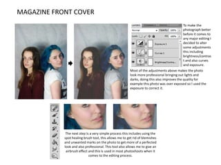
Most of the adjustments above makes the photo
look more professional bringing out lights and
darks, doing this also improves the quality for
example this photo was over exposed so I used the
exposure to correct it.
To make the
photograph better
before it comes to
any major editing I
decided to alter
some adjustments
this including
brightness/contras
t and also curves
and exposure.
The next step is a very simple process this includes using the
spot healing brush tool, this allows me to get rid of blemishes
and unwanted marks on the photo to get more of a perfected
look and also professional. This tool also allows me to give an
airbrush effect and this is used in most photoshoots when it
comes to the editing process.
2. MAGAZINE DOUBLE PAGE SPREAD
After doing the adjustments in
the previous slide I then look into
more of the minor details within
the photograph because when these minor changes are
edited they make a major difference in the photo and it
works really well.. To start off I decided to bring the light and
dark features of the face out more to structure there face a
bit more because when it comes to a professional standard
this is what would be done. I brought out the light features
using the dodge tool for example I did this under the
eyebrows, under the cheekbones just to bring the natural
features out of the model. I then used the burn tool to
bring out all the dark features for example this would be the
cheek bones to create a better structure on the face and also
use it for the eyebrows and eyelashes to darken the hair so
they stand out a bit more.
Looking at the top images to the right this shows a before and after of using the
clone tool to make the top of my models head more perfected. This tool allows
you too basically copy and paste with a brush motion to make it look more
effective. For example if you look a lot closer at some of my images in my
magazine around the hair there's a lot of frizz and this clone tool allows me to
copy a similar area and to basically brush the background onto the area you
want.
3. DOUBLE PAGE SPREAD ADDITIONAL PHOTOS
The photos below are before and afters of my
editing process, I put them side by side to
compare the different and see differences and
how much more effective my adjustments make
it. For example from the adjustments I have
made you can tell on the photos below that it
looks a lot more high defined and better to look
at. It brings out more of the colours used and
also using the dodge and burn tool that allow me
to structure the face a lot more and again this
defines it like I mentioned earlier.
This image was done exactly the same but with
minor improvements because of how the
photograph originally came out. The same was
done with the whole exposure,
brightness/contrast and curves. Also Because the
theme of my magazine was blue I decided to edit
the models eyes slightly bluer and I did this using
layers and selecting the area of the eyes and
then making them blue changing the opacity so
it looks more realistic.