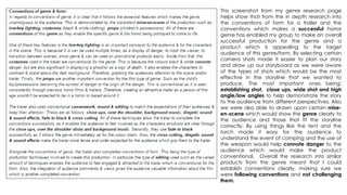
1. This screenshot from my genre research page
helps show that from the in depth research into
the conventions of form for a trailer and the
conventions which makes a successful horror
genre has enabled my group to make an overall
successful production for the genre and a
product which is appealing to the target
audience of this genre/form. By selecting certain
camera shots made it easier to plan our story
and draw up our storyboard as we were aware
of the types of shots which would be the most
effective in the storyline that we wanted to
produce. The most important ones being:
establishing shot, close ups, wide shot and high
angle/low angles to help demonstrate the story
to the audience from different perspectives. Also
we were also able to drawn upon certain mise-en-
scene which would show the genre clearly to
the audience and those that fit the storyline
correctly. By using things like the tent and the
torch made it easy for the audience to
understand the event of camping and the use of
the weapon would help connote danger to the
audience which would make the product
conventional. Overall the research into similar
products from the genre meant that I could
establish conventions clearly, making sure we
were following conventions and not challenging
them.
2. Analysis of trailer
Mise-en-scene
From the previous slide it is clear that we are following certain conventions needed for a successful
horror trailer as we use low key lighting throughout our trailer. From the use of technology Adobe
Premiere it allowed us to tint the footage that we had filmed to create a dark effect & increase
the impact that the surroundings had on the audience. The use of low key lighting is a convention
for the horror genre as the use of dark colours has significant connotations that the audience are
aware of such as danger. This therefore shows us following correct conventions as our trailer is dark
throughout, therefore connoting danger and gripping the audience to the trailer as they wouldn’t
know what is coming next.
Another convention that we have followed due to the research into the genre is the use of dark
clothing for the characters. This shows us to be following conventions & not challenging them as
we are able to create a significantly larger impact on the audience as we connote danger in a
variety of ways. The use of dark clothing allows some characters to stand out in certain scenes
against specific props used, but also the use of the clothing would relate to the location as they
wouldn’t be seen in the woods in which would make the audience fear for the characters safety.
Also this screenshot shows that we have used specific props which relate to the storyline that our
trailer is telling. This would appeal to our target audience as they like to see specific props as they
are able to understand the story and are able to associate themselves with the characters events.
Low key lighting
Conventional location
Low key lighting
Specific props
Dark clothing
Conventional location
Low key lighting
This screenshot helps show that we have researched into a lot of horror genres and looked into
locations which are used most frequently. From watching Cabin in the Woods and The Conjuring it
is clear that the use of woods are successful in telling a horror story. The woods location is
successful as it is relatable to a horror genre target audience as they may have visited woods
before. This would therefore make the audience evoke emotion for the characters as walking
around the woods at night are known to be dangerous. Also, the use of the woods will help create
tension as the audience will not be able to see what is around the woods & therefore would want
to carry on watching the film. We also chose the location due to its size against the characters &
due to the darkness that it created. This would help show the characters to be vulnerable & for the
audience to sympathise with them.
3. From this screenshot it shows that we have followed conventions due to the use of young
characters, who would appeal to the target audience. From finding this convention within Scream
and the Conjuring as they used young characters to help connect the audience with the story this
led to us using characters around the same age of our target audience. This would make our trailer
successful as the audience would be able to associate with the characters adventurous behaviour
and the event that they are embarking in. Also within this shot it shows that we have used a
character who causes conflict within the story. This is conventional as all horror films include a
character which results in problems within the story. This would be conventional for the genre and
appealing for the audience as the character would cause a lot of tension and fear for the
audience, which in turn would encourage them to watch the film. In terms of the costume we may
challenge conventions as the characters which cause the horror are normally wearing white to
connote death/danger to which our character doesn’t. However he is able to stand out –
regardless of the white costume due to the mysterious effect that the woods create.
Conventional characters
From research into the genre and the audience I found that the audience liked a scene
which was interesting to look at. This would therefore make a lot of our footage successful in
appeal to the target audience as by using the rule of thirds when positioning our characters
within certain scenes. This has meant that the audience are able to acknowledge all of the
surroundings and also the feelings of the characters. This therefore shows how technology has
also aided us in making a successful production as the rule of thirds has meant that our shots
are of different variety. The positioning would heighten the appeal of the product to the
target audience as the surroundings would make the audience tense and the characters in
the scene would make the story/action happening more believable for the audience.
Rule of thirds
weapon
This screenshot shows that we have used some more conventional props to create a horror
scene for the audience. From research we found that there are frequent weapons used by
the characters who create the horror. This would appeal to the genre as it would create
more of a dangerous atmosphere and the audience would be able to associate with
these weapons to inflict pain on other people. Therefore by using this type of prop it would
mean that the audience would feel encouraged to go and watch the film as they would
want to know what the character uses it for. It also would evoke a sad emotion from the
audience as they would feel for the characters – by using this as a feature it would mean
they would enjoy it as they expect/like interesting scenes which connect with them.
4. Low key lighting
Establishing shot
Establishing shot
Camerawork
These two screen shots show how we are following conventions in terms of camerawork as we have used an
establishing shot, similarly to the Conjuring. This is conventional as this shot allows us to introduce the audience
to the location which therefore sets the scene and atmosphere for the rest of the film. This would be
appealing to the audience as they expect to see a shot to immediately introduce them to the scene so they
have a clear understanding of the storyline from the very beginning. Also the establishing shot helps
demonstrate the genre clearly to the audience as the audience would able to consider the surroundings of
the dark woods which would help connote danger and fear to the audience. This would in turn grip the
audience to the story from the start as they would want to find out what would happen within the dark
woods.
This screenshot shows how we have used a point of view shot. This camerawork would be
somewhat challenging conventions of the horror genre as it isn’t the most frequently used
camera shot. However this camera shot is successful as it helps connect the audience with the
action that is happening as they would be able to feel as though they are running as the
character. This would one of our improvements (to engage the audience more) which in turn this
camera shot does as it helps exaggerate the action of the characters and makes the story more
believable as the audience are being involved. This would help create anticipation from the
audience and tension as they don’t know what they will see in the point of view of the character.
Low key lighting
Point of view shot
Low key lighting
Close up
Use of the colour red
In our trailer we have used several close ups which are the most conventional
camerawork which can be used in a horror trailer. The close ups in our trailer are
successful as it helps focus on the emotions/feelings of the characters in the
scene. This would be appealing for the audience as they would be experiencing
their emotions first hand and would therefore feel sorry for the characters. In which
would make the trailer more believable to which they would want to go and
watch the film. The use of close ups in several scenes will help focus on the
appearance and injuries which the characters have. The connotation of the
colour red from the blood on the character would be conventional for the genre
as it would help connote danger and hurt. But will also be conventional for the
form as the colours would stand out amongst the dark background, which would
help catch the audience’s attention and encourage them to watch the film.
5. Dark grungy background
slogan
Dark grungy background
slogan
Main image
Main image
Large blocking bill
Smaller blocking bill
Plain font
Bold font
By comparing my poster production to the Conjuring poster it
shows that I have used a significant amount of conventions to
make my poster appealing for the genre and for the target
audience. Similarly to the Conjuring poster I have used a central
main image to attract the audience in. Even though the
Conjuring’s poster is successful in appealing to the audience I
believe that the image I have used based on a vast amount of
different horror poster is successful in connecting the audience
with model due to her focus. This would appeal to the audience
as it would draw them into the poster. Also, the fact that the
audience can see the model’s features they will be able to
know what film the character is from – meaning that our
products will be easily linked together. By achieving this it
means that if the audience enjoyed the film then they would
buy the other ancillary products. Another way my poster is
successful is through the use of low key lighting in the image. This
is successful like the Conjuring as the low key lighting connotes
danger and fear which would help portray the genre to the
audience and would set the scene for the horror trailer. Also the
lighting helps the main image and the other features on the
poster would stand out above the dark background. This would
Be conventional for the form as it would immediately attract the audience to product as it is eye catching to look at. From this, it would help
represent the film to be interesting and eye catching so they would therefore be interested in watching the film. The use of the white
coloured writing is used on the Conjuring poster helps it stand out above the dark background. Therefore I followed this convention as the
colour white connotes death/darkness which is a theme that is present in our trailer and therefore is represented throughout the products.
Also I used the colour white to help create a contrast between the background and the features to allow them to stand out to the
audience & connect the trailer’s title screens with the products. I also used a slogan at the top to help entice the audience in through
reference to previous directors or to reviews of the film. This is successful as a means of attracting the audience as if they have had good
reviews or previous experiences than they would want to watch the film they have created. Without this convention the audience may not
trust the product sufficiently enough to go and watch. Therefore this helps in making our product appealing and trustworthy.
6. Magazine name
Magazine name
Coverlines
Coverlines
MAIN IMAGE
ROUTE OF THE EYE ROUTE OF THE EYE
The use of the route of the eye is visible on a vast amount of horror
genre magazines. This shows that I have followed conventions and
not challenged them as I have used the route of the eye – the
audience are able to look at the magazine title, then down to the
image, along the coverlines, past the main coverline and finishing
at the optical area. This means that it is successful for its form as it
will be attractive for the audience and therefore encourage them
to buy the product. The use of the main image is successful as it is
clear to the audience that the magazine is focused on the film
Hunted due to the character association. This is also achieved
through the colours I have used as they match those that have
been used on my poster. By using the colours red, white and grey
helps tell the audience the type of genre it is based around as
these colours help connote danger and fear which is apparent in
our trailer (enabling a link between the products to be formed). The
colours also stand out above the dark background which therefore
makes the magazine appealing and attractive for the audience to
look at & makes them take interest in the magazine. The varied use
of colours throughout the magazine means that the important text features will be more visible to the audience and they will therefore
take more notice of them when reading the magazine. This is successful for the form as it means it will be more formal and informative for
the audience which is what they would expect for a magazine product. It is also appealing to the genre as the coverlines are directed
towards information that is based around the horror genre and horror products. This would therefore make our product understandable
and the genre obvious as the word ‘horror’ is mentioned throughout. This would influence the audience as they would understand and
appreciate the information which is directed at their interests of horror. The use of the slogan ‘based on a story from footage found in the
woods’ is following conventions and not challenging them as the horror magazine uses a short description underneath the main
coverline to tell the story behind the image. This means that my product will be successful as the audience will have information about
the film and there will be a clear link between the products and the film trailer. This will therefore influence the audience into watching
the trailer as they like the look of the product and ant to find out the story behind it.