
Recommended
More Related Content
What's hot
What's hot (17)
Similar to Sanger Blooming Designs - Brand Style Guide
Similar to Sanger Blooming Designs - Brand Style Guide (20)
Recently uploaded
Recently uploaded (20)
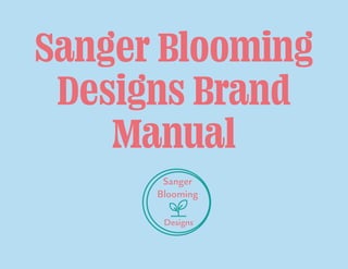
Sanger Blooming Designs - Brand Style Guide
- 2. My Personal Brand Hello there! My name is Danielle Sanger, but most people call me Danni and I am from Buckinghamshire in the UK. I am a freelance designer with a honest and open-minded approach that shines through my love of helping the environment and being creative and passionate with my work. I am currently working towards my BA Hons Graphic Design degree with Arden University, which is based online. Hope you enjoy my personal visual guide! Dani
- 3. Who am i? As a designer, I am a very bubbly and enthusiastic character, so when it comes to my work these traits shine through to bring passion, reliability and creativity to my graphic designs. I consider myself a freelance creative designer that works on the main focuses of illustrations , graphic design branding and photography. My design learning journey is very active and a continuous process where I am learning more and more each day. I didn’t want to narrow myself just to these skills as I am always open to learning new techniques and skills to make myself standout from the rest. 3 SangerBloomingDesign
- 5. About Sanger Blooming Designs MY VISION AND MISSION STATEMENT To create a visual experience that inspires, connects and engages the audience through astonishing and high-quality designs that are pleasing to the eye. MY BRAND STORY I will be using my attributes of honesty, reliability, organization, creativity, environmental, open-minded and communication on the front line throughout our whole process of working together, bringing your designs to life and making those visions an experience. MY BRAND PROMISE Promising you as a brand, that all produced work will be moulded with passion, reliability, creativeness and communication that will shine through just like the smile we will put on your face from the work created. 5 Sanger Blooming Design
- 6. 2. Logo
- 7. 2.1. Company name SANGER BLOOMING DESIGNS As a company we have seven attributes that make us unique and standout from the crowd • Honesty • Reliability • Creativity • Spiritual/ Environmental • Organized • Open-minded • Communication Having these attributes have allowed me to create my brand story making my clients the promise, that all produced work will have the aspects of more that just a standard project, but the creation of a visual experience. 7 Sanger Blooming Design
- 8. 2.2. Company logo SANGER BLOOMING DESIGNS LOGO As a company we wanted the logo name to be personal to the designer, so we decided on having the last name ‘Sanger’ to create that uniqueness that will separate us from the competition. Then the second word ‘blooming’ relates to one of the company’s brand attributes of Spiritual and Eco-friendly aspects within the design and visual brand identity. 8 Sanger Blooming Design
- 9. 2.3. Clear space LOGO SPACING To make sure that when the logo is placed on any form of promotional materials digital or print that it must stick to the clear spacing shown on the left of this page. The left and right side must have a gap of 2.5 cm on each side, especially when it comes to it been close to the boarder of a promotional piece of material. Then the top and bottom sides must have a clear space of 1.5 cm allowing it to have enough space between other graphical elements. 1.5 cm 1.5 cm 2.5 cm 2.5 cm 9 Sanger Blooming Design
- 10. 3. Colour
- 11. 3.1. Brand Colours COMPANY’S BRAND COLOURS The logo colours chosen really shows the meaning behind the designer, as well as fitting around the company’s personal attributes. The pantone colours needed to be considered when being used within my brand identity designs on self-promotional materials like business card, letterheads, envelopes etc. Where they are more eye popping and visual for those who are viewing it in the Turquoise and Coral. Then having the third colour of the light blue allows the logo to stand out on each of the promotional material pieces. 11 Sanger Blooming Design
- 12. 3.2. Primary Colours Pantone 1777 C CMYK - C0 M70 Y42 K0 RGB - R237 G108 B117 HEX - FF657E Pantone P 115-11 C CMYK - C30 M0 Y0 K4 RGB - R183 G212 B243 HEX - B0D5E8 PRIMARY COLOURS 12 Sanger Blooming Design
- 13. Pantone 7703 CMYK - C80 M10 Y45 K0 RGB - R0 G161 B154 HEX - 458B74 3.3. Secondary and Text Colours Pantone Black 6 C Pantone 11-0601 1CX CMYK - C100 M61 Y32 K96 RGB - R16 G24 B32 HEX - 101820 CMYK - C0 M0 Y0 K0 RGB - R244 G249 B255 HEX - F4F9FF SECONDARY TEXT COLOURS 13 Sanger Blooming Design
- 14. 3.3. Colour Tints 80% 60% 40% 20%Colours 14 Sanger Blooming Design
- 15. 3.3. Colour Tints 80% 60% 40% 20%Colours White will not change it stays the same throughout! 15 Sanger Blooming Design
- 16. 3.4. Colour Versions Due to the logo being transparent it can work on most coloured backgrounds like the White and Blue backgrounds above. The blue background will commonly be used with self-promotional materials for the brand due to it being a primary colour that makes the logo shine out. On a white background it makes it clean and stands out against the vibrant logo colours. 16 Sanger Blooming Design
- 17. 3.4. Colour Versions Again the Light Pink and Black backgrounds above also work well against the logos and the vibrant colours of the Coral and Teal Green. This makes the logo look clean and stands out against on the backgrounds. 17 Sanger Blooming Design
- 18. 4. Typography
- 19. 4.1. Ohno Fatface OHNO FATFACE . The Ohno Fatface font (12 Pt Condensed) will be used for Headline titles throughout both digital and print media as the creates a bold dynamic like effect, which fits in perfectly with design work by complimenting it. It also creates that inviting and open-minded effect. Ohno Fatface ABCDEFGHIJKLMNOPQRSTUVWXYZ abcdefghijklmnopqrstuvwxyz 1234567890(!”·$%&/=^*¨Ç,.-;:_) 12pt Condensed 19 Sanger Blooming Design
- 20. Gaultier ABCDEFGHIJKLMNOPQRSTUVWXYZ abcdefghijklmnopqrstuvwxyz 1234567890 (!”·$%&/=^*Ç,.-;:_) ABCDEFGHIJKLMNOPQRSTUVWXYZ abcdefghijklmnopqrstuvwxyz 1234567890(!”·$%&/=^*Ç,.-;:_) ABCDEFGHIJKLMNOPQRSTUVWXYZ abcdefghijklmnopqrstuvwxyz 1234567890(!”·$%&/=^*Ç,.-;:_) 4.2. Gaultier Medium Light Thin GAULTIER . Gaultier font will be used for the body text of the designs in the sizes of light and regular. Light will be mainly for the body text as it balances really well with the more title heading. Medium Gaultier is to be used for Sub-heading to standout and be eye catching to those reading it. 18 Sanger Blooming Design
- 21. Um que cori omnit Fugia Essi omnimus eos sim eiunt ut ut ut excestem es aut essimint utem natectatat la cus digendant, simus as accabo. Otatiis et voluptur, que sequam, ut optiam, sequidi doluptaspis quodias as dolum velitae ctaepedissit dolecab ipsamus nos estiure nis molum sandipsunt et, quunt ut acea quianis ma volut officid eum eiciunt. Essi omnimus eos sim eiunt ut ut ut excestem es aut essimint utem natectatat la cus digendant, simus as accabo. Otatiis et voluptur, que sequam, ut optiam, sequidi doluptaspis quodias as dolum velitae ctaepedissit dolecab ipsamus nos estiure nis molum sandipsunt et, quunt ut acea quianis ma volut officid eum eiciunt. Essi omnimus eos sim eiunt ut ut ut excestem es aut essimint utem natectatat la cus digendant, simus as accabo. molum sandipsunt et, quunt ut acea quianis ma volut officid eum eiciunt. 4.3. Typeface Example 21 Sanger Blooming Design