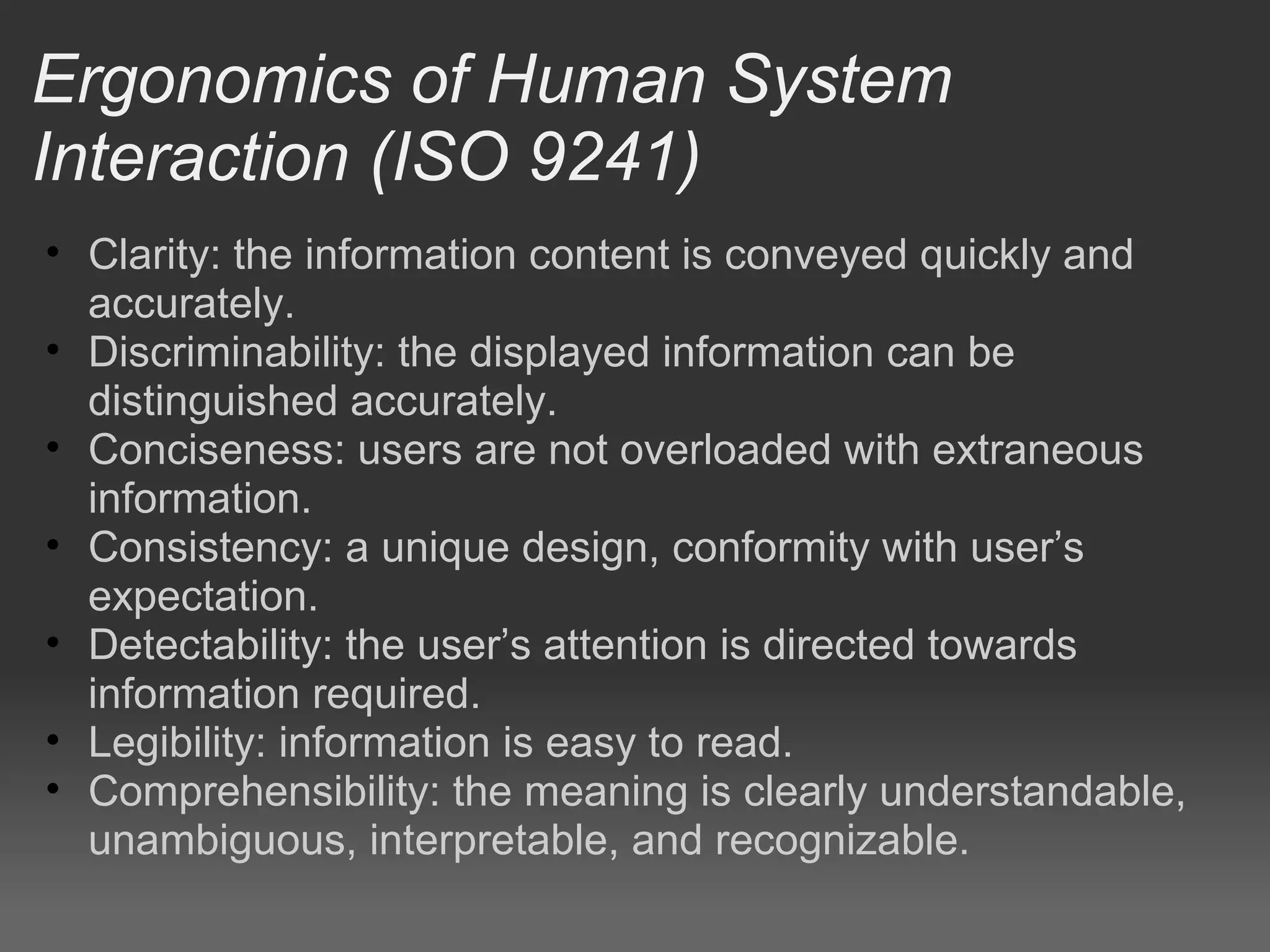
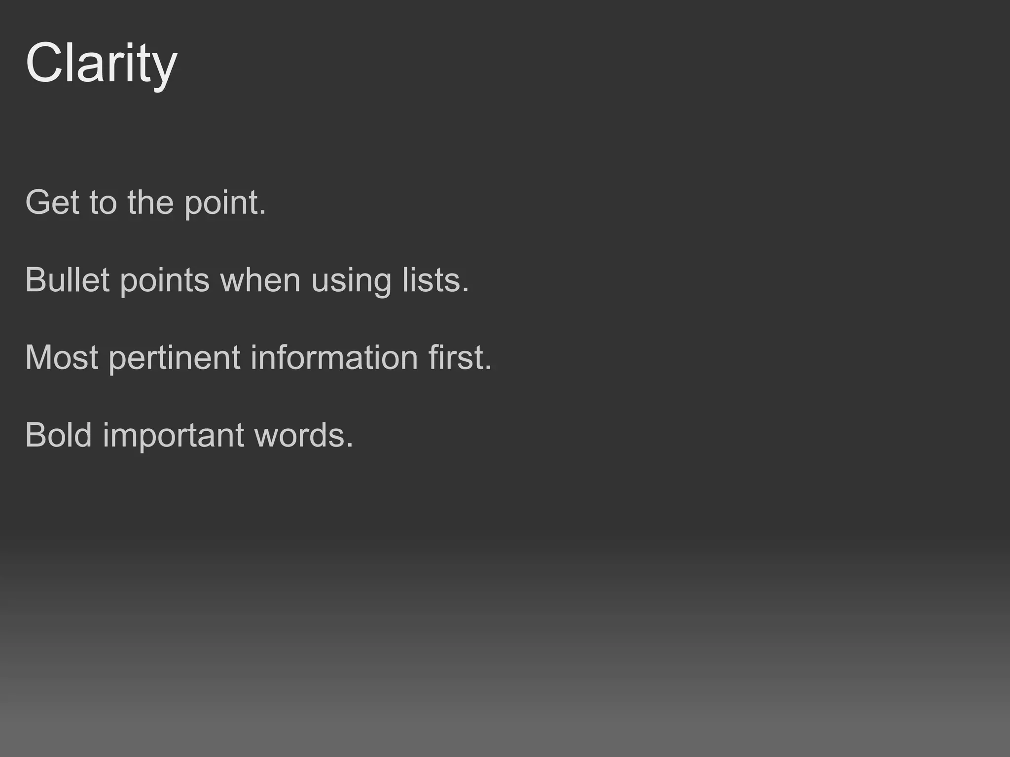
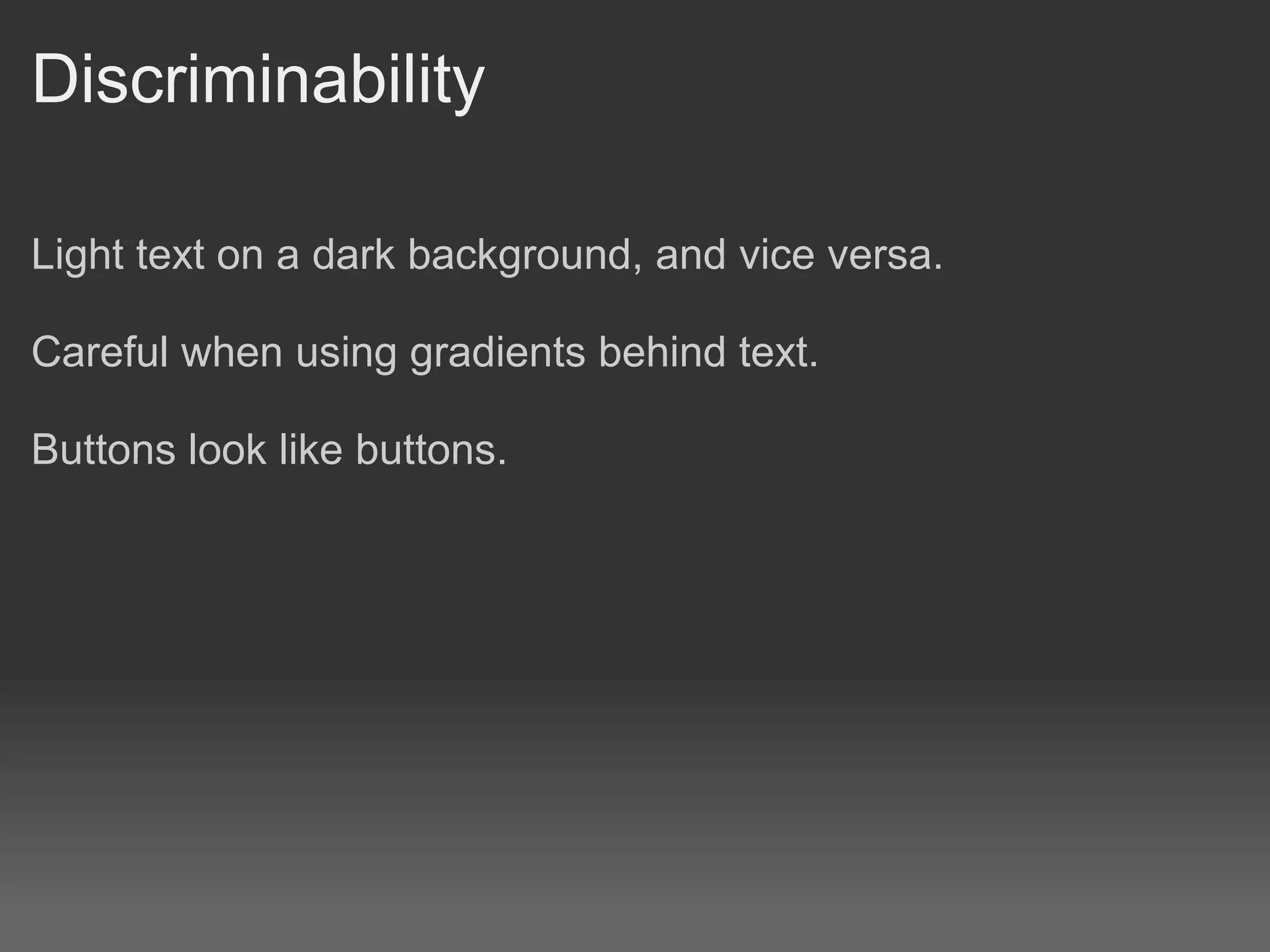
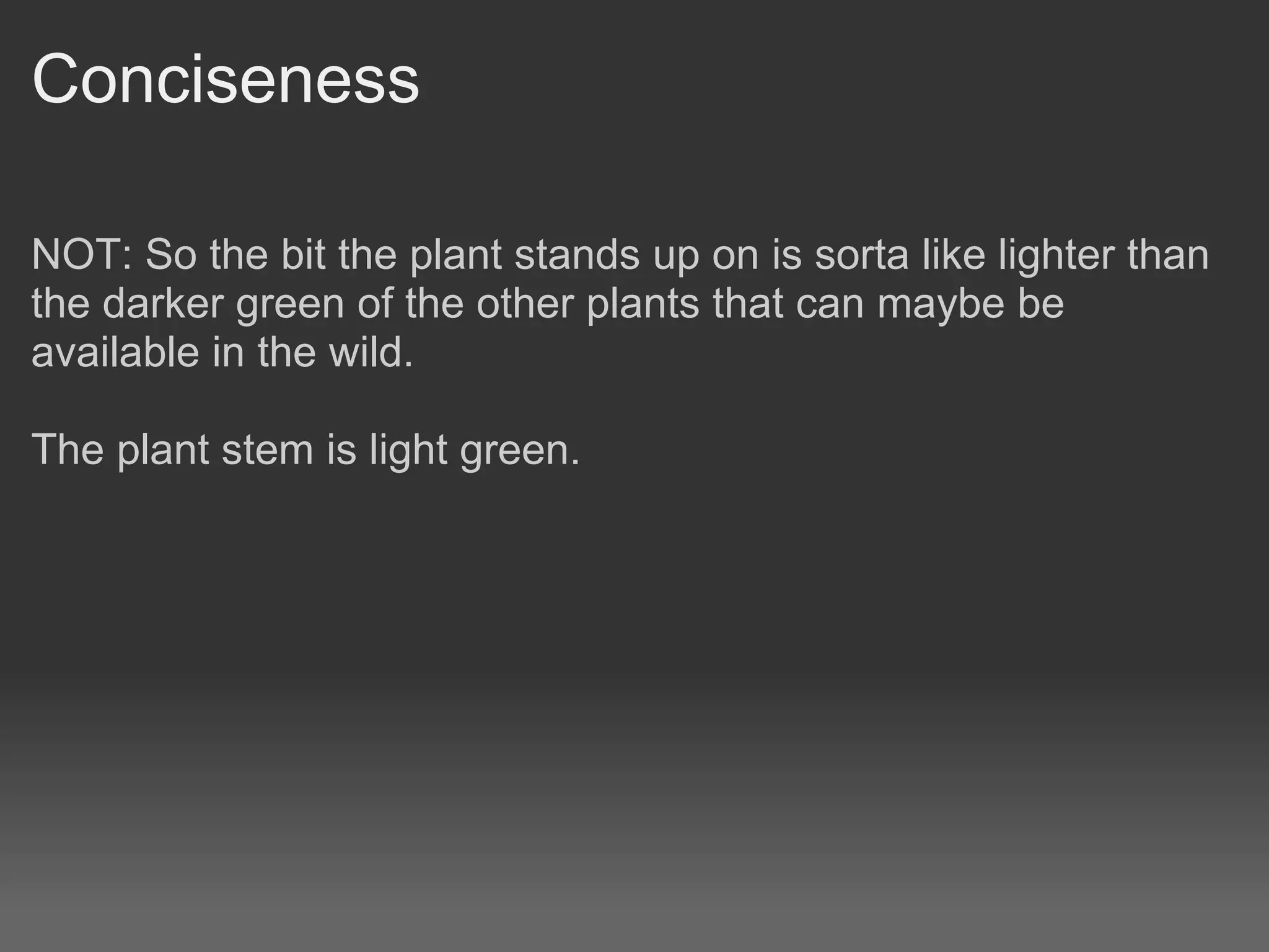
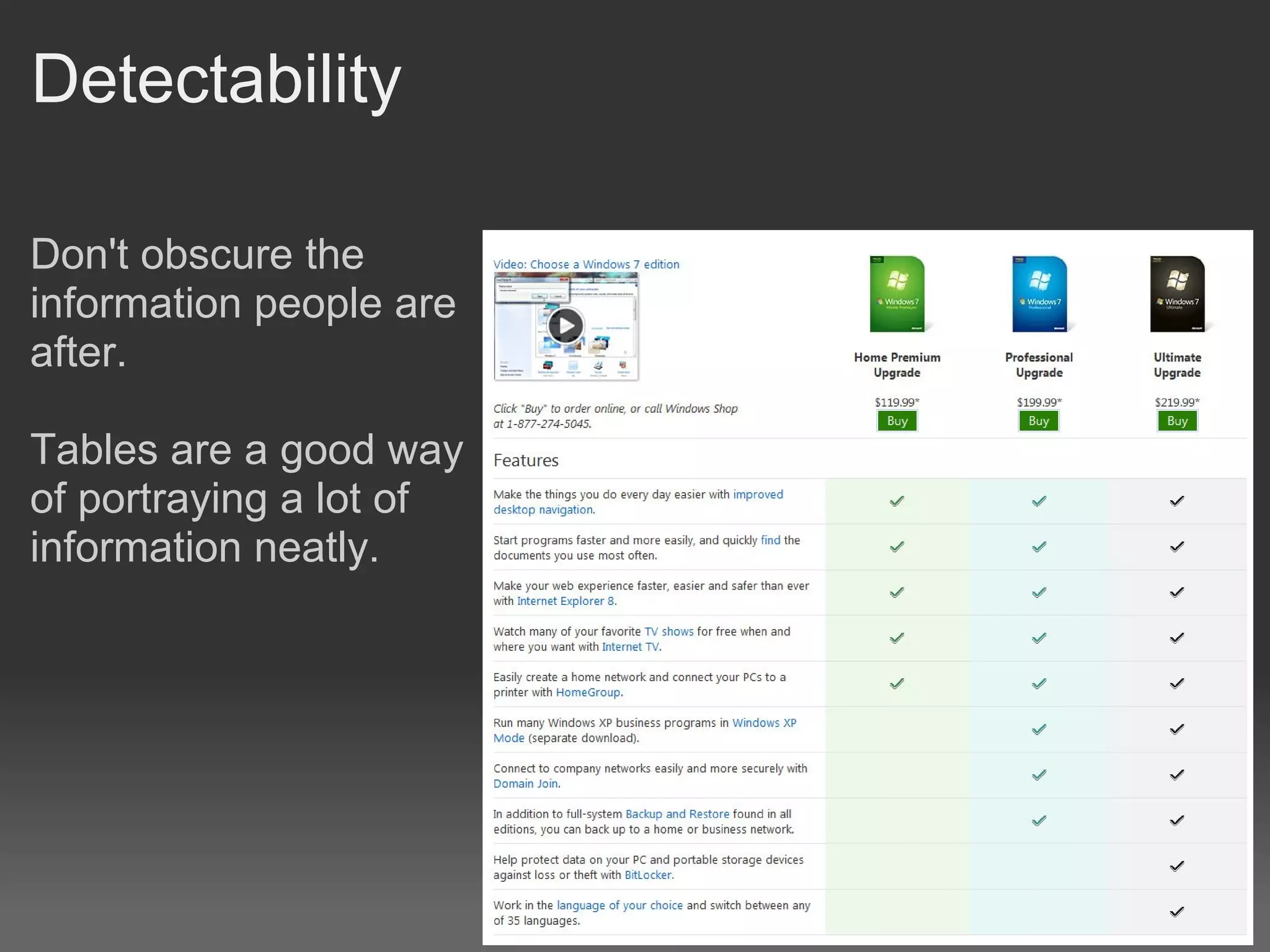
Website Design2

  Robert Clarkson
Ergonomics of Human System
Interaction (ISO 9241)
• Clarity: the information content is conveyed quickly and
  accurately.
• Discriminability: the displayed information can be
  distinguished accurately.
• Conciseness: users are not overloaded with extraneous
  information.
• Consistency: a unique design, conformity with user’s
  expectation.
• Detectability: the user’s attention is directed towards
  information required.
• Legibility: information is easy to read.
• Comprehensibility: the meaning is clearly understandable,
  unambiguous, interpretable, and recognizable.
Clarity

Get to the point.

Bullet points when using lists.

Most pertinent information first.

Bold important words.
Discriminability

Light text on a dark background, and vice versa.

Careful when using gradients behind text.

Buttons look like buttons.
Conciseness

NOT: So the bit the plant stands up on is sorta like lighter than
the darker green of the other plants that can maybe be
available in the wild.

The plant stem is light green.
Consistency

Keep navigation in the same place, ie. Don't move it around
between pages.

Clicking on a navigation link takes you to the same place no
matter what page you are on.
Detectability

Don't obscure the
information people are
after.

Tables are a good way
of portraying a lot of
information neatly.
Legibility
Comprehensibility

The information is easy for the person to understand.

Depends a lot on target audience.

How old / clever is the person the information is aimed at?
Clients want more WOW or ZING!

Having said all that if we made websites and stuck with this
stuff to the letter they would be all be boring black and white
straight lined boxed things.

Your client might ask for more WOW factor or, a bit more ZING,
or maybe even lightening bolts, because that looks cool.

The trick is to try to maintain all these principles despite your
client wanting more "frills".
Website template outline

Fixed width

www.howstuffworks.com

Preferred by designers, can set pixel widths for elements on
the page.

Variable width

www.slashdot.org
developer.android.com/resources

Preferred by technical websites, all about the information.
Form follows Function

It doesn't matter how pretty your website is if no one can use it.
Typography

             Would you please stop your dog
             from pooing on our lawn

             WOULD YOU PLEASE STOP
             YOUR DOG FROM POOING ON
             OUR LAWN
Font Types


Serif

Sans-Serif

Monospace
Monospaced fonts were widely used in
early computers and computer terminals,
which often had extremely limited
graphical capabilities.
Web safe Fonts

http://www.w3schools.com/css/css_websafe_fonts.asp

Web-safe fonts are fonts likely to be present on a wide range of
computer systems, and used by web content authors to
increase the likelihood that content will be displayed in their
chosen font.

If a visitor to a website does not have the specified font, their
browser will attempt to select a similar alternative, based on the
author-specified fallback fonts and generic families.
Why are web fonts this way

   A technique to download remote fonts was first specified
   in the CSS2 specification, which introduced the @font-
   face rule.
   It was (and remains) controversial because using a
   remote font as part of a web page allows the font to be
   freely downloaded.

   This could result in fonts being used against the terms of
   their license or illegally spread through the web.

   TrueDoc (PFR), Embedded OpenType (EOT) and Web
   Open Font Format (WOFF) are formats designed to
   address these issues.
Options to get round the font problem

Use an Image containing the font

Use a font thats close to the one you want

The Web Open Font Format (WOFF) is a font format for use in
web pages. It is in the process of being standardized as a
recommendation by the World Wide Web Consortium (W3C)

! Warning Out of scope !
Use flash and import the font into there
http://www.mikeindustries.com/blog/sifr/

Use a Javascript SVG font renderer converter such as Cufon
http://cufon.shoqolate.com/generate/
Helvetica

http://www.youtube.com/watch?v=McZSUjP1AcE

Find a font

That suggests
"old"
"modern"
"scary"
"happy"
Scalable Vector Graphics

SVG has been in development
since 1999 by a group of
companies within the W3C

All major modern web browsers
support and render SVG markup
directly with the very notable
exception of Microsoft Internet
Explorer (IE), although Internet
Explorer 9 supports the basic
SVG feature set.
Whitespace

White space should not be considered merely 'blank' space —
it is an important element of design which enables the objects
in it to exist at all, the balance between positive (or non-white)
and the use of negative spaces is key to aesthetic composition.

When space is at a premium, such as some types of magazine,
newspaper, and yellow pages advertising, white space is
limited in order to get as much vital information on to the page
as possible. A page crammed full of text or graphics with very
little white space runs the risk of appearing busy, cluttered, and
is typically difficult to read. Some designs compensate for this
problem through the careful use of leading and typeface.
Whitespace

Judicious use of white space can give a page a classic,
elegant, or rich appearance. For example, upscale brands often
use ad layouts with little text and a lot of white space. Inexpert
use of white space can make a page appear incomplete.

More interesting information about whitespace here:
http://www.alistapart.com/articles/whitespace

Find a website with interesting use of whitespace

Website design2

  • 1.
    Website Design2 Robert Clarkson
  • 2.
    Ergonomics of HumanSystem Interaction (ISO 9241) • Clarity: the information content is conveyed quickly and accurately. • Discriminability: the displayed information can be distinguished accurately. • Conciseness: users are not overloaded with extraneous information. • Consistency: a unique design, conformity with user’s expectation. • Detectability: the user’s attention is directed towards information required. • Legibility: information is easy to read. • Comprehensibility: the meaning is clearly understandable, unambiguous, interpretable, and recognizable.
  • 3.
    Clarity Get to thepoint. Bullet points when using lists. Most pertinent information first. Bold important words.
  • 4.
    Discriminability Light text ona dark background, and vice versa. Careful when using gradients behind text. Buttons look like buttons.
  • 5.
    Conciseness NOT: So thebit the plant stands up on is sorta like lighter than the darker green of the other plants that can maybe be available in the wild. The plant stem is light green.
  • 6.
    Consistency Keep navigation inthe same place, ie. Don't move it around between pages. Clicking on a navigation link takes you to the same place no matter what page you are on.
  • 7.
    Detectability Don't obscure the informationpeople are after. Tables are a good way of portraying a lot of information neatly.
  • 8.
  • 9.
    Comprehensibility The information iseasy for the person to understand. Depends a lot on target audience. How old / clever is the person the information is aimed at?
  • 10.
    Clients want moreWOW or ZING! Having said all that if we made websites and stuck with this stuff to the letter they would be all be boring black and white straight lined boxed things. Your client might ask for more WOW factor or, a bit more ZING, or maybe even lightening bolts, because that looks cool. The trick is to try to maintain all these principles despite your client wanting more "frills".
  • 11.
    Website template outline Fixedwidth www.howstuffworks.com Preferred by designers, can set pixel widths for elements on the page. Variable width www.slashdot.org developer.android.com/resources Preferred by technical websites, all about the information.
  • 12.
    Form follows Function Itdoesn't matter how pretty your website is if no one can use it.
  • 13.
    Typography Would you please stop your dog from pooing on our lawn WOULD YOU PLEASE STOP YOUR DOG FROM POOING ON OUR LAWN
  • 14.
    Font Types Serif Sans-Serif Monospace Monospaced fontswere widely used in early computers and computer terminals, which often had extremely limited graphical capabilities.
  • 15.
    Web safe Fonts http://www.w3schools.com/css/css_websafe_fonts.asp Web-safefonts are fonts likely to be present on a wide range of computer systems, and used by web content authors to increase the likelihood that content will be displayed in their chosen font. If a visitor to a website does not have the specified font, their browser will attempt to select a similar alternative, based on the author-specified fallback fonts and generic families.
  • 16.
    Why are webfonts this way A technique to download remote fonts was first specified in the CSS2 specification, which introduced the @font- face rule. It was (and remains) controversial because using a remote font as part of a web page allows the font to be freely downloaded. This could result in fonts being used against the terms of their license or illegally spread through the web. TrueDoc (PFR), Embedded OpenType (EOT) and Web Open Font Format (WOFF) are formats designed to address these issues.
  • 17.
    Options to getround the font problem Use an Image containing the font Use a font thats close to the one you want The Web Open Font Format (WOFF) is a font format for use in web pages. It is in the process of being standardized as a recommendation by the World Wide Web Consortium (W3C) ! Warning Out of scope ! Use flash and import the font into there http://www.mikeindustries.com/blog/sifr/ Use a Javascript SVG font renderer converter such as Cufon http://cufon.shoqolate.com/generate/
  • 18.
  • 19.
    Scalable Vector Graphics SVGhas been in development since 1999 by a group of companies within the W3C All major modern web browsers support and render SVG markup directly with the very notable exception of Microsoft Internet Explorer (IE), although Internet Explorer 9 supports the basic SVG feature set.
  • 20.
    Whitespace White space shouldnot be considered merely 'blank' space — it is an important element of design which enables the objects in it to exist at all, the balance between positive (or non-white) and the use of negative spaces is key to aesthetic composition. When space is at a premium, such as some types of magazine, newspaper, and yellow pages advertising, white space is limited in order to get as much vital information on to the page as possible. A page crammed full of text or graphics with very little white space runs the risk of appearing busy, cluttered, and is typically difficult to read. Some designs compensate for this problem through the careful use of leading and typeface.
  • 21.
    Whitespace Judicious use ofwhite space can give a page a classic, elegant, or rich appearance. For example, upscale brands often use ad layouts with little text and a lot of white space. Inexpert use of white space can make a page appear incomplete. More interesting information about whitespace here: http://www.alistapart.com/articles/whitespace Find a website with interesting use of whitespace