Downloaded 848 times


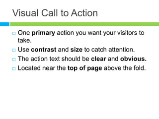


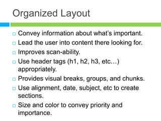
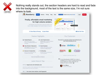
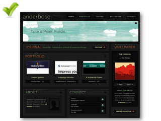

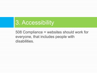


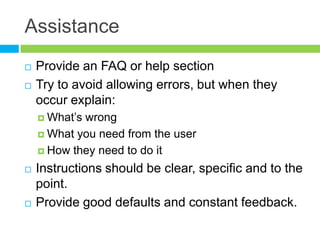

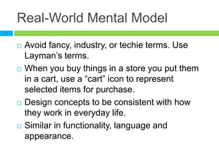


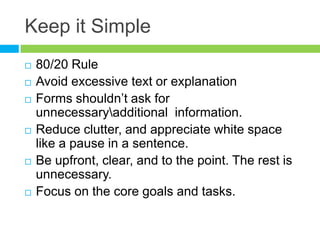


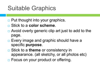


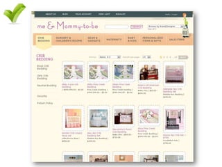
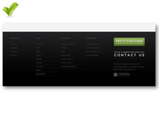


The document outlines 10 key design and layout principles to enhance website effectiveness, including the importance of visual calls to action, organized layouts, and accessibility features. It emphasizes the need for clear navigation, user assistance, and suitable graphics to improve user experience and satisfaction. Overall, the principles advocate for simplicity, clarity, and engagement to help users interact more effectively with the website.


