Visual Rhetoric, Feb 26th, 2013
•Download as PPT, PDF•
1 like•446 views

1) The document discusses the uses of graphics including to entice audiences, illustrate concepts, inform, brand, visually enhance designs, and unify elements. Examples are provided for each use. 2) It then discusses an upcoming lesson on graphic novels and sequential art that will be presented by Penny Feltner. Students are given time to discuss with their teams. 3) The document provides guidance on graphics and their purposes across media, discusses an upcoming lesson, and allows for team discussion among the students.

Recommended
Recommended
More Related Content
What's hot
What's hot (20)
Similar to Visual Rhetoric, Feb 26th, 2013
Similar to Visual Rhetoric, Feb 26th, 2013 (20)
More from Miami University
More from Miami University (20)
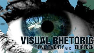
Visual Rhetoric, Feb 26th, 2013
- 1. SIX
- 2. TODAY 1) Graphics: how do they work? 2) Group time 3) Penny’s activity 4) Homework
- 3. ACE feedback We had some ACE students visit the evening class last night. We did some talking, showed them some work, and captured some video.
- 4. ACE: we’ll do that again next week… With any luck, we will have another set of ACE students to work with next Monday night, so if any of you can come in during that time (it’s here, 7 pm to probably 8:30 or so), that’d be fantastic.
- 5. Graphic key: the rule of thirds One thing that we must always bear in mind when thinking about the use of graphics is the rule of thirds. What is that, exactly? I’m glad you asked!
- 6. The Rule of Thirds is basically this: think of your visual images (including video footage) as being broken into 9 quadrants, like the image to the side. Key elements should appear at the intersections or on the lines themselves.
- 7. Good rule of thirds framing on a terrible slide :
- 8. Graphics For today, you did a slew of readings on graphics and how to best use them in your both print and digital work. If you have questions from the readings, we can talk about that, but what I wanted to do first is give you a little different slant on things (like I did last week with the color stuff) by adding my voice to the mix in your heads. :)
- 9. Dr. Phill presents: the 6 things we do with graphics In a society so intimately tied to the nature of the visual, we use graphics to do all sorts of heavy lifting in our design (and in our rhetoric). The following slides enumerate some common ways that we use graphics and offer examples of each.
- 11. Use 1: to Entice You will find that many graphics do more than one of the things on this list, but one of the most visceral uses of any graphics is to entice the audience, to give them something pretty, interesting, or awe inspiring to look at while considering your document. This can take many forms.
- 15. Use 2: to Illustrate Perhaps the most obvious use of an image is to illustrate something that is being written about, or literally to show the “thing” being shared.
- 19. Use 3: to Inform Sometimes graphics exist simply to offer information that the text either cannot share verbally or which is more user-friendly, or more dramatic, to be seen in image form.
- 24. Use 4: to Brand Graphics– particularly here logos– are one of the most powerful ways to brand a product. In a world currently obsessed with marketing (even on the level of the individual), branding is a key element in current visual rhetoric.
- 30. Use 5: to Visually Enhance Sometimes graphics are present because they “spice up” a design that is otherwise bland. It’s from this particular use that we get the terminology “splash” art. These images usually do one of the other things as well, but their primary use is to enhance a layout or otherwise make the visual presence of something more pleasing.
- 35. Use 6: to Unify Nothing pulls together a design like the use of a nice, crisp, clean graphic that can span the majority of a document or can through color or shape draw together what seem like disconnected elements.
- 43. Some team time Take a few minutes to work with your team. Think about what you need to coordinate, what questions you have, where things are right now, etc. I will circulate to check in and ask questions.
- 44. And now… Penny Feltner will be presenting us a lesson on graphic novels and, I believe, sequential art. It’s all yours, Penny.