Download to read offline

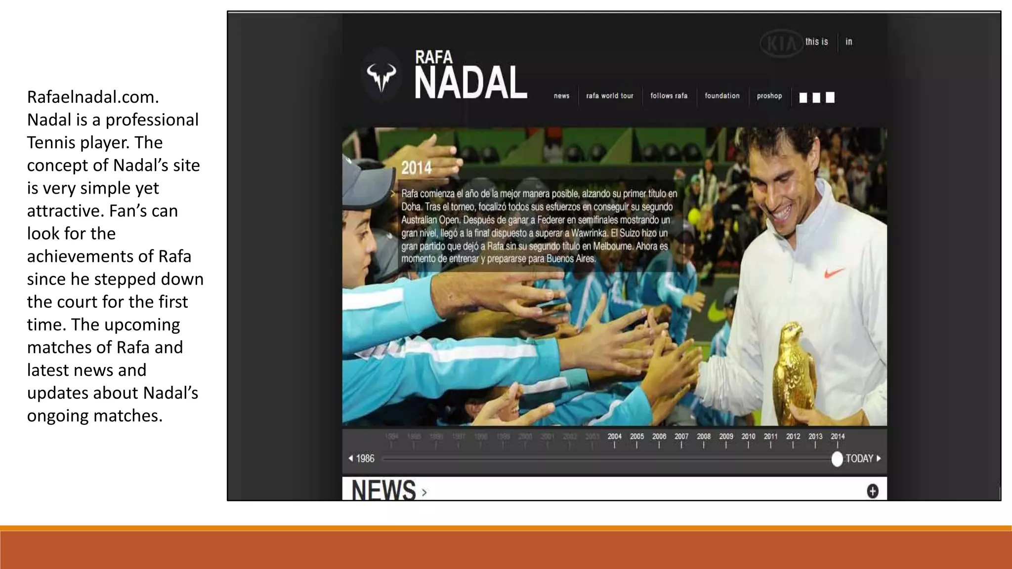
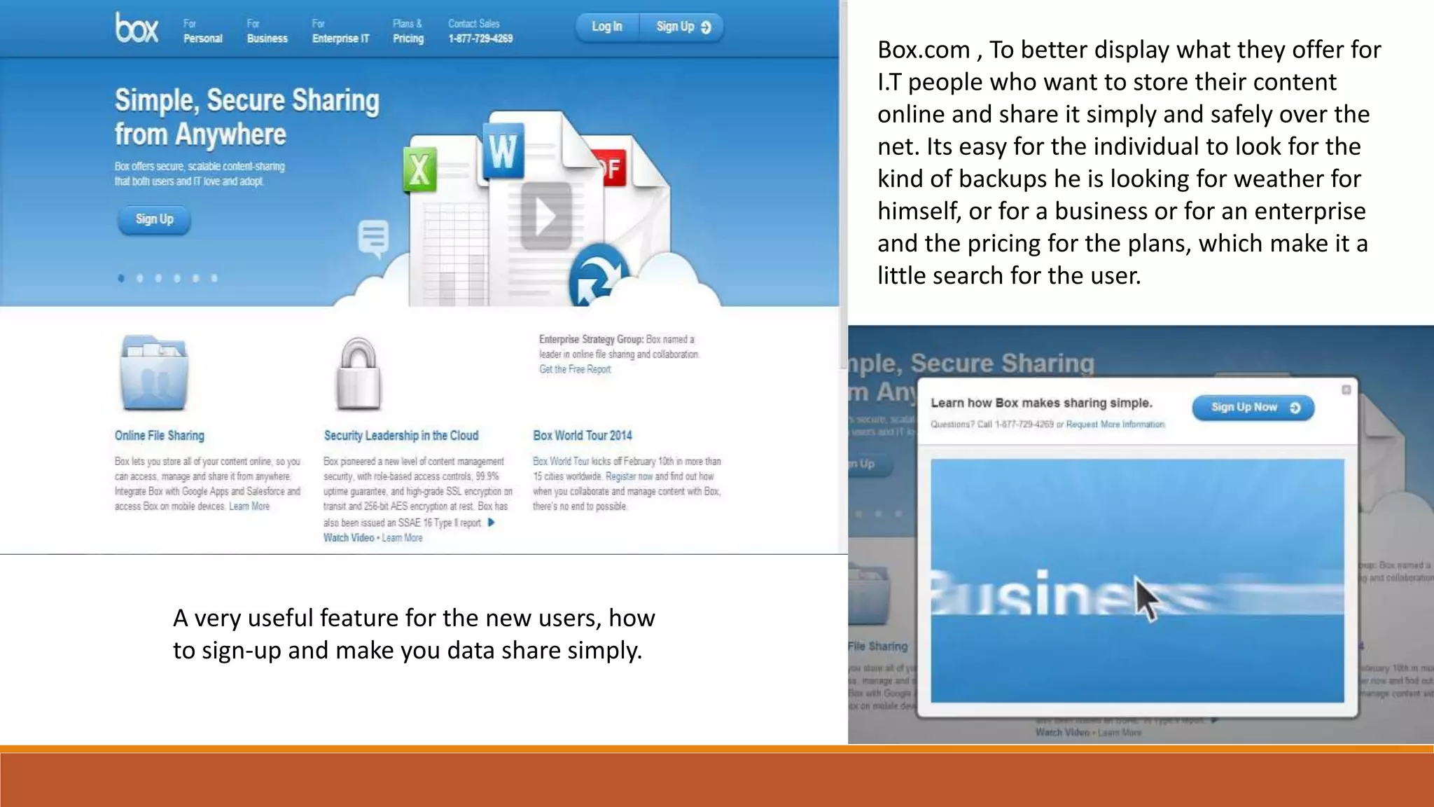
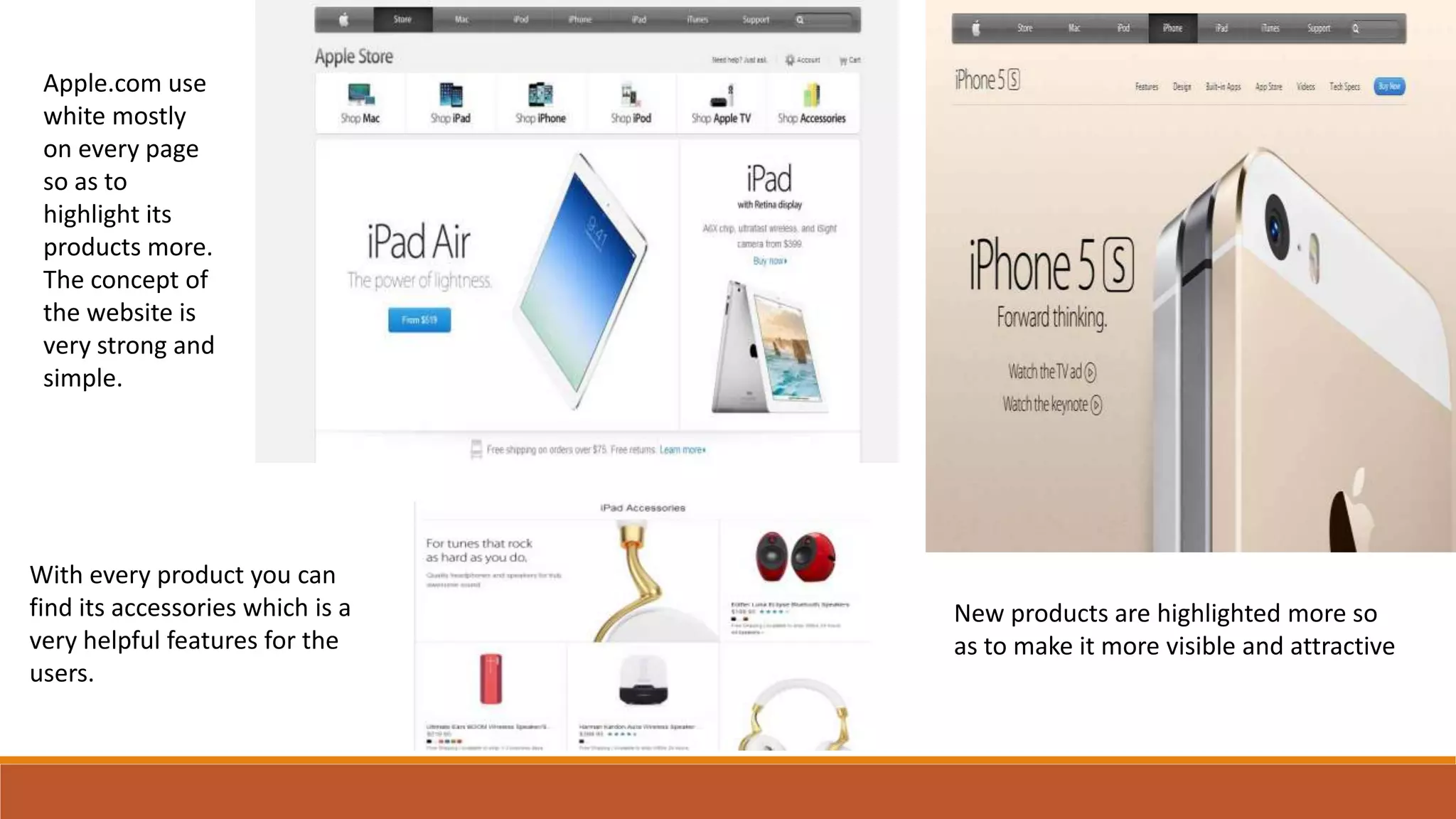
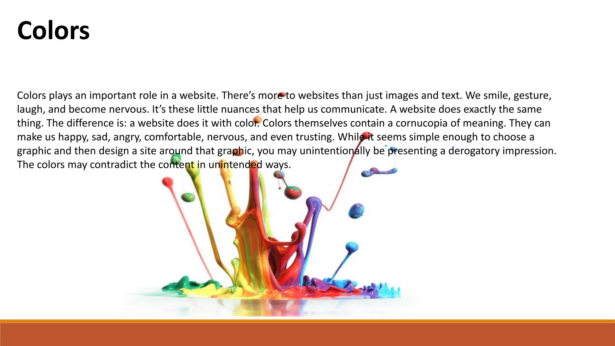
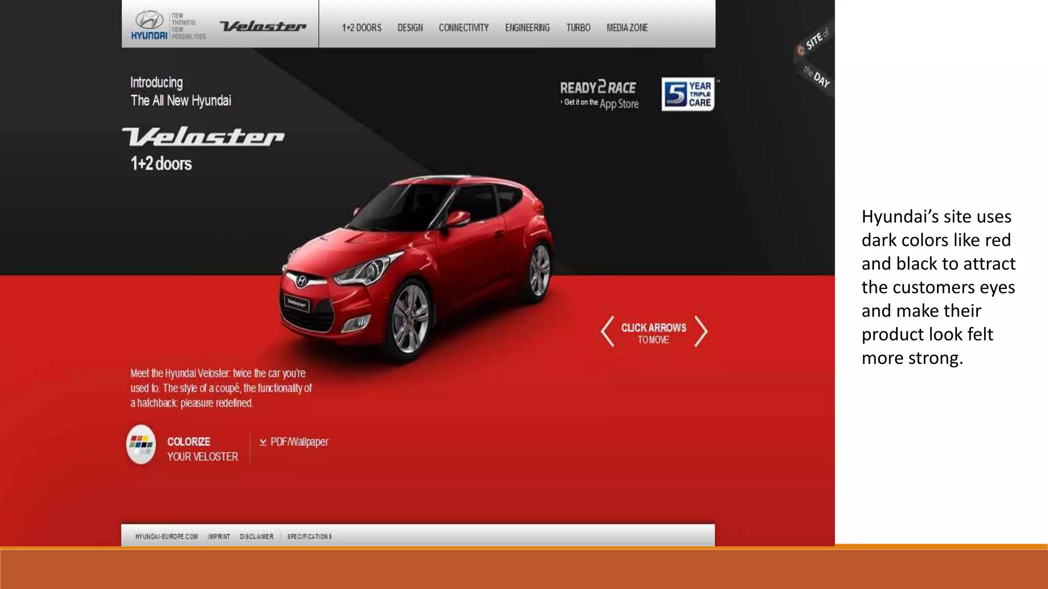
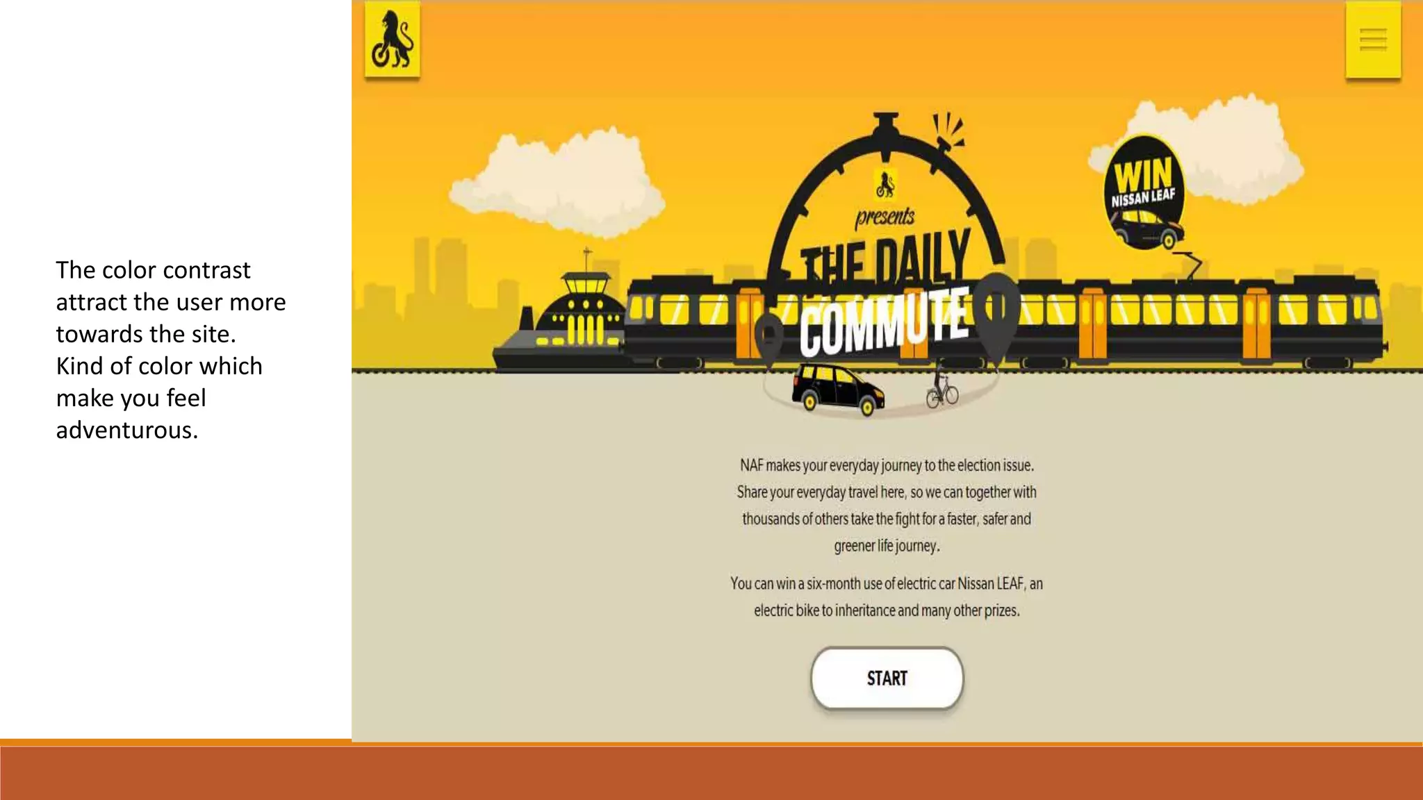
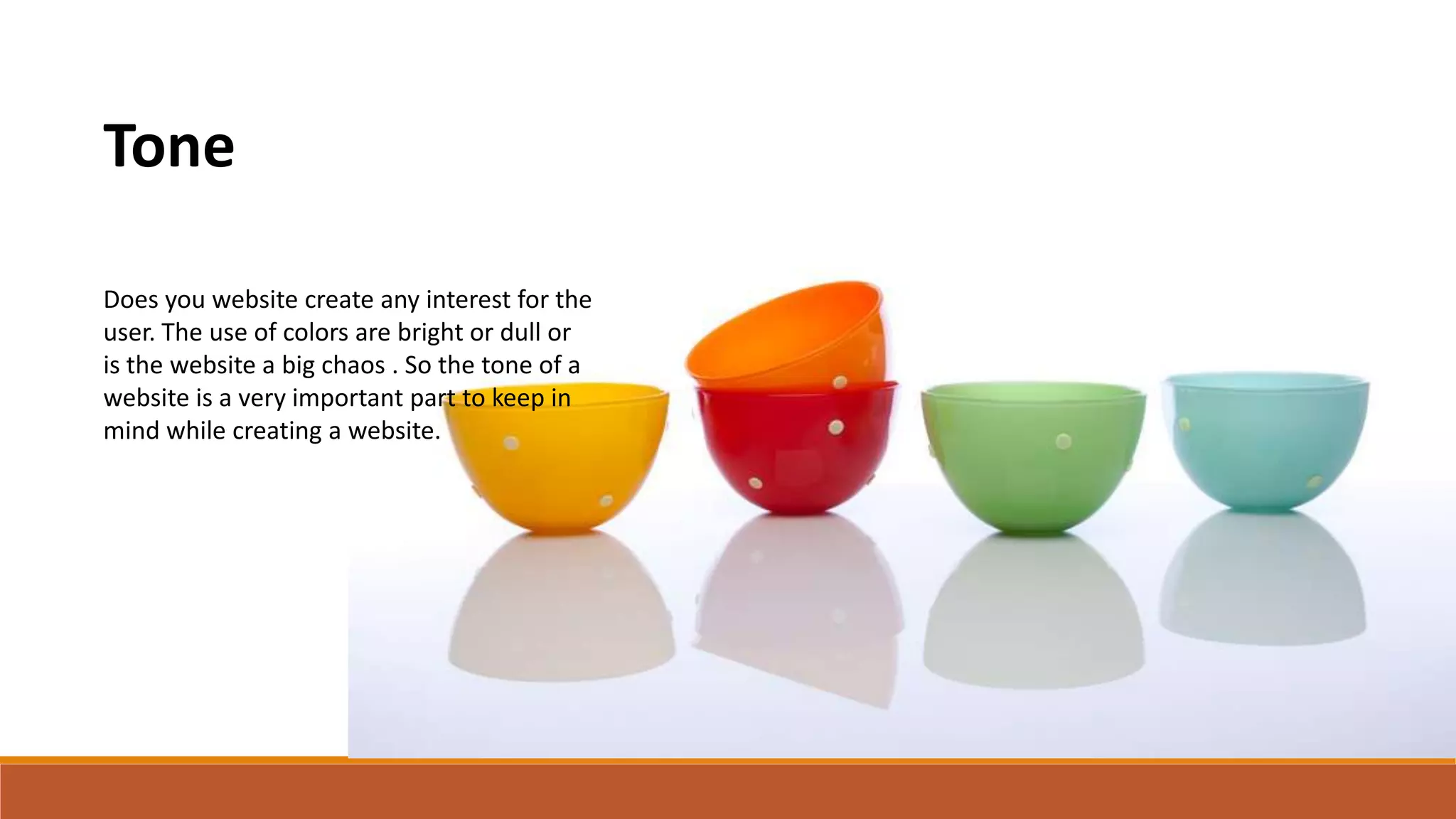
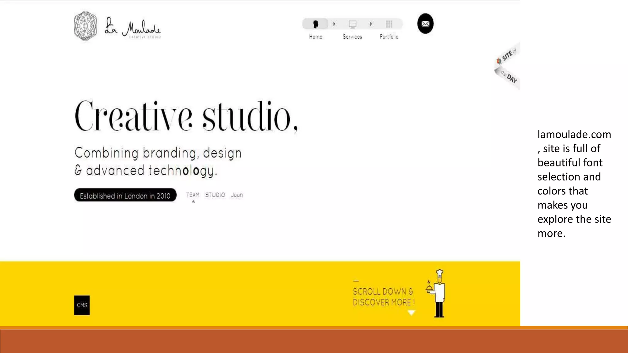
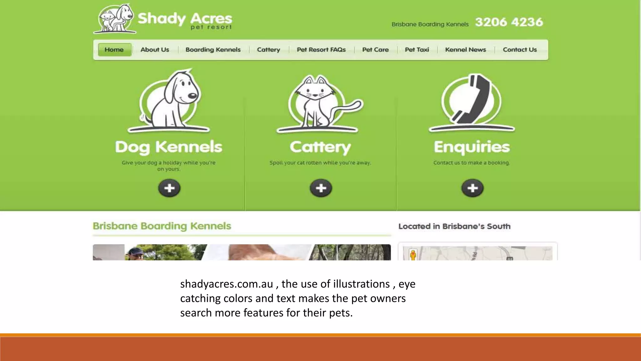

The document discusses concepts, colors, and tone in website design. It provides examples of several well-designed websites and what makes their concepts, use of colors, and tones effective. The Rafael Nadal website's concept is simple yet attractive, focusing on the tennis player's achievements, matches and news. Box.com's concept is to clearly display their backup and sharing options for individuals and businesses. Apple.com uses white space to highlight products and features easy accessibility of accessories. Hyundai's website uses dark red and black colors that make their products feel strong. Lamoulade.com features beautiful fonts and colors that encourage exploration, while shadyacres.com.au uses illustrations and eye-catching colors and


![Coded Agents – with UiPath SDK + LangGraph [Virtual Hands-on Workshop]](https://cdn.slidesharecdn.com/ss_thumbnails/codedagentsdeck-251215155422-5497c599-thumbnail.jpg?width=640&height=640&fit=bounds)


