Download as PDF, PPTX
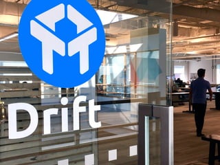


The document provides an overview of the branding guidelines for Drift. It begins with the company's mission and values of being customer-driven and transparent. It then details the brand assets including the logo, colors, typography and visual style. The branding is meant to reflect Drift's culture of being human, learning-focused and using humor. Illustrations are used in a semi-realistic black, white and gray palette. Photos show the real people behind Drift.


![Ux design. Quoi, Comment, Pourquoi. [Downloadable version - French]](https://cdn.slidesharecdn.com/ss_thumbnails/uxdesign-quoicommentpourquoifrenchversion-130930163937-phpapp01-thumbnail.jpg?width=640&height=640&fit=bounds)


![State of Conversational Marketing 2019 [Free Report]](https://cdn.slidesharecdn.com/ss_thumbnails/final-slideshare-socm-2019-190715164621-thumbnail.jpg?width=640&height=640&fit=bounds)


