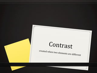
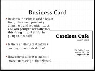
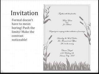
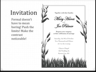
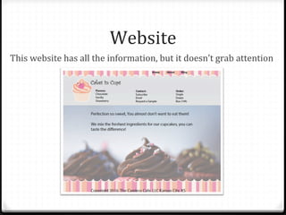
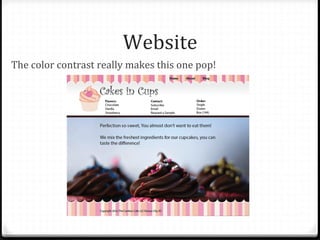
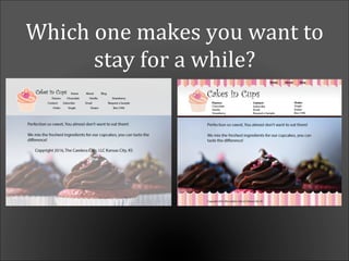
Contrast	
  created	
  when	
  two	
  elements	
  are	
  different	
  
Business	
  Card	
  
!  Revisit	
  our	
  business	
  card	
  one	
  last	
  
time,	
  It	
  has	
  good	
  proximity,	
  
alignment,	
  and	
  repetition…but	
  
are	
  you	
  going	
  to	
  actually	
  pick	
  
this	
  thing	
  up	
  and	
  think	
  about	
  
going	
  to	
  this	
  café?	
  
!  Is	
  there	
  anything	
  that	
  catches	


  your	
  eye	
  about	
  this	
  design?	
  
!  How	
  can	
  we	
  alter	
  it	
  to	
  make	
  it	


  more	
  interesting	
  at	
  Birst	
  glance?	
  
Business	
  Card	
  
!  How	
  about	
  now?	
  
!  Contrast	
  is	
  what	
  makes	
  
your	
  design	
  POP!	
  	
  
!  It’s	
  what	
  makes	
  someone	
  
actually	
  want	
  to	
  pick	
  up	
  
your	
  design!	
  
!  Notice	
  that	
  even	
  more	
  
repetition	
  has	
  been	
  
added	
  into	
  the	
  design.	
  
Which	
  one	
  would	
  you	
  pick	
  up?	
  
Gamer	
  Night	
  Flyer	
  
!  Use	
  contrast	
  to	
  
compliment	
  the	
  
design	
  
!  This	
  Blyer	
  has	
  
appropriate	
  
graphics,	
  but	
  they	
  
tend	
  to	
  get	
  in	
  the	
  
way	
  of	
  the	
  
information	
  
Gamer	
  Night	
  Flyer	
  
!  Now	
  the	
  
repeated	
  
graphics	
  
compliment	
  
the	
  design	
  and	
  
help	
  add	
  
visual	
  interest	
  	
  
Which	
  one	
  would	
  you	
  pick	
  up?	
  
Invitation	
  
Formal	
  doesn’t	
  
have	
  to	
  mean	
  
boring!	
  Push	
  the	
  
limits!	
  Make	
  the	
  
contrast	
  
noticeable!	
  
Invitation	
  
Formal	
  doesn’t	
  
have	
  to	
  mean	
  
boring!	
  Push	
  the	
  
limits!	
  Make	
  the	
  
contrast	
  
noticeable!	
  
Website	
  
This	
  website	
  has	
  all	
  the	
  information,	
  but	
  it	
  doesn’t	
  grab	
  attention	
  
Website	
  
The	
  color	
  contrast	
  really	
  makes	
  this	
  one	
  pop!	
  
Which	
  one	
  makes	
  you	
  want	
  to	
  
stay	
  for	
  a	
  while?	
  
Summary	
  
!  Purpose:	
  to	
  create	
  an	
  interest	
  on	
  the	
  page	
  and	
  help	
  
organize	
  the	
  information	
  
!  Tip:	
  Use	
  contrast	
  through	
  your	
  typeface	
  choices,	
  line	
  
thicknesses,	
  colors,	
  shapes,	
  sizes,	
  space,	
  etc.	
  
!  Avoid:	
  using	
  two	
  or	
  more	
  typefaces	
  that	
  are	
  similar.	
  If	
  
they	
  are	
  not	
  exactly	
  the	
  same,	
  make	
  them	
  different!	
  
Contrast	
  Poster	
  
!  Use	
  the	
  same	
  requirements	
  as	
  you	
  did	
  for	
  the	
  
previous	
  poster.	
  
!  Design	
  your	
  poster	
  with	
  the	
  following	
  elements:	
  	
  
!  Choose	
  2	
  contrasting	
  colored	
  papers	
  (9”x12”),	
  cut	
  one	
  in	
  
half	
  
!  Leave	
  space	
  to	
  write	
  the	
  word	
  CONTRAST	
  at	
  least	
  2	
  
inches	
  high	
  
!  Cut	
  half	
  of	
  a	
  simple	
  shape	
  out	
  of	
  your	
  half	
  sheet	
  of	
  paper	
  
!  Flip	
  the	
  sheet	
  over	
  so	
  that	
  you	
  have	
  a	
  silhouetted	
  design	
  
!  Glue	
  the	
  half	
  sheet	
  and	
  the	
  Blipped	
  design	
  you	
  created	
  
onto	
  your	
  contrasting	
  color	
  page	
  	
  
Example	
  
Resource	
  
0 The	
  content	
  in	
  this	
  PowerPoint	
  was	
  inspired	
  by	
  “The	
  
Non-­‐Designer’s	
  Design	
  Book”	
  by	
  Robin	
  Williams.	
  	
  
0 The	
  assignment	
  was	
  inspired	
  by	
  the	
  content	
  on	
  
www.nhsdesigns.com	


Page Layout Techniques: Contrast

  • 1.
    Contrast  created  when  two  elements  are  different  
  • 2.
    Business  Card   ! Revisit  our  business  card  one  last   time,  It  has  good  proximity,   alignment,  and  repetition…but   are  you  going  to  actually  pick   this  thing  up  and  think  about   going  to  this  café?   !  Is  there  anything  that  catches            your  eye  about  this  design?   !  How  can  we  alter  it  to  make  it            more  interesting  at  Birst  glance?  
  • 3.
    Business  Card   ! How  about  now?   !  Contrast  is  what  makes   your  design  POP!     !  It’s  what  makes  someone   actually  want  to  pick  up   your  design!   !  Notice  that  even  more   repetition  has  been   added  into  the  design.  
  • 4.
    Which  one  would  you  pick  up?  
  • 5.
    Gamer  Night  Flyer   !  Use  contrast  to   compliment  the   design   !  This  Blyer  has   appropriate   graphics,  but  they   tend  to  get  in  the   way  of  the   information  
  • 6.
    Gamer  Night  Flyer   !  Now  the   repeated   graphics   compliment   the  design  and   help  add   visual  interest    
  • 7.
    Which  one  would  you  pick  up?  
  • 8.
    Invitation   Formal  doesn’t   have  to  mean   boring!  Push  the   limits!  Make  the   contrast   noticeable!  
  • 9.
    Invitation   Formal  doesn’t   have  to  mean   boring!  Push  the   limits!  Make  the   contrast   noticeable!  
  • 11.
    Website   This  website  has  all  the  information,  but  it  doesn’t  grab  attention  
  • 12.
    Website   The  color  contrast  really  makes  this  one  pop!  
  • 13.
    Which  one  makes  you  want  to   stay  for  a  while?  
  • 14.
    Summary   !  Purpose:  to  create  an  interest  on  the  page  and  help   organize  the  information   !  Tip:  Use  contrast  through  your  typeface  choices,  line   thicknesses,  colors,  shapes,  sizes,  space,  etc.   !  Avoid:  using  two  or  more  typefaces  that  are  similar.  If   they  are  not  exactly  the  same,  make  them  different!  
  • 15.
    Contrast  Poster   ! Use  the  same  requirements  as  you  did  for  the   previous  poster.   !  Design  your  poster  with  the  following  elements:     !  Choose  2  contrasting  colored  papers  (9”x12”),  cut  one  in   half   !  Leave  space  to  write  the  word  CONTRAST  at  least  2   inches  high   !  Cut  half  of  a  simple  shape  out  of  your  half  sheet  of  paper   !  Flip  the  sheet  over  so  that  you  have  a  silhouetted  design   !  Glue  the  half  sheet  and  the  Blipped  design  you  created   onto  your  contrasting  color  page    
  • 16.
  • 18.
    Resource   0 The  content  in  this  PowerPoint  was  inspired  by  “The   Non-­‐Designer’s  Design  Book”  by  Robin  Williams.     0 The  assignment  was  inspired  by  the  content  on   www.nhsdesigns.com