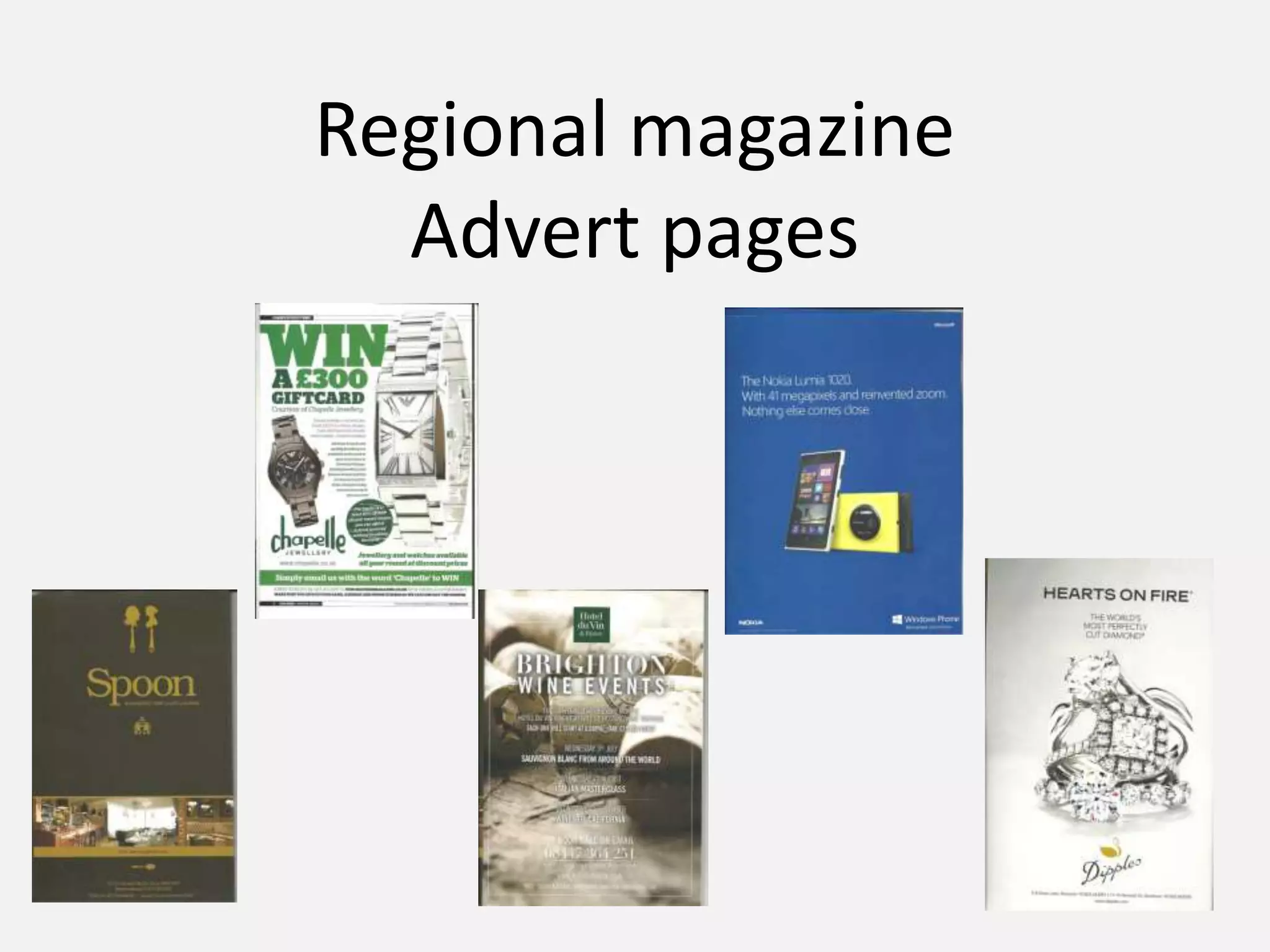
Regional magazine
Advert pages
Mayhem magazine advert
Advertising a
shopping centre for
Christmas
Picture of “Santa” By
using a picture of
something people
recognise make them
have interest in the
advert.
List of shops to
attract attention.
Uses a blue, red and
white colour
scheme. Makes the
advert eye catching.
Having a blue
background with
snowflakes gives the
advert a Christmas
feel.
Website and social
media sites
Ideas for Christmas
gifts so they will go
and get it from the
shopping centre.
Chance to win so
people will pay
attention to advert
Green, black and
white colour
scheme. Makes it
more eye
catching.
Discount token so
more people likely
to buy.
Big “win” makes it
eye catching so
people will be
interested.
Two pictures of
watches makes it
eye catching a
clear what they
sell.
Email address.
“competition time”
grabs people
attention because
they could win
something.
Information in block
text describing the
watch and smaller
details.
Studio taken picture
of the watches.
Absolut Brighton advert
Corks in the
background show
its advertising wine.
Advertising things
that are happening
in Brighton because
it’s a regional
magazine.
All the text is in
different size and fonts
so it looks eye catching
Contact details big
so it stands out.
Neatly layed out
so its easy to read
and understand.
Brown and gold colour
scheme makes the
advert stand out.
The title is the biggest
so you know what the
advert is for.
Contact details and
social media so you
can easily contact
them.
Three pictures showing
the bar so you can
clearly see what it looks
like encouraging people
to go there.
A logo to remind you
of the bar.
Neatly layed out so
its clear what they
are advertising.
Time out advert
Blue background with
white writing makes it
eye catching.
Large text stating
what they are
advertising.
Studio taken picture of
the phone they are
advertising.
Logo of the phone.Advertising the makers
of the phone.
The advert is neatly
layed out with lots
of spare space.
Norfolk advert
Address and
contact details.
Studio taken photograph of
the ring, the picture also takes
up most of the page so its
clear what they are
advertising.
Name of company and
logo.
Promoting words
encouraging you to buy
the ring.
Sophisticated colour
scheme and layout.
Kent life advert
A very empty advert
of just a picture and
a website.
Website.
Studio taken
picture. The model
is advertising the
jewellery she is
wearing.
She is also not
looking directly
into the camera.
Blurred background
behind the women.
Codes and convention for adverts.
• Adverts appear to have a set colour scheme too them. They normally have 2 or 3 main colours
which dominate the advert.
• They normally have a studio shot photo of the thing they are advertising.
• They also seems to have quite a lot of space on the page there is not too many things on the page.
They are neatly set out.
• The biggest writing on the page is normally what the product is called. For example if there
advertising a phone the name of the phone is be dominant on the page.
• They also have email addresses and social networking sites on the page.
• They normally have 1 main picture on the advert and that is it. (Sometime two if they take a
picture of the same thing at a different angle)
From looking at the magazine adverts I
wish to carry forward...
• A colour scheme with 2 or 3 main colours.
• A studio shot photo of the product I am advertising as this makes it look the best it can be. It also
makes the product look professional.
• I will have a neat layout on the page without too much text or other things making the page look
full. I will do this because it makes it clear what you are advertising because only the important
things are on the page.
• I will have email address, and social media links near the bottom of my page as this makes it easy
for people to look into the product more.
• The biggest font on the page will be the name of the product so it is clear what it being
advertised.

Regional magazine advert

  • 1.
  • 2.
    Mayhem magazine advert Advertisinga shopping centre for Christmas Picture of “Santa” By using a picture of something people recognise make them have interest in the advert. List of shops to attract attention. Uses a blue, red and white colour scheme. Makes the advert eye catching. Having a blue background with snowflakes gives the advert a Christmas feel. Website and social media sites Ideas for Christmas gifts so they will go and get it from the shopping centre.
  • 3.
    Chance to winso people will pay attention to advert Green, black and white colour scheme. Makes it more eye catching. Discount token so more people likely to buy. Big “win” makes it eye catching so people will be interested. Two pictures of watches makes it eye catching a clear what they sell. Email address. “competition time” grabs people attention because they could win something. Information in block text describing the watch and smaller details. Studio taken picture of the watches.
  • 4.
    Absolut Brighton advert Corksin the background show its advertising wine. Advertising things that are happening in Brighton because it’s a regional magazine. All the text is in different size and fonts so it looks eye catching Contact details big so it stands out. Neatly layed out so its easy to read and understand.
  • 5.
    Brown and goldcolour scheme makes the advert stand out. The title is the biggest so you know what the advert is for. Contact details and social media so you can easily contact them. Three pictures showing the bar so you can clearly see what it looks like encouraging people to go there. A logo to remind you of the bar. Neatly layed out so its clear what they are advertising.
  • 6.
    Time out advert Bluebackground with white writing makes it eye catching. Large text stating what they are advertising. Studio taken picture of the phone they are advertising. Logo of the phone.Advertising the makers of the phone. The advert is neatly layed out with lots of spare space.
  • 7.
    Norfolk advert Address and contactdetails. Studio taken photograph of the ring, the picture also takes up most of the page so its clear what they are advertising. Name of company and logo. Promoting words encouraging you to buy the ring. Sophisticated colour scheme and layout.
  • 8.
    Kent life advert Avery empty advert of just a picture and a website. Website. Studio taken picture. The model is advertising the jewellery she is wearing. She is also not looking directly into the camera. Blurred background behind the women.
  • 9.
    Codes and conventionfor adverts. • Adverts appear to have a set colour scheme too them. They normally have 2 or 3 main colours which dominate the advert. • They normally have a studio shot photo of the thing they are advertising. • They also seems to have quite a lot of space on the page there is not too many things on the page. They are neatly set out. • The biggest writing on the page is normally what the product is called. For example if there advertising a phone the name of the phone is be dominant on the page. • They also have email addresses and social networking sites on the page. • They normally have 1 main picture on the advert and that is it. (Sometime two if they take a picture of the same thing at a different angle)
  • 10.
    From looking atthe magazine adverts I wish to carry forward... • A colour scheme with 2 or 3 main colours. • A studio shot photo of the product I am advertising as this makes it look the best it can be. It also makes the product look professional. • I will have a neat layout on the page without too much text or other things making the page look full. I will do this because it makes it clear what you are advertising because only the important things are on the page. • I will have email address, and social media links near the bottom of my page as this makes it easy for people to look into the product more. • The biggest font on the page will be the name of the product so it is clear what it being advertised.