Downloaded 1,397 times


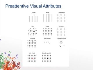


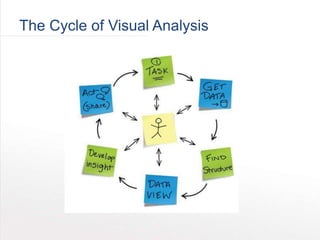
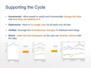

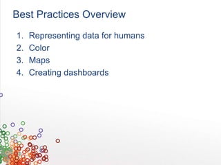
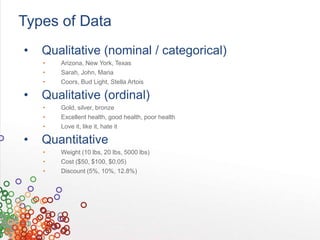
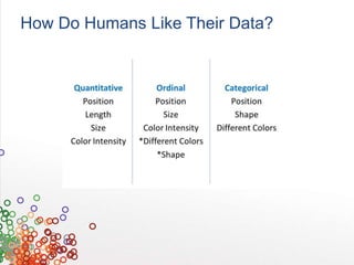
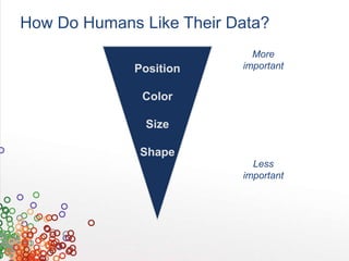


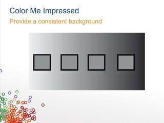
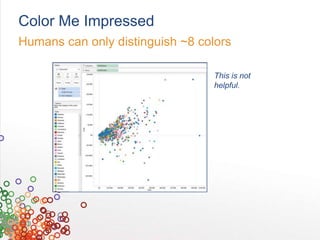
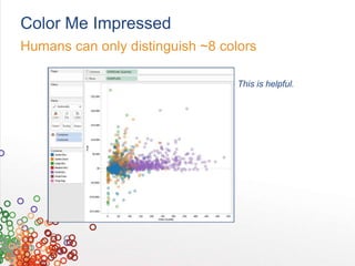

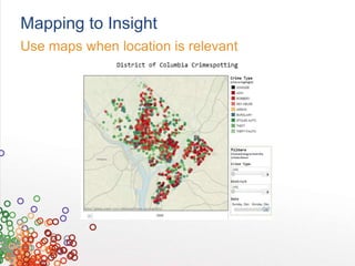


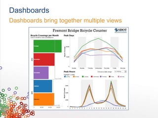

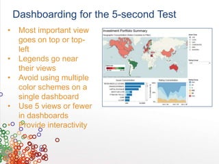
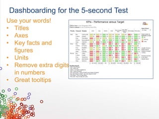

The document outlines best practices for visual analytics, emphasizing the importance of human perception and cognition in data representation. It discusses the visual analysis cycle, types of data, and effective dashboard design, stressing that data should be presented in a way that is easily interpretable. Key recommendations include using appropriate colors, avoiding visual interruptions, and allowing for interactivity in dashboards to enhance comprehension.