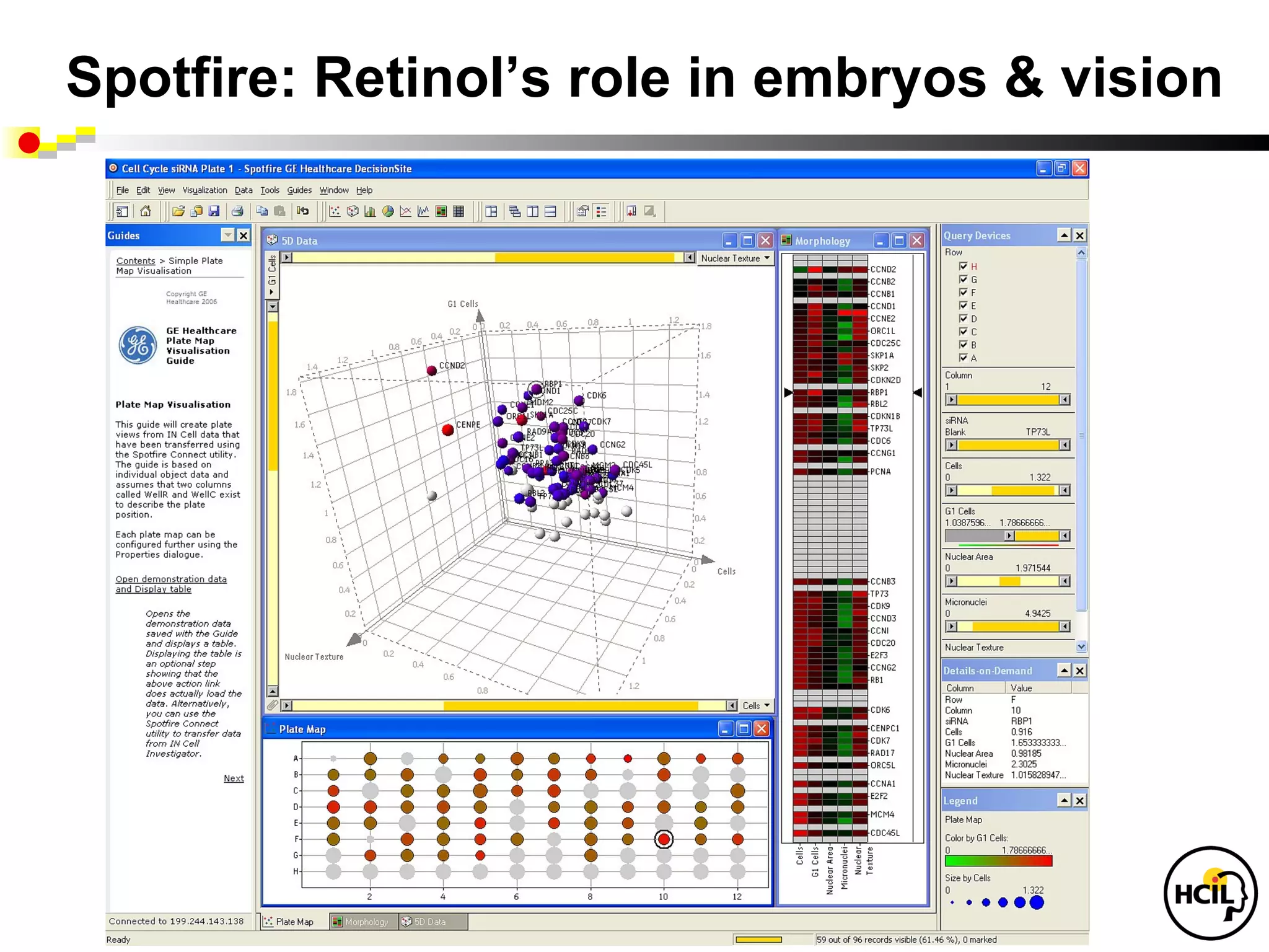
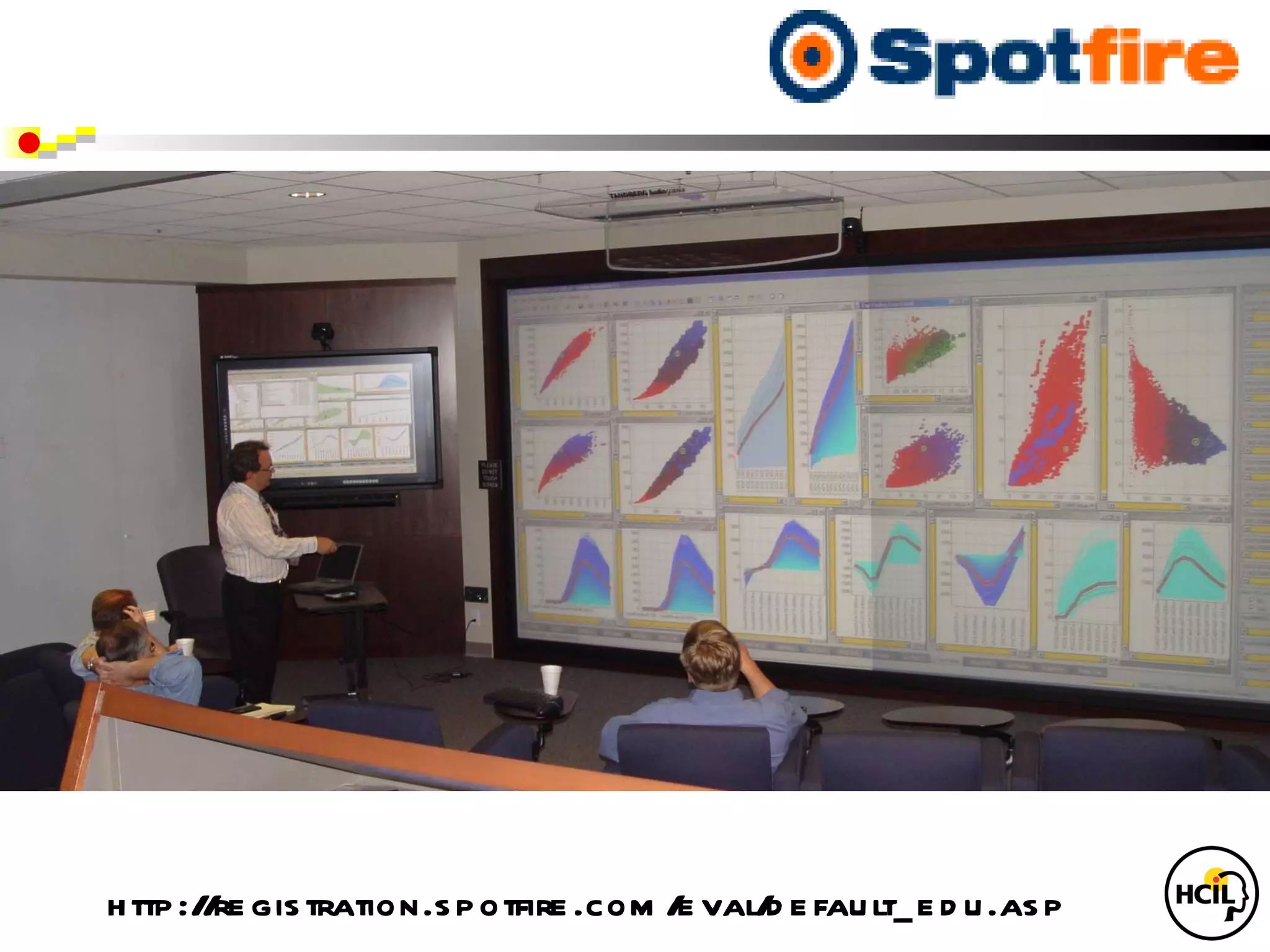
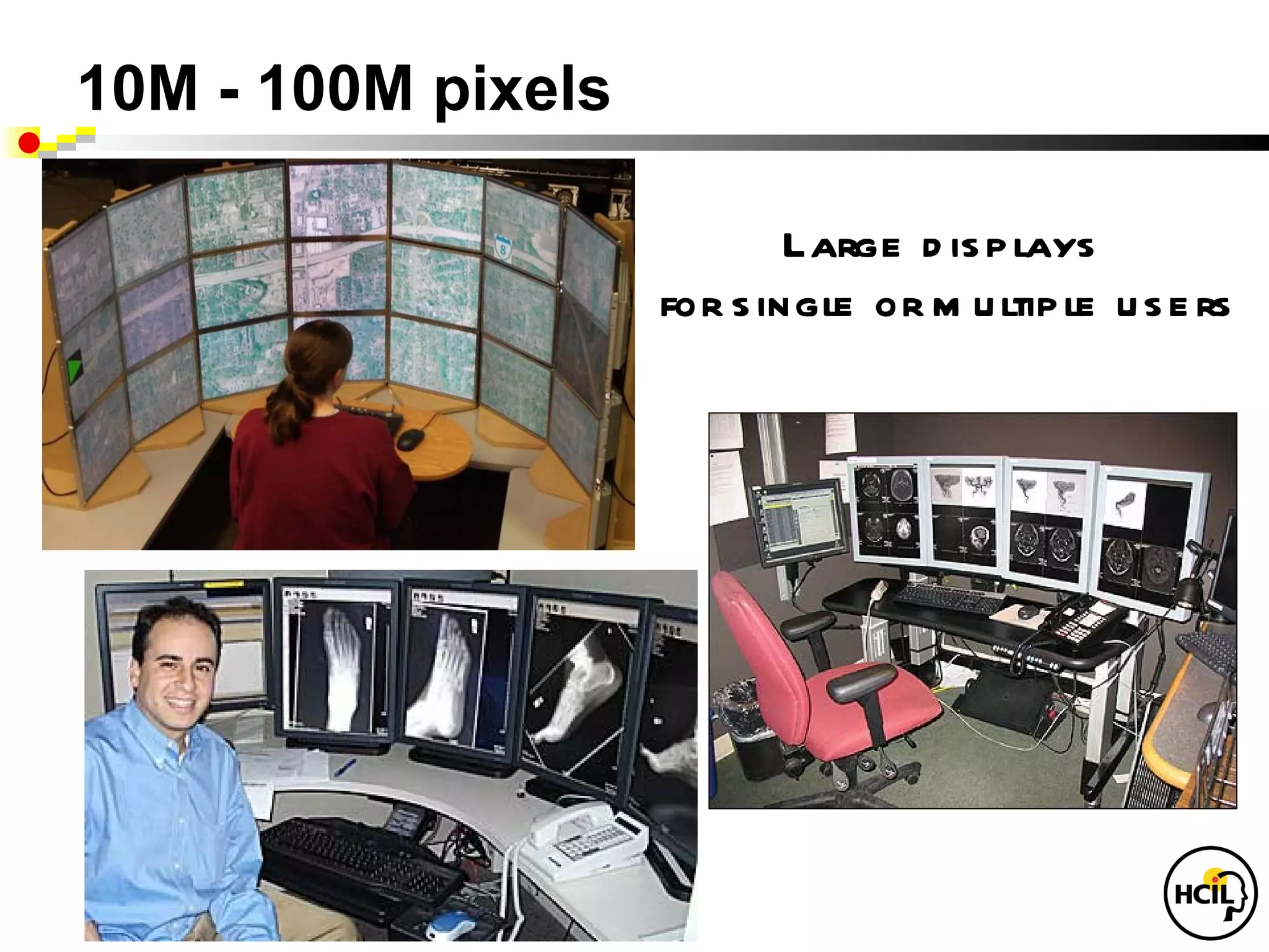
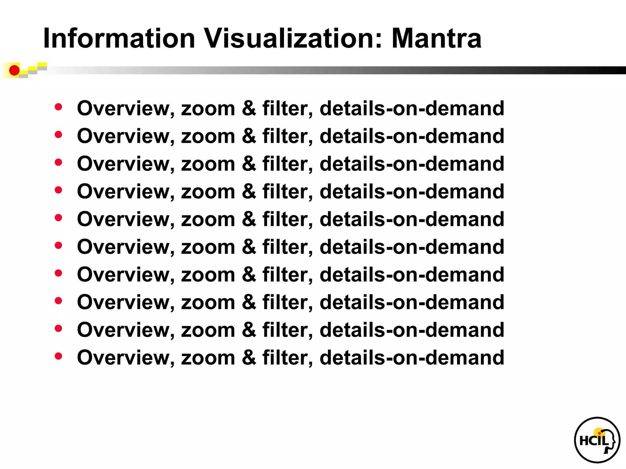
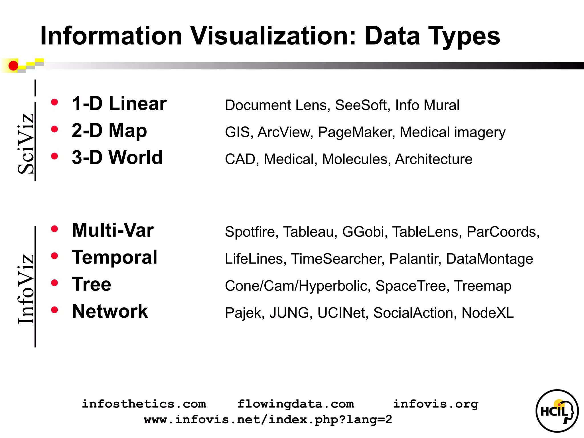
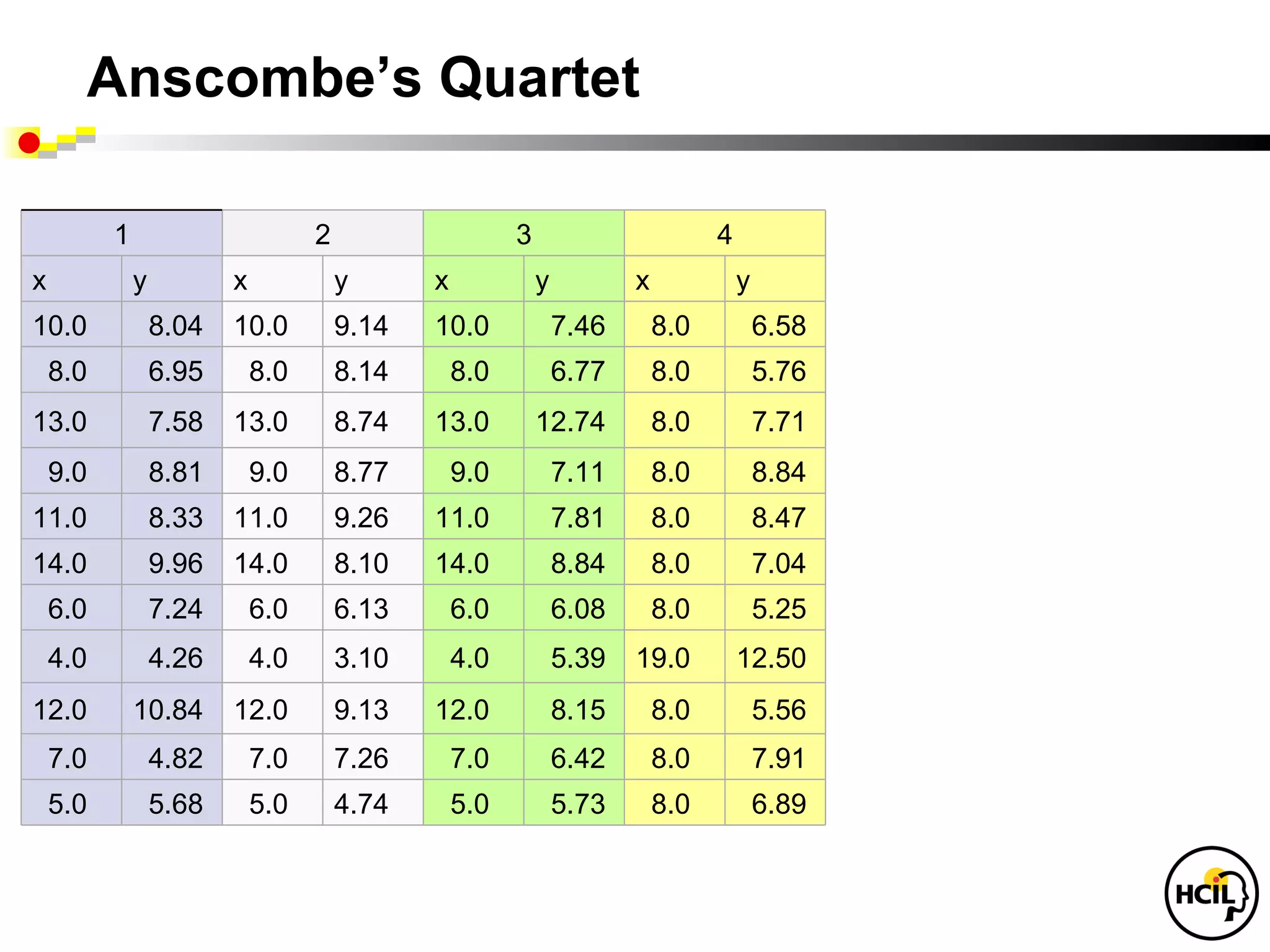
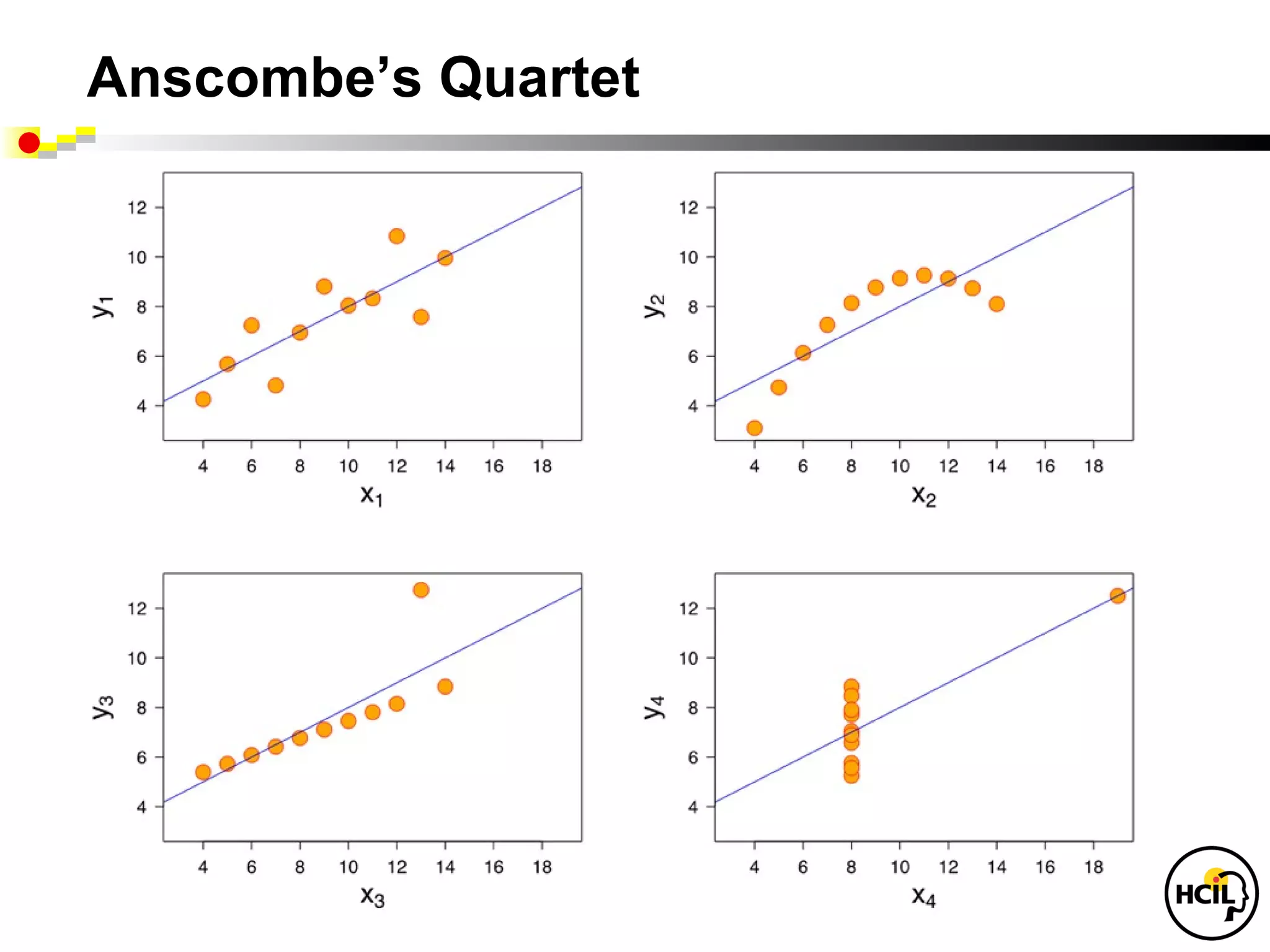
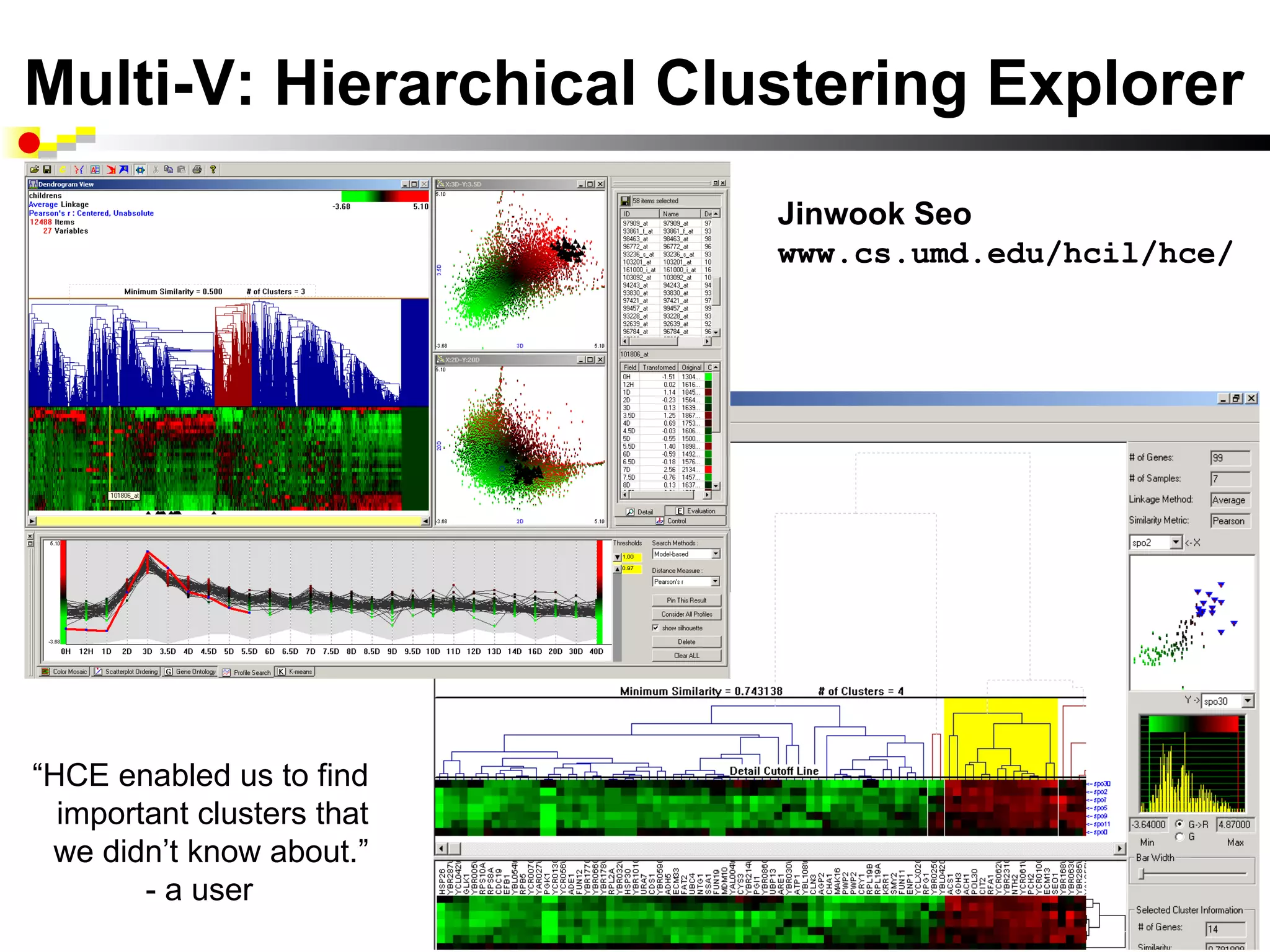
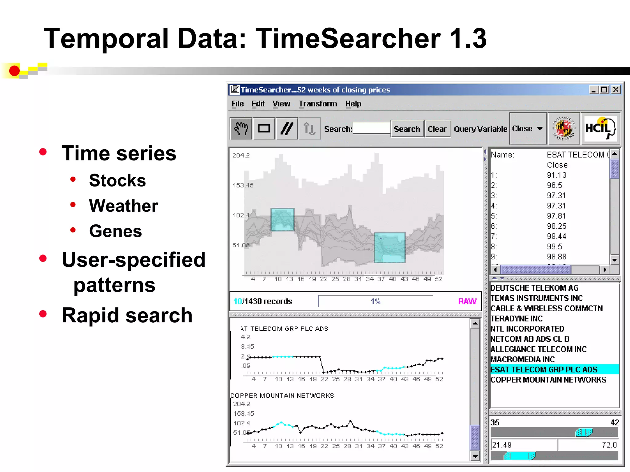
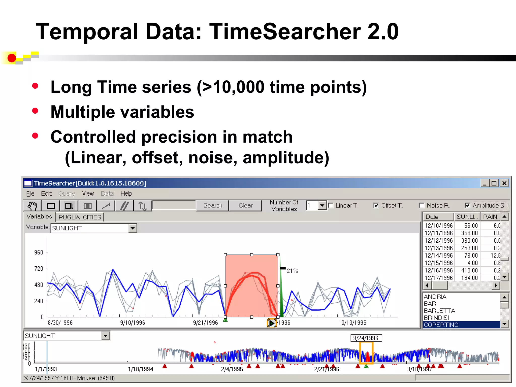
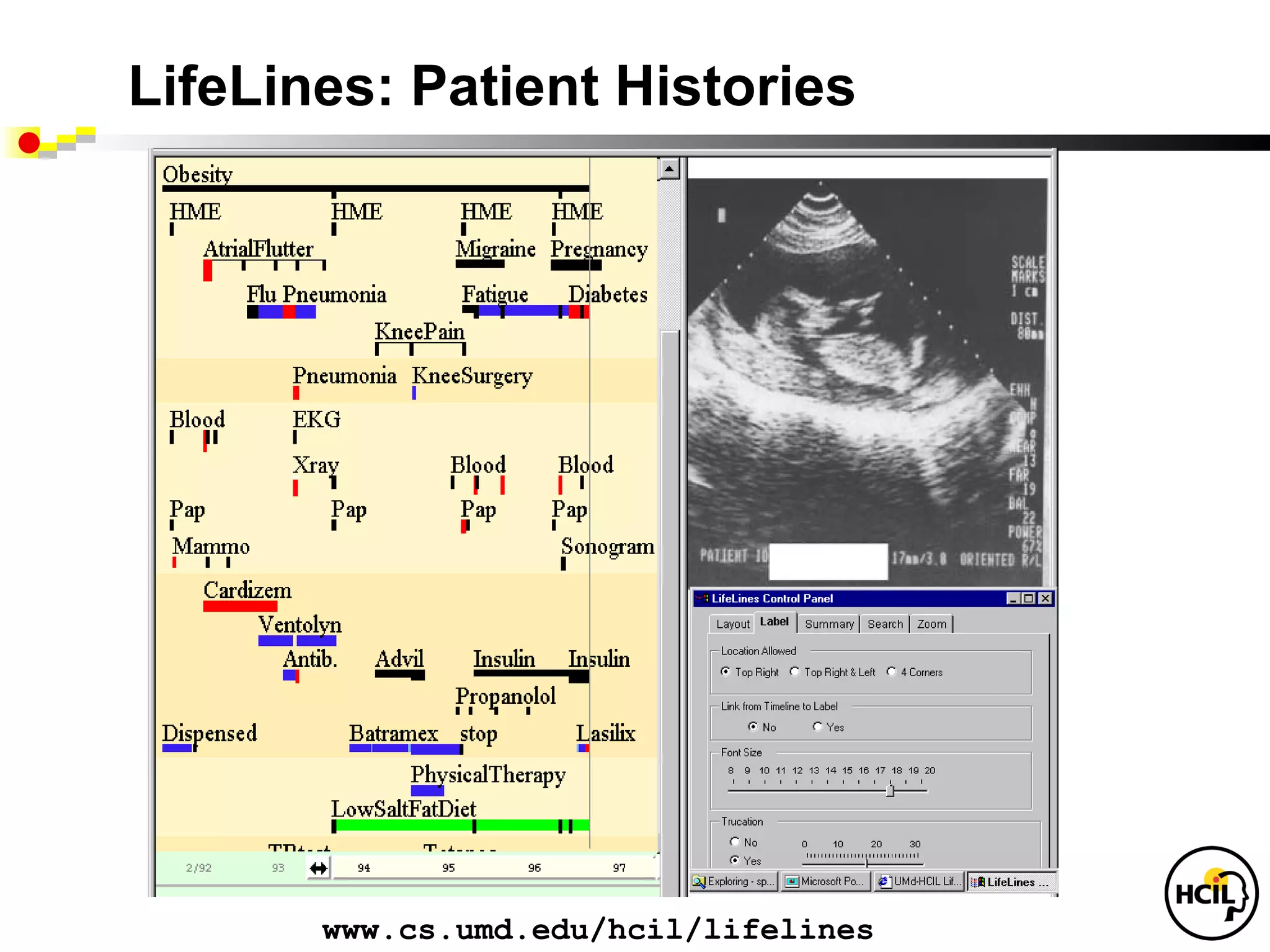
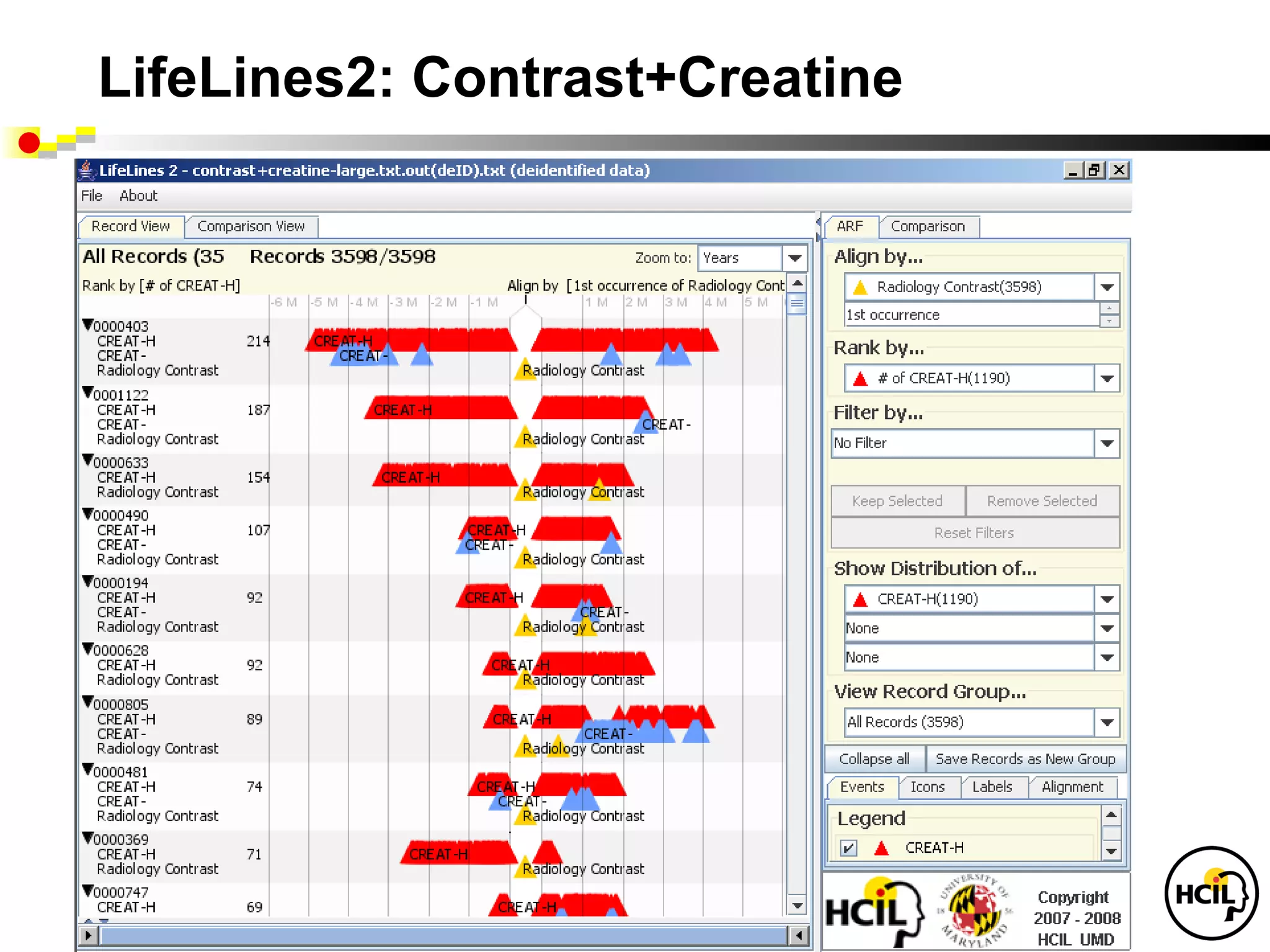
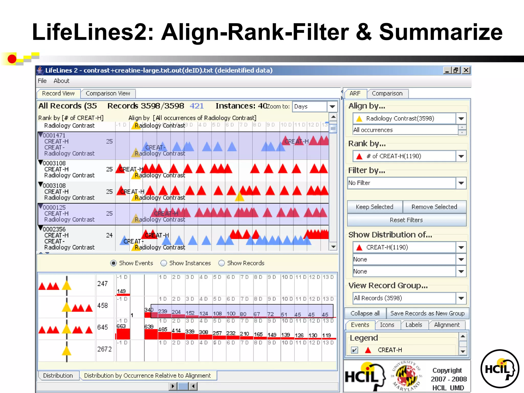
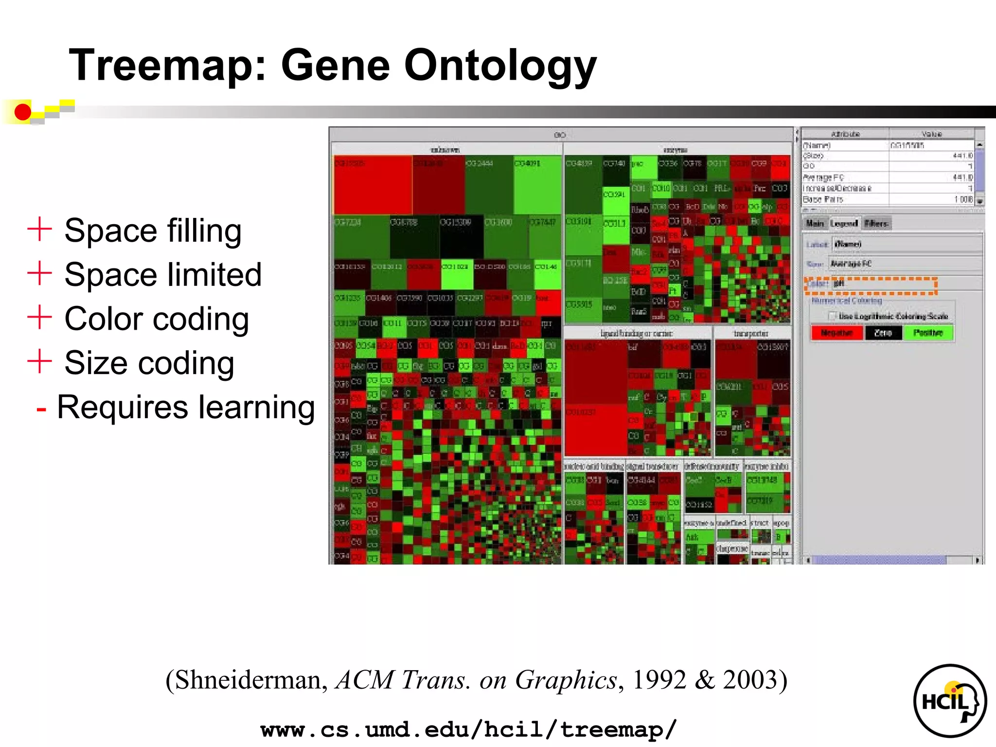
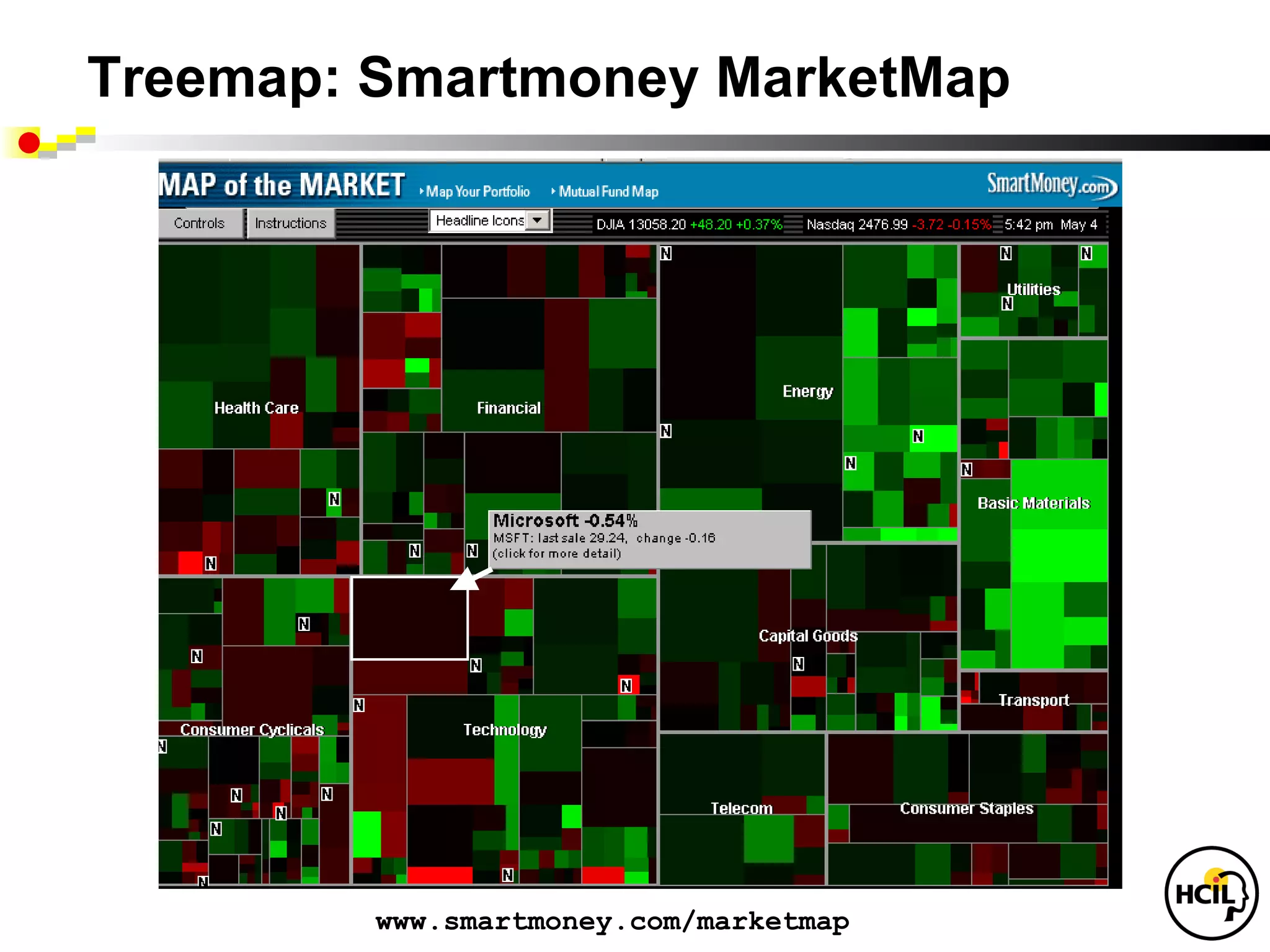
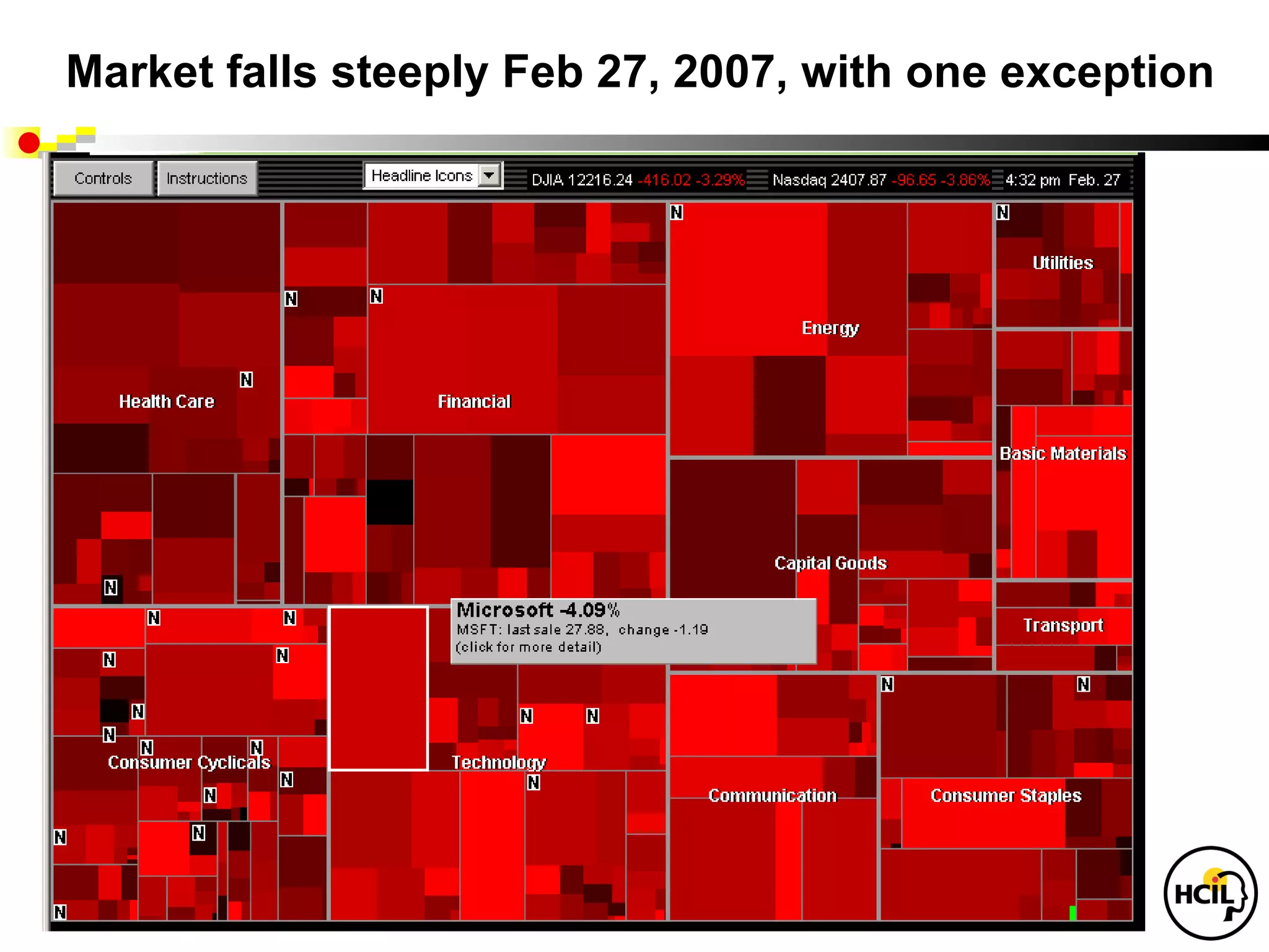
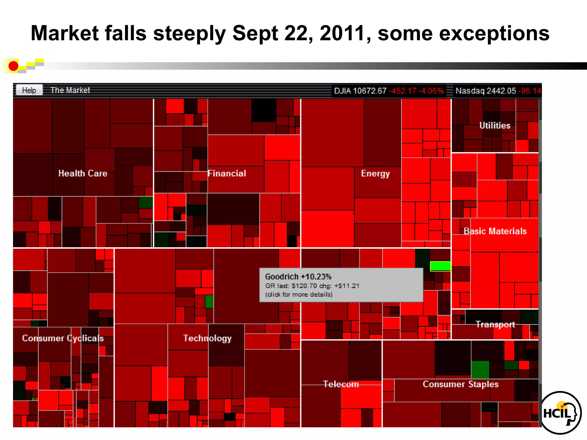
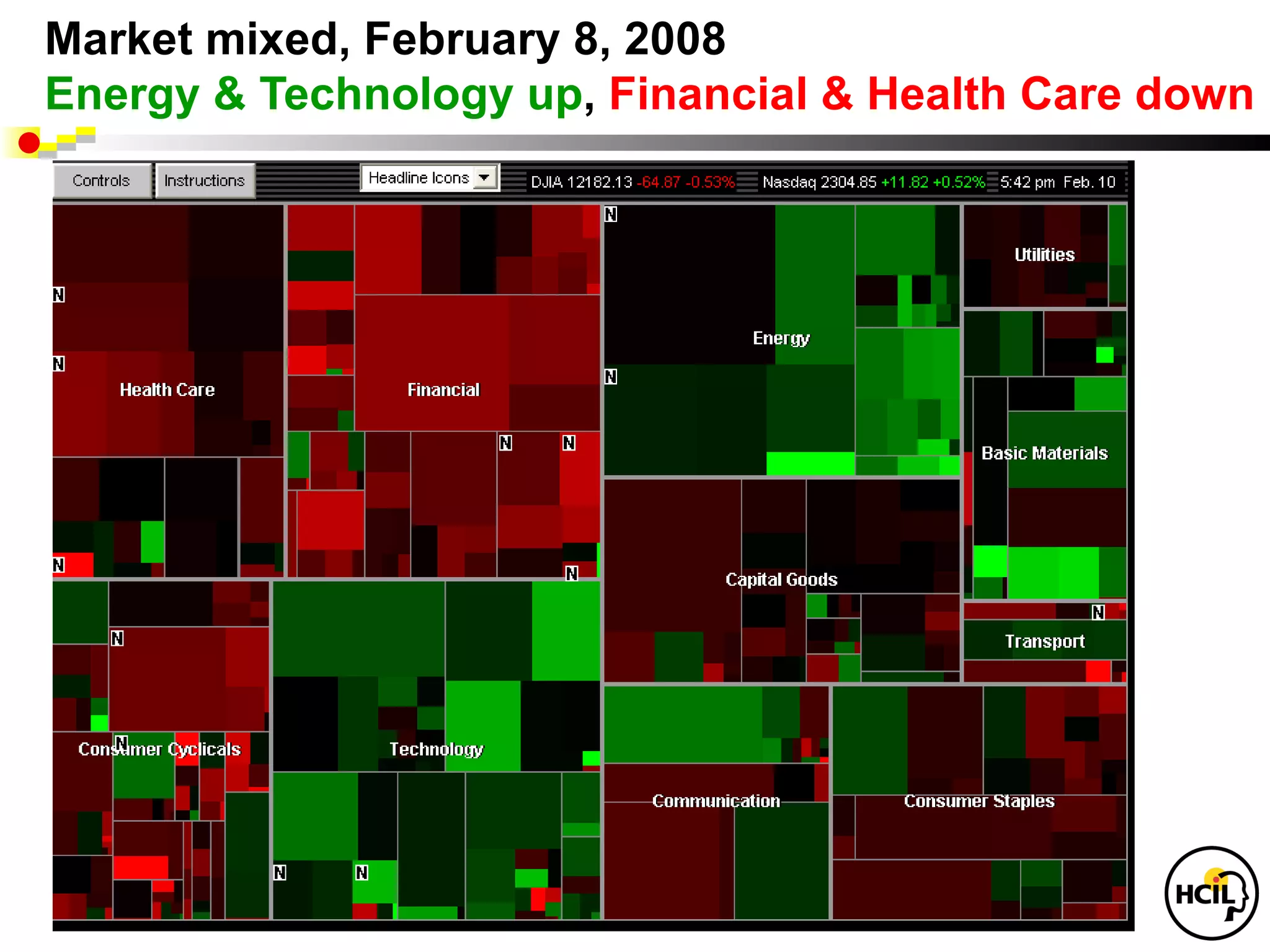
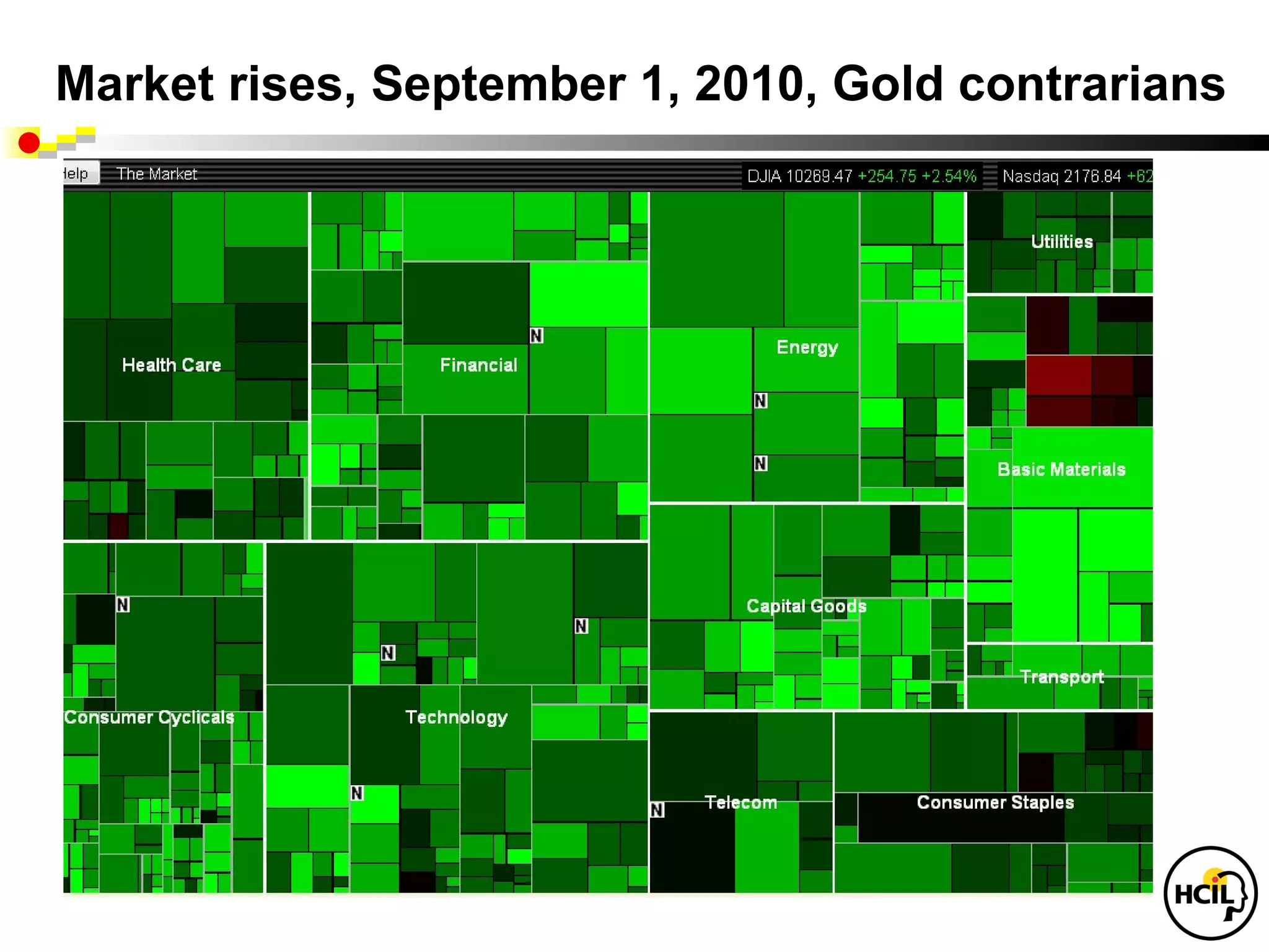
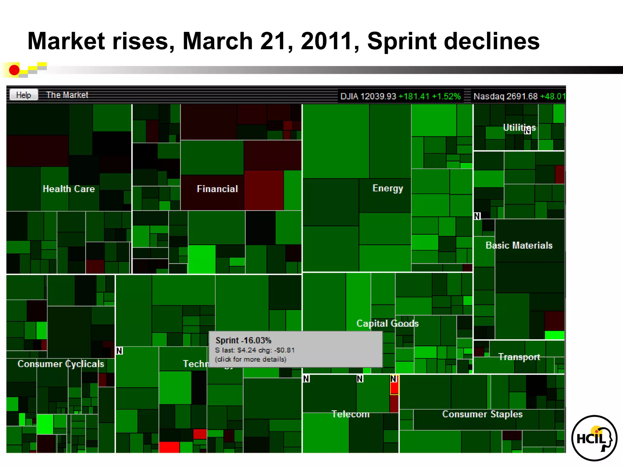
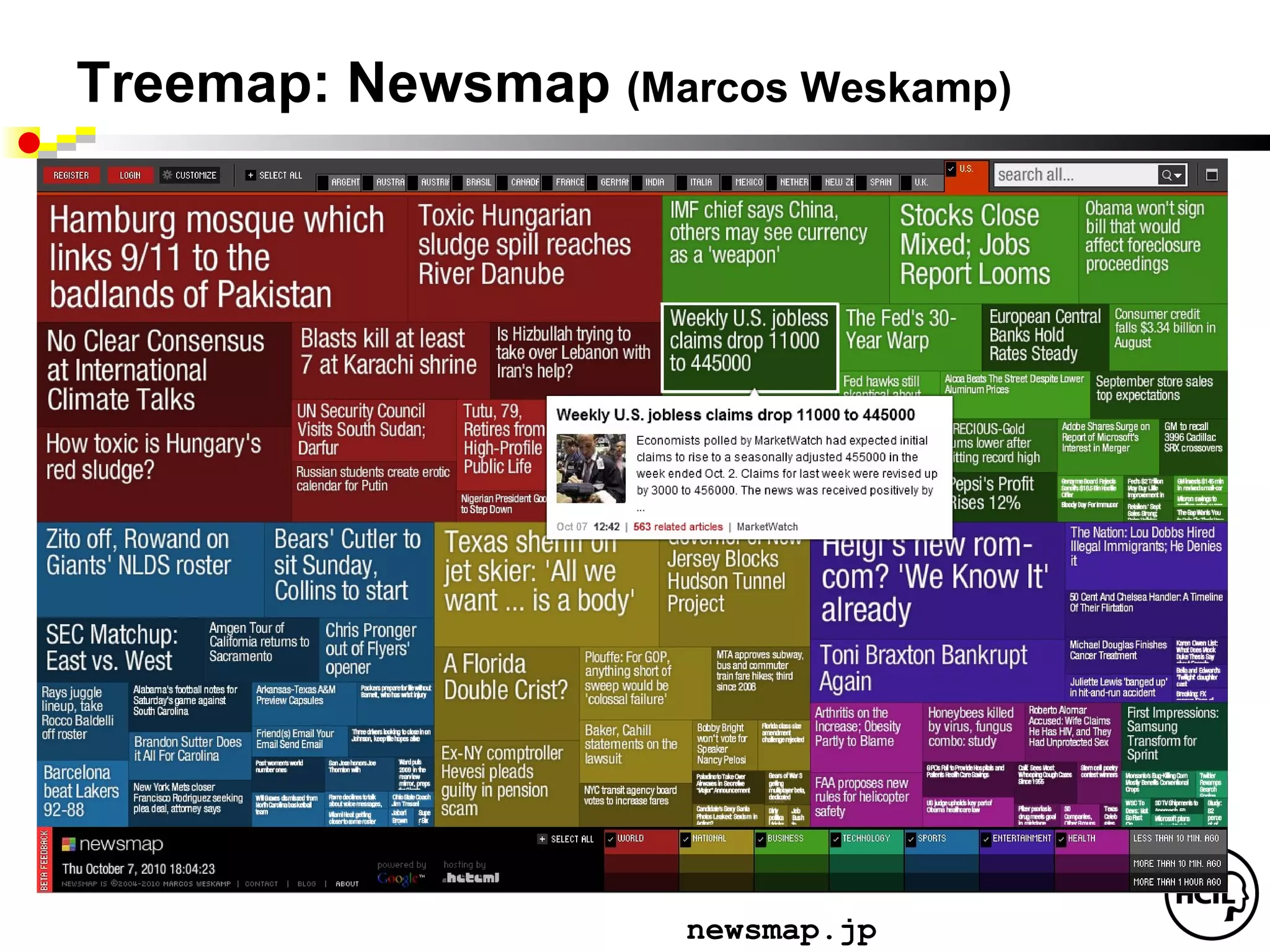
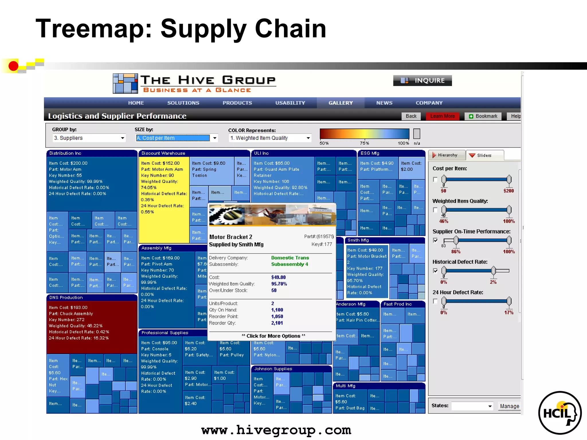
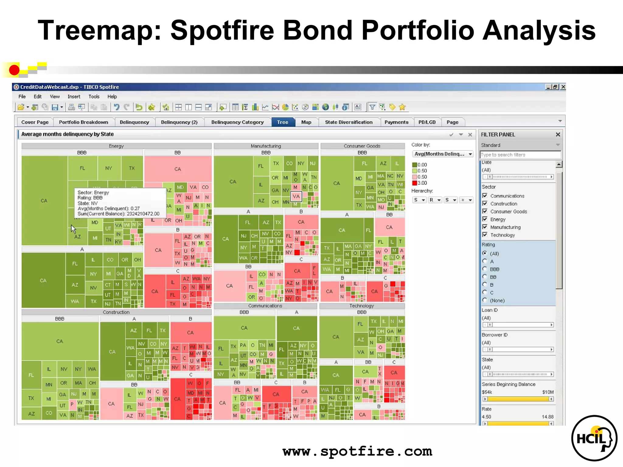
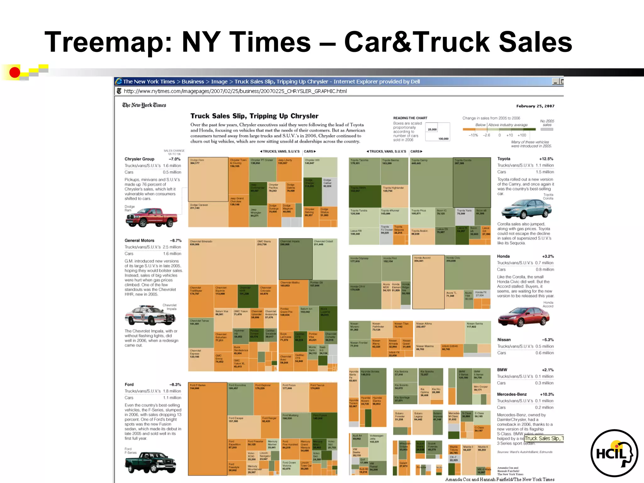
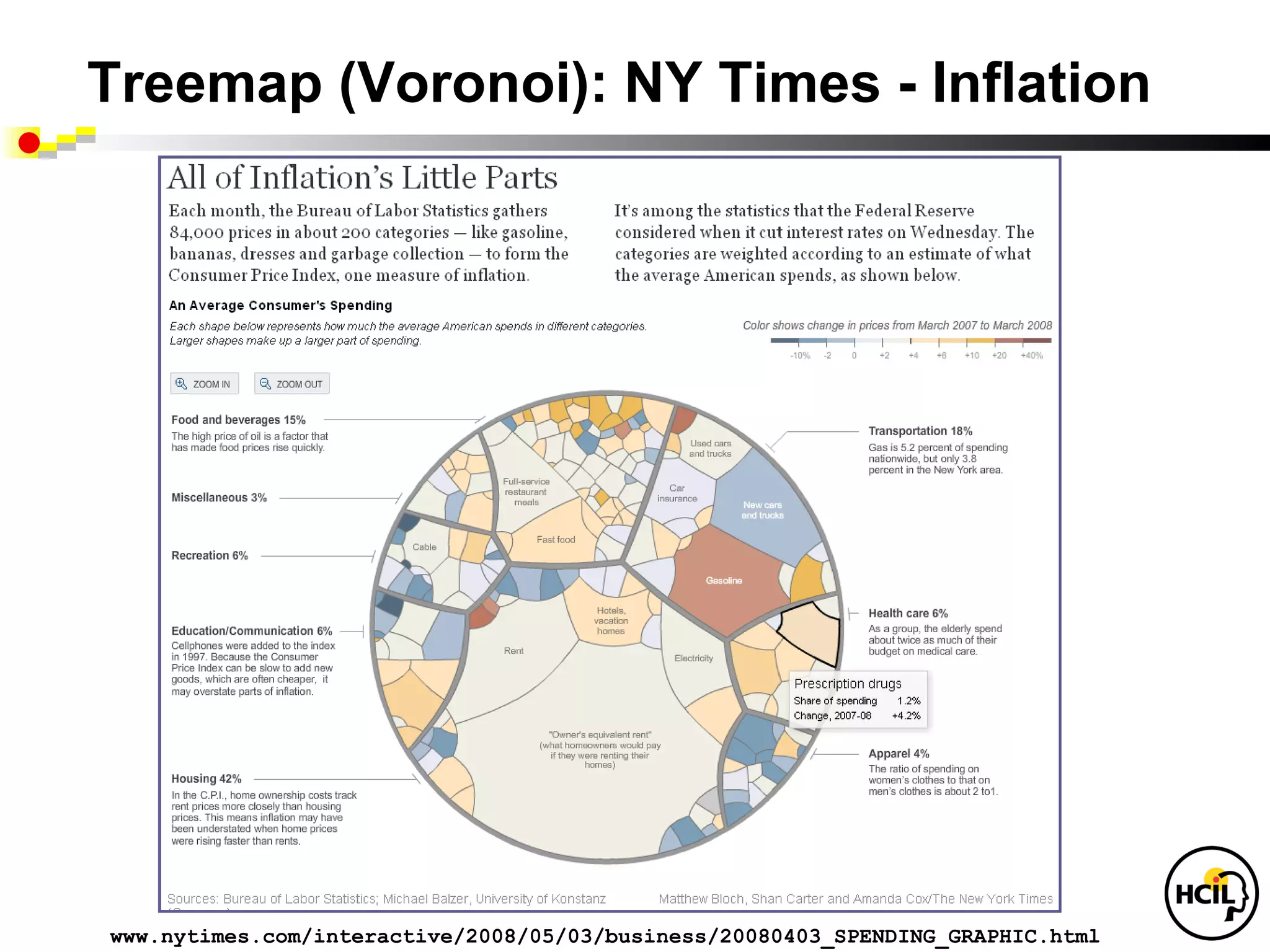
Information Visualization for Medical Informatics
Lifelines, Lifelines2, LifeFlow, treemaps, networks
(slide file: Shneiderman info vismedical-georgetown-v1 )
Information Visualization for Medical Informatics
Lifelines, Lifelines2, LifeFlow, treemaps, networks
(slide file: Shneiderman info vismedical-georgetown-v1 )
This slideshow provides an overview for best practices for visual analysis within Tableau. This is intended for anyone who wants to tell more compelling stories with their data.
Best Practices for Killer Data VisualizationQualtrics
There’s something special about simple, powerful visualizations that tell a story. In fact, 65% of people are visual learners.
Join Qualtrics and Sasha Pasulka from Tableau as we illuminate the world of data visualization and give you clear takeaways to help you tell a better story with data. Getting executive buy-in or that seat at the table may come down to who can visualize data in a way that excites and enlightens the audience.
Towards Probabilistic Assessment of ModularityKevin Hoffman
We propose new modularity metrics based on probabilistic computations over weighted design structure matrices, also known as dependency structure matrices.
We define how these metrics are calculated, discuss some practical applications, and conclude with future work.
A talk at Data Visualization Summit 2014 in Santa Clara, CA
ABSTRACT: What is the thought process that transforms data into visualizations? In this presentation, I will talk about guidelines that will help you when starting with raw data, walk through standard techniques, and also discuss things to keep in mind when making design decisions.
Presentation for Collective Intelligence conference at MIT, 4/19-20/2012, File name:
Collective intelligence 2012-shneiderman-v2
Covers policy issues for social media research, mention of our work and intro to NodeXL
Presentation on SHARP projects: Medication reconciliation, tracking medical lab tests, systematic yet flexible systems analysis, and preventing wrong patient errors. Houston, TX April 4, 2012
In his public lecture, Christian Timmerer provides insights into the fascinating history of video streaming, starting from its humble beginnings before YouTube to the groundbreaking technologies that now dominate platforms like Netflix and ORF ON. Timmerer also presents provocative contributions of his own that have significantly influenced the industry. He concludes by looking at future challenges and invites the audience to join in a discussion.
Accelerate your Kubernetes clusters with Varnish CachingThijs Feryn
A presentation about the usage and availability of Varnish on Kubernetes. This talk explores the capabilities of Varnish caching and shows how to use the Varnish Helm chart to deploy it to Kubernetes.
This presentation was delivered at K8SUG Singapore. See https://feryn.eu/presentations/accelerate-your-kubernetes-clusters-with-varnish-caching-k8sug-singapore-28-2024 for more details.
UiPath Test Automation using UiPath Test Suite series, part 4DianaGray10
Welcome to UiPath Test Automation using UiPath Test Suite series part 4. In this session, we will cover Test Manager overview along with SAP heatmap.
The UiPath Test Manager overview with SAP heatmap webinar offers a concise yet comprehensive exploration of the role of a Test Manager within SAP environments, coupled with the utilization of heatmaps for effective testing strategies.
Participants will gain insights into the responsibilities, challenges, and best practices associated with test management in SAP projects. Additionally, the webinar delves into the significance of heatmaps as a visual aid for identifying testing priorities, areas of risk, and resource allocation within SAP landscapes. Through this session, attendees can expect to enhance their understanding of test management principles while learning practical approaches to optimize testing processes in SAP environments using heatmap visualization techniques
What will you get from this session?
1. Insights into SAP testing best practices
2. Heatmap utilization for testing
3. Optimization of testing processes
4. Demo
Topics covered:
Execution from the test manager
Orchestrator execution result
Defect reporting
SAP heatmap example with demo
Speaker:
Deepak Rai, Automation Practice Lead, Boundaryless Group and UiPath MVP
Le nuove frontiere dell'AI nell'RPA con UiPath Autopilot™UiPathCommunity
In questo evento online gratuito, organizzato dalla Community Italiana di UiPath, potrai esplorare le nuove funzionalità di Autopilot, il tool che integra l'Intelligenza Artificiale nei processi di sviluppo e utilizzo delle Automazioni.
📕 Vedremo insieme alcuni esempi dell'utilizzo di Autopilot in diversi tool della Suite UiPath:
Autopilot per Studio Web
Autopilot per Studio
Autopilot per Apps
Clipboard AI
GenAI applicata alla Document Understanding
👨🏫👨💻 Speakers:
Stefano Negro, UiPath MVPx3, RPA Tech Lead @ BSP Consultant
Flavio Martinelli, UiPath MVP 2023, Technical Account Manager @UiPath
Andrei Tasca, RPA Solutions Team Lead @NTT Data
Observability Concepts EVERY Developer Should Know -- DeveloperWeek Europe.pdfPaige Cruz
Monitoring and observability aren’t traditionally found in software curriculums and many of us cobble this knowledge together from whatever vendor or ecosystem we were first introduced to and whatever is a part of your current company’s observability stack.
While the dev and ops silo continues to crumble….many organizations still relegate monitoring & observability as the purview of ops, infra and SRE teams. This is a mistake - achieving a highly observable system requires collaboration up and down the stack.
I, a former op, would like to extend an invitation to all application developers to join the observability party will share these foundational concepts to build on:
Dev Dives: Train smarter, not harder – active learning and UiPath LLMs for do...UiPathCommunity
💥 Speed, accuracy, and scaling – discover the superpowers of GenAI in action with UiPath Document Understanding and Communications Mining™:
See how to accelerate model training and optimize model performance with active learning
Learn about the latest enhancements to out-of-the-box document processing – with little to no training required
Get an exclusive demo of the new family of UiPath LLMs – GenAI models specialized for processing different types of documents and messages
This is a hands-on session specifically designed for automation developers and AI enthusiasts seeking to enhance their knowledge in leveraging the latest intelligent document processing capabilities offered by UiPath.
Speakers:
👨🏫 Andras Palfi, Senior Product Manager, UiPath
👩🏫 Lenka Dulovicova, Product Program Manager, UiPath
PHP Frameworks: I want to break free (IPC Berlin 2024)Ralf Eggert
In this presentation, we examine the challenges and limitations of relying too heavily on PHP frameworks in web development. We discuss the history of PHP and its frameworks to understand how this dependence has evolved. The focus will be on providing concrete tips and strategies to reduce reliance on these frameworks, based on real-world examples and practical considerations. The goal is to equip developers with the skills and knowledge to create more flexible and future-proof web applications. We'll explore the importance of maintaining autonomy in a rapidly changing tech landscape and how to make informed decisions in PHP development.
This talk is aimed at encouraging a more independent approach to using PHP frameworks, moving towards a more flexible and future-proof approach to PHP development.
Essentials of Automations: The Art of Triggers and Actions in FMESafe Software
In this second installment of our Essentials of Automations webinar series, we’ll explore the landscape of triggers and actions, guiding you through the nuances of authoring and adapting workspaces for seamless automations. Gain an understanding of the full spectrum of triggers and actions available in FME, empowering you to enhance your workspaces for efficient automation.
We’ll kick things off by showcasing the most commonly used event-based triggers, introducing you to various automation workflows like manual triggers, schedules, directory watchers, and more. Plus, see how these elements play out in real scenarios.
Whether you’re tweaking your current setup or building from the ground up, this session will arm you with the tools and insights needed to transform your FME usage into a powerhouse of productivity. Join us to discover effective strategies that simplify complex processes, enhancing your productivity and transforming your data management practices with FME. Let’s turn complexity into clarity and make your workspaces work wonders!
Transcript: Selling digital books in 2024: Insights from industry leaders - T...BookNet Canada
The publishing industry has been selling digital audiobooks and ebooks for over a decade and has found its groove. What’s changed? What has stayed the same? Where do we go from here? Join a group of leading sales peers from across the industry for a conversation about the lessons learned since the popularization of digital books, best practices, digital book supply chain management, and more.
Link to video recording: https://bnctechforum.ca/sessions/selling-digital-books-in-2024-insights-from-industry-leaders/
Presented by BookNet Canada on May 28, 2024, with support from the Department of Canadian Heritage.
Climate Impact of Software Testing at Nordic Testing DaysKari Kakkonen
My slides at Nordic Testing Days 6.6.2024
Climate impact / sustainability of software testing discussed on the talk. ICT and testing must carry their part of global responsibility to help with the climat warming. We can minimize the carbon footprint but we can also have a carbon handprint, a positive impact on the climate. Quality characteristics can be added with sustainability, and then measured continuously. Test environments can be used less, and in smaller scale and on demand. Test techniques can be used in optimizing or minimizing number of tests. Test automation can be used to speed up testing.
GDG Cloud Southlake #33: Boule & Rebala: Effective AppSec in SDLC using Deplo...James Anderson
Effective Application Security in Software Delivery lifecycle using Deployment Firewall and DBOM
The modern software delivery process (or the CI/CD process) includes many tools, distributed teams, open-source code, and cloud platforms. Constant focus on speed to release software to market, along with the traditional slow and manual security checks has caused gaps in continuous security as an important piece in the software supply chain. Today organizations feel more susceptible to external and internal cyber threats due to the vast attack surface in their applications supply chain and the lack of end-to-end governance and risk management.
The software team must secure its software delivery process to avoid vulnerability and security breaches. This needs to be achieved with existing tool chains and without extensive rework of the delivery processes. This talk will present strategies and techniques for providing visibility into the true risk of the existing vulnerabilities, preventing the introduction of security issues in the software, resolving vulnerabilities in production environments quickly, and capturing the deployment bill of materials (DBOM).
Speakers:
Bob Boule
Robert Boule is a technology enthusiast with PASSION for technology and making things work along with a knack for helping others understand how things work. He comes with around 20 years of solution engineering experience in application security, software continuous delivery, and SaaS platforms. He is known for his dynamic presentations in CI/CD and application security integrated in software delivery lifecycle.
Gopinath Rebala
Gopinath Rebala is the CTO of OpsMx, where he has overall responsibility for the machine learning and data processing architectures for Secure Software Delivery. Gopi also has a strong connection with our customers, leading design and architecture for strategic implementations. Gopi is a frequent speaker and well-known leader in continuous delivery and integrating security into software delivery.
Elevating Tactical DDD Patterns Through Object CalisthenicsDorra BARTAGUIZ
After immersing yourself in the blue book and its red counterpart, attending DDD-focused conferences, and applying tactical patterns, you're left with a crucial question: How do I ensure my design is effective? Tactical patterns within Domain-Driven Design (DDD) serve as guiding principles for creating clear and manageable domain models. However, achieving success with these patterns requires additional guidance. Interestingly, we've observed that a set of constraints initially designed for training purposes remarkably aligns with effective pattern implementation, offering a more ‘mechanical’ approach. Let's explore together how Object Calisthenics can elevate the design of your tactical DDD patterns, offering concrete help for those venturing into DDD for the first time!
Secstrike : Reverse Engineering & Pwnable tools for CTF.pptx
Info vis 4-2012-part1
1. Information Visualization for
Knowledge Discovery
Ben Shneiderman
ben@cs.umd.edu @benbendc
Founding Director (1983-2000), Human-Computer Interaction Lab
Professor, Department of Computer Science
Member, Institute for Advanced Computer Studies
University of Maryland
College Park, MD 20742
3. Design Issues
• Input devices & strategies
• Keyboards, pointing devices, voice
• Direct manipulation
• Menus, forms, commands
• Output devices & formats
• Screens, windows, color, sound
• Text, tables, graphics
• Instructions, messages, help
• Collaboration & Social Media www.awl.com/DTUI
Fifth E dition: 2010
• Help, tutorials, training
• Search • Vis u alization
4. Information Visualization
• Visual bandwidth is enormous
• Human perceptual skills are remarkable
• Trend, cluster, gap, outlier...
• Color, size, shape, proximity...
• Three challenges
• Meaningful visual displays of massive data
• Interaction: widgets & window coordination
• Process models for discovery
5. Business takes action
• General Dynamics buys MayaViz
• Agilent buys GeneSpring
• Google buys Gapminder
• Oracle buys Hyperion
• Microsoft buys Proclarity
• InfoBuilders buys Advizor Solutions
• SAP buys (Business Objects buys
Xcelsius & Inxight & Crystal Reports )
• IBM buys (Cognos buys Celequest) & ILOG
• TIBCO buys Spotfire
16. Multi-V: Hierarchical Clustering Explorer
Jinwook Seo
www.cs.umd.edu/hcil/hce/
“HCE enabled us to find
important clusters that
we didn’t know about.”
- a user
17. Temporal Data: TimeSearcher 1.3
• Time series
• Stocks
• Weather
• Genes
• User-specified
patterns
• Rapid search
18. Temporal Data: TimeSearcher 2.0
• Long Time series (>10,000 time points)
• Multiple variables
• Controlled precision in match
(Linear, offset, noise, amplitude)
22. LifeFlow: Aggregation Strategy
Te m p oral
C ate gorical D ata
(4 re cord s )
Life Line s 2 form at
Tre e of E ve nt
S e qu e nce s
Life F low Aggre gation
www.cs.umd.edu/hcil/lifeflow
40. Treemap (Voronoi): NY Times - Inflation
www.nytimes.com/interactive/2008/05/03/business/20080403_SPENDING_GRAPHIC.html
Editor's Notes
"The IN Cell Analyzer automated microscope was used to identify proteins influencing the division of human cells. After the images were analyzed, quantitative results were transferred to Spotfire DecisionSite. This screen revealed the previously unknown involvement of the retinol binding protein RBP1 in cell cycle control.(Stubbs S, & Thomas N. 2006 Methods in Enzymology; 414:1-21.) Retinol a form of Vitamin A plays a crucial role in vision and during embryonic development"
Contrast and Creatinine dataset In some diagnostic radiology procedures, patients are injected contrast material. However, some patients develop adverse side effects to the contrast material. One serious side effect is renal failure, which is detected by high creatinine levels in a patient's blood. This adverse effect usually occur within two weeks after the radiology contrast. WHC is interested in finding the proportion of patients who exhibit this condition in historical records. Screenshots 1-aligned-ranked.png: We align by the 1st occurrence of radiology contrast and rank by the number of creatinine high (CREAT-H) events to bring the most severe patients to the top. We realize two things: (1) some patients have more than 1 "Radiology Contrast" events, and (2), some patients have consistently high creatinine readings (chronic kidney failure). 2-aligned(all)-distribution-selected.png We align by all occurrences of raiology contrast, and then show the temporal summary of CREAT-H events. The patients are presented in 4 exclusive sets in the summary: those who have CREAT-H only before alignment, only after alignment, both before and after, and neither. We then select from the "only after" summary the patients who have at least one CREAT-H event within 2 weeks of any "Radiology Contrast" event. There are 421 patients.
Using LifeFlow, 7,041 patients are aggregated into this visualization and LifeFlow immediately reveal the most common pattern, which you could not do easily in SQL. You could easily notice this huge pattern “Arrival -> ER -> Exit”, meaning patients who visited with minor injuries or simple conditions and left the hospital immediately after receiving their treatment. When hovering the mouse over, LifeFlow displays a tooltip that gives more information, such as number of patients and other statistics, and also shows the distribution of the patients. As the horizontal gap represents time, you can see from the distribution that some patients left the hospital very quickly after visiting the emergency room while some of them stayed longer. *optional The second most common pattern is “Arrival (Blue) -> ER (Pink) -> Floor (Green) -> Exit (Cyan)”, meaning patients who were admitted to observe the conditions and then everything went well so they left the hospital. You can also use the horizontal gap to compare these patients with the patients who exit from the emergency room. Comparing the gap from pink to cyan and pink to green, you can see that the gap from pink to green is smaller than pink to cyan, so the patients were transferred to Floor faster than exit the hospital in average. You have seen the two most common cases, now I will remove the common patterns so we can analyze the less frequent patterns.
After removing all the common cases, we have 344 patients left. These are mostly the patients who were admitted. There are many information that I can explain from this visualization here, but I will go straight into the case that our physician partners are mostly interested in. The mouse is pointing at this sequence, which represents the “bounce backs” patients, meaning patients who were transferred from ICU to Floor because they seemed to get better, however, they were transferred back to the ICU. So the physician are interested in finding these patients to analyze what made them made the wrong decisions. *optional Another case is the step ups, which means the patients whose level of care were escalated to higher level, you can see from the visualization that there were patients who were transferred from ER to Floor (green) to ICU (red) and IMC (orange). The number of these patients and the average transferred time could be compare to the hospital standards to measure the quality of care.
Ben: This slide is optional. You can use it to show that when you click on the bounce backs patients, you can get the details of each patient in LifeLines2 view.
Another interesting feature is you can align by a particular event. For example, if you want to know what happened before and after the patients went to the ICU, you can align by ICU. The dash line separate between what happened before and what happened after. You can see that the ICU patients mostly came from the ER (pink), and most of them were transferred to Floor (green) after that. Unfortunately, some of them died after they were transferred to the ICU (black). From this visualization, you may notice a small pattern in the bottom. Let me zoom in.
So this patient was dead before transferred to the ICU, which is impossible. Of course, this must be problem with data entry. But we may never notice it if the data are hidden in the database. Therefore, you can see that LifeFlow support this kind of analysis by giving overview, showing common trends, providing summary of every sequences, you can do SQL and calculate average for every transfer if you like, but in LifeFlow, it is right there, you just need to move your mouse over. showing every possible transfer pattern and may led you to a discovery of surprising pattern.