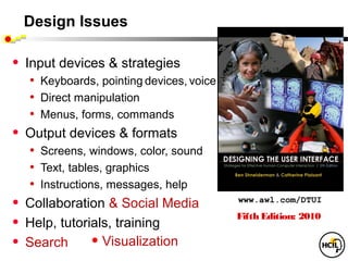
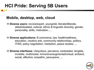
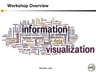
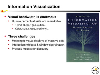
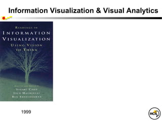
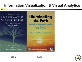
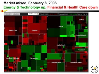
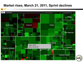
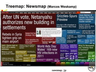
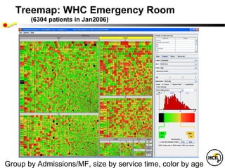
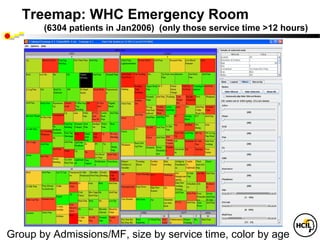
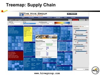
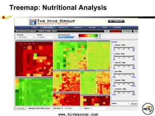
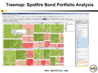
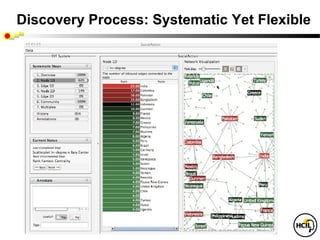
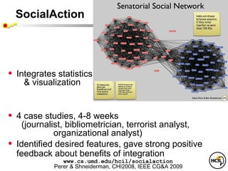
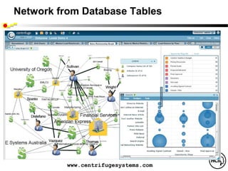
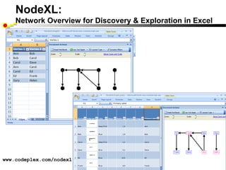
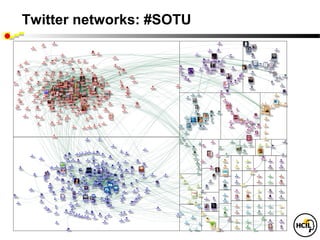
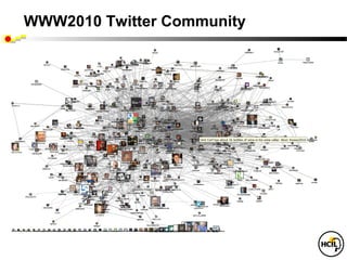
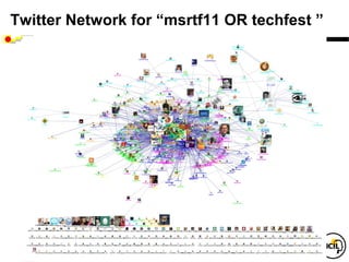
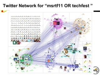
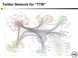
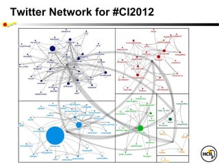
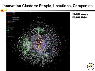
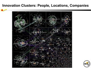
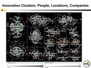
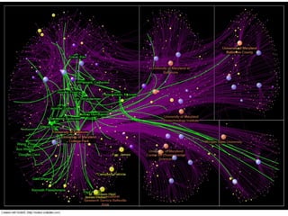
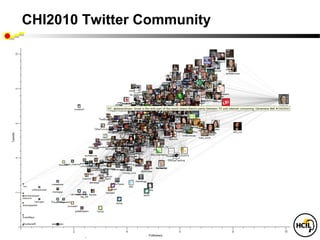
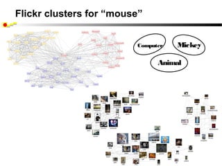
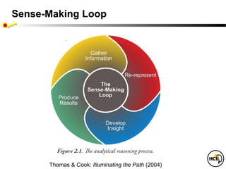
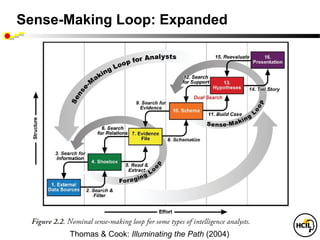
The document discusses visual analytics and information visualization, describing how new tools can provide insights from data through the combination of visualization, human interaction, and data mining. It outlines challenges in creating meaningful visual displays of massive data, enabling interaction, and developing process models for discovery. The field of visual analytics uses visual representations and interaction to help analysts gain insights into datasets and solve analytical problems.
Information Visualization for Medical Informatics
Lifelines, Lifelines2, LifeFlow, treemaps, networks
(slide file: Shneiderman info vismedical-georgetown-v1 )
Information Visualization for Medical Informatics
Lifelines, Lifelines2, LifeFlow, treemaps, networks
(slide file: Shneiderman info vismedical-georgetown-v1 )
This slideshow provides an overview for best practices for visual analysis within Tableau. This is intended for anyone who wants to tell more compelling stories with their data.
Best Practices for Killer Data VisualizationQualtrics
There’s something special about simple, powerful visualizations that tell a story. In fact, 65% of people are visual learners.
Join Qualtrics and Sasha Pasulka from Tableau as we illuminate the world of data visualization and give you clear takeaways to help you tell a better story with data. Getting executive buy-in or that seat at the table may come down to who can visualize data in a way that excites and enlightens the audience.
A talk at Data Visualization Summit 2014 in Santa Clara, CA
ABSTRACT: What is the thought process that transforms data into visualizations? In this presentation, I will talk about guidelines that will help you when starting with raw data, walk through standard techniques, and also discuss things to keep in mind when making design decisions.
Feature Detector and Descriptor
Feature Detector and DescriptorFeature Detector and DescriptorFeature Detector and DescriptorFeature Detector and Descriptor
It is the best book on data mining so far, and I would defln,(teJ�_.,tdiiPt
my course. The book is very C011Jprehensive and cove� all of
topics and algorithms of which I am aware. The depth of CO!Irer•liM
topic or method is exactly right and appropriate. Each a/grorirtmti �r�
in pseudocode that is s , icient for any interested readers to
working implementation in a computer language of their choice.
-Michael H Huhns, Umversity of �UDilCiii
Discussion on distributed, parallel, and incremental algorithms is outst:tlftfi!tr··· '��
-Z an Obradovic, Temple Univef'Sf1tv
Margaret Dunham offers the experienced data base professional or graduate
level Computer Science student an introduction to the full spectrum of Data
Mining concepts and algorithms. Using a database perspective throughout,
Professor Dunham examines algorithms, data structures, data types, and
complexity of algorithms and space. This text emphasizes the use of data
mining concepts in real-world applications with large database components.
KEY FEATURES:
.. Covers advanced topics such as Web Mining and Spatialrremporal mining
Includes succinct coverage of Data Warehousing, OLAP, Multidimensional
Data, and Preprocessing
Provides case studies
Offers clearly written algorithms to better understand techniques
Includes a reference on how to use Prototypes and DM products
Bibliotheca Digitalis. Reconstitution of Early Modern Cultural Networks. From Primary Source to Data.
DARIAH / Biblissima Summer School, 4-8 July 2017, Le Mans, France.
5th and last day, July 8th – Digital representation and data accuracy for Humanities.
Visualisation in Digital Humanities for Understanding, Cleaning, and Explaining.
Jean-Daniel Fekete – Research Scientist, INRIA.
Abstract: https://bvh.hypotheses.org/3330#conf-JDFekete
Presentation for Collective Intelligence conference at MIT, 4/19-20/2012, File name:
Collective intelligence 2012-shneiderman-v2
Covers policy issues for social media research, mention of our work and intro to NodeXL
Presentation on SHARP projects: Medication reconciliation, tracking medical lab tests, systematic yet flexible systems analysis, and preventing wrong patient errors. Houston, TX April 4, 2012
State of ICS and IoT Cyber Threat Landscape Report 2024 previewPrayukth K V
The IoT and OT threat landscape report has been prepared by the Threat Research Team at Sectrio using data from Sectrio, cyber threat intelligence farming facilities spread across over 85 cities around the world. In addition, Sectrio also runs AI-based advanced threat and payload engagement facilities that serve as sinks to attract and engage sophisticated threat actors, and newer malware including new variants and latent threats that are at an earlier stage of development.
The latest edition of the OT/ICS and IoT security Threat Landscape Report 2024 also covers:
State of global ICS asset and network exposure
Sectoral targets and attacks as well as the cost of ransom
Global APT activity, AI usage, actor and tactic profiles, and implications
Rise in volumes of AI-powered cyberattacks
Major cyber events in 2024
Malware and malicious payload trends
Cyberattack types and targets
Vulnerability exploit attempts on CVEs
Attacks on counties – USA
Expansion of bot farms – how, where, and why
In-depth analysis of the cyber threat landscape across North America, South America, Europe, APAC, and the Middle East
Why are attacks on smart factories rising?
Cyber risk predictions
Axis of attacks – Europe
Systemic attacks in the Middle East
Download the full report from here:
https://sectrio.com/resources/ot-threat-landscape-reports/sectrio-releases-ot-ics-and-iot-security-threat-landscape-report-2024/
SAP Sapphire 2024 - ASUG301 building better apps with SAP Fiori.pdfPeter Spielvogel
Building better applications for business users with SAP Fiori.
• What is SAP Fiori and why it matters to you
• How a better user experience drives measurable business benefits
• How to get started with SAP Fiori today
• How SAP Fiori elements accelerates application development
• How SAP Build Code includes SAP Fiori tools and other generative artificial intelligence capabilities
• How SAP Fiori paves the way for using AI in SAP apps
Smart TV Buyer Insights Survey 2024 by 91mobiles.pdf91mobiles
91mobiles recently conducted a Smart TV Buyer Insights Survey in which we asked over 3,000 respondents about the TV they own, aspects they look at on a new TV, and their TV buying preferences.
Accelerate your Kubernetes clusters with Varnish CachingThijs Feryn
A presentation about the usage and availability of Varnish on Kubernetes. This talk explores the capabilities of Varnish caching and shows how to use the Varnish Helm chart to deploy it to Kubernetes.
This presentation was delivered at K8SUG Singapore. See https://feryn.eu/presentations/accelerate-your-kubernetes-clusters-with-varnish-caching-k8sug-singapore-28-2024 for more details.
Observability Concepts EVERY Developer Should Know -- DeveloperWeek Europe.pdfPaige Cruz
Monitoring and observability aren’t traditionally found in software curriculums and many of us cobble this knowledge together from whatever vendor or ecosystem we were first introduced to and whatever is a part of your current company’s observability stack.
While the dev and ops silo continues to crumble….many organizations still relegate monitoring & observability as the purview of ops, infra and SRE teams. This is a mistake - achieving a highly observable system requires collaboration up and down the stack.
I, a former op, would like to extend an invitation to all application developers to join the observability party will share these foundational concepts to build on:
In his public lecture, Christian Timmerer provides insights into the fascinating history of video streaming, starting from its humble beginnings before YouTube to the groundbreaking technologies that now dominate platforms like Netflix and ORF ON. Timmerer also presents provocative contributions of his own that have significantly influenced the industry. He concludes by looking at future challenges and invites the audience to join in a discussion.
PHP Frameworks: I want to break free (IPC Berlin 2024)Ralf Eggert
In this presentation, we examine the challenges and limitations of relying too heavily on PHP frameworks in web development. We discuss the history of PHP and its frameworks to understand how this dependence has evolved. The focus will be on providing concrete tips and strategies to reduce reliance on these frameworks, based on real-world examples and practical considerations. The goal is to equip developers with the skills and knowledge to create more flexible and future-proof web applications. We'll explore the importance of maintaining autonomy in a rapidly changing tech landscape and how to make informed decisions in PHP development.
This talk is aimed at encouraging a more independent approach to using PHP frameworks, moving towards a more flexible and future-proof approach to PHP development.
The Metaverse and AI: how can decision-makers harness the Metaverse for their...Jen Stirrup
The Metaverse is popularized in science fiction, and now it is becoming closer to being a part of our daily lives through the use of social media and shopping companies. How can businesses survive in a world where Artificial Intelligence is becoming the present as well as the future of technology, and how does the Metaverse fit into business strategy when futurist ideas are developing into reality at accelerated rates? How do we do this when our data isn't up to scratch? How can we move towards success with our data so we are set up for the Metaverse when it arrives?
How can you help your company evolve, adapt, and succeed using Artificial Intelligence and the Metaverse to stay ahead of the competition? What are the potential issues, complications, and benefits that these technologies could bring to us and our organizations? In this session, Jen Stirrup will explain how to start thinking about these technologies as an organisation.
GraphRAG is All You need? LLM & Knowledge GraphGuy Korland
Guy Korland, CEO and Co-founder of FalkorDB, will review two articles on the integration of language models with knowledge graphs.
1. Unifying Large Language Models and Knowledge Graphs: A Roadmap.
https://arxiv.org/abs/2306.08302
2. Microsoft Research's GraphRAG paper and a review paper on various uses of knowledge graphs:
https://www.microsoft.com/en-us/research/blog/graphrag-unlocking-llm-discovery-on-narrative-private-data/
Essentials of Automations: The Art of Triggers and Actions in FMESafe Software
In this second installment of our Essentials of Automations webinar series, we’ll explore the landscape of triggers and actions, guiding you through the nuances of authoring and adapting workspaces for seamless automations. Gain an understanding of the full spectrum of triggers and actions available in FME, empowering you to enhance your workspaces for efficient automation.
We’ll kick things off by showcasing the most commonly used event-based triggers, introducing you to various automation workflows like manual triggers, schedules, directory watchers, and more. Plus, see how these elements play out in real scenarios.
Whether you’re tweaking your current setup or building from the ground up, this session will arm you with the tools and insights needed to transform your FME usage into a powerhouse of productivity. Join us to discover effective strategies that simplify complex processes, enhancing your productivity and transforming your data management practices with FME. Let’s turn complexity into clarity and make your workspaces work wonders!
LF Energy Webinar: Electrical Grid Modelling and Simulation Through PowSyBl -...DanBrown980551
Do you want to learn how to model and simulate an electrical network from scratch in under an hour?
Then welcome to this PowSyBl workshop, hosted by Rte, the French Transmission System Operator (TSO)!
During the webinar, you will discover the PowSyBl ecosystem as well as handle and study an electrical network through an interactive Python notebook.
PowSyBl is an open source project hosted by LF Energy, which offers a comprehensive set of features for electrical grid modelling and simulation. Among other advanced features, PowSyBl provides:
- A fully editable and extendable library for grid component modelling;
- Visualization tools to display your network;
- Grid simulation tools, such as power flows, security analyses (with or without remedial actions) and sensitivity analyses;
The framework is mostly written in Java, with a Python binding so that Python developers can access PowSyBl functionalities as well.
What you will learn during the webinar:
- For beginners: discover PowSyBl's functionalities through a quick general presentation and the notebook, without needing any expert coding skills;
- For advanced developers: master the skills to efficiently apply PowSyBl functionalities to your real-world scenarios.
Dev Dives: Train smarter, not harder – active learning and UiPath LLMs for do...UiPathCommunity
💥 Speed, accuracy, and scaling – discover the superpowers of GenAI in action with UiPath Document Understanding and Communications Mining™:
See how to accelerate model training and optimize model performance with active learning
Learn about the latest enhancements to out-of-the-box document processing – with little to no training required
Get an exclusive demo of the new family of UiPath LLMs – GenAI models specialized for processing different types of documents and messages
This is a hands-on session specifically designed for automation developers and AI enthusiasts seeking to enhance their knowledge in leveraging the latest intelligent document processing capabilities offered by UiPath.
Speakers:
👨🏫 Andras Palfi, Senior Product Manager, UiPath
👩🏫 Lenka Dulovicova, Product Program Manager, UiPath
Encryption in Microsoft 365 - ExpertsLive Netherlands 2024Albert Hoitingh
In this session I delve into the encryption technology used in Microsoft 365 and Microsoft Purview. Including the concepts of Customer Key and Double Key Encryption.
Why You Should Replace Windows 11 with Nitrux Linux 3.5.0 for enhanced perfor...SOFTTECHHUB
The choice of an operating system plays a pivotal role in shaping our computing experience. For decades, Microsoft's Windows has dominated the market, offering a familiar and widely adopted platform for personal and professional use. However, as technological advancements continue to push the boundaries of innovation, alternative operating systems have emerged, challenging the status quo and offering users a fresh perspective on computing.
One such alternative that has garnered significant attention and acclaim is Nitrux Linux 3.5.0, a sleek, powerful, and user-friendly Linux distribution that promises to redefine the way we interact with our devices. With its focus on performance, security, and customization, Nitrux Linux presents a compelling case for those seeking to break free from the constraints of proprietary software and embrace the freedom and flexibility of open-source computing.
Why You Should Replace Windows 11 with Nitrux Linux 3.5.0 for enhanced perfor...
Info vis 12-2012-v17-shneiderman
1. Visual Analytics:
New Tools for Gaining Insight from Your Data
Ben Shneiderman ben@cs.umd.edu
Founding Director (1983-2000), Human-Computer Interaction Lab
Professor, Department of Computer Science
Member, Institute for Advanced Computer Studies
University of Maryland
College Park, MD 20742
2. Visual Analytics:
New Tools for Gaining Insight from Your Data
Ben Shneiderman ben@cs.umd.edu
Twitter: @benbendc
University of Maryland
College Park, MD 20742
7. Information Visualization
• Visual bandwidth is enormous
• Human perceptual skills are remarkable
• Trend, cluster, gap, outlier...
• Color, size, shape, proximity...
• Three challenges
• Meaningful visual displays of massive data
• Interaction: widgets & window coordination
• Process models for discovery
8. Information Visualization & Visual Analytics
• Visual bands
• Human percle
• Trend, clus..
• Color, size,..
• Three challe
• Meaningful vi
• Interaction: w
• Process mo
1999
9. Information Visualization & Visual Analytics
• Visual bandwidth is enormous
• Human perceptual skills are remarkable
• Trend, cluster, gap, outlier...
• Color, size, shape, proximity...
• Three challenges
• Meaningful visual displays of massive da
• Interaction: widgets & window coordinati
• Process models for discovery
1999 2004
10. Information Visualization & Visual Analytics
• Visual bandwidth is enormous
• Human perceptual skills are remarkable
• Trend, cluster, gap, outlier...
• Color, size, shape, proximity...
• Three challenges
• Meaningful visual displays of massive data
• Interaction: widgets & window coordination
• Process models for discovery
1999 2004 2010
11. Business takes action
• General Dynamics buys MayaViz
• Agilent buys GeneSpring
• Google buys Gapminder
• Oracle buys Hyperion
• Microsoft buys Proclarity
• InfoBuilders buys Advizor Solutions
• SAP buys (Business Objects buys
Xcelsius & Inxight & Crystal Reports )
• IBM buys (Cognos buys Celequest) & ILOG
• TIBCO buys Spotfire
19. Information Visualization: Data Types
• 1-D Linear
.
Document Lens, SeeSoft, Info Mural
• 2-D Map GIS, ArcView, PageMaker, Medical imagery
• 3-D World CAD, Medical, Molecules, Architecture
zi Vc S
i
• Multi-Var Spotfire, Tableau, GGobi, TableLens, ParCoords,
• Temporal LifeLines, TimeSearcher, Palantir, DataMontage
• Tree Cone/Cam/Hyperbolic, SpaceTree, Treemap
• Network Pajek, JUNG, UCINet, SocialAction, NodeXL
zi V f nI
o
infosthetics.com flowingdata.com infovis.org
www.infovis.net/index.php?lang=2
24. Temporal Data: TimeSearcher 1.3
• Time series
• Stocks
• Weather
• Genes
• User-specified
patterns
• Rapid search
25. Temporal Data: TimeSearcher 2.0
• Long Time series (>10,000 time points)
• Multiple variables
• Controlled precision in match
(Linear, offset, noise, amplitude)
29. LifeFlow: Aggregation Strategy
Temporal
Categorical Data
(4 records)
LifeLines2 format
Tree of Event
Sequences
LifeFlow Aggregation
www.cs.umd.edu/hcil/lifeflow
44. Treemap: WHC Emergency Room
(6304 patients in Jan2006)
Group by Admissions/MF, size by service time, color by age
45. Treemap: WHC Emergency Room
(6304 patients in Jan2006) (only those service time >12 hours)
Group by Admissions/MF, size by service time, color by age
53. Discovery Process: Systematic Yet Flexible
Preparation
• Own the problem & define the schedule
• Data cleaning & conditioning
• Handle missing & uncertain data
• Extract subsets & link to related information
54. SocialAction
• Integrates statistics
& visualization
• 4 case studies, 4-8 weeks
(journalist, bibliometrician, terrorist analyst,
organizational analyst)
• Identified desired features, gave strong positive
feedback about benefits of integration
www.cs.umd.edu/hcil/socialaction
Perer & Shneiderman, CHI2008, IEEE CG&A 2009
68. No Location Philadelphia
Innovation Clusters: People, Locations, Companies
11,000 nodes
26,000 links
Pharmaceutical/Medical
Pittsburgh Metro
Westinghouse Electric
69. No Location Philadelphia
Innovation Clusters: People, Locations, Companies
Pharmaceutical/Medical
Pittsburgh Metro
Westinghouse Electric
70. No Location Philadelphia
Innovation Clusters: People, Locations, Companies
Patent
Tech
Navy SBIR (federal)
PA DCED (state)
Related patent
2: Federal agency
Pharmaceutical/Medical 3: Enterprise
Pittsburgh Metro 5: Inventors
9: Universities
10: PA DCED
11/12: Phil/Pitt metro cnty
13-15: Semi-rural/rural cnty
17: Foreign countries
19: Other states
Westinghouse Electric
75. Analyzing Social Media Networks with NodeXL
I. Getting Started with Analyzing Social Media Networks
1. Introduction to Social Media and Social Networks
2. Social media: New Technologies of Collaboration
3. Social Network Analysis
II. NodeXL Tutorial: Learning by Doing
4. Layout, Visual Design & Labeling
5. Calculating & Visualizing Network Metrics
6. Preparing Data & Filtering
7. Clustering &Grouping
III Social Media Network Analysis Case Studies
8. Email
9. Threaded Networks
10. Twitter
11. Facebook
12. WWW
13. Flickr
14. YouTube
15. Wiki Networks
www.elsevier.com/wps/find/bookdescription.cws_home/723354/description
76. Social Media Research Foundation
Researchers who want to
- create open tools
- generate & host open data
- support open scholarship
Map, measure & understand
social media
Support tool projects to
collection, analyze & visualize
social media data.
smrfoundation.org
79. Discovery Process: Systematic Yet Flexible
Preparation
• Own the problem & define the schedule
• Data cleaning & conditioning
• Handle missing & uncertain data
• Extract subsets & link to related information
80. Discovery Process: Systematic Yet Flexible
Preparation
• Own the problem & define the schedule
• Data cleaning & conditioning
• Handle missing & uncertain data
• Extract subsets & link to related information
Purposeful exploration – Hypothesis testing
• Range & distribution
• Relationships & correlations
• Clusters & gaps
• Outliers & anomalies
• Aggregation & summary
• Split & trellis
• Temporal comparisons & multiple views
• Statistics & forecasts
81. Discovery Process: Systematic Yet Flexible
Preparation
• Own the problem & define the schedule
• Data cleaning & conditioning
• Handle missing & uncertain data
• Extract subsets & link to related information
Purposeful exploration – Hypothesis testing
• Range & distribution
• Relationships & correlations
• Clusters & gaps
• Outliers & anomalies
• Aggregation & summary
• Split & trellis
• Temporal comparisons & multiple views
• Statistics & forecasts
Situated decision making - Social context
• Annotation & marking
• Collaboration & coordination
• Decisions & presentations
82. UN Millennium Development Goals
To be achieved by 2015
• Eradicate extreme poverty and hunger
• Achieve universal primary education
• Promote gender equality and empower women
• Reduce child mortality
• Improve maternal health
• Combat HIV/AIDS, malaria and other diseases
• Ensure environmental sustainability
• Develop a global partnership for development
84. For More Information
• Visit the HCIL website for 650 papers & info on videos
www.cs.umd.edu/hcil
• Conferences & resources: www.infovis.org
• See Chapter 14 on Info Visualization
Shneiderman, B. and Plaisant, C., Designing the User Interface:
Strategies for Effective Human-Computer Interaction:
Fifth Edition (2010) www.awl.com/DTUI
• Edited Collections:
Card, S., Mackinlay, J., and Shneiderman, B. (1999)
Readings in Information Visualization: Using Vision to Think
Bederson, B. and Shneiderman, B. (2003)
The Craft of Information Visualization: Readings and Reflections
"The IN Cell Analyzer automated microscope was used to identify proteins influencing the division of human cells. After the images were analyzed, quantitative results were transferred to Spotfire DecisionSite. This screen revealed the previously unknown involvement of the retinol binding protein RBP1 in cell cycle control.(Stubbs S, & Thomas N. 2006 Methods in Enzymology; 414:1-21.) Retinol a form of Vitamin A plays a crucial role in vision and during embryonic development"
Contrast and Creatinine dataset In some diagnostic radiology procedures, patients are injected contrast material. However, some patients develop adverse side effects to the contrast material. One serious side effect is renal failure, which is detected by high creatinine levels in a patient's blood. This adverse effect usually occur within two weeks after the radiology contrast. WHC is interested in finding the proportion of patients who exhibit this condition in historical records. Screenshots 1-aligned-ranked.png: We align by the 1st occurrence of radiology contrast and rank by the number of creatinine high (CREAT-H) events to bring the most severe patients to the top. We realize two things: (1) some patients have more than 1 "Radiology Contrast" events, and (2), some patients have consistently high creatinine readings (chronic kidney failure). 2-aligned(all)-distribution-selected.png We align by all occurrences of raiology contrast, and then show the temporal summary of CREAT-H events. The patients are presented in 4 exclusive sets in the summary: those who have CREAT-H only before alignment, only after alignment, both before and after, and neither. We then select from the "only after" summary the patients who have at least one CREAT-H event within 2 weeks of any "Radiology Contrast" event. There are 421 patients.
Using LifeFlow, 7,041 patients are aggregated into this visualization and LifeFlow immediately reveal the most common pattern, which you could not do easily in SQL. You could easily notice this huge pattern “Arrival -> ER -> Exit”, meaning patients who visited with minor injuries or simple conditions and left the hospital immediately after receiving their treatment. When hovering the mouse over, LifeFlow displays a tooltip that gives more information, such as number of patients and other statistics, and also shows the distribution of the patients. As the horizontal gap represents time, you can see from the distribution that some patients left the hospital very quickly after visiting the emergency room while some of them stayed longer. *optional The second most common pattern is “Arrival (Blue) -> ER (Pink) -> Floor (Green) -> Exit (Cyan)”, meaning patients who were admitted to observe the conditions and then everything went well so they left the hospital. You can also use the horizontal gap to compare these patients with the patients who exit from the emergency room. Comparing the gap from pink to cyan and pink to green, you can see that the gap from pink to green is smaller than pink to cyan, so the patients were transferred to Floor faster than exit the hospital in average. You have seen the two most common cases, now I will remove the common patterns so we can analyze the less frequent patterns.
After removing all the common cases, we have 344 patients left. These are mostly the patients who were admitted. There are many information that I can explain from this visualization here, but I will go straight into the case that our physician partners are mostly interested in. The mouse is pointing at this sequence, which represents the “bounce backs” patients, meaning patients who were transferred from ICU to Floor because they seemed to get better, however, they were transferred back to the ICU. So the physician are interested in finding these patients to analyze what made them made the wrong decisions. *optional Another case is the step ups, which means the patients whose level of care were escalated to higher level, you can see from the visualization that there were patients who were transferred from ER to Floor (green) to ICU (red) and IMC (orange). The number of these patients and the average transferred time could be compare to the hospital standards to measure the quality of care.
Ben: This slide is optional. You can use it to show that when you click on the bounce backs patients, you can get the details of each patient in LifeLines2 view.
Another interesting feature is you can align by a particular event. For example, if you want to know what happened before and after the patients went to the ICU, you can align by ICU. The dash line separate between what happened before and what happened after. You can see that the ICU patients mostly came from the ER (pink), and most of them were transferred to Floor (green) after that. Unfortunately, some of them died after they were transferred to the ICU (black). From this visualization, you may notice a small pattern in the bottom. Let me zoom in.
So this patient was dead before transferred to the ICU, which is impossible. Of course, this must be problem with data entry. But we may never notice it if the data are hidden in the database. Therefore, you can see that LifeFlow support this kind of analysis by giving overview, showing common trends, providing summary of every sequences, you can do SQL and calculate average for every transfer if you like, but in LifeFlow, it is right there, you just need to move your mouse over. showing every possible transfer pattern and may led you to a discovery of surprising pattern.
Live Demonstration
Aligning sales and marketing is essential for success. The graph on the left shows sales people linked to opportunities, including industry. The thicker the line, the higher the probability of closing the deal. The larger the dollar sign, the bigger the deal. Sullivan, Vazquez and Distefano are performing the best. The upper right shows the number of deals by stage in the sales cycle. The blue bubble chart shows potential revenue by marketing program and stage in the sales cycle. Search engine optimization and inbound links from Web sites have the biggest impact. Armed with this information, marketing managers can advertise to the financial services and manufacturing sectors through specific tactics, and sales managers can see the performance of the reps and the industries where they are successful.
Chapter 3, Figure 1 (page 6). A NodeXL social media network diagram of relationships among Twitter users mentioning the hashtag “#WIN09” used by attendees of a conference on Network Science at NYU in September 2009. Each user’s node is sized proportional to the number of tweets they have ever made to that date.
Figure 1. (a) Harel-Koren (HK) fast multi-scale layout of a clustered network of Twitter users, using color to differentiate among the vertices in different clusters. The layout produces a visualization with overlapping cluster positions. . (b) Group-in-a-Box (GIB) layout of the same Twitter network: clusters are distributed in a treemap structure that partitions the drawing canvas based on the size of the clusters and the properties of the rendered layout. Inside each box, clusters are rendered with the HK layout.
Figure 3. The 2007 U.S. Senate co-voting network graph, visualized with the GIB layout. The group in each box represents senators from a given U.S. region (1: South; 2: Midwest; 3: Northeast; 4: Mountain; 5: Pacific) and individual groups are displayed using the FR layout. Vertices colors represent the senators’ party affiliations (blue: Democrats; red: Republicans; orange: Independent) and their size is proportional to betweenness centrality. Edges represent percentage of agreement between senators: (a) above 50%; (b) above 90%..
Figure 13.20. NodeXL cluster visualization showing three Flickr tag clusters, each representing a different context for “mouse”. Figure 13.21. NodeXL display of Isolated clusters for three different contexts for the “mouse” tag in Flickr: mouse animal, computer mouse, and Mickey Mouse Disney character.
Chapter 3, Figure 1 (page 6). A NodeXL social media network diagram of relationships among Twitter users mentioning the hashtag “#WIN09” used by attendees of a conference on Network Science at NYU in September 2009. Each user’s node is sized proportional to the number of tweets they have ever made to that date.