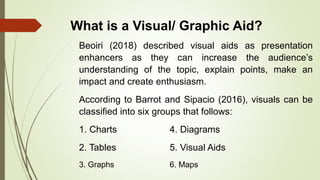
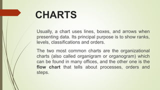
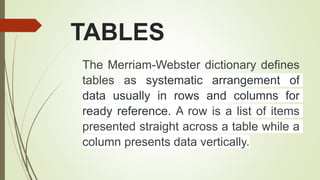
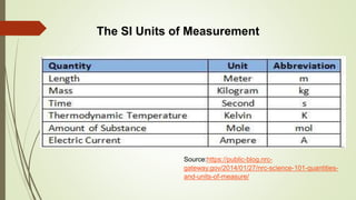
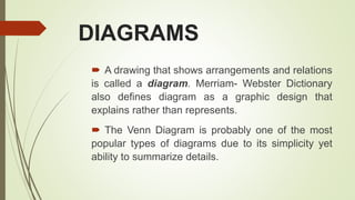
This document discusses different types of graphic/visual aids and their uses in presentations. It identifies 6 main categories: charts, tables, graphs, diagrams, visual images, and maps. Each category is described through definitions and examples. Charts are used to show ranks, levels and classifications. Tables arrange data in rows and columns for easy reference. Graphs present numerical data and trends through visual representations. Diagrams show arrangements and relationships through drawings. Visual images like photographs support information through pictures. Maps are useful for presenting data about places or areas. The document provides guidance on selecting the appropriate visual aid based on the type of data to present and gives activities to practice identifying and creating visual aids.
3. Objectives
a. Familiarize oneself of the different
graphic/visual aids and their uses
b. Use visual/graphic aids in presenting a
concept or paper
4. What is a Visual/ Graphic Aid?
Beoiri (2018) described visual aids as presentation
enhancers as they can increase the audience’s
understanding of the topic, explain points, make an
impact and create enthusiasm.
According to Barrot and Sipacio (2016), visuals can be
classified into six groups that follows:
1. Charts 4. Diagrams
2. Tables 5. Visual Aids
3. Graphs 6. Maps
5. CHARTS
Usually, a chart uses lines, boxes, and arrows when
presenting data. Its principal purpose is to show ranks,
levels, classifications and orders.
The two most common charts are the organizational
charts (also called organigram or organogram) which
can be found in many offices, and the other one is the
flow chart that tells about processes, orders and
steps.
7. TABLES
The Merriam-Webster dictionary defines
tables as systematic arrangement of
data usually in rows and columns for
ready reference. A row is a list of items
presented straight across a table while a
column presents data vertically.
8. The SI Units of Measurement
Source:https://public-blog.nrc-
gateway.gov/2014/01/27/nrc-science-101-quantities-
and-units-of-measure/
9. According to reference.com, graphs are meant to be
focused on the data in question and how they trend. They
have exact numerical figures shown on axes, usually
organized on the left and at the bottom of the graph.
Common graph types include dot-and-line and bar graphs.
Graphs are most commonly used in analyses and situations
that call for raw and exact. Some of the common types of
graphs are: bar, line (uses lines in presenting data), pie (or
also called a circle graph usually used for presenting
expenses and budgets), and pictograph (that uses pictures
to represent data).
11. DIAGRAMS
A drawing that shows arrangements and relations
is called a diagram. Merriam- Webster Dictionary
also defines diagram as a graphic design that
explains rather than represents.
The Venn Diagram is probably one of the most
popular types of diagrams due to its simplicity yet
ability to summarize details.
12. Components of Electronic Systems
https://pressbooks.bccampus.ca/technicalwriting/chapter/proposals/III
13. VISUAL IMAGES
Visual images are pictures or photographs. Providing visual
images to reports and concept papers can surely support and in
some cases, add information. If taken well, these images can
likewise add aesthetics to the output.
Here is one good example of using visual images in a report.
This is a page in a multinational company’s annual report. Notice
how the photographs intensified the overall effect to anyone who
may read it.
15. MAPS
Maps can be a common addition to
reports especially when presenting data
about places or areas. Since maps are
usually presented with numerical data,
using them can somehow break the
monotony of numbers in a presentation.
17. III. ACTIVITIES
A.Practice Tasks
Task 1 – Directions: Decide from among the choices the best
visual/ graphic aid to be used with the given data. Write the letter
only.
1. Ranks, orders, levels and classifications
a. graph b. chart c. map d.
diagram
2. differences, similarities
a. table b. Venn diagram c. map d. line
graph
18. 3. pictures with short descriptions, explanations, or
discussions
a. bar graph b. visual images c. map
d. chart
4. data to be presented in rows and columns
a. diagram b. map c. table
d. pictograph
5. places and areas
a. table b. diagram c. chart d.
map
19. Task 2 – Directions: Determine the most appropriate visual/ graphic aid to be used in the situation and
data given below. Present the data in your chosen visual/ graphic aid.
The ABM students of Malaya National High School plan on starting a
small canteen, selling hot snacks such as Pansit and Macaroni
Soup. During the meeting, they have agreed to spend their
starting capital, put 3500 pesos on expenses specified below:
● 2,500 pesos – ingredients for Pansit and Macaroni soup including
condiments
● 500 pesos – paper plates, disposable spoons and forks, paper
cups, straws and tissues
● 300 pesos – gas stove refill
● 200 pesos – travel expenses
20. Task 3 – Directions: For 5 points, explain
what kind of data will be best for this graphic/visual aid below.
Describe how you can use it, and what kind of visual/ graphic aid it may be.
Explain well and present your ideas logically and clearly.
Also, suggest improvement of this visual/ graphic aid to fit your ideas on how you can use it.