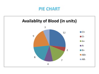
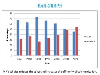
The document discusses the importance and uses of visual aids in communication. It notes that visual aids like illustrations, tables, graphs and diagrams are more effective than plain text alone. They help reduce space, increase understanding and make complex ideas and data more easily comprehensible. The document also provides examples of different types of visual aids like tables, bar graphs, flowcharts and maps and discusses when and how they should be used.
BUSINESS INTELLIGENCE AND DATA ANALYTICS presentationMohit Negi
SIX SIGMA APPROACH, DIFFERENT TYPES OF CHARTS AND THEIR FUNCTION, DASHBOARD, BUSINESS INTELLIGENCE, DATA VISUALISATION INFORMATION VISUALISATION, PERFORMANCE DASHBOARD, BUSINESS REPORTING, BALANCE SCORECARD
Paper presented in the research methodology workshop. The error if any is regretted and suggestions most welcome. Good for students and researchers alike, enjoy.
Contains different types of Data Visualizations, best practices to follow for each case and what type of visualization should be made for different kinds of datasets.
Top 8 Different Types Of Charts In Statistics And Their UsesStat Analytica
Are you confused about various Types Of Charts In Statistics? In this blog, you will get to learn about the various Types Of Charts In Statistics in detail.
Top 7 types of Statistics Graphs for Data RepresentationStat Analytica
Are you struggling with choosing the right type of graph to represent your data set? if yes then have a look at this presentation to choose the best statistics graph to represent your data set.
In this video Data Graphics has been discussed. How the data can be presented with the help of different line graph, poly graph, bar diagram, histogram and Scatter plot and semi logarithmic plot/graph.
Portion completed:
1.DATA GRAPHICS
2. REPRESENTATION OF DATA
3. line graph,
4. poly graph,
5. bar diagram,
6. histogram
7. Pie diagram
8. Wind rose and star diagram
9. Flow Charts
10. Simple Bar Diagram
11. Line and Bar Graph
12. Multiple Bar Diagram
13. Compound Bar Diagram
14. Pie Diagram
15. Scatter plot
16. Semi-log plot
The Roman Empire A Historical Colossus.pdfkaushalkr1407
The Roman Empire, a vast and enduring power, stands as one of history's most remarkable civilizations, leaving an indelible imprint on the world. It emerged from the Roman Republic, transitioning into an imperial powerhouse under the leadership of Augustus Caesar in 27 BCE. This transformation marked the beginning of an era defined by unprecedented territorial expansion, architectural marvels, and profound cultural influence.
The empire's roots lie in the city of Rome, founded, according to legend, by Romulus in 753 BCE. Over centuries, Rome evolved from a small settlement to a formidable republic, characterized by a complex political system with elected officials and checks on power. However, internal strife, class conflicts, and military ambitions paved the way for the end of the Republic. Julius Caesar’s dictatorship and subsequent assassination in 44 BCE created a power vacuum, leading to a civil war. Octavian, later Augustus, emerged victorious, heralding the Roman Empire’s birth.
Under Augustus, the empire experienced the Pax Romana, a 200-year period of relative peace and stability. Augustus reformed the military, established efficient administrative systems, and initiated grand construction projects. The empire's borders expanded, encompassing territories from Britain to Egypt and from Spain to the Euphrates. Roman legions, renowned for their discipline and engineering prowess, secured and maintained these vast territories, building roads, fortifications, and cities that facilitated control and integration.
The Roman Empire’s society was hierarchical, with a rigid class system. At the top were the patricians, wealthy elites who held significant political power. Below them were the plebeians, free citizens with limited political influence, and the vast numbers of slaves who formed the backbone of the economy. The family unit was central, governed by the paterfamilias, the male head who held absolute authority.
Culturally, the Romans were eclectic, absorbing and adapting elements from the civilizations they encountered, particularly the Greeks. Roman art, literature, and philosophy reflected this synthesis, creating a rich cultural tapestry. Latin, the Roman language, became the lingua franca of the Western world, influencing numerous modern languages.
Roman architecture and engineering achievements were monumental. They perfected the arch, vault, and dome, constructing enduring structures like the Colosseum, Pantheon, and aqueducts. These engineering marvels not only showcased Roman ingenuity but also served practical purposes, from public entertainment to water supply.
Read| The latest issue of The Challenger is here! We are thrilled to announce that our school paper has qualified for the NATIONAL SCHOOLS PRESS CONFERENCE (NSPC) 2024. Thank you for your unwavering support and trust. Dive into the stories that made us stand out!
2024.06.01 Introducing a competency framework for languag learning materials ...Sandy Millin
http://sandymillin.wordpress.com/iateflwebinar2024
Published classroom materials form the basis of syllabuses, drive teacher professional development, and have a potentially huge influence on learners, teachers and education systems. All teachers also create their own materials, whether a few sentences on a blackboard, a highly-structured fully-realised online course, or anything in between. Despite this, the knowledge and skills needed to create effective language learning materials are rarely part of teacher training, and are mostly learnt by trial and error.
Knowledge and skills frameworks, generally called competency frameworks, for ELT teachers, trainers and managers have existed for a few years now. However, until I created one for my MA dissertation, there wasn’t one drawing together what we need to know and do to be able to effectively produce language learning materials.
This webinar will introduce you to my framework, highlighting the key competencies I identified from my research. It will also show how anybody involved in language teaching (any language, not just English!), teacher training, managing schools or developing language learning materials can benefit from using the framework.
Instructions for Submissions thorugh G- Classroom.pptxJheel Barad
This presentation provides a briefing on how to upload submissions and documents in Google Classroom. It was prepared as part of an orientation for new Sainik School in-service teacher trainees. As a training officer, my goal is to ensure that you are comfortable and proficient with this essential tool for managing assignments and fostering student engagement.
Palestine last event orientationfvgnh .pptxRaedMohamed3
An EFL lesson about the current events in Palestine. It is intended to be for intermediate students who wish to increase their listening skills through a short lesson in power point.
The Art Pastor's Guide to Sabbath | Steve ThomasonSteve Thomason
What is the purpose of the Sabbath Law in the Torah. It is interesting to compare how the context of the law shifts from Exodus to Deuteronomy. Who gets to rest, and why?
Students, digital devices and success - Andreas Schleicher - 27 May 2024..pptxEduSkills OECD
Andreas Schleicher presents at the OECD webinar ‘Digital devices in schools: detrimental distraction or secret to success?’ on 27 May 2024. The presentation was based on findings from PISA 2022 results and the webinar helped launch the PISA in Focus ‘Managing screen time: How to protect and equip students against distraction’ https://www.oecd-ilibrary.org/education/managing-screen-time_7c225af4-en and the OECD Education Policy Perspective ‘Students, digital devices and success’ can be found here - https://oe.cd/il/5yV
GIÁO ÁN DẠY THÊM (KẾ HOẠCH BÀI BUỔI 2) - TIẾNG ANH 8 GLOBAL SUCCESS (2 CỘT) N...
Visual Aids.pptx
1.
2. Visual aids, generally referred to as an illustration,
is a visual representation such as a drawing,
painting, photograph, or other work of art that
stresses the subject more than form.
To understand its necessity let us perform two
activities.
Technical reports, like laboratory reports, project
reports, or feasibility reports, include illustrations
such as tables, graphs, maps, diagrams, charts, or
photographs.
3. Consider this passage :
In a blood bank, there are total of 33 units of different
blood groups. There are 12 units of O+ve blood,
7 units of A+ blood, 4 units of A- blood, 8 units of B+
blood, 9 units of AB+ blood, 3 units of AB- blood and
no units of B- blood.
4.
5. Now consider this passage :
In a locality, the percentage of men and women is
recorded every decade. It is done for 10 consecutive
decades and the records are as follows:
68% of men and 32% of women were present in 1960.
In 1970, it was recorded that 63% of men and 37% of
women lived in the locality. In 1980, men comprised
73% and women 27%. 67% of men and 33% of
women population was recorded in 1990. In 2000, it
was recorded that 61% were men and 39% were
women. 51% of men and 49% of women were
recorded in 2010. In 2020, it is recorded that 46% are
men and 54% are women.
6. Visual aids reduces the space and increases the efficiency of communication.
10. The human brain is more responsive towards illustrations than letters and words.
11. Concepts
Depicts non-physical, conceptual things and their relationships. To
show how a company is organized, that is, the relationships between
the different departments and officials, organization chart—boxes
and circles connected with lines that show how everything is
hierarchically arranged and related.
Objects
Photographs, drawings, diagrams, and schematics are the types of
graphics that show objects. To describe a fuel-injection system, we
probably need a drawing or diagram to explain the system
properly.
12. Numbers
Numbers are used while presenting data and statistics. If you are
discussing the rising cost of housing in a particular city, you
could use a table, with the columns showing the data for five
year periods since 1995.
Words
Graphics are also used to depict words. You have probably
noticed how textbooks put key definitions and examples in
boxes with words.
13. To further understand visual aids, let us answer the following
questions:
• When to use?
• How to use?
• Why to use?
• What are the types?
Illustrations are very effective when there is a mass of statistics and
complex ideas to be represented. Statistical data is best explained
through tables, graphs, charts, maps, diagrams, or photographs.
When ?
14. • Arouses interest and focuses on essentials
• Leads the reader to quicker comprehension
• Supports and reinforces words
• Saves much time and effort in explaining complex ideas
• Explains the data in much lesser space but with greater accuracy
• Simplifies numerical data
• Emphasizes and clarifies certain facts and relationships
• Makes the descriptions vivid and eye-catching
• Renders a professional flavour to the communication
Why ?
15. • neat, accurate, and self-contained
• appropriate to the data
• labelled completely
• self-contained
• integrated with the text
• placed as close to the first reference as possible
• sized appropriately so that they are clear even upon reproduction
• such that they create a good balance between the verbal and the visual
How ?
16.
17. A Table is a representation of data in vertical and horizontal
subsets called columns and rows respectively.
Numerical and statistical data are usually represented in the form
of tables. Sometimes, data in the form of phrases are also
represented in a table.
There are three types of tables :
i) Independent Tables
ii) Dependent Tables
iii) Phrase Tables
18.
19.
20. Line graphs
Line graphs are used to show continuous change with respect to time.
For example, the increase, decrease, or no change in temperature along
with time can be depicted through a line graph.
21. Bar graphs
Bar graphs are effective in emphasizing the comparison of various
data items. They can be used to depict the quantity of different items
during the same period or the same item during different periods.
22. Scatter Plots
A scatter graph is used to show the correlation between two variables.
Usually, dots (•) or crosses (×) are used to represent the data. The
association or dependency of the variables depends upon four factors:
Direction, Curvature, Variation and Outliers.
23. Pictograms are similar to bar graphs, with figures or small
pictures plotted instead of bars. The pictures are chosen in
accordance with the variables represented.
Pictogram/ Pictorial graph
24. Area graphs
Area graphs can be used to show how something changes over time.
Usually, the x axis represents the time period and the y axis
represents the variable being measured. These graphs also help to
compare trends over a period of time.
25. Charts are often used to make it easier to understand large
quantities of data and the relationships between different
parts of the data.
In technical documents, drawings and diagrams are used to
depict the objects, processes, circuits, etc. that are being
described. Diagrams can be used to show the normal,
sectional, or cut-away view of an object.
29. Maps graphically represent spatial relationships on plane
surfaces. They are used to establish a frame of reference and
to facilitate the understanding of spatial relationships that are
difficult to describe in words, especially to serve as
navigational aid.
Maps can be represented for any area irrespective of its size.
In Communication, maps are considered as the most
important visual aid, as it could give lots of information
about a large geographical area in a small piece of paper.
• Sky map
• World map
• Political map
• State map
• City map
• Layout map